Category: Papercrafting

  • I’m in love with Papertrey Ink Clouds…

    Seriously, I can't stand it… I am IN LOVE with the Papertrey Ink cloud dies and cream felt. ACK. I am posting two cards today made with the little beauties, and I could probably have made ten more cards without even thinking about it. The felt is unbelievably high quality and I cut the dies with my Cuttlebug machine and they come out perfect every time. Click here to go to the PTI website to see the dies. The clouds match the little stamps in the Up Up and Away stamp set. Seriously…no seriously…I cannot stand it.

    Card #1 was made with a pretty rainbow bling I had tucked away in the bling drawer. It came like that…no I did not put alllll those blings into a rainbow! I used my Nestabilities to cut a white circle and then a royal blue scallop circle. Keeping it simple and bright.

    IMG_2525


    Some of the clouds are mounted onto foam tape to pop them off the page. The yellow paper is by Bazzill for Doodlebug Designs. Has a nice texture.

    IMG_2529


    IMG_2532


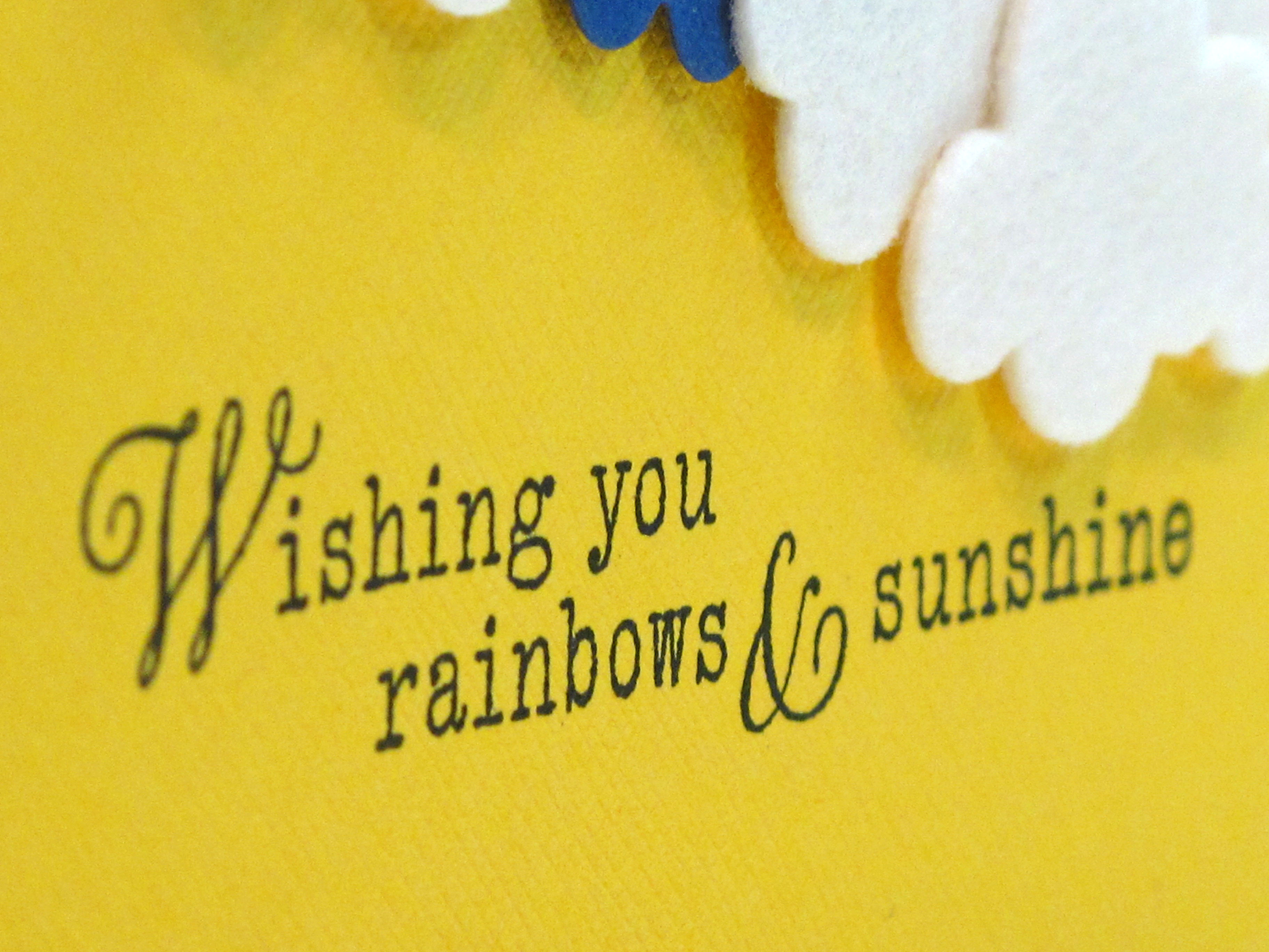
    The sentiment is also from Papertrey Ink…isn't it perfect?
    IMG_2533


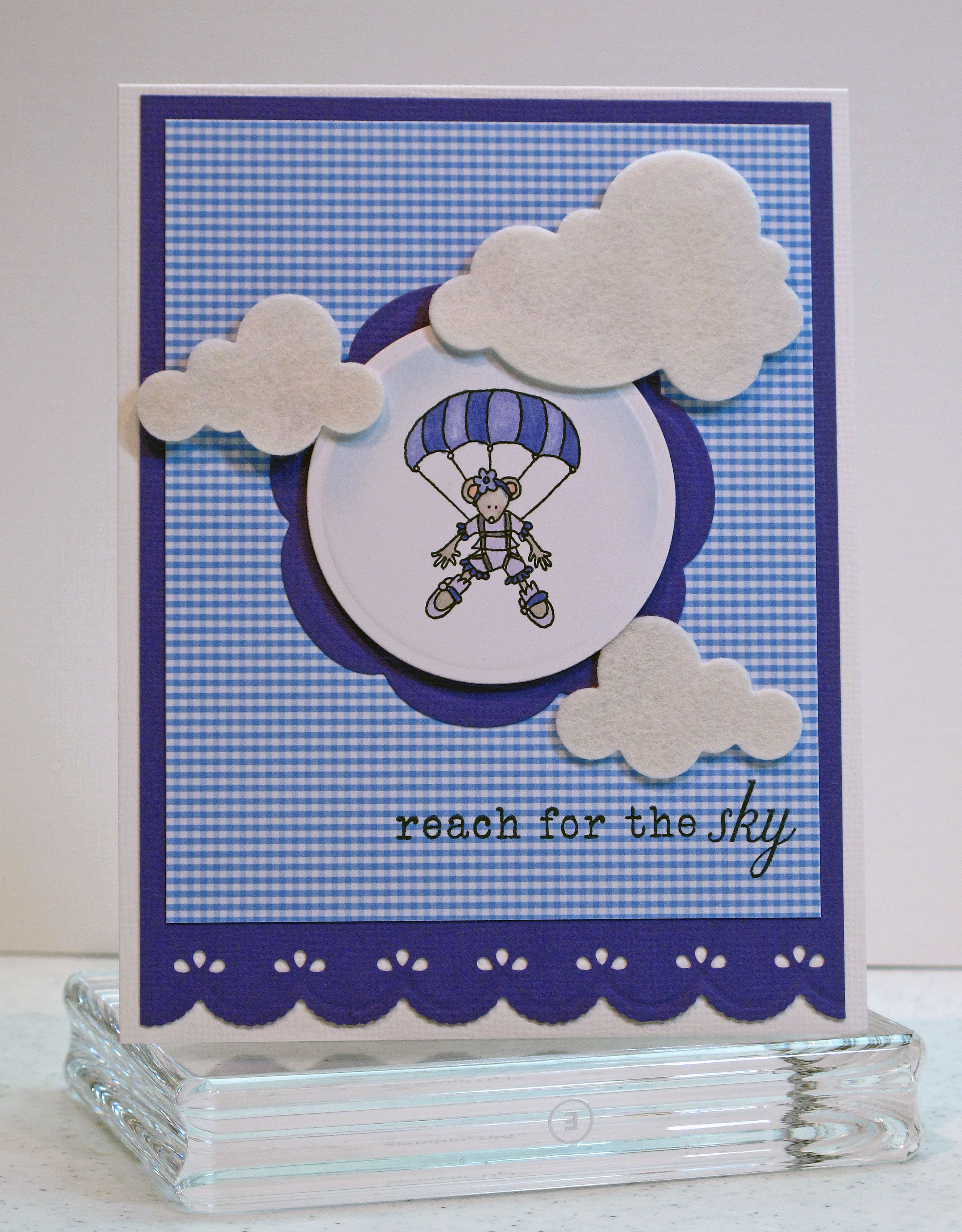
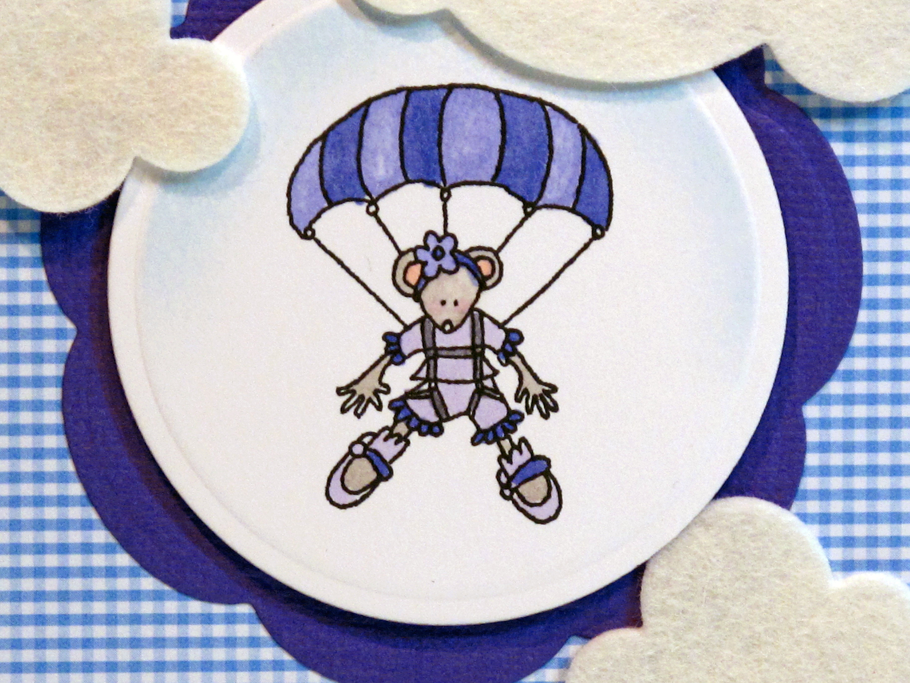
    Card #2 was made with this cute little mouse stamp from Stampin' Up. A-DORABLE. I used shades of blue and blue violet and again kept the layout simple. A pretty border at the bottom and my favorite checked paper keep it cheery.
    IMG_2498


    IMG_2499


    This sentiment is from the same Papertrey Ink stamp set…

    IMG_2501

    I hope these clouds and cards have uplifted you today! Have a wonderful week!

  • Happy Birthday to Teadub!

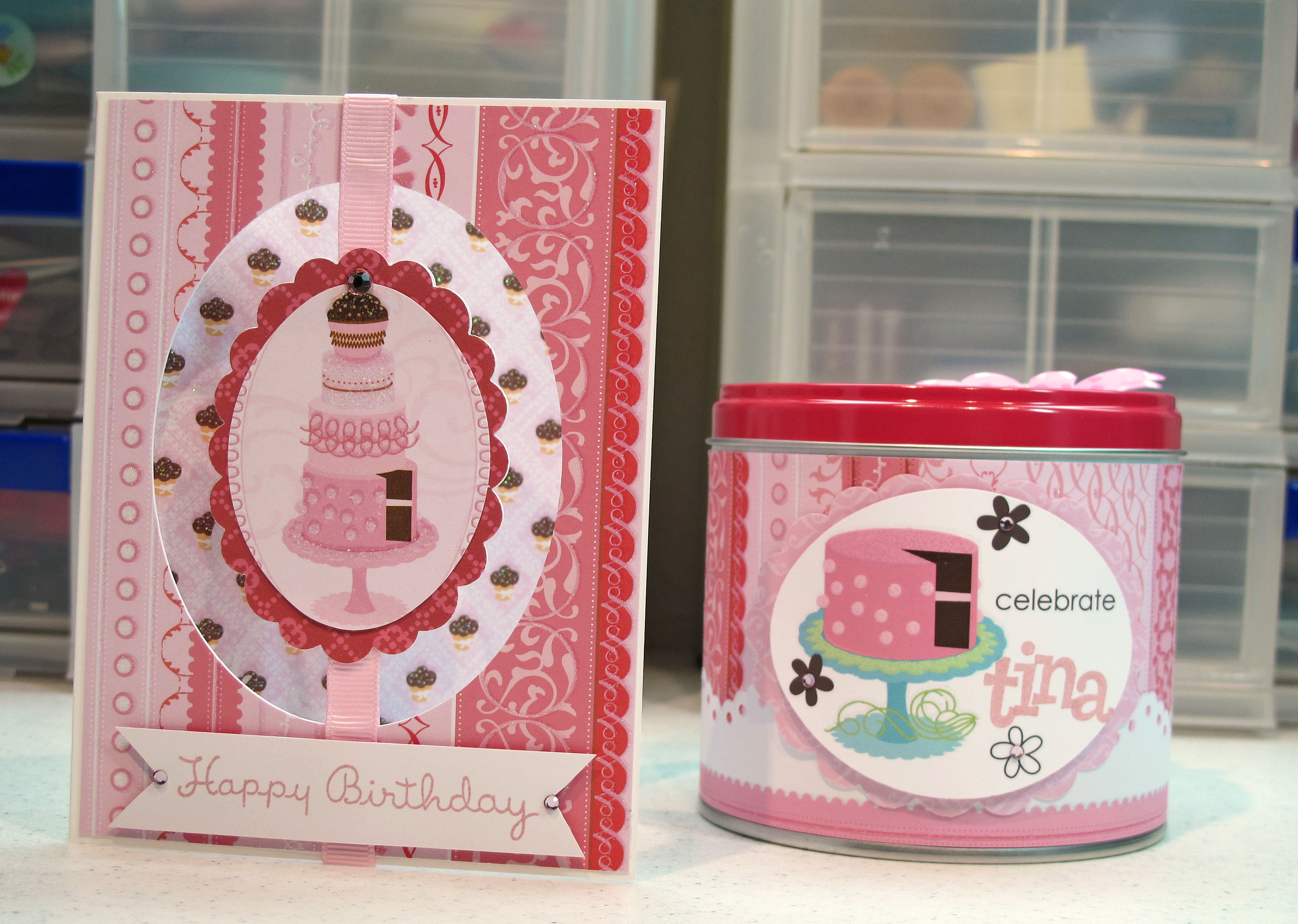
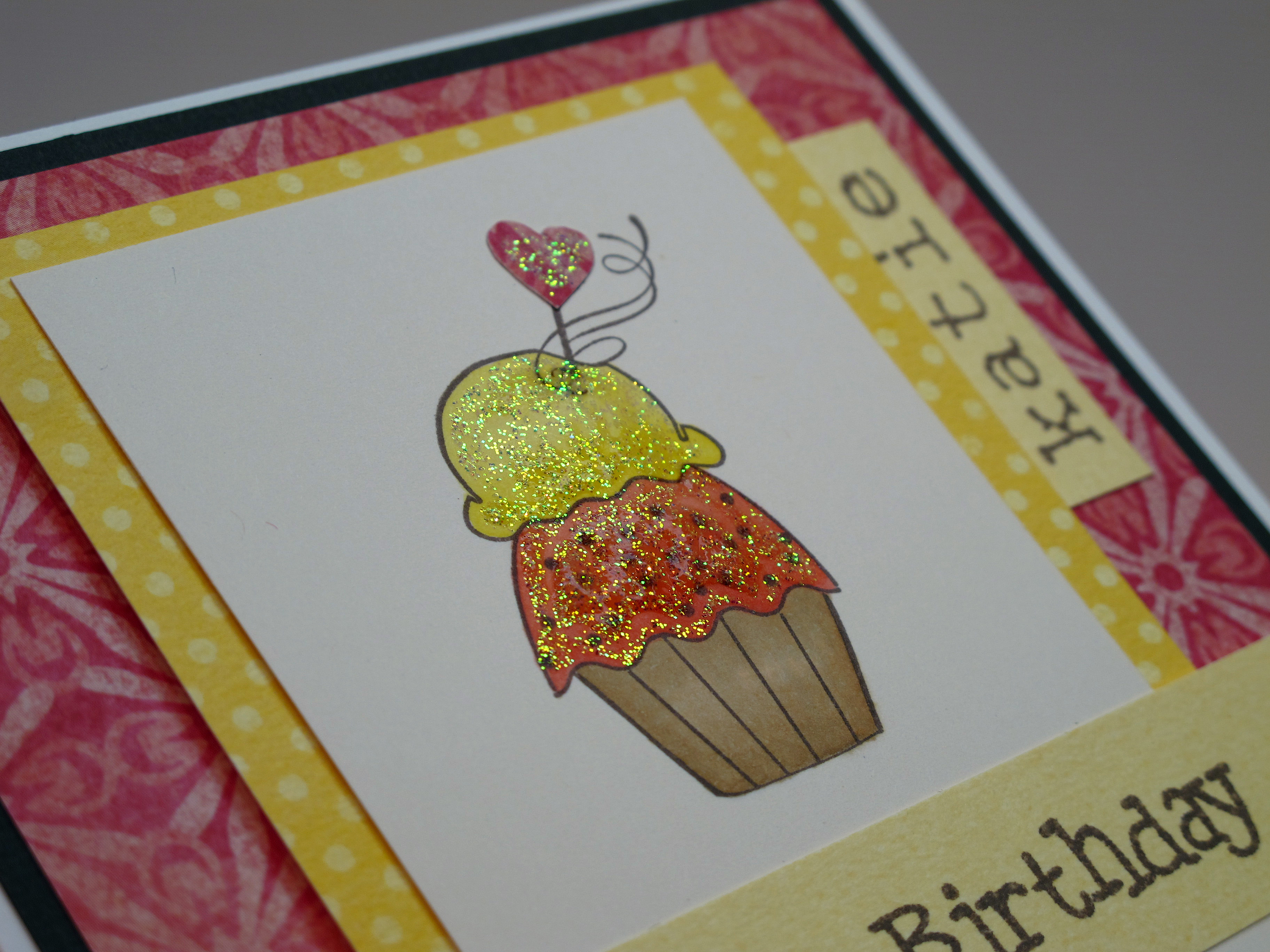
    Today is my friend Teadub's birthday! I made her some goodies and sent them her way earlier in the week…but now I can post them! Now…Ms. Teadub is allll about pink! So her card and prezzies needed to be pink and girlie and sparkly.

    Here is the matching card and gift tin:

    IMG_2487

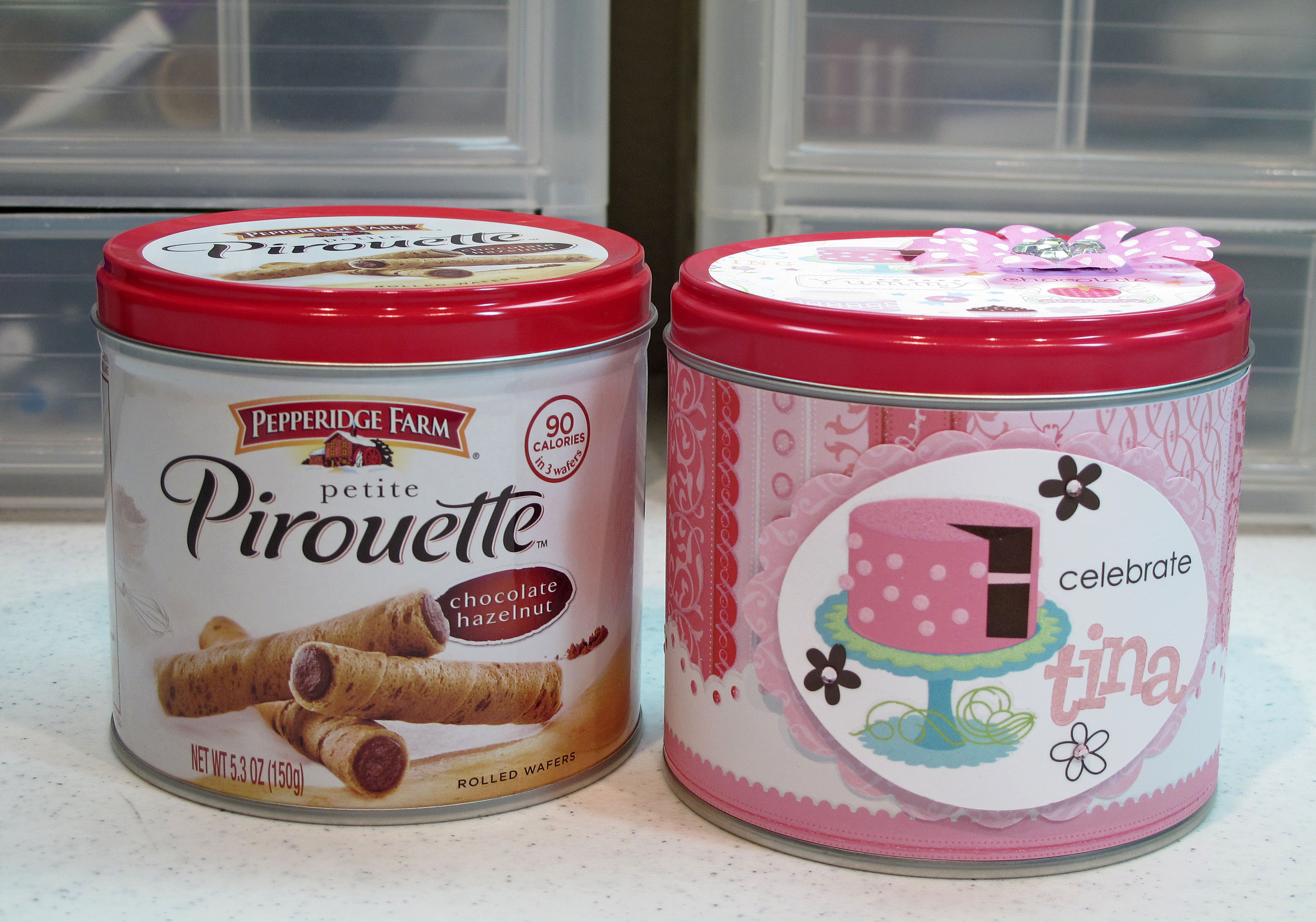
    I decorated the tin with patterned paper and then some rub-ons and some stamped letters. Oh…and don't forget the bling! Pink and brown is the way to go. Before and after… One of my favorite projects for prezzies is to take these short Pepperidge Farm tins and decorate them specifically for the person. (Oh and it doesn't hurt that I have to eat the treats first!). They can hold a gift card, a little jewelry prezzy, some candy, or STAMPS!
    IMG_2496

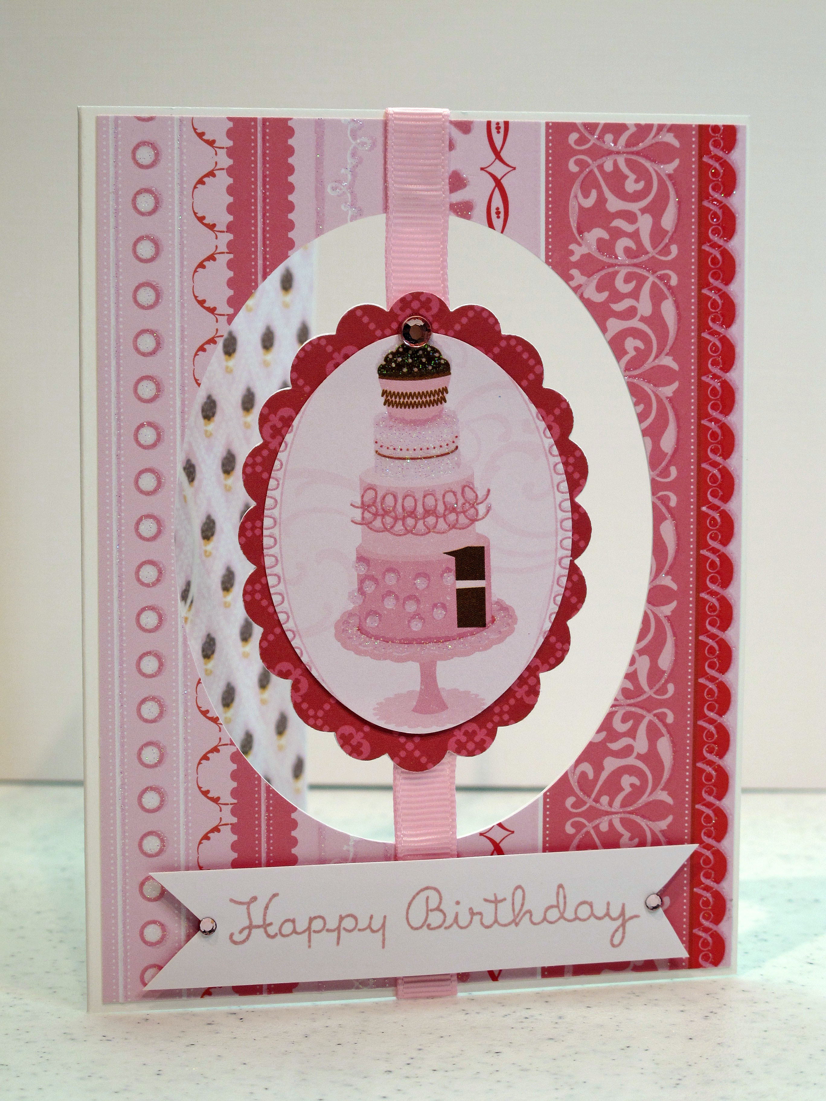
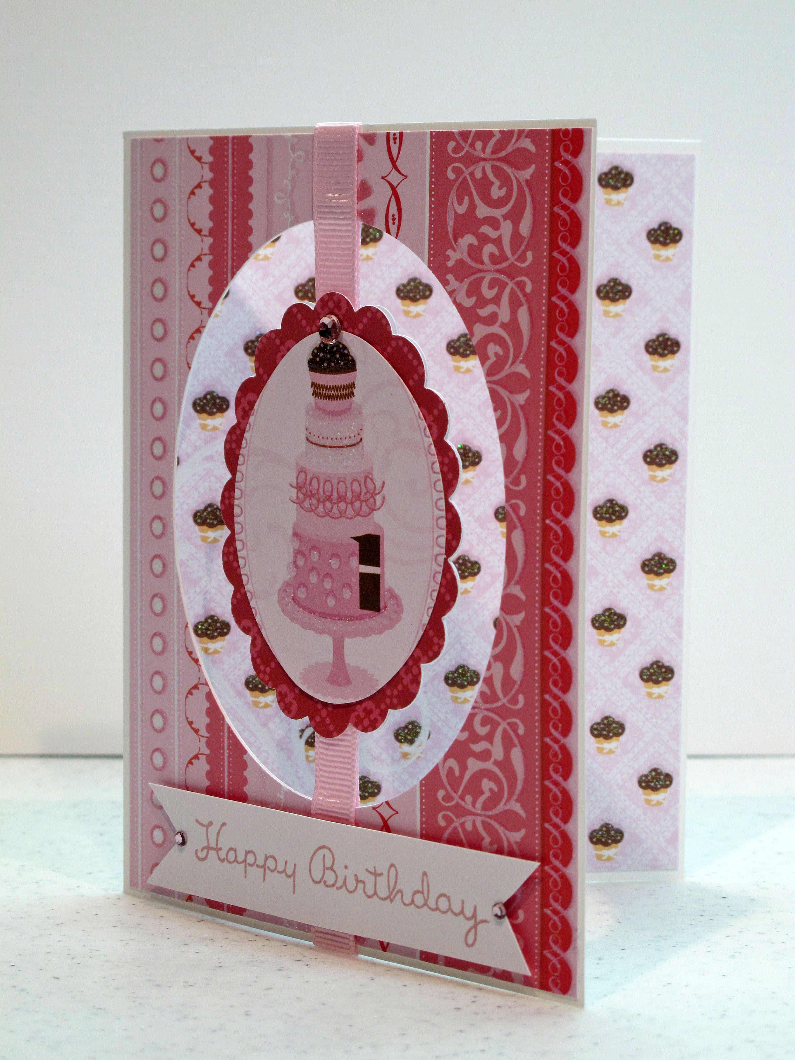
    Here is the card. I tried a new technique with the cut out. I used my Creative Memories oval cutter after putting the layers of patterned paper together. Then I used my oval punches to make a center piece and hooked it all up with ribbon!

    IMG_2490

    Some cute little pink cupcakes in the background…

    IMG_2492


    IMG_2493


    IMG_2494

    Have a fantastic weekend everyone!
  • TESC #122 Challenge card!

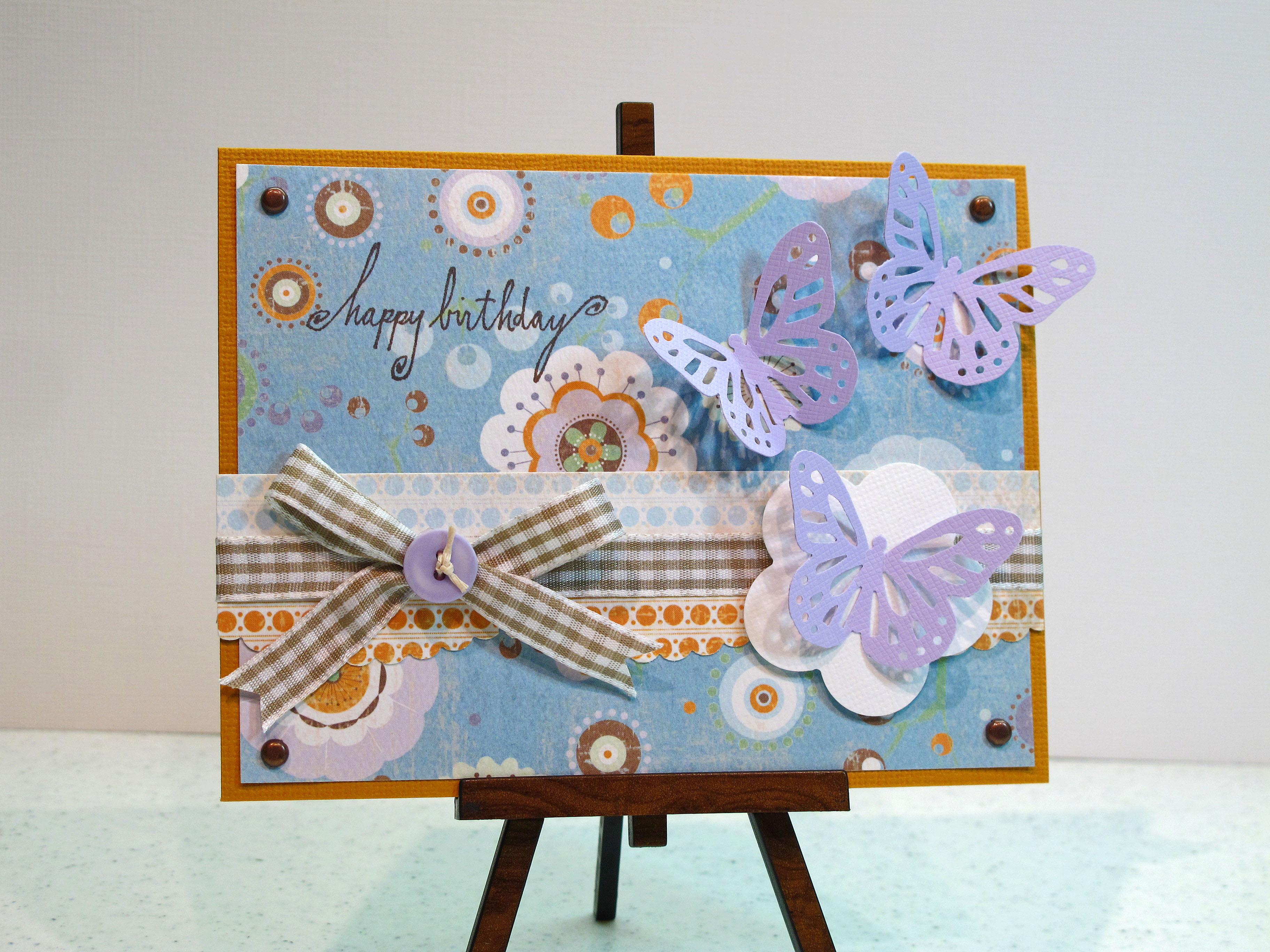
    I am trying to use some different color combinations in my cards and I found this pretty patterned paper from Crate Paper in my stash to use for inspiration. I love doing the challenges for Taylored Expressions and this card is my entry for Challenge #122. Hey…I used orange…and purple…and brown! Hahaha…and take note…no polka dots!


    IMG_2522 

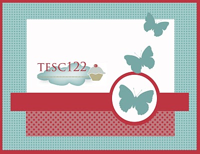
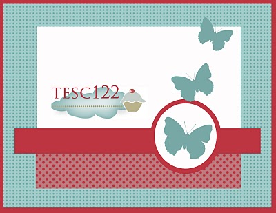
    The sketch image is below. I tried to use different items for the accents, but ended up using butterflies because it looked the best and stayed true to the sketch.

    TESC122


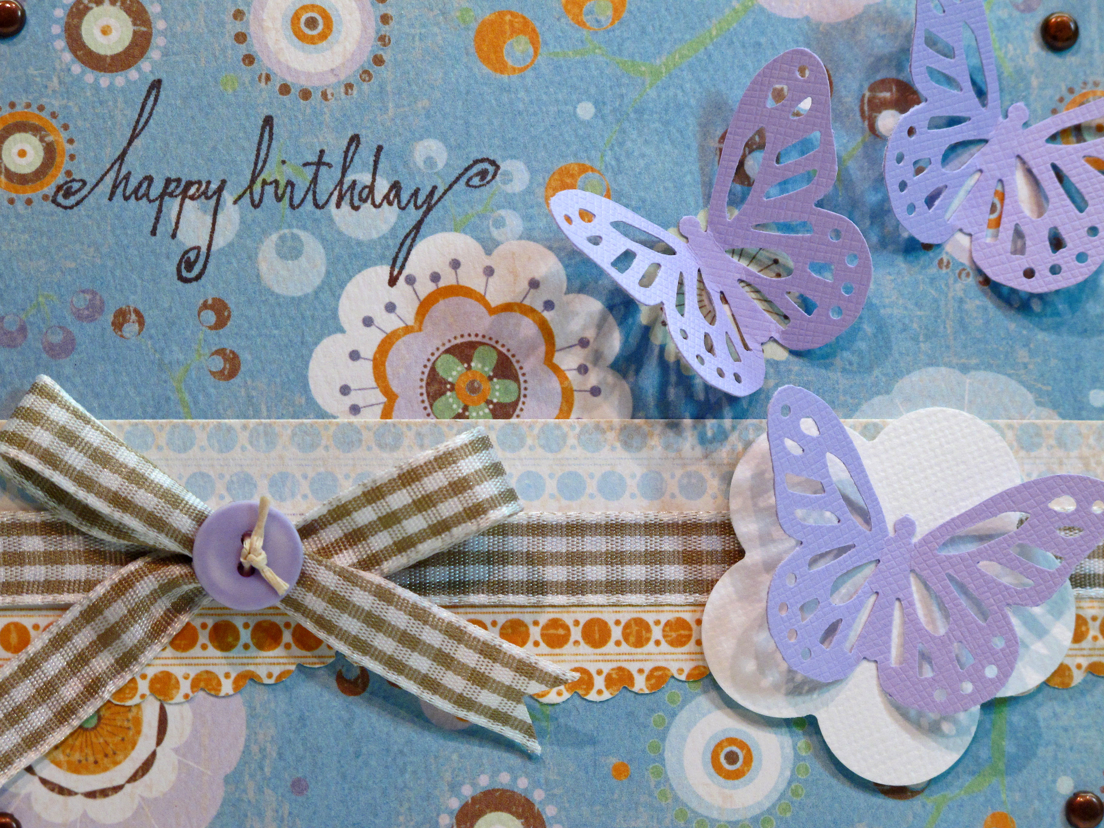
    The butterfly punch is one of my favorites from, where else, Martha Stewart. I used some gingham ribbon and tied a lavender button on with some twine. One of my favorite tricks with the butterflies is to glue down the center only and pop the wings off the page.

    IMG_2523


    I just love making these butterflies pop up off the page!

     IMG_2524 

  • Shabby Tea Room Challenge #19!

    Saturday! Glorious Saturday! Hi everybody…hope you are having a wonderful weekend. I've been holed up in the craft room all day with Mr. Buddy. We're watching Mad Men Season 3 on DVD getting ready for the Season 4 premiere tomorrow night! That Don Draper is dreamy…and a total cad! Does anyone else remember the office party with the tractor? Just sayin' - brilliant television!  

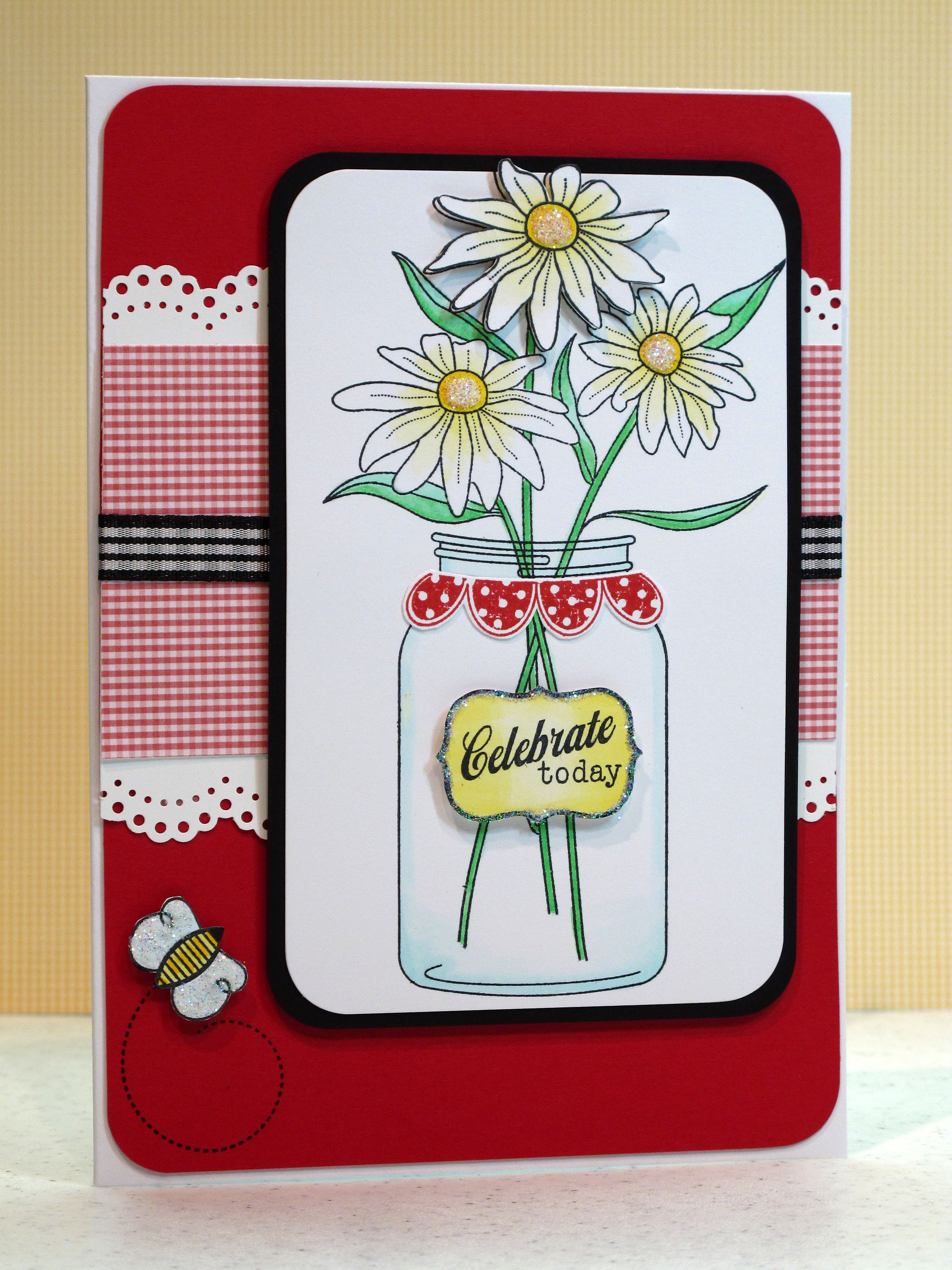
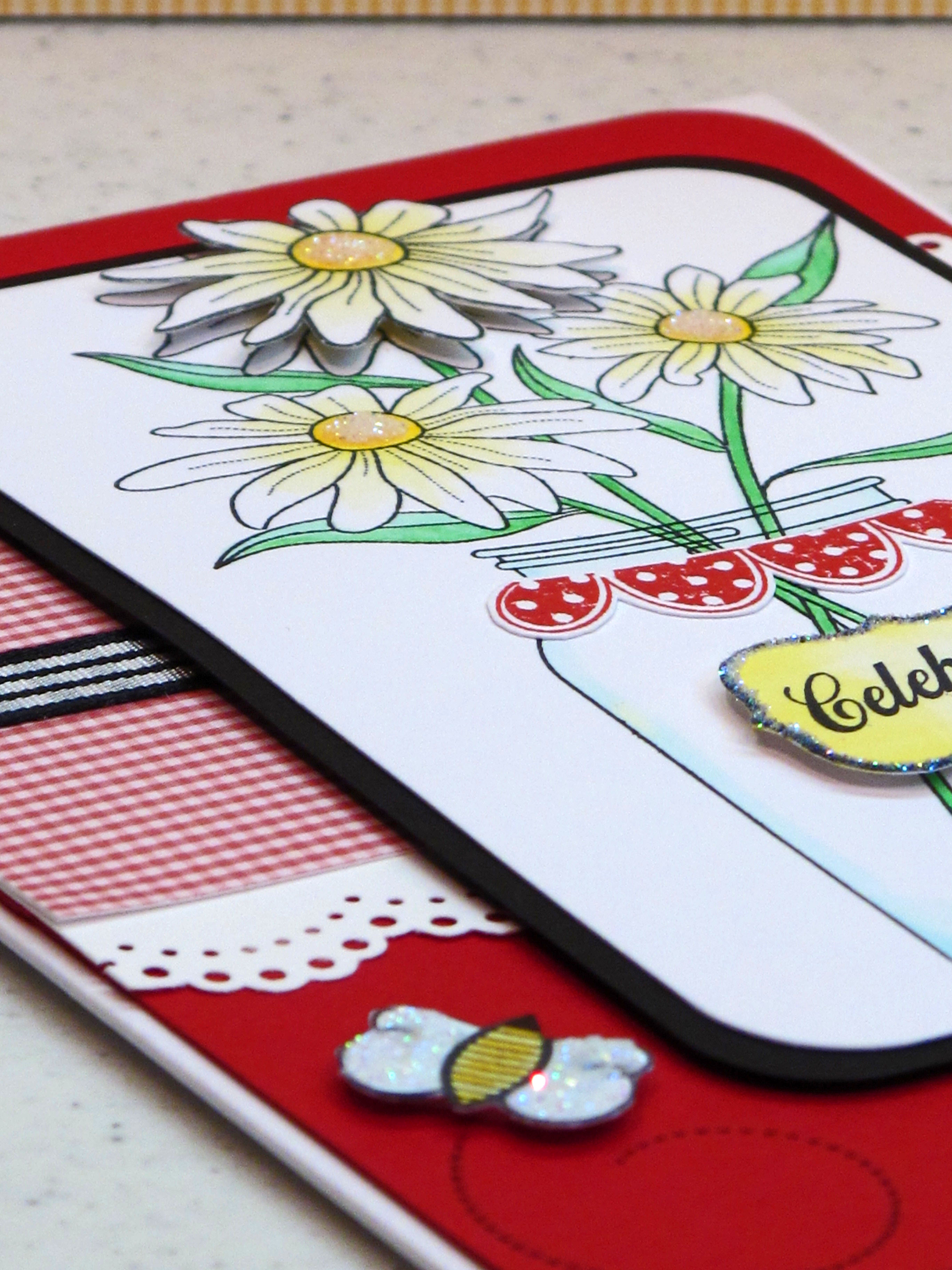
    I finally got my craft on this week! Yay! The first card I made today is my entry for the Shabby Tea Room Blog Challenge #19. It's been too long since I entered their challenge. Glad to be back! The theme for this week is "From the Garden" using Red, White, Yellow and Green colors. I got the idea instanty to use the PTI Friendship Jar set with the pretty daisies…fresh from the garden. Hope you likey.


    IMG_2477


    All the stamps are from Papertrey Ink…love that company, don't you? Lots of cutting on this one…the label, the top flower, the scallop red lining on the jar, the bee…

    IMG_2482


    I really wanted the flowers to look like white daisies but it seemed strange to leave them all white. I used my lightest yellow Copics to barely color the petals. I put some prisma glitter in the centers. I used a MS edge puncher and the red paper is also from PTI.

    IMG_2478  

    I felt that it needed something in the bottom corner so I added the bee. Notice that I popped up several parts of the card with foam tape to add dimension. I couldn't live without foam tape! I may later add a sentiment on the very bottom also. But for now I just liked it as is.


  • TESC #121 Challenge Card!

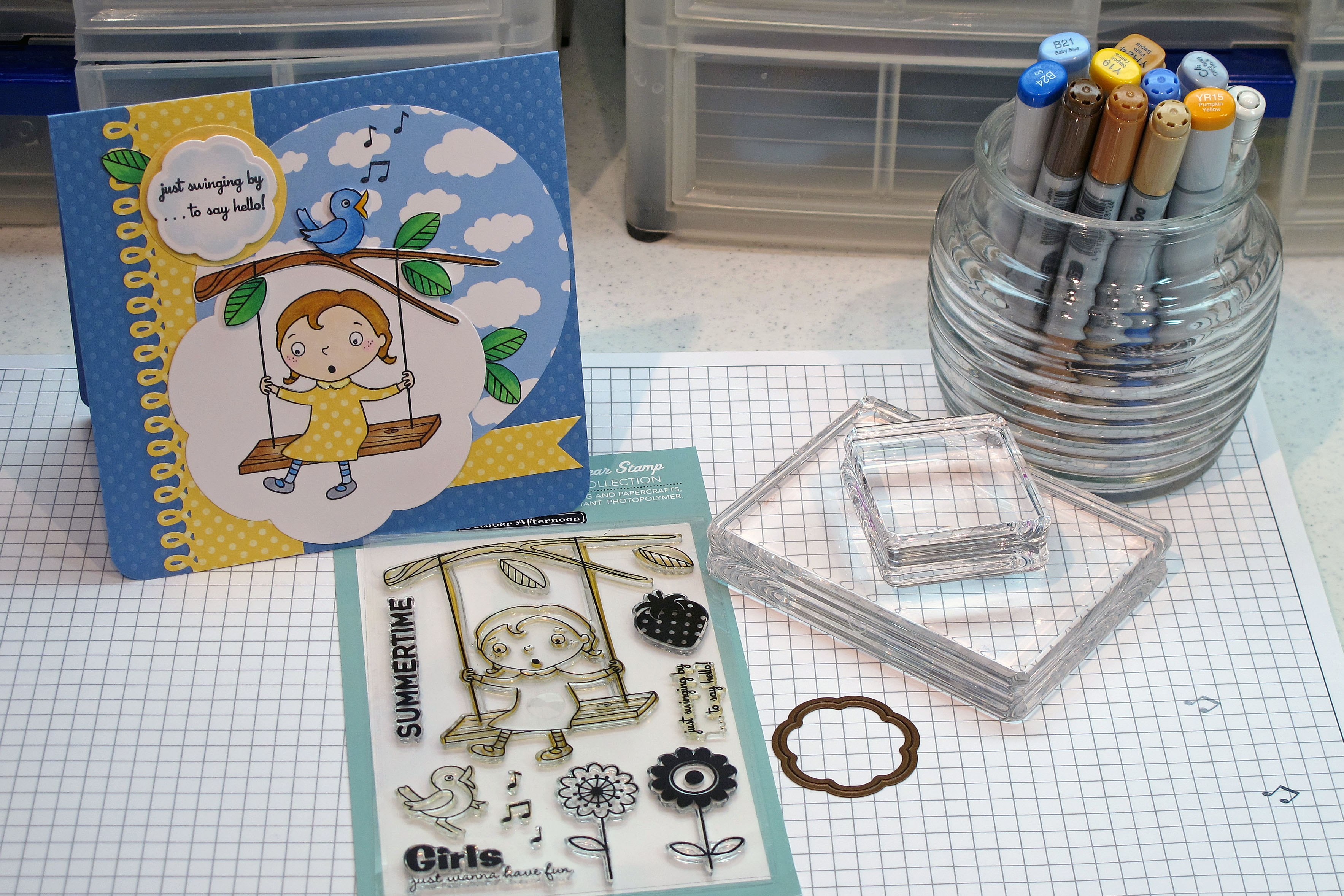
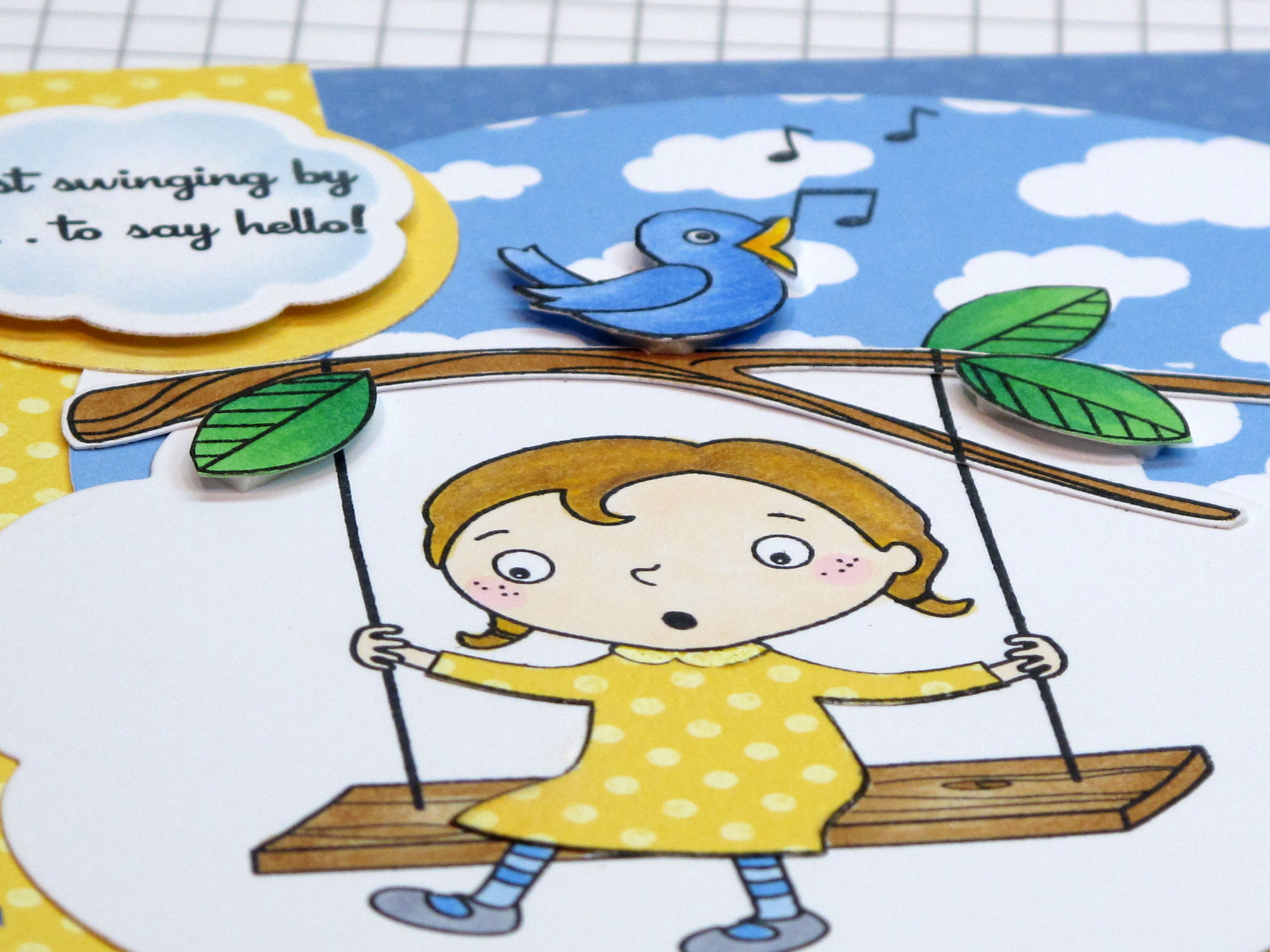
    Today's card is my entry for Taylored Expressions Challenge #121! I haven't entered Taylor's challenge in a couple of weeks and it's fun to play along again. There's still time…why don't you make a card and enter too? After making this card, I realized I need to stop with the yellow and the polka dots! Hmmmm. What will be my next obsession? Anyhoo…here is my card! You best be appreciatin' all the cutting involved in this one! hahaha. This is a great layout. The finished card is 6 inches square.

    IMG_2407


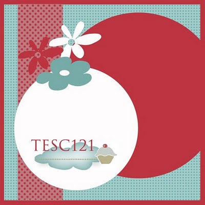
    The sketch image from Taylor:

    TESC121


    Supplies – October Afternoon stamps, Copic Markers, Dotted Swiss paper from Bazzill, Amuse cloud paper, Creative Memories circle cutter, and blossom nestabilities…

    IMG_2406


    IMG_2409


    IMG_2410


    Chirp Chirp!

    IMG_2413 

  • Amuse Marigold Card

    Hello chicadees! Oy, it's still roasting here in Sac-town and I'm in the craft room trying to stay cool…

    The DH just went up to Target to get the Season 3 Mad Men DVD set so we can get ready for Season 4 which starts next weekend. He got the LAST copy!!! Thanks honey!!! He said he only had to hurt one person! Just kidding! If you have never watched that show, I highly recommend it. I would start from season 1 and watch the whole thing. It's my favorite show – like a wonderful, beautiful movie each week. So well made, I can hardly believe it's television. Sunday nights on AMC. Check it out.

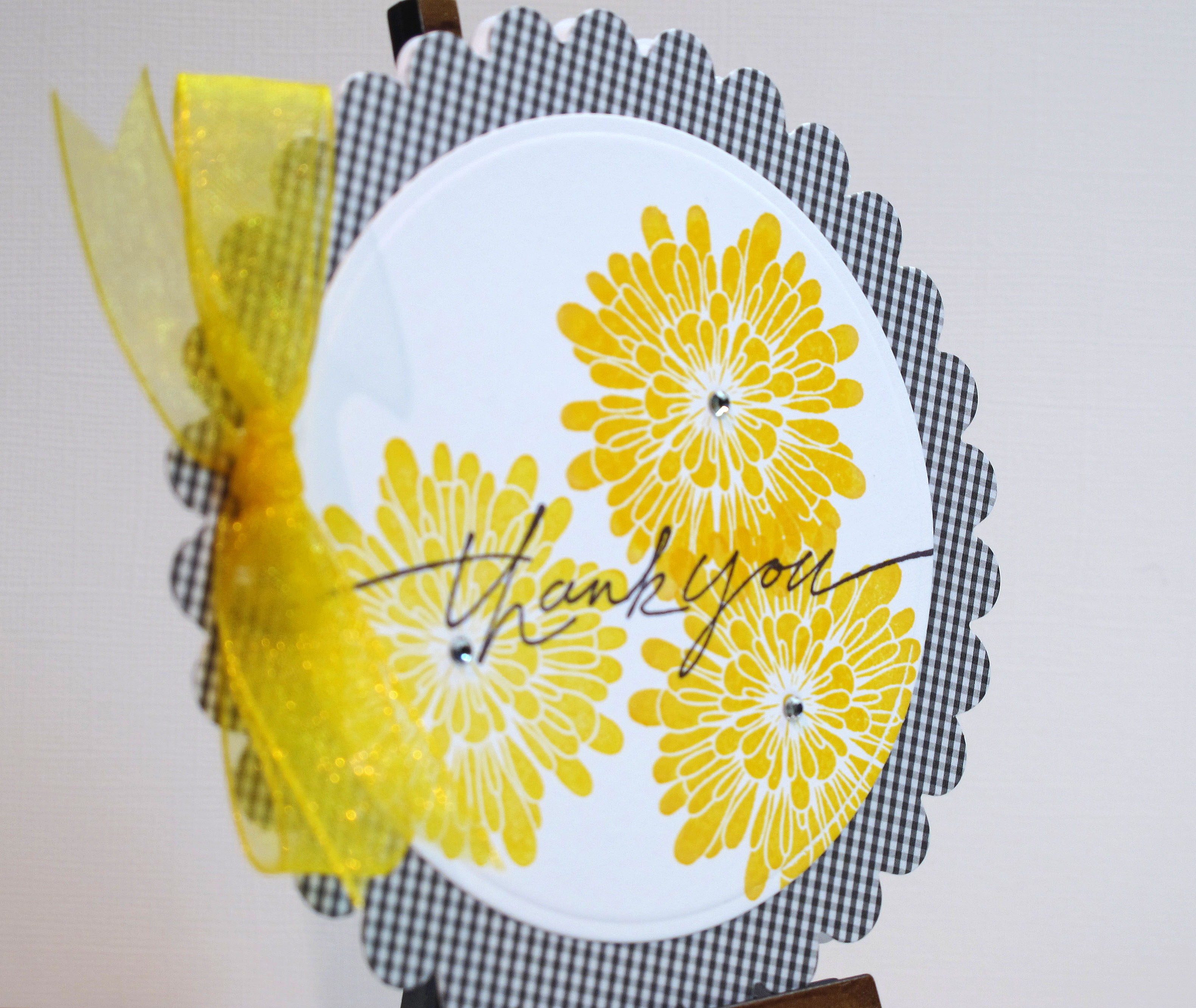
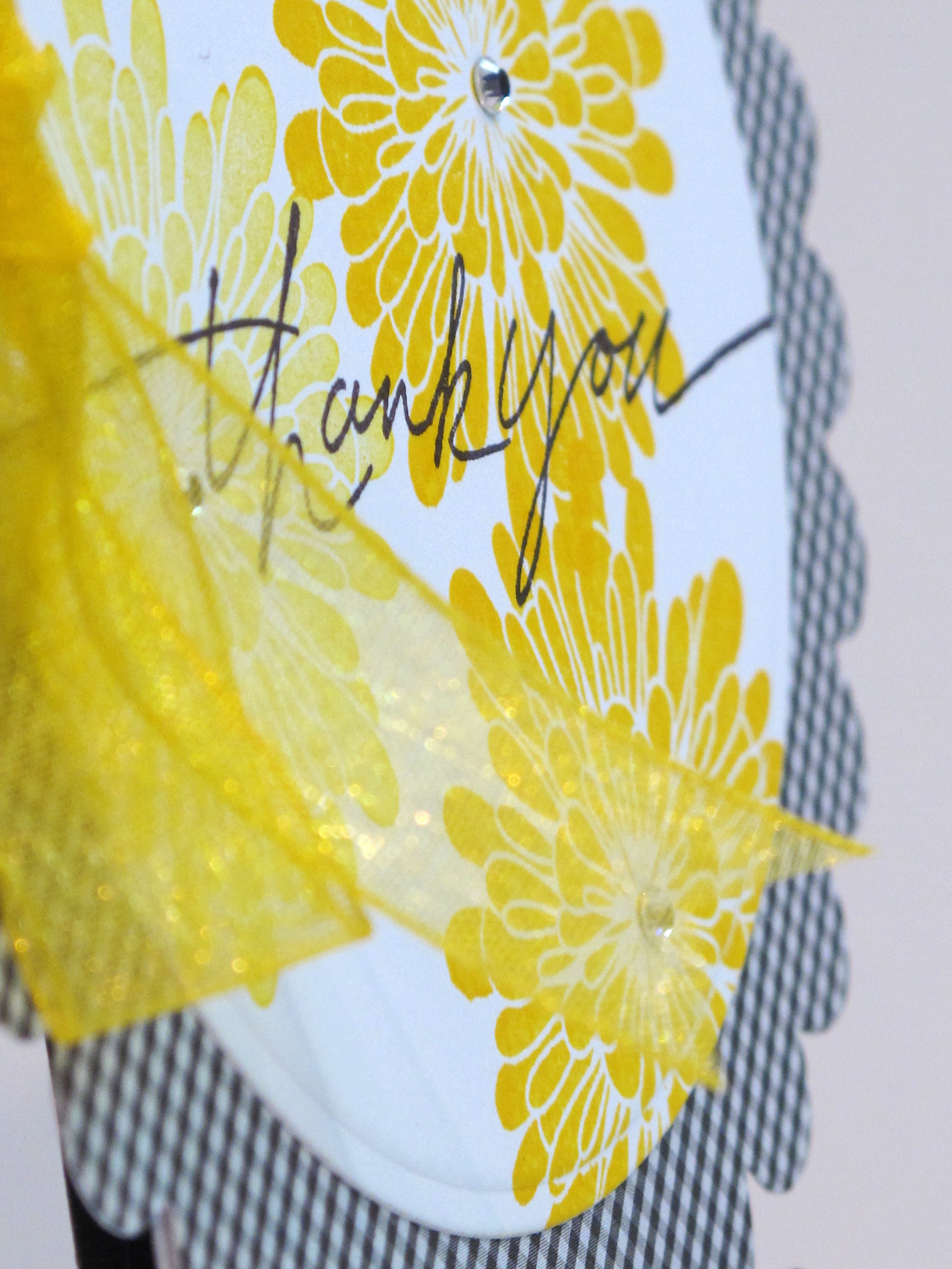
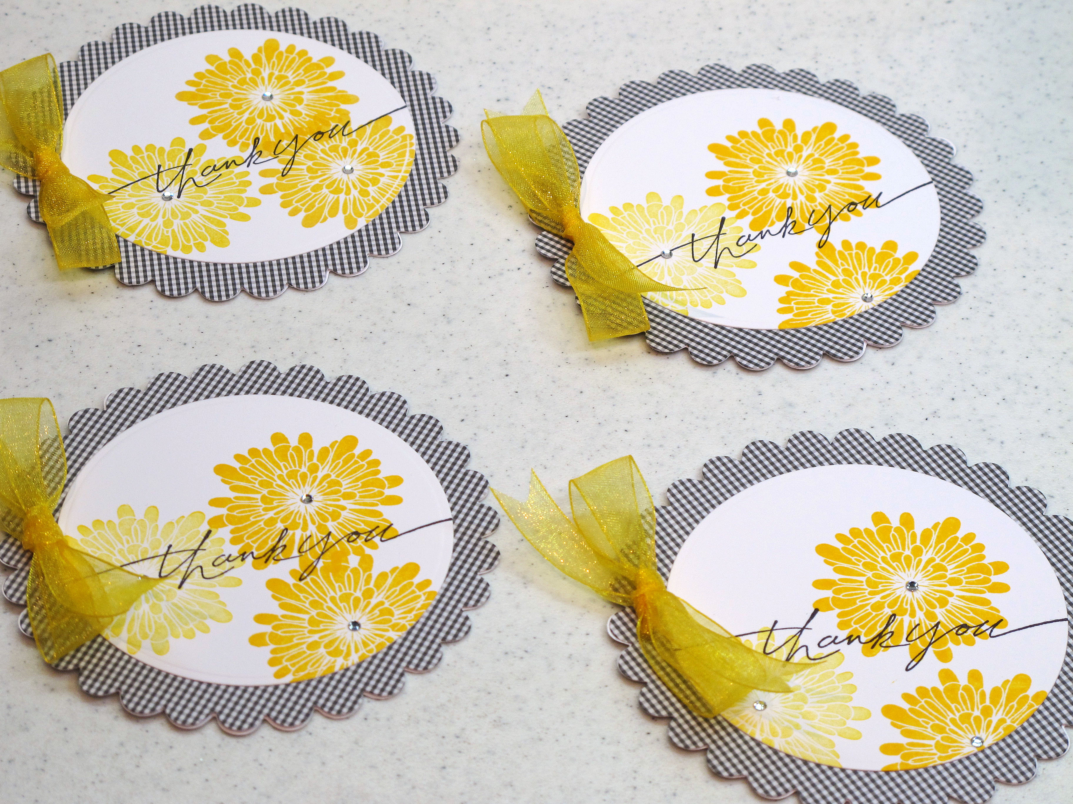
    The card I'm posting today was inspired by Julie's Amuse flowers class we took last week at Paper Garden. I made a round card inspired by one of her cards and used the new marigold stamp I bought – which we used on another card in class. I kept it sweet and simple, too. Hope you likey.

    I used my large scallop die from Stampin' Up in my Cuttlebug to make the card bases. One tip Julie gave us is to score the back circle instead of the front one – so your card front is a solid circle. I punched two small holes on the side for the bright yellow riboon.

    IMG_2401

    This marigold stamp is very versatile…you can stamp it in any color and it makes a nice crisp image. I used Adirondack Ink in Sunshine Yellow. The "Thank You" is a Stampin' Up image.

    IMG_2402


    Notice the tiny clear rhinestones in the center of the flowers?

    IMG_2403

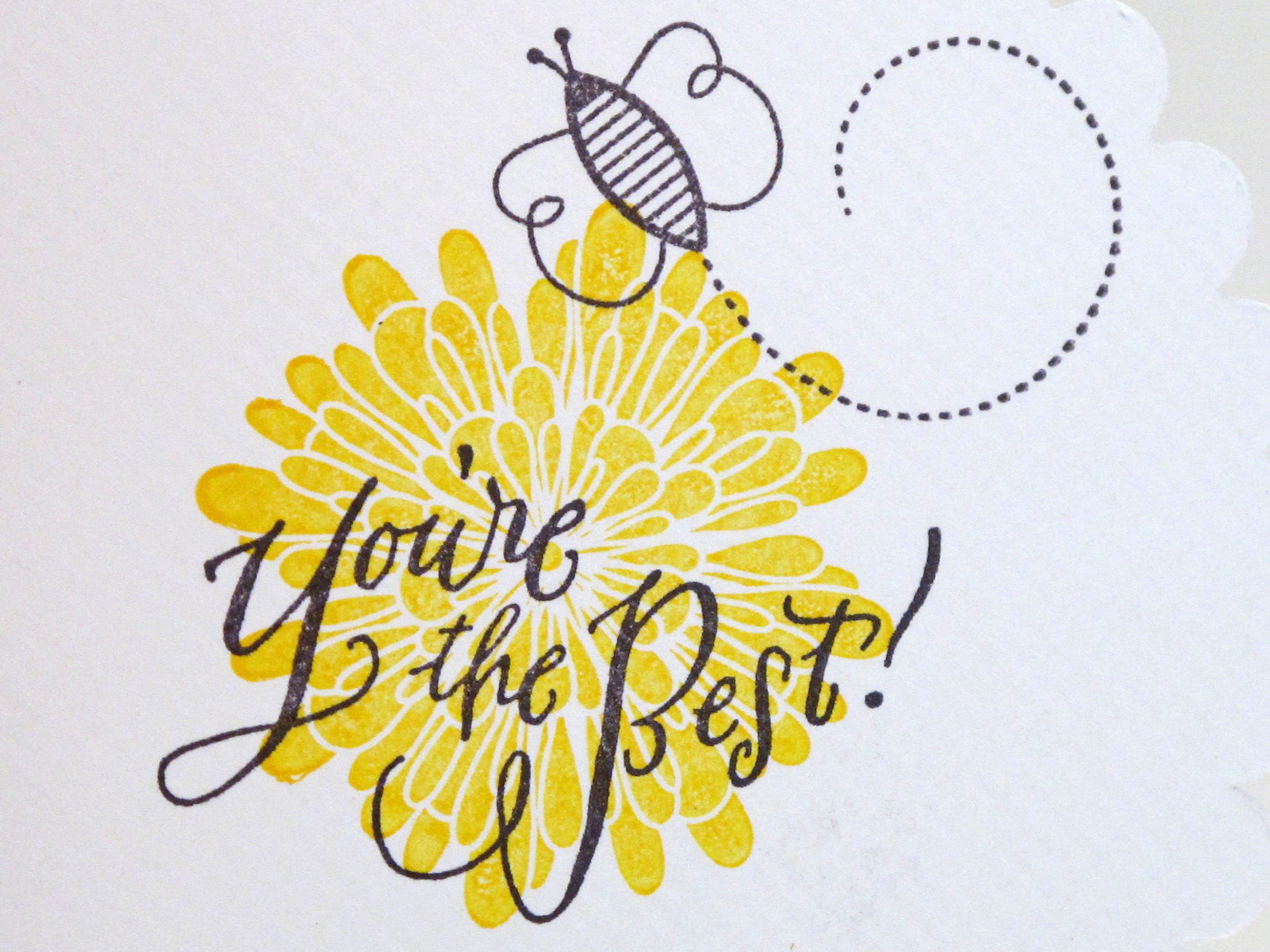
    This is the inside of the card. The bee is from PTI and the saying is from Paper Source.

    IMG_2405


    Pretty little Thank You's all ready to go!

    IMG_2400 

  • Cards for little ones…

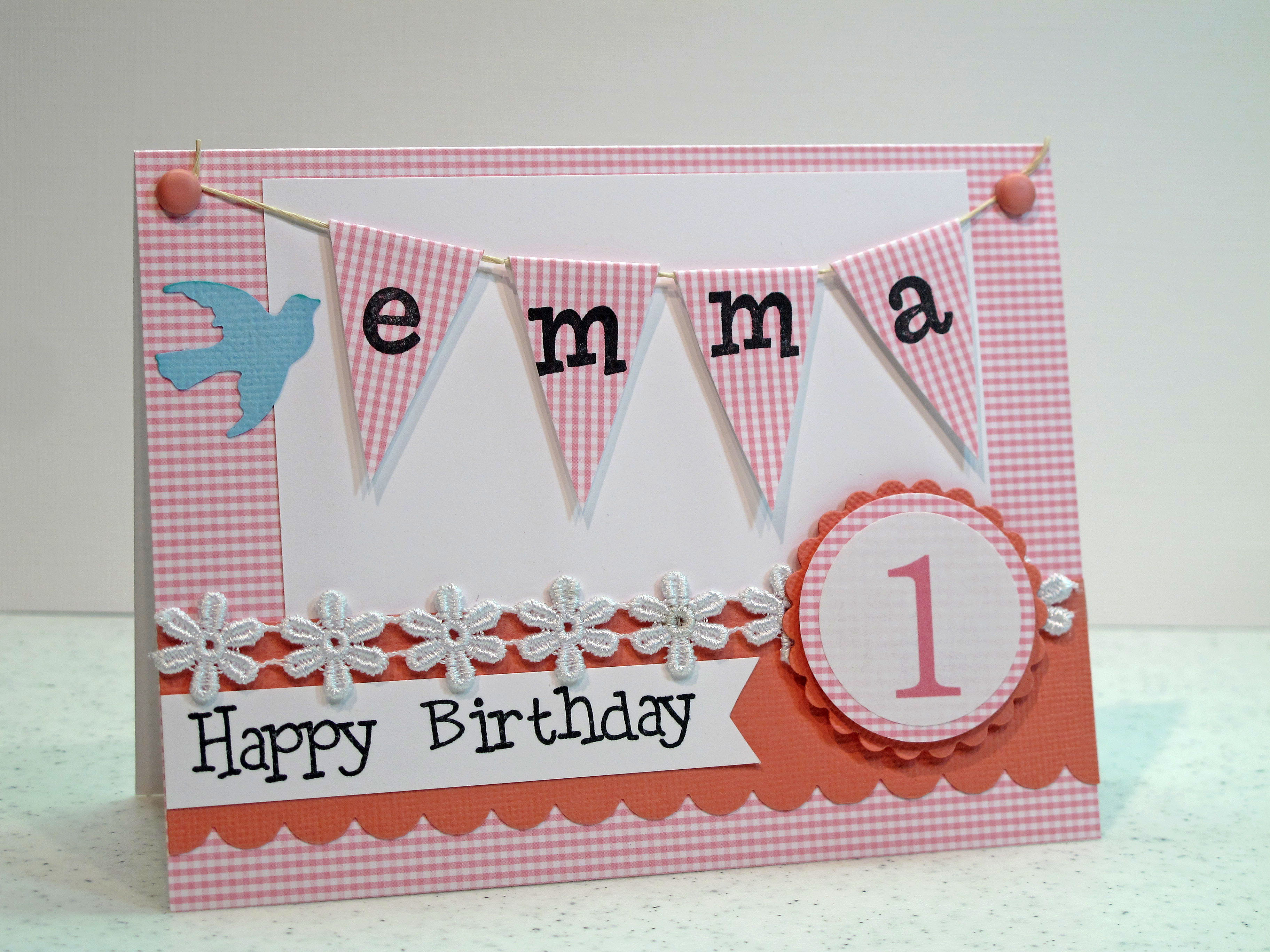
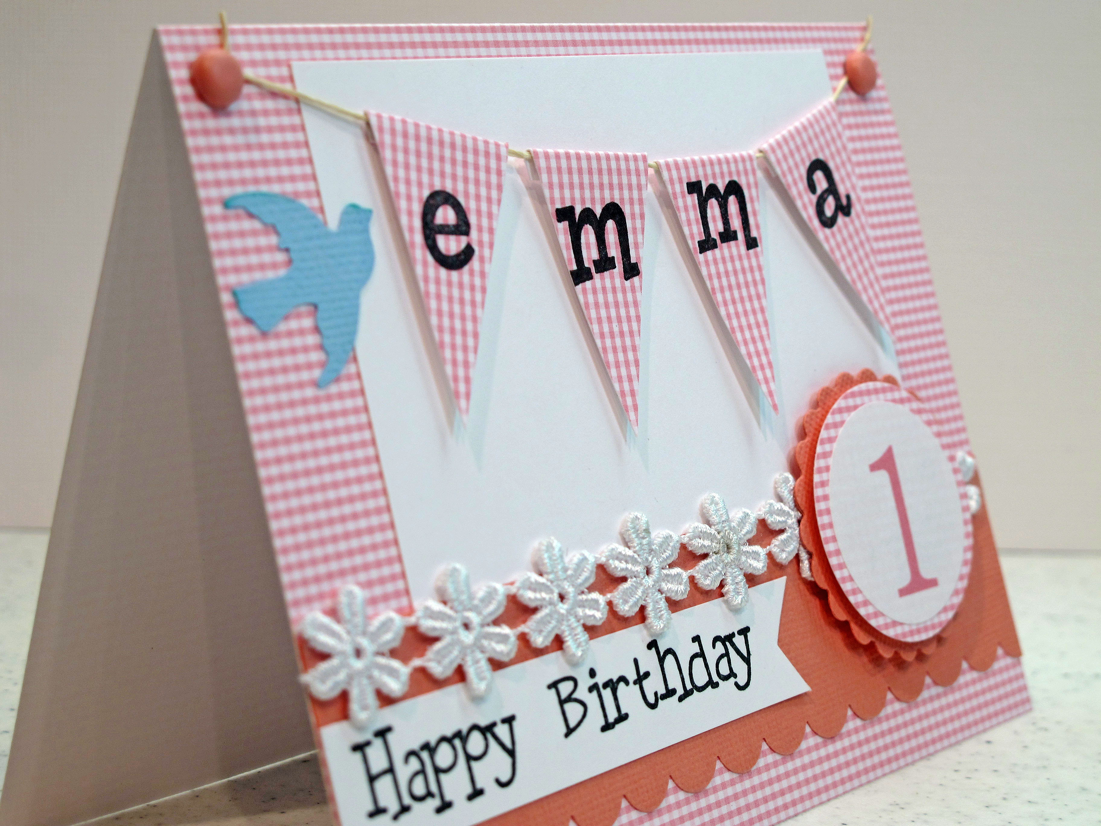
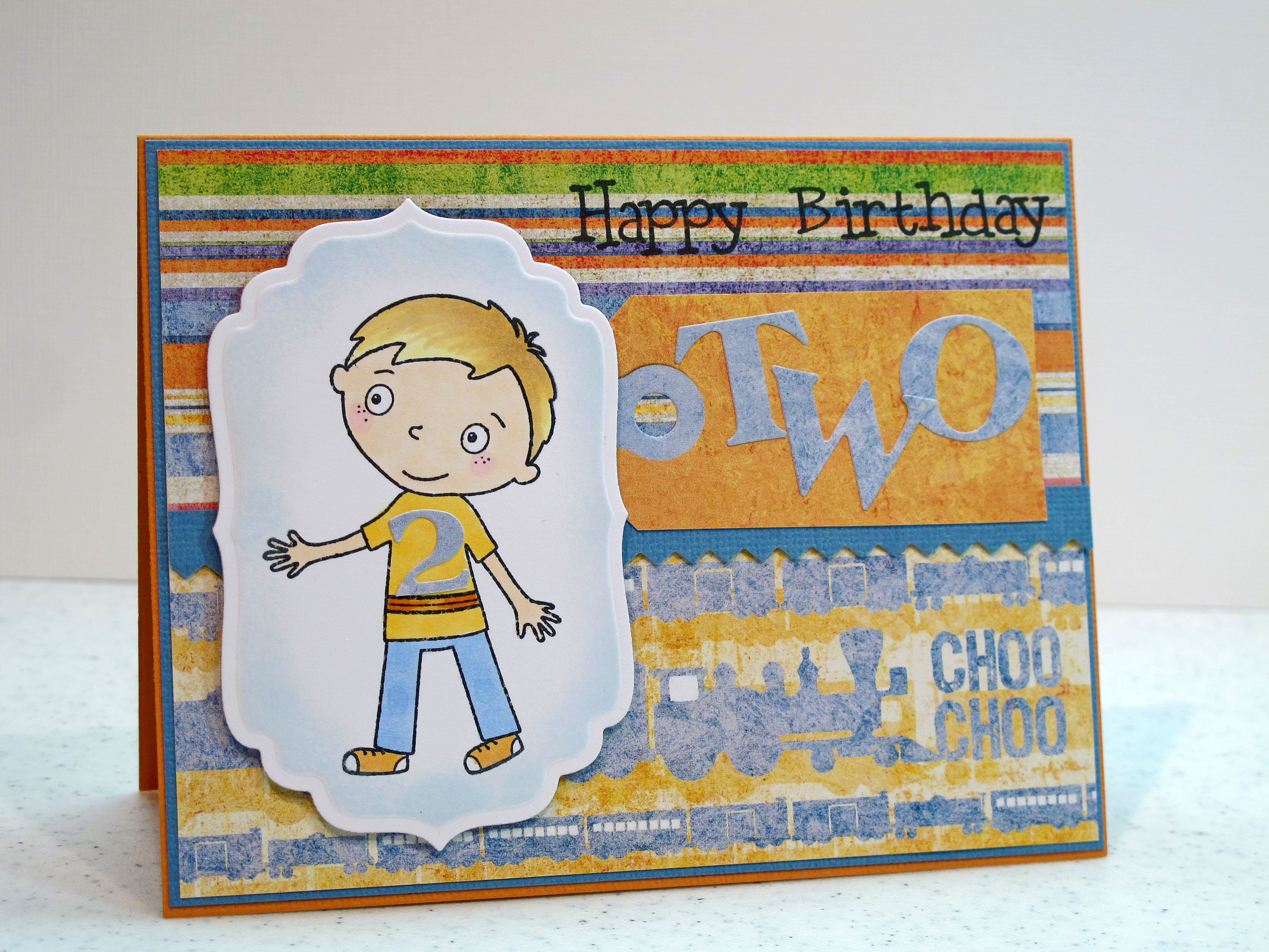
    A friend at work hired me to make some cards for her recently. One card for a little girl turning one and the other card for a little boy turning two. I don't often do cards for the wee ones! I don't really have a lot of images or paper to fit this scenario. I thought I would share my ideas in case anyone else has this dilemma. I am pleased with how the cards turned out and hope you like them too.

    IMG_2394

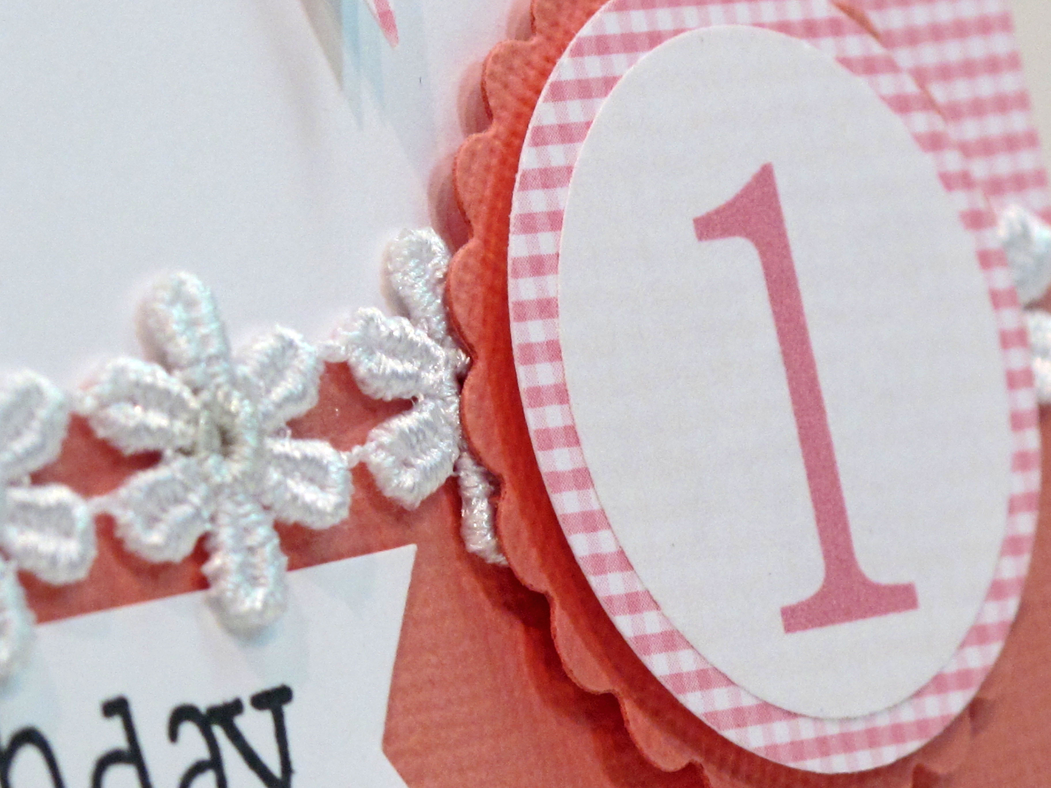
    What is sweeter than this pink and white checked paper? I made some banners and stamped her name on them. Added some little daisies and a big number ONE!

    IMG_2395


    IMG_2396


    A really great color combination for boys is blue and orange. Since these are complementary colors on the color wheel, they look great together. To me they imply fun and activity. I can't explain it but I think in color that way. I used Basic Grey paper and letter stickers for this card.

    IMG_2397

    The boy image is from an October Afternoon clear stamp set. I colored him in with my Copic markers to match the paper exactly. I used a small TWO from the letter stickers to put on his t-shirt. I got some new nesties and used them too!


  • Supah Fun Weekend! Class with Julie Ebersole…Visit from Teadub!

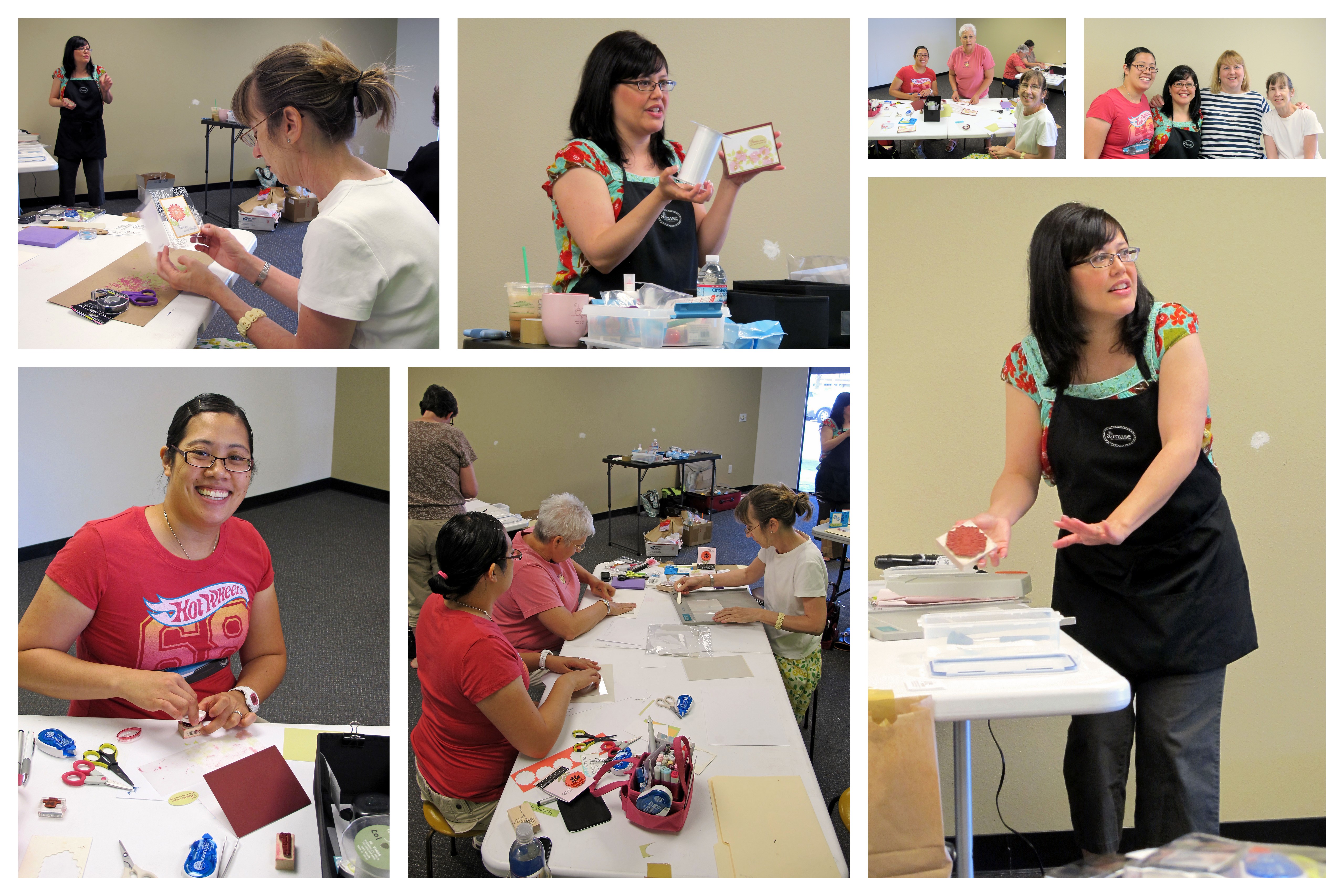
    Hi y'all! Whew…just had me some fun this weekend! It went by in a flash…maybe the fastest weekend on record. Lemme tell ya about it! Julie Ebersole, Amuse teacher extraordinaire, came to our local stamp store, Paper Garden, this weekend to teach classes! I have followed her blog for a long time and love her style and her cards and photographs. I was really excited to get to meet her in person and make some great projects. My friend Teadub, also a big fan, came to stay the weekend at my house and take a class with me. I was also very excited that my friend Shauna was in class! We made some new friends along the way too – Erna and Joy and Renee (shout out to ya gals!)

    Julietina blog
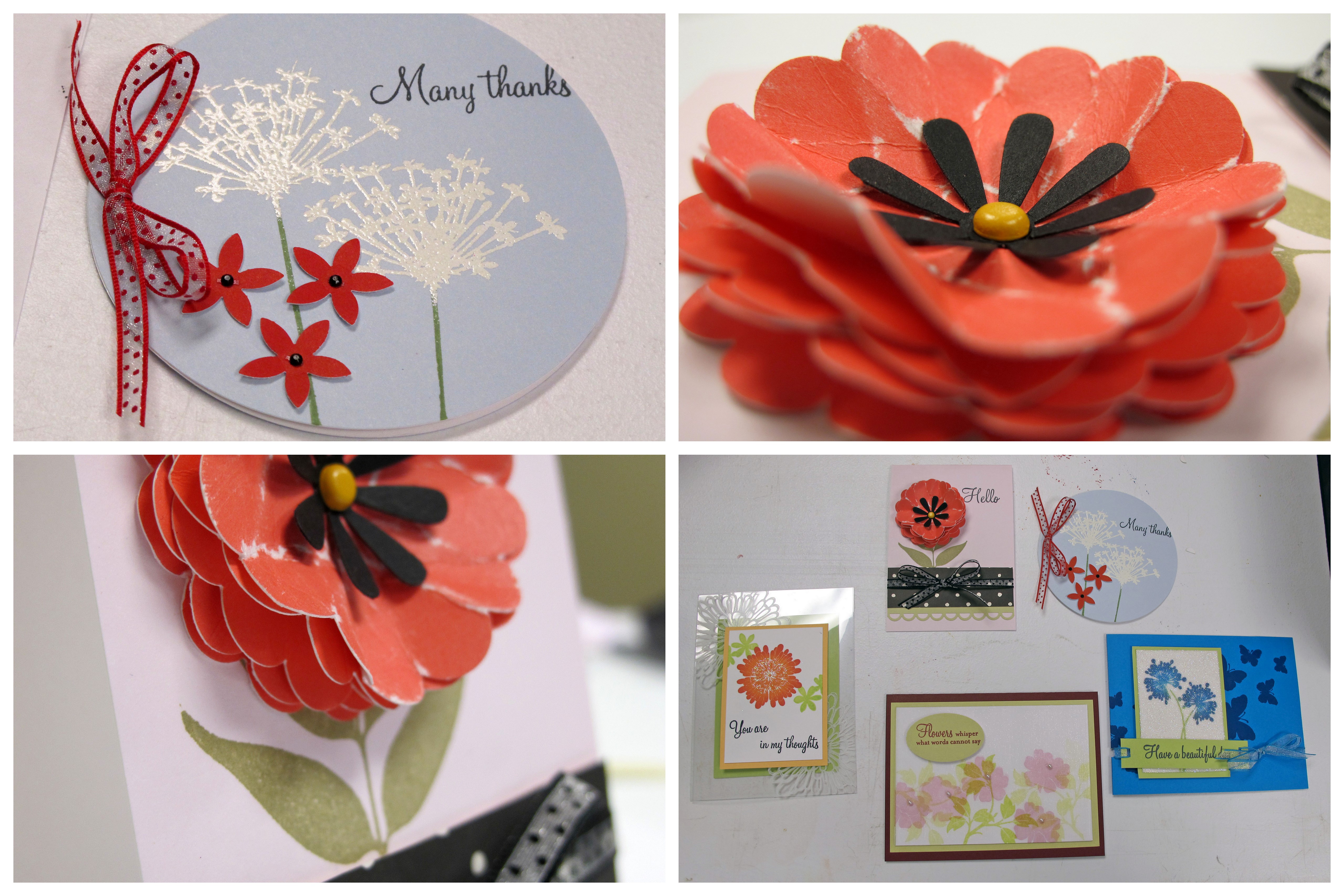
    Julie is just as lovely and fun in person as I imagined and also very funny! The cards we made – five in all – we just so cute. We made this one card using some supah cool five inch wide ribbon she found! We stamped on the ribbon for a very soft effect. Also made some poofy paper flowers. The whole class had a flower theme. Great time!

    Julietina blog1 
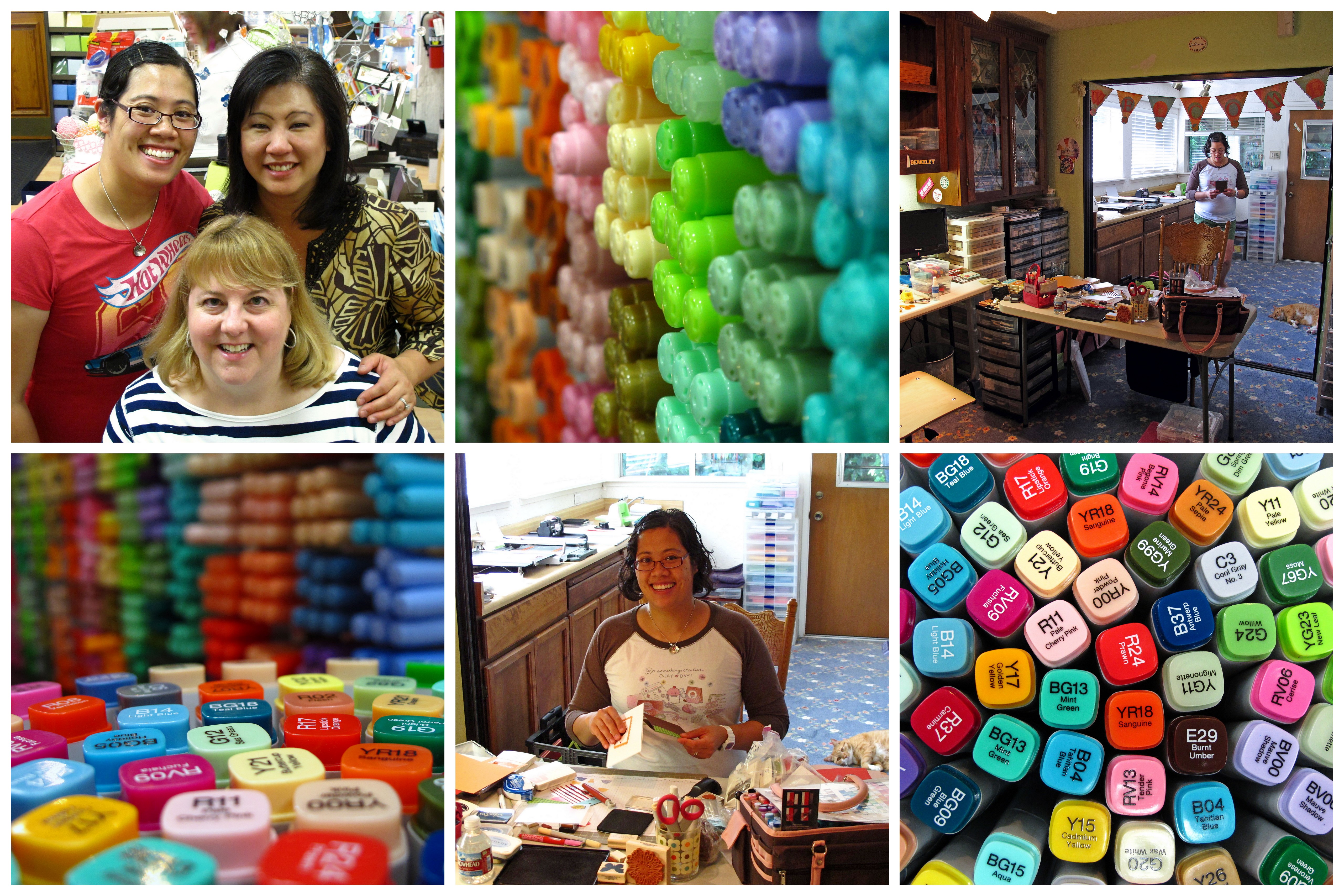
    Later on Saturday we did some power shopping at Paper Garden. Love the Copic Marker display to take pictures! Sunday allllll day we stamped in my studio and had grilled cheese sammiches. MMMM. I tried to accurately document the tornado that occurred in the studio with TWO crazy crafty girls!! You can see Mr. Buddy in the background. He LOVES Teadub! They are new BFF's.

    Julietina blog2

    Aren't crafty gal pals the best? What would we do without 'em? Luckily we don't have to find out.

  • Woof woof! Cute Scotty dog cards!

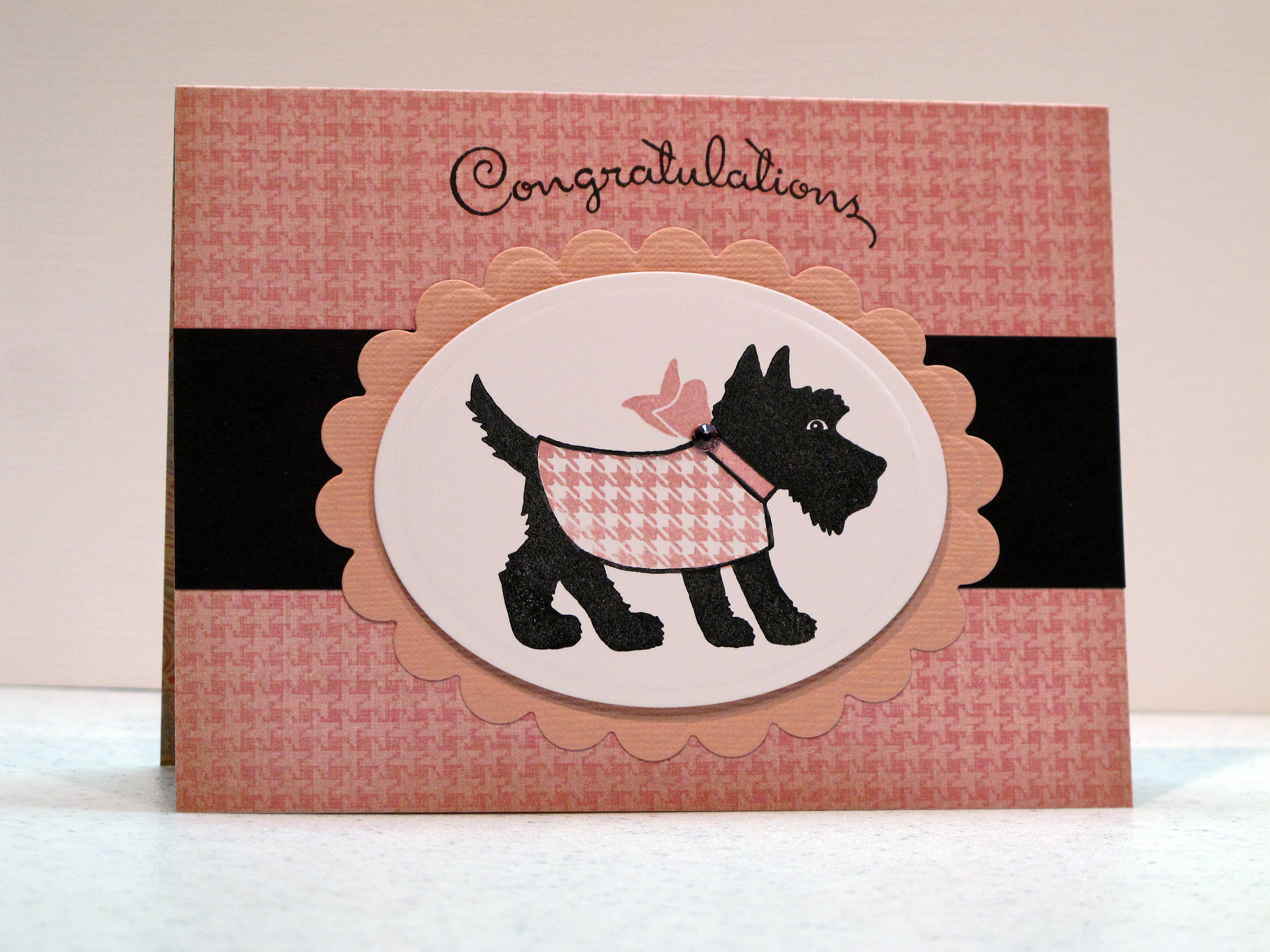
    One of my favorite gal pals recently adopted two brand new tiny baby Scotty Dog Puppies!!! I have seen some pictures and lemme tell ya…they are uber cute! Well…I'm never one to miss an opportunity to make a card so I decided to make "new baby" cards for her.  My friend shares my love of all things vintagey and preppy so I had the idea pop into my head to use kind of an old rose shade of pink for one card. The perfect stamp set from Pink Persimmon. Ugh, I seriously can't stand it.

    Well…I made this girlie card ahead of time and set it aside to save for when the new girl baby came home…then I got an email saying that she went to pick her up and ended up with a girl and a boy! I had to quickly go and make a second card! Hahaha. I can't wait to meet the new kids!

    IMG_2022


    IMG_2027


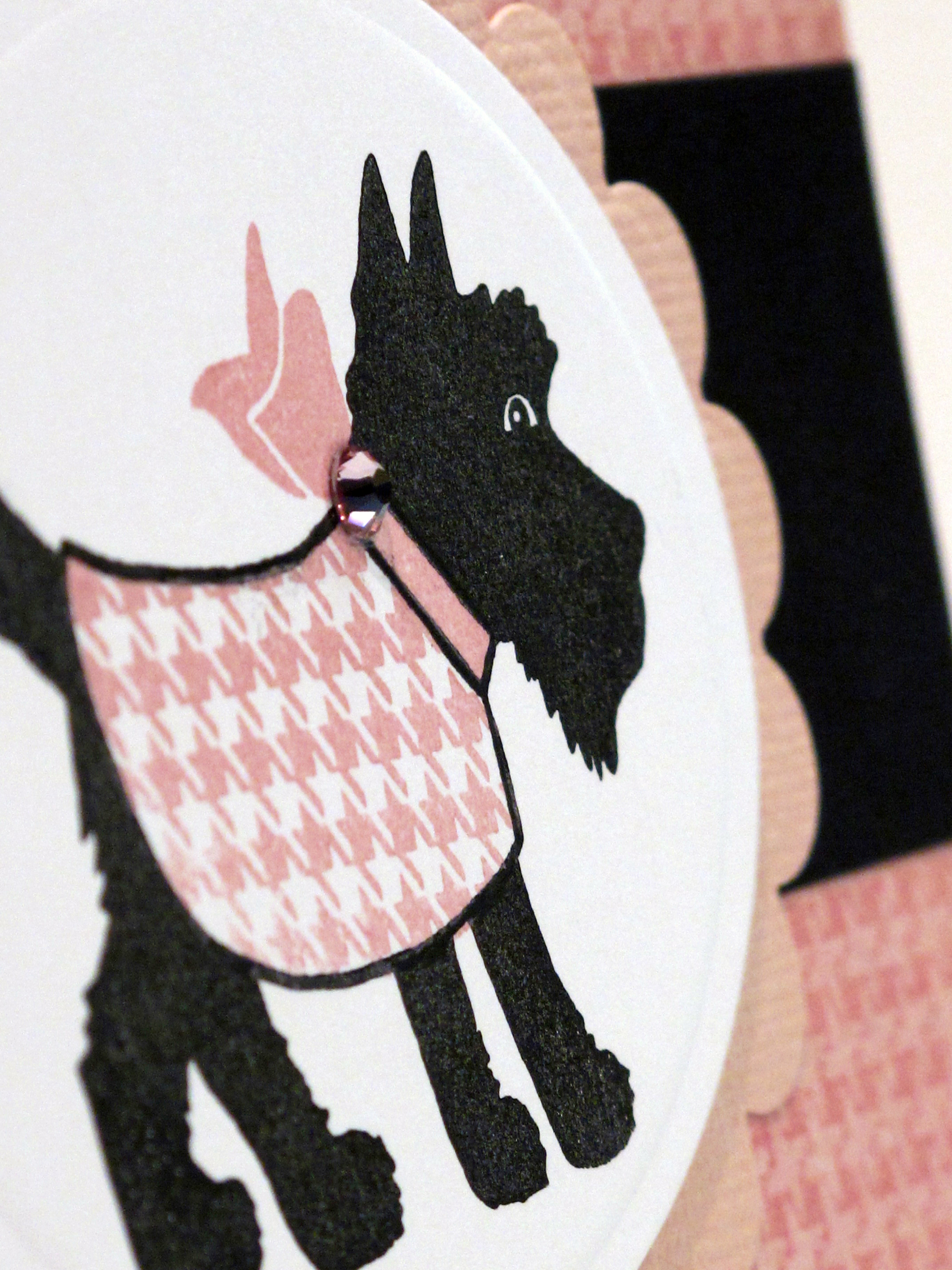
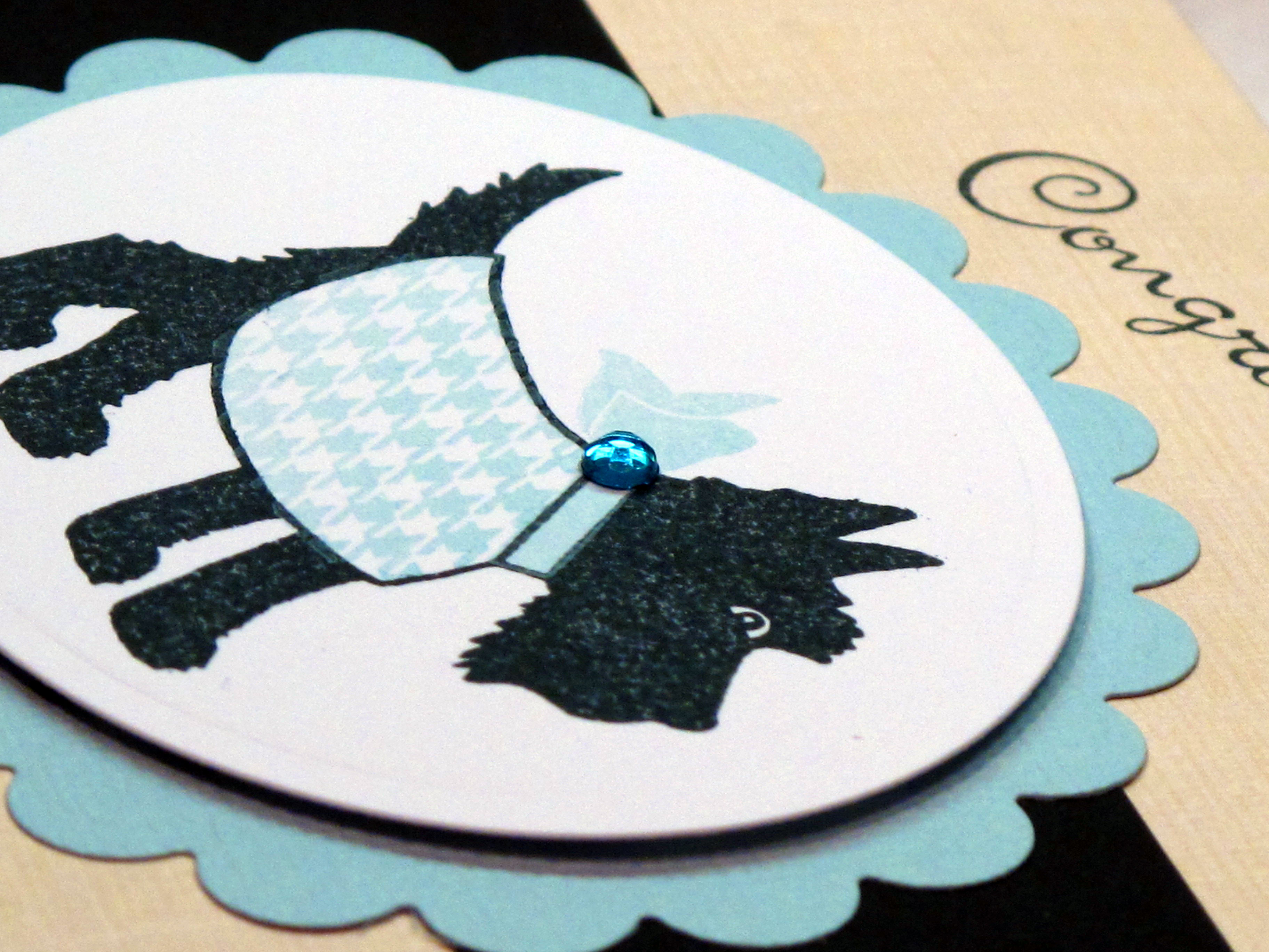
    With this super cool stamp set you can stamp your doggy and then either color in the sweater or use one of the patterns provided. Also, you can use the tiny bow stamp to make the bow match in the same color. I found some of this herringbone paper in my stash and it was PERFECT! I added a tiny pink rhinestone for just a touch of bling.

    IMG_2143


    IMG_2026

    And here is the boy card! I used the same herringbone print…in baby blue of course. I then put on a tiny blue rhinestone for the bow. I did not have blue herringbone paper (sad face) so I used some aged vanilla paper to keep the same vintage feel.

    IMG_2345 

    This weekend my bestie Teadub is coming to our house for the weekend!! WOOT WOOT! We are taking a class from Julie Ebersole (of Amuse fame) at my friend Stephanie's Stamp Store (Paper Garden) and then attending a party at the store later Saturday night. Sunday we are planning to stamp the day away. I'm so excited! Hope you all have a wonderful weekend!  

  • TESC #119 with a fun color inspiration!

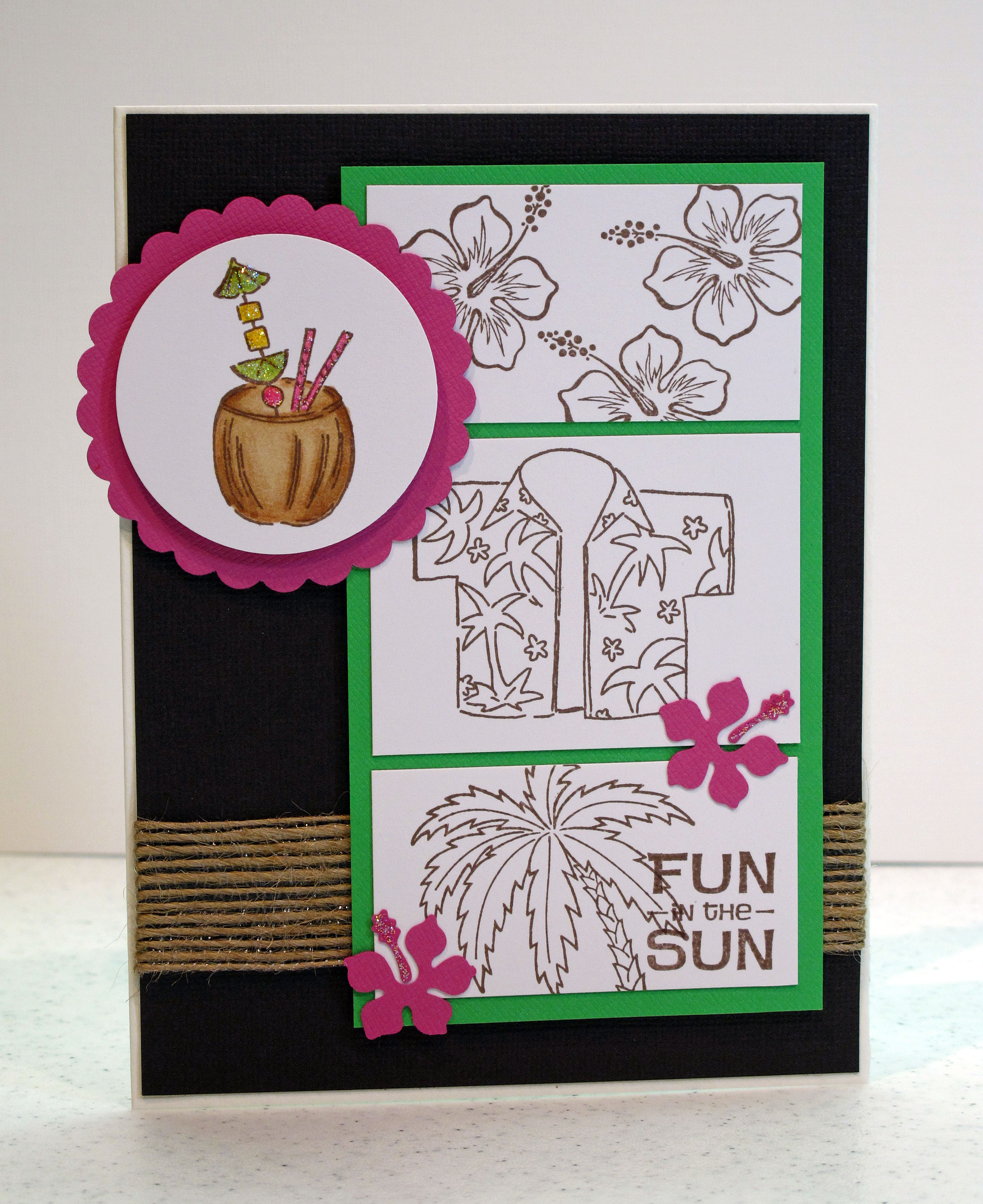
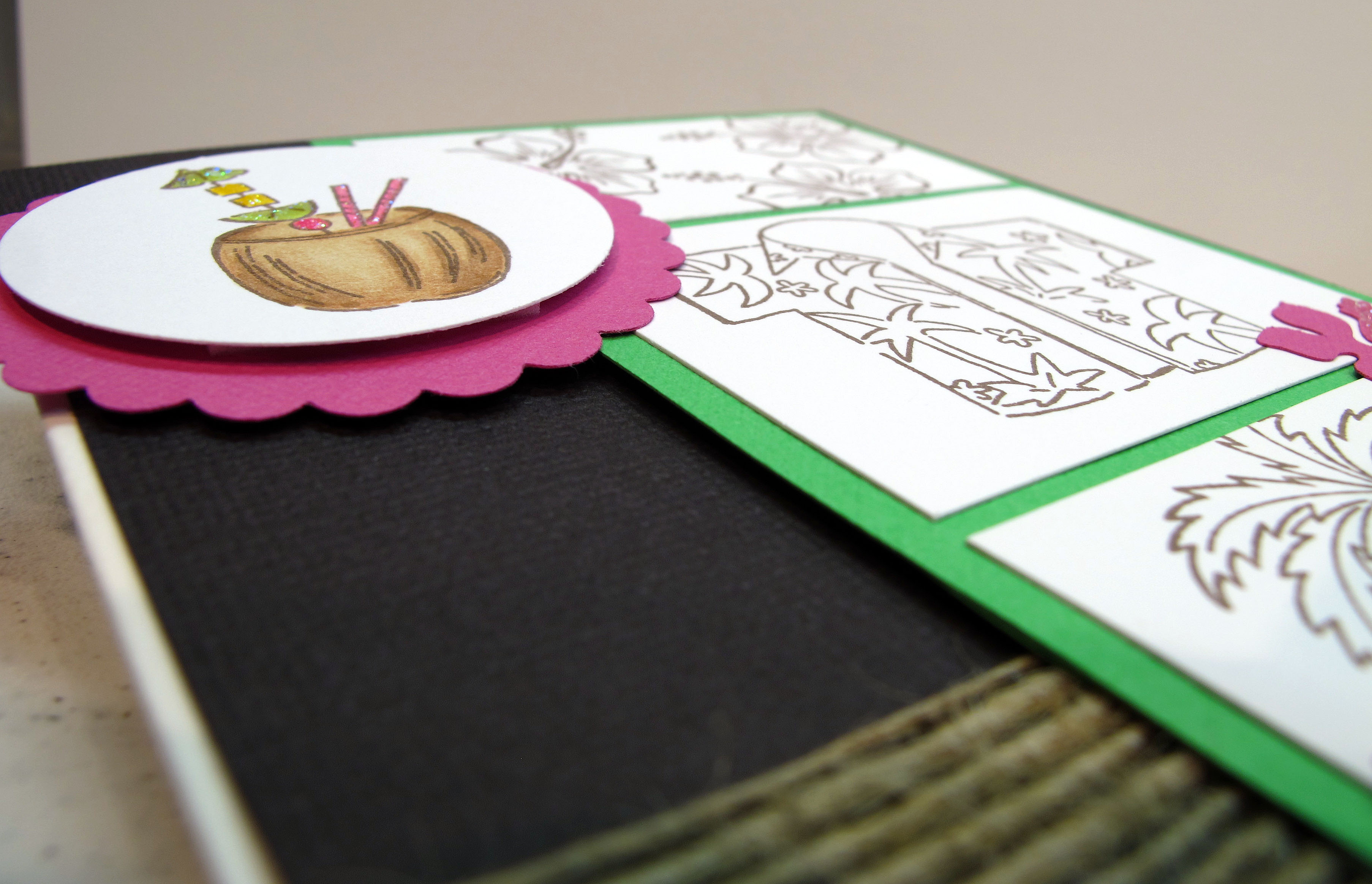
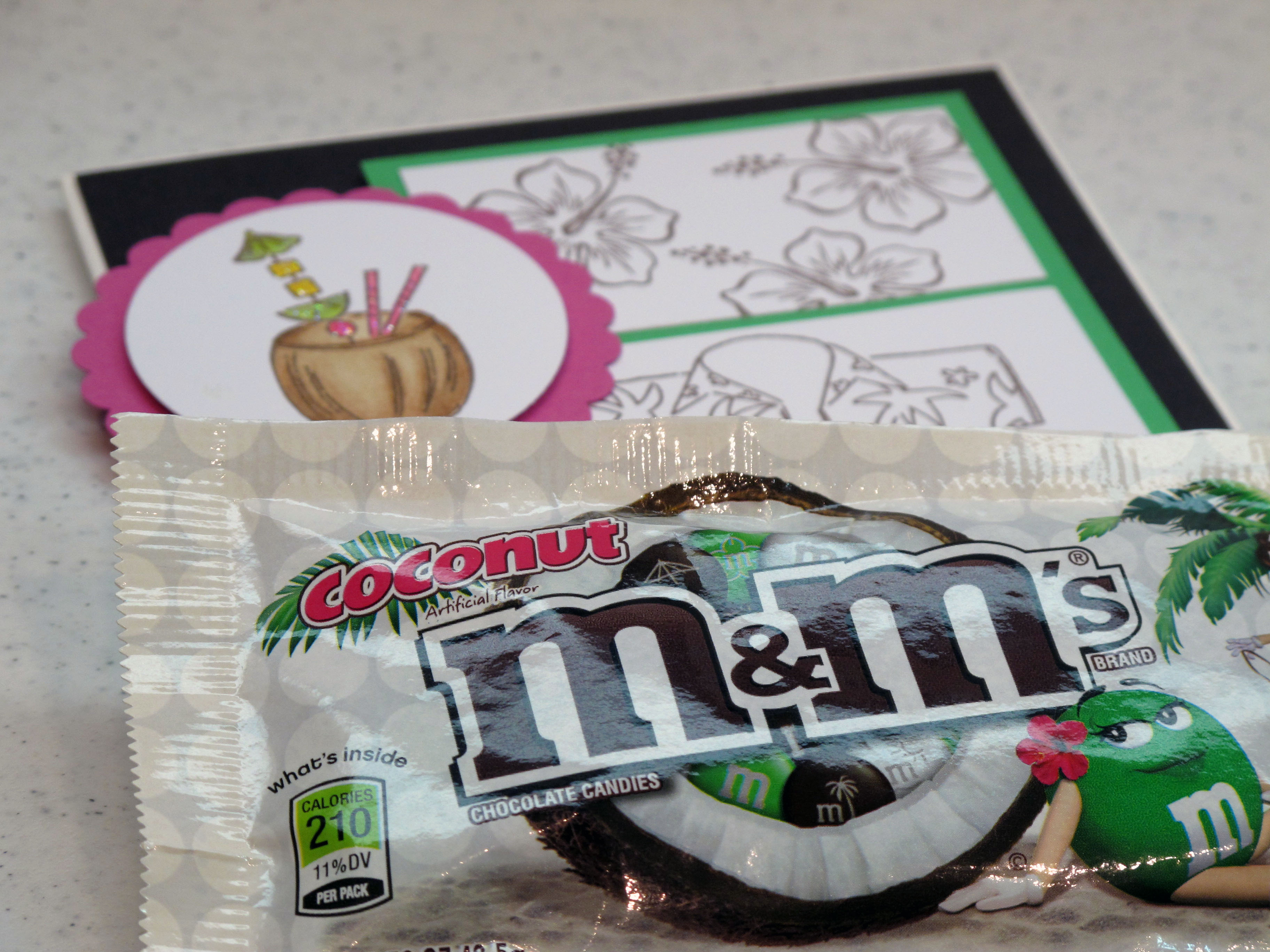
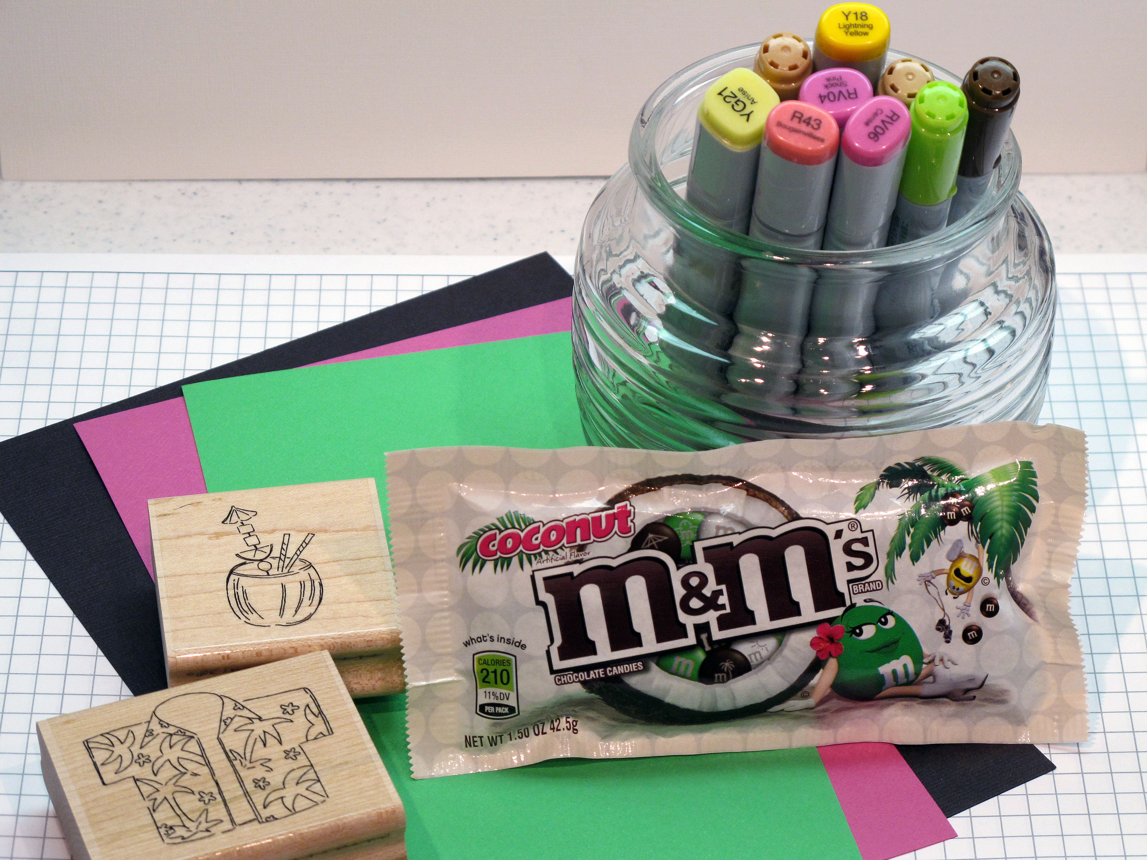
    Today's card is my entry for the Taylored Expressions #119 Challenge. Check out Taylor's blog by clicking here. I was having a hard time coming up with an idea for this card. I tried all kinds of colored papers and different stamp sets. Then…as I was eating my recent favorite snack…it came to me! I used the fun color scheme inspired by the Coconut M&M's package! The colors are bright kelly green, chocolate brown, white and a pop of hot pink! Perfect.

    IMG_2349

    I tried coloring in all the images but I thought it looked better leaving the images in the panels simple and just coloring the main coconut image. Below is a picture of some of my supplies! The cute Hawaiian set is an old set from CTMH.

    IMG_2347

    The sketch image:

    TESC119

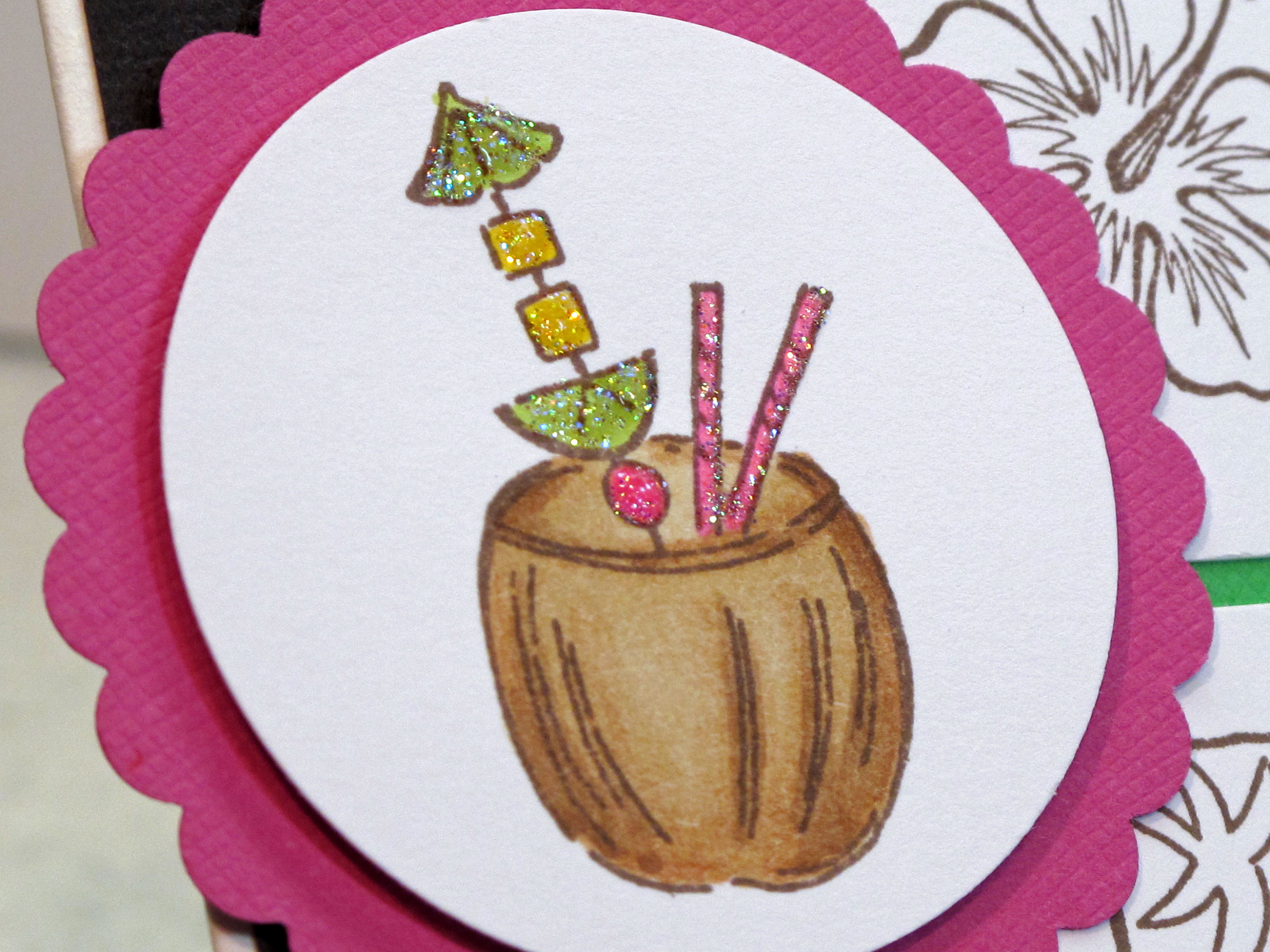
    The coconut was colored in with my Copic markers and then I put some ultra fine glitter on the accents. I used my Marvy punches to add the hot pink scallop around the image.

    IMG_2351


    IMG_2353

    MMMMMMMMM. You can find inspiration anywhere!

    IMG_2356

  • Art from the Heart

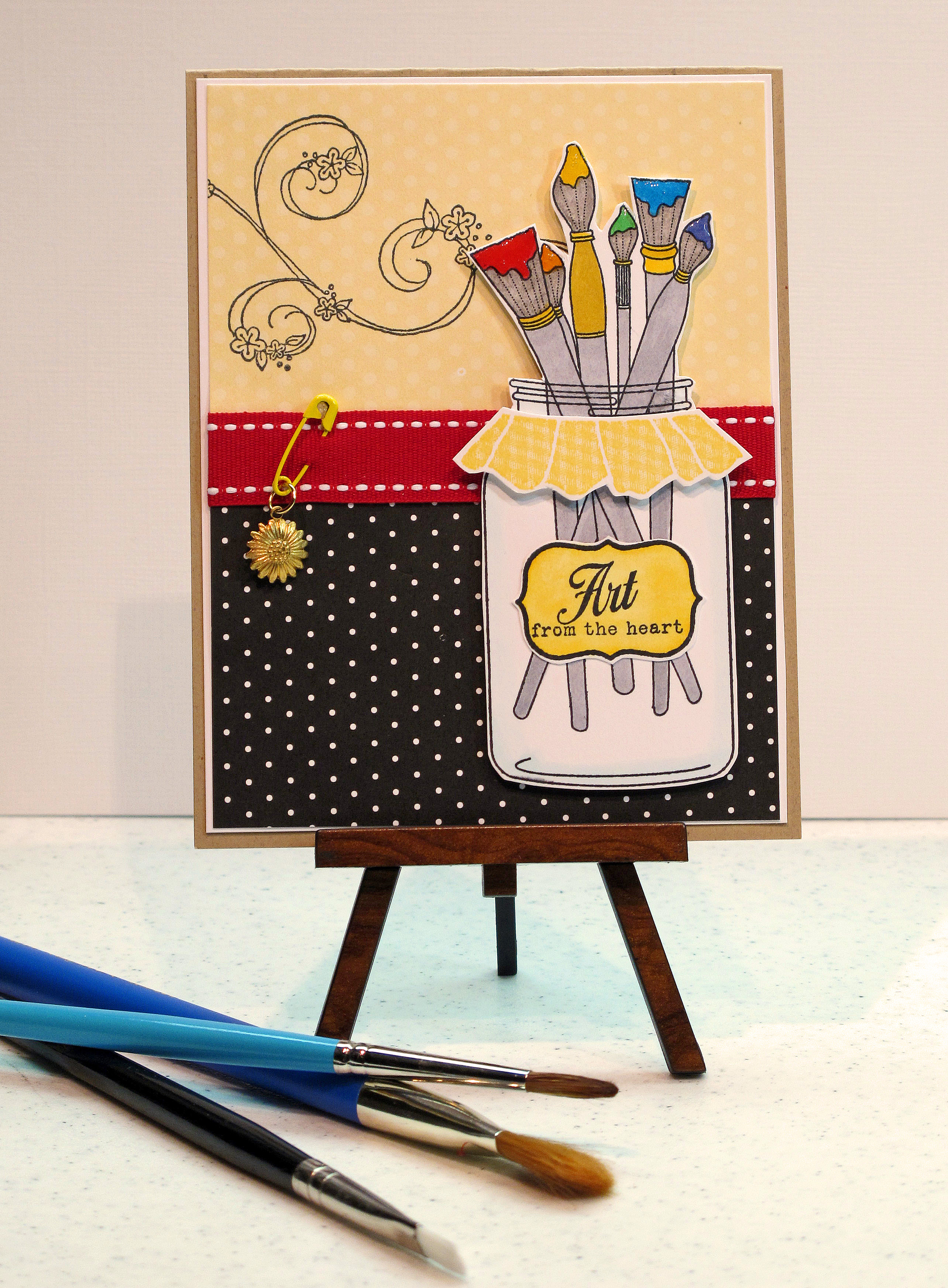
    Happy 4th of July!!! Hope you are having a nice holiday weekend and enjoying time with friends and family today. I got in some stamping time this morning – before we get ready to head over to my brother in law's house for fireworks later! I made a card using PTI's new sets "Friendship Jar" and 'Friendship Jar Additions." Really cute stuff!

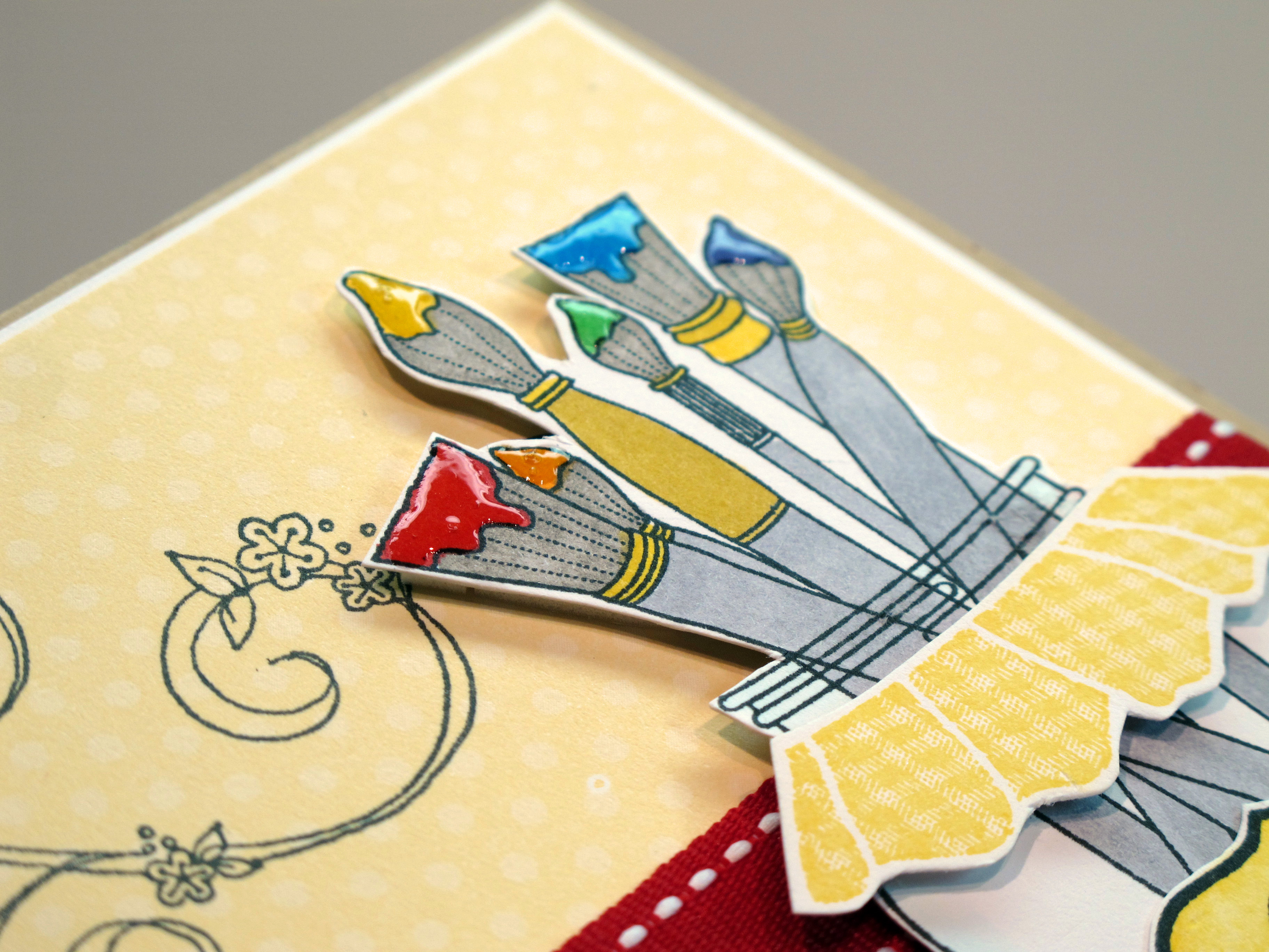
    The jar, label, paintbrushes, and cover are all separate clear stamps. I cut out the label and the cover to add some dimension. I colored in the paintbrushes using colors of the rainbow in bright primary shades. Used my Copics…of course.

    IMG_2251_edited-1

    The ribbon is also from PTI – Poppy is the color. Here are my Copic colors. I didn't do shading since I wanted the color to look rich and bright. I did a little shading on the label with two shades of yellow. I used the lightest blue green color around the edge of the jar to make it look like glass.

    IMG_2250

    I added diamond glaze to the paint to make it look like wet paint! I colored the bristles with warm grey and the handles with cool grey. You could do so much with this set! I can't wait to make stuff in different color schemes.

    IMG_2255

        Bye everyone! And again…Happy 4th and God Bless America!
  • Sweet! Two challenges in one!

    Hey everyone! I'm kinda short on stamping time this week. We are trying to refinance our house and do all that comes with that…paperwork, appraisal, etc. It is a long process, but one that will hopefully work out and be a good thing in the long run. Send some good vibes our way.

    Since stamping time is at a premium, I combined two challenges in one! A color challenge from the gals over at Shabby Tea Room and a sketch layout from Taylored Expressions. The colors are bright and happy: Lime green, hot pink and aqua blue Love those colors… and I always love a sketch from Taylor.

    Check out Shabby Tea Room Challenge #16 by clicking here. AND Check out Taylored Expressions Challenge #118 by clicking here.

    TESC118 

    I used this super fun paper collection from K & Company called Citronella. It has all the bright, juicy colors called for in the challenge and has fruits and drinks and all kinds of yumminess! The drink is a big sticker! The limes and strawberry on the right were cut out from the patterned paper. I used hot pink bazzill paper and some white paper for my layers. The polka dot ribbon is from PTI – chartreuse.

    IMG_2238


    IMG_2241


    IMG_2244

    Cocktails anyone??? Yes, please!!!

  • 4th of July Cards!

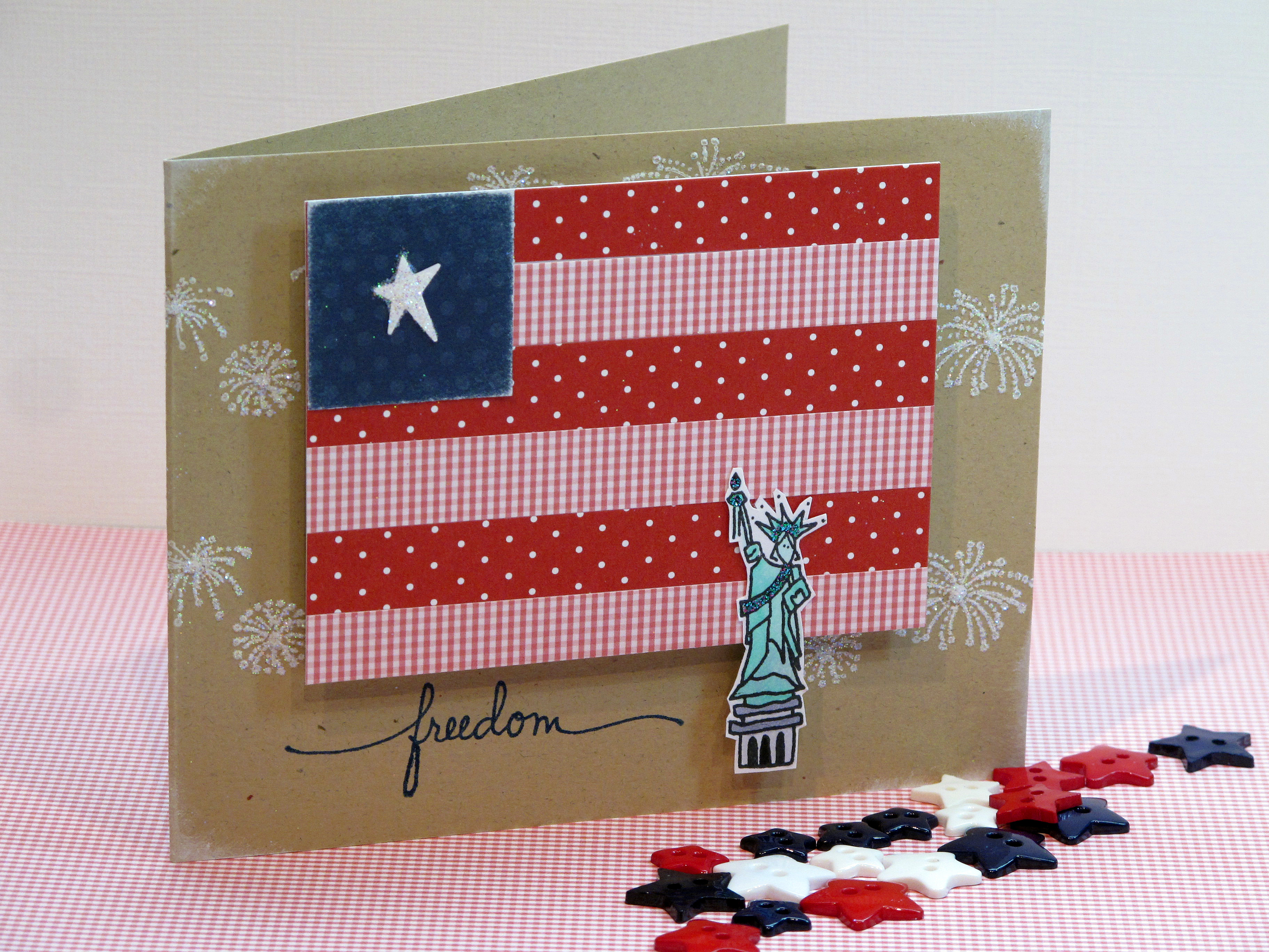
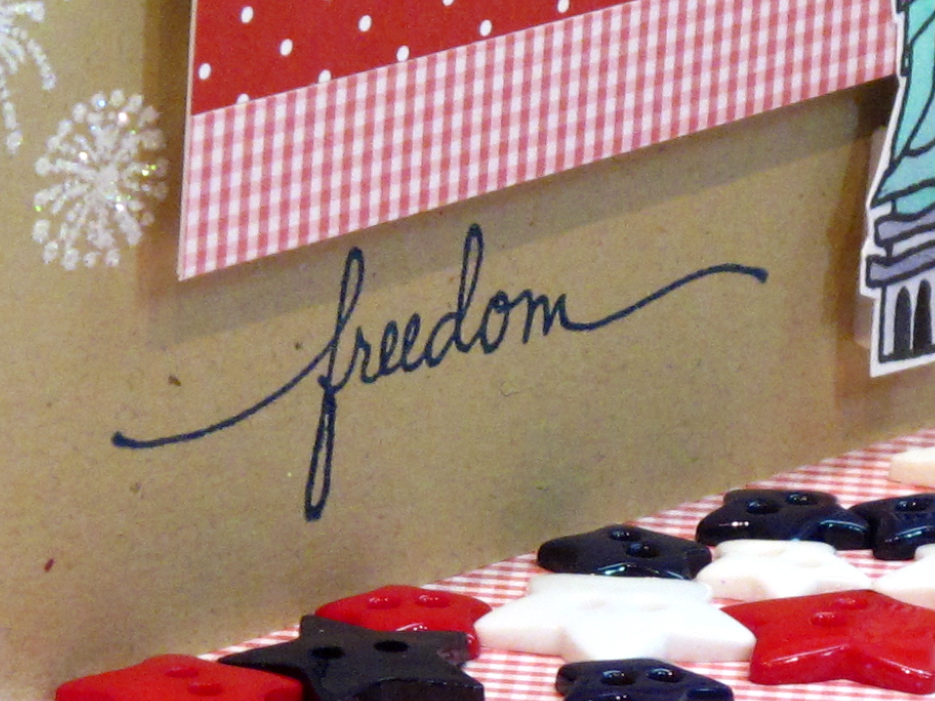
    Let Freedom Ring! Today I'm posting my 4th of July cards to share with you. I love making patriotic cards – as you've probably noticed from my blog! For my 4th of July cards this year I called upon an idea from a card I made a while back for Shabby Tea Room. (click here to see that card). This time I made the flag much smaller and also more geometric.

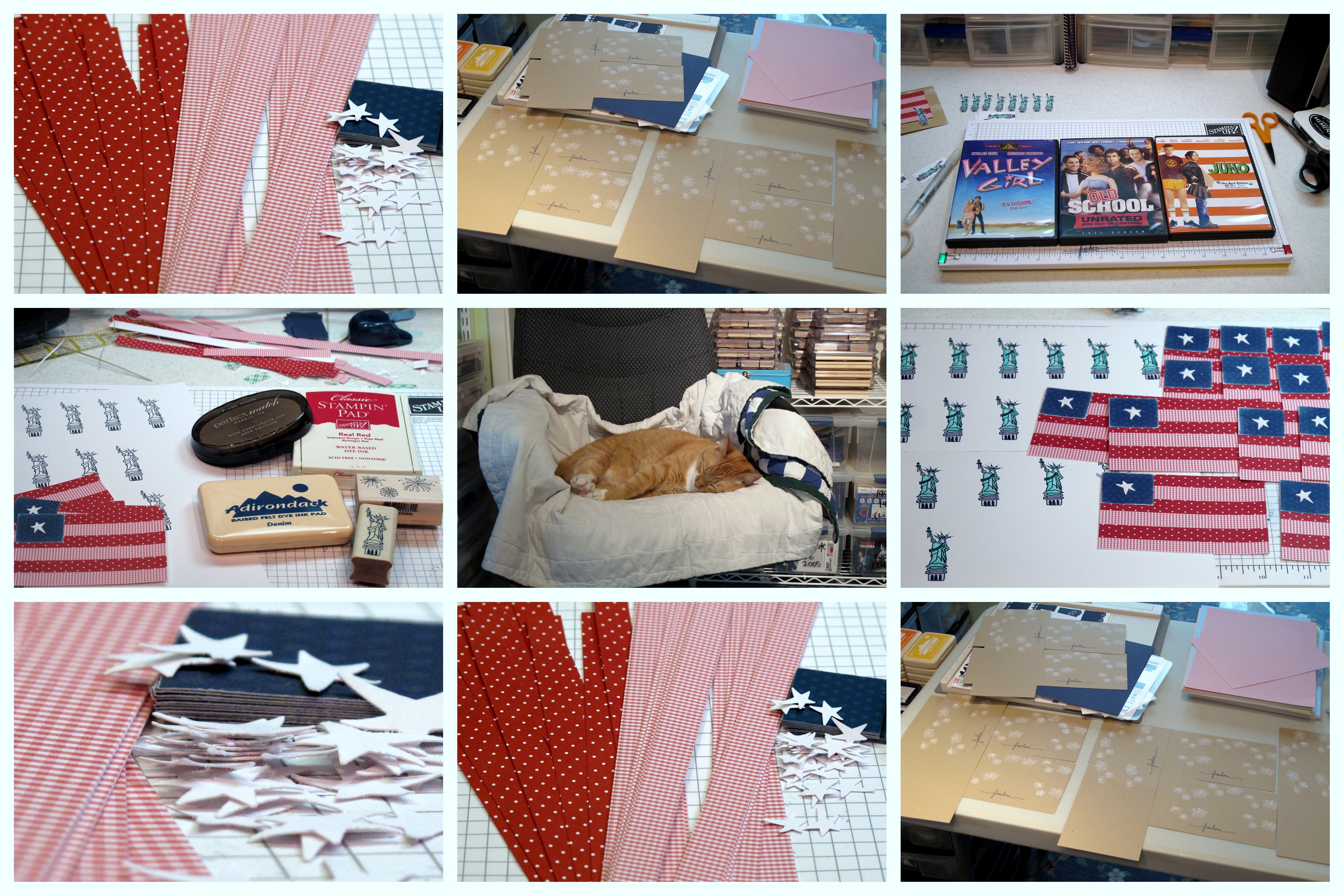
    Okay, I have to say that making one of these was okay….but making 16 of them!? Not so much! I had no idea how long it would take me with all that glitter and cutting, and punching, and gluing! Oy. I do like how they came out though, so I guess it was worth it!! And I got to watch THREE movies…hahaha.

    The card:

    D


    The Process:


    Collage 


    IMG_2191 
     

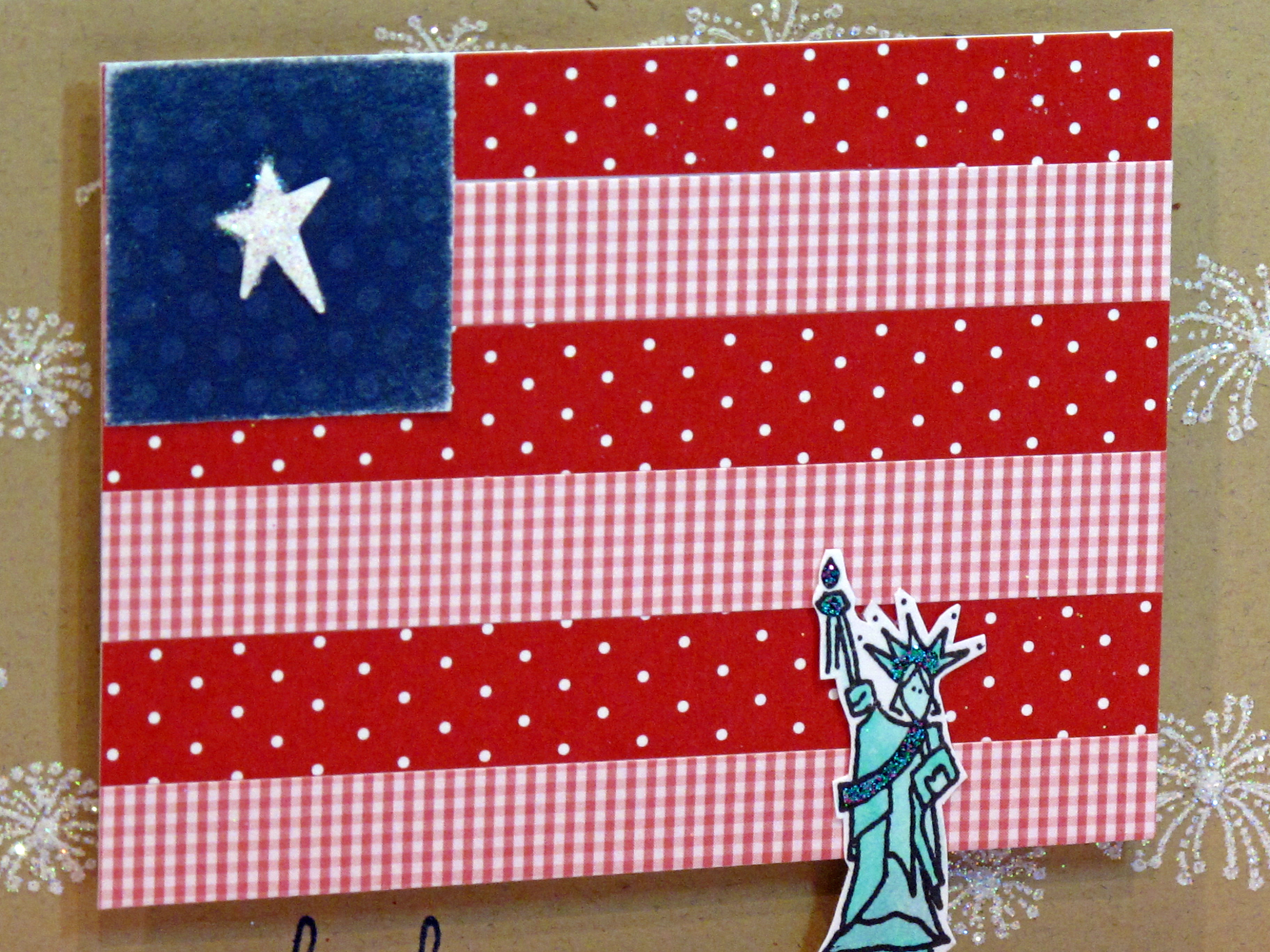
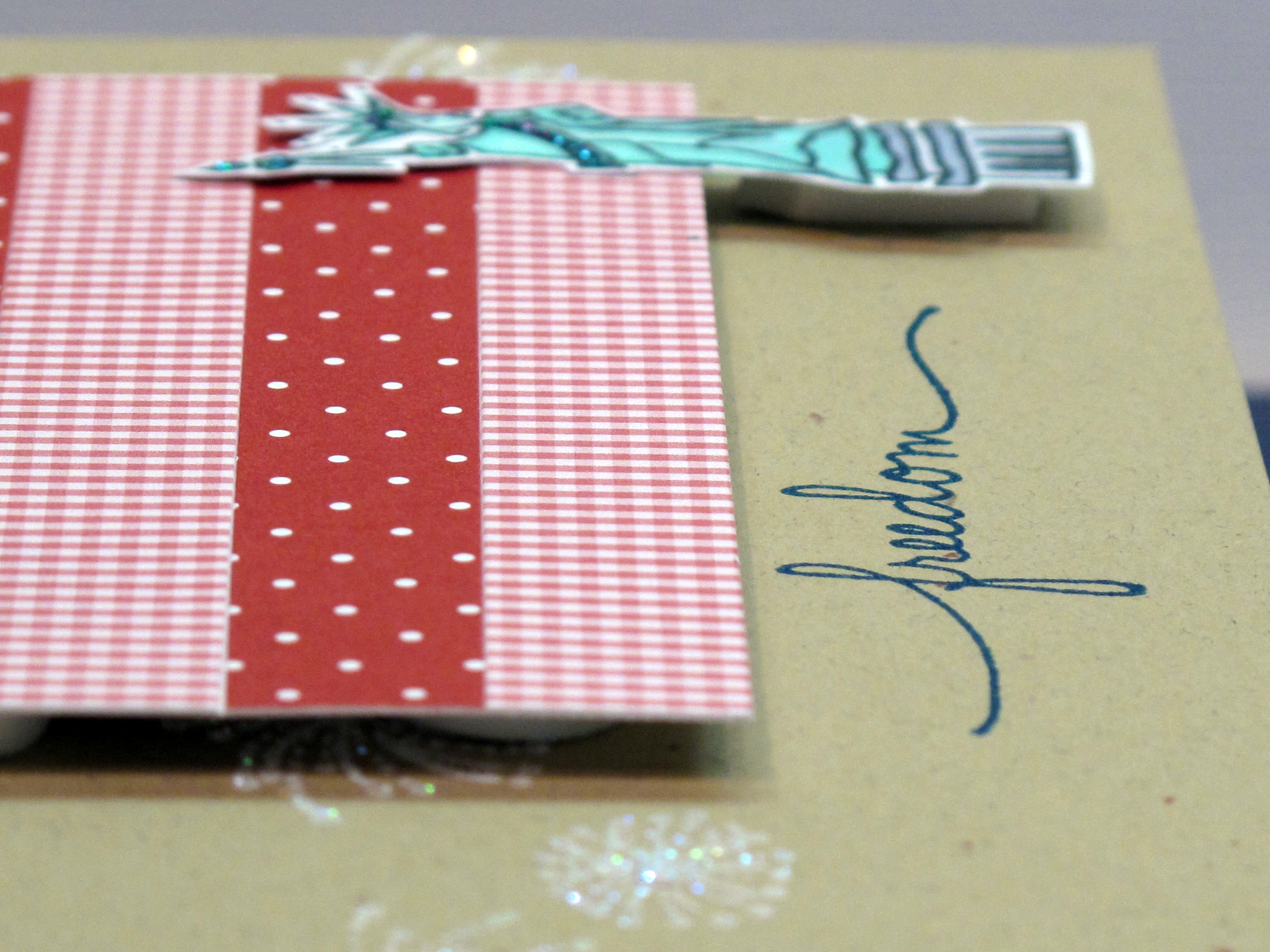
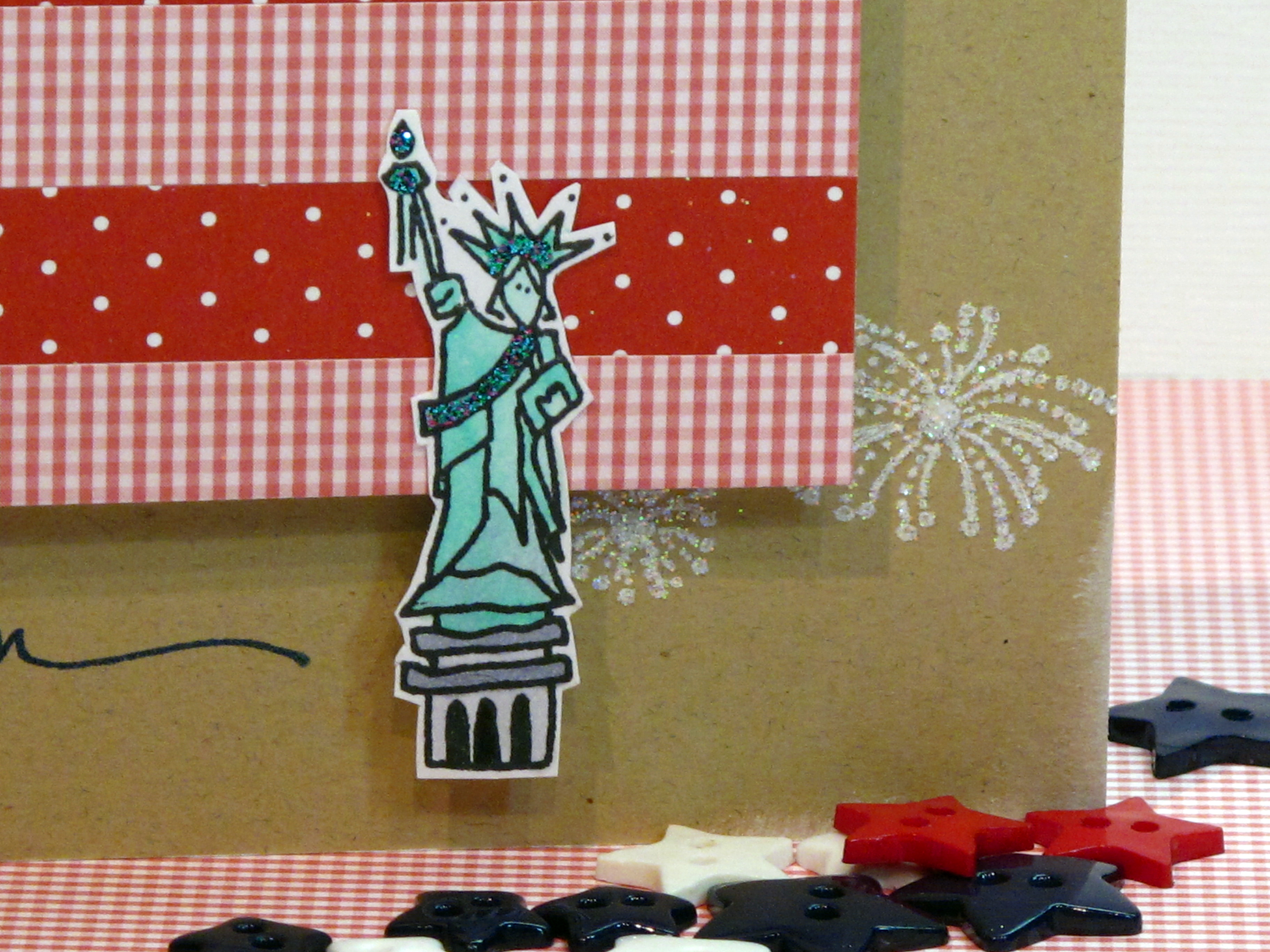
    The finished flag is 4" x 3". The blue part is a 1" square punch. the stripes are 1/2" wide. It was fun to combine two of my favorite things right now: polka dots and gingham! The Statue of Liberty is from Amuse stamps! I colored her with my Copics and then put on some 'mermaid' glitter glue. The fireworks were stamped in white ink and then glittered up!

    IMG_2192


    IMG_2182


    IMG_2189 
      

    God Bless America! Happy 4th of July week!
     
    My card just happened to fit into the Curtain Call #36 Challenge too!
     
  • Hello!

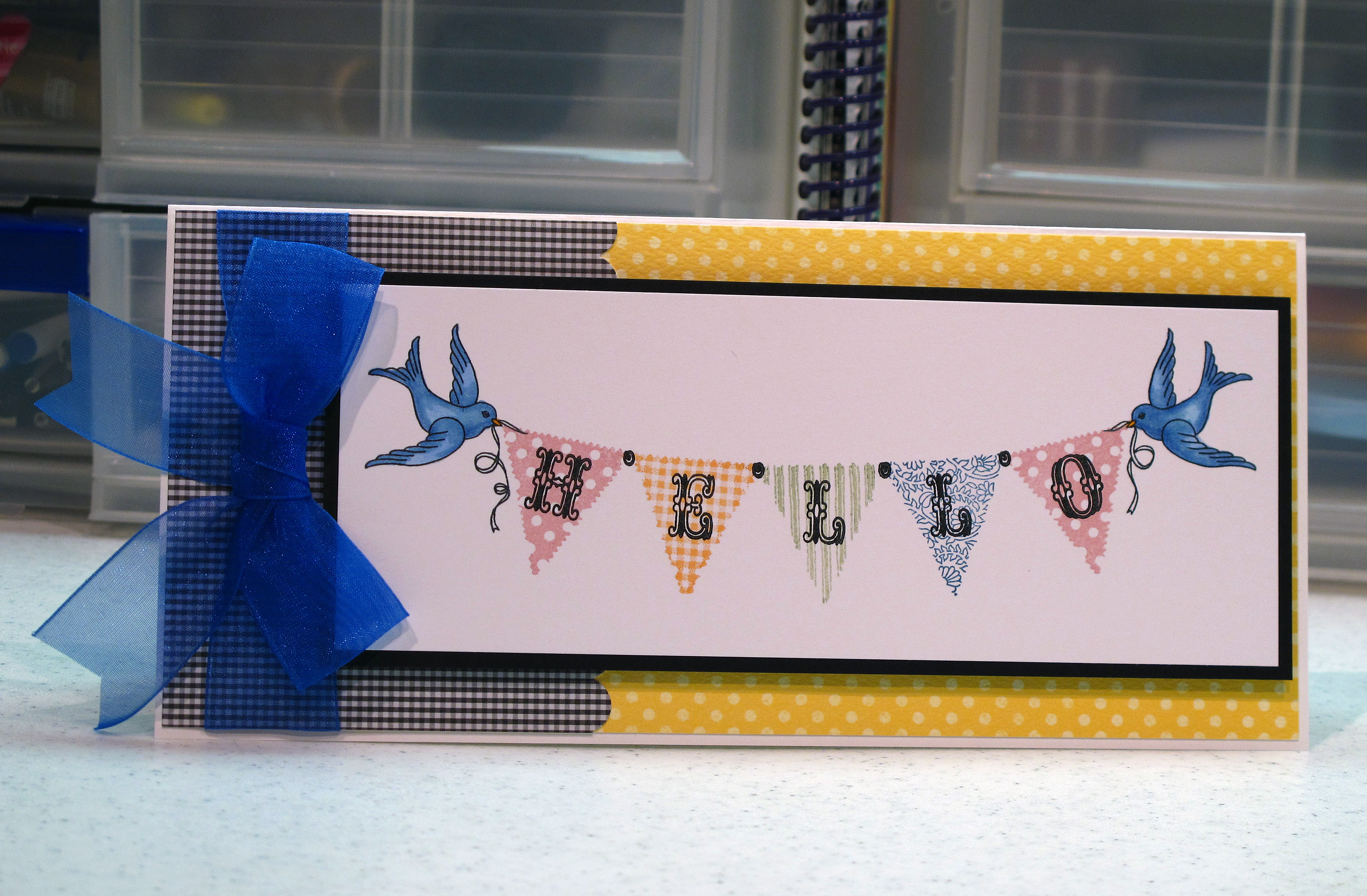
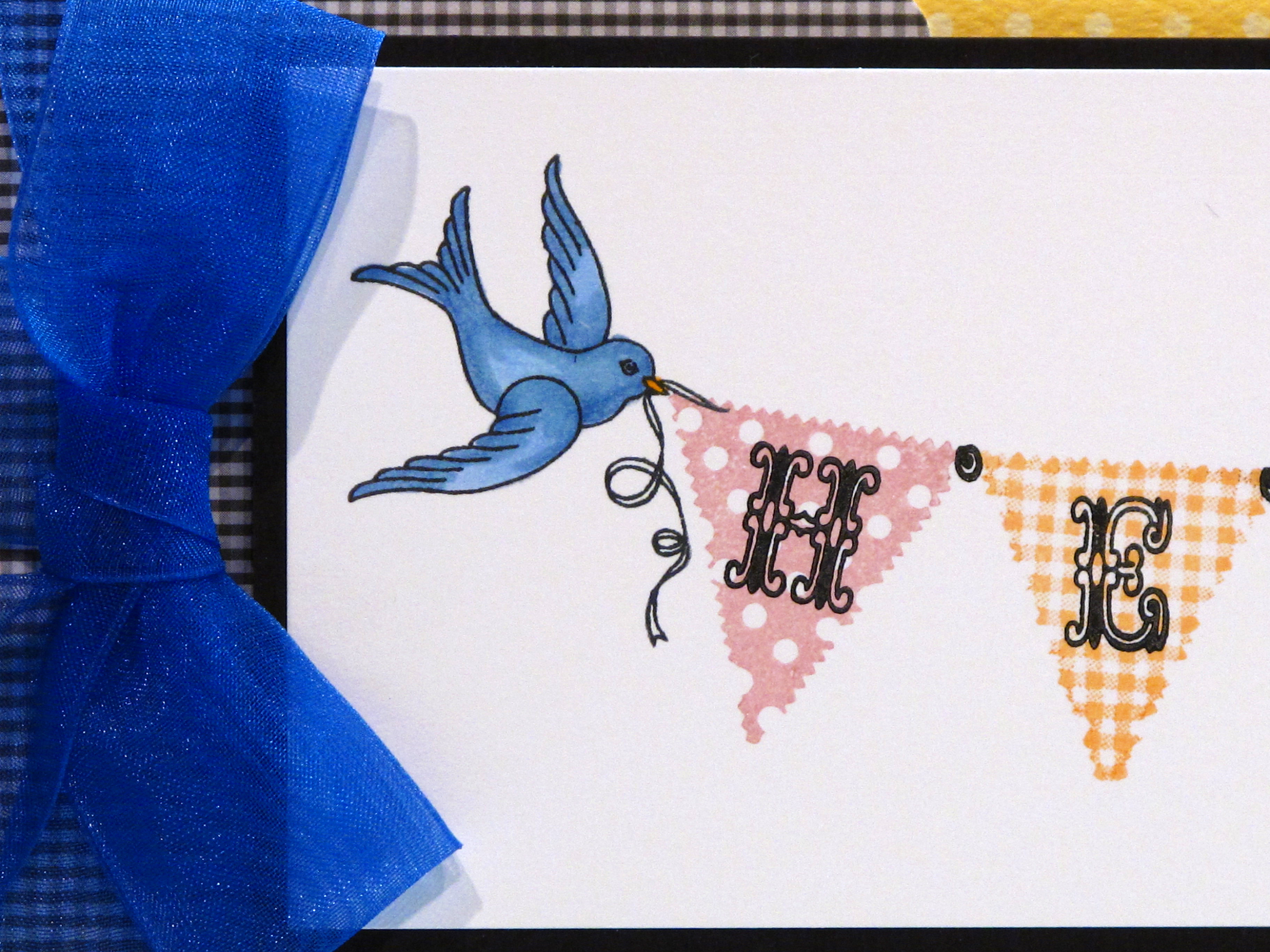
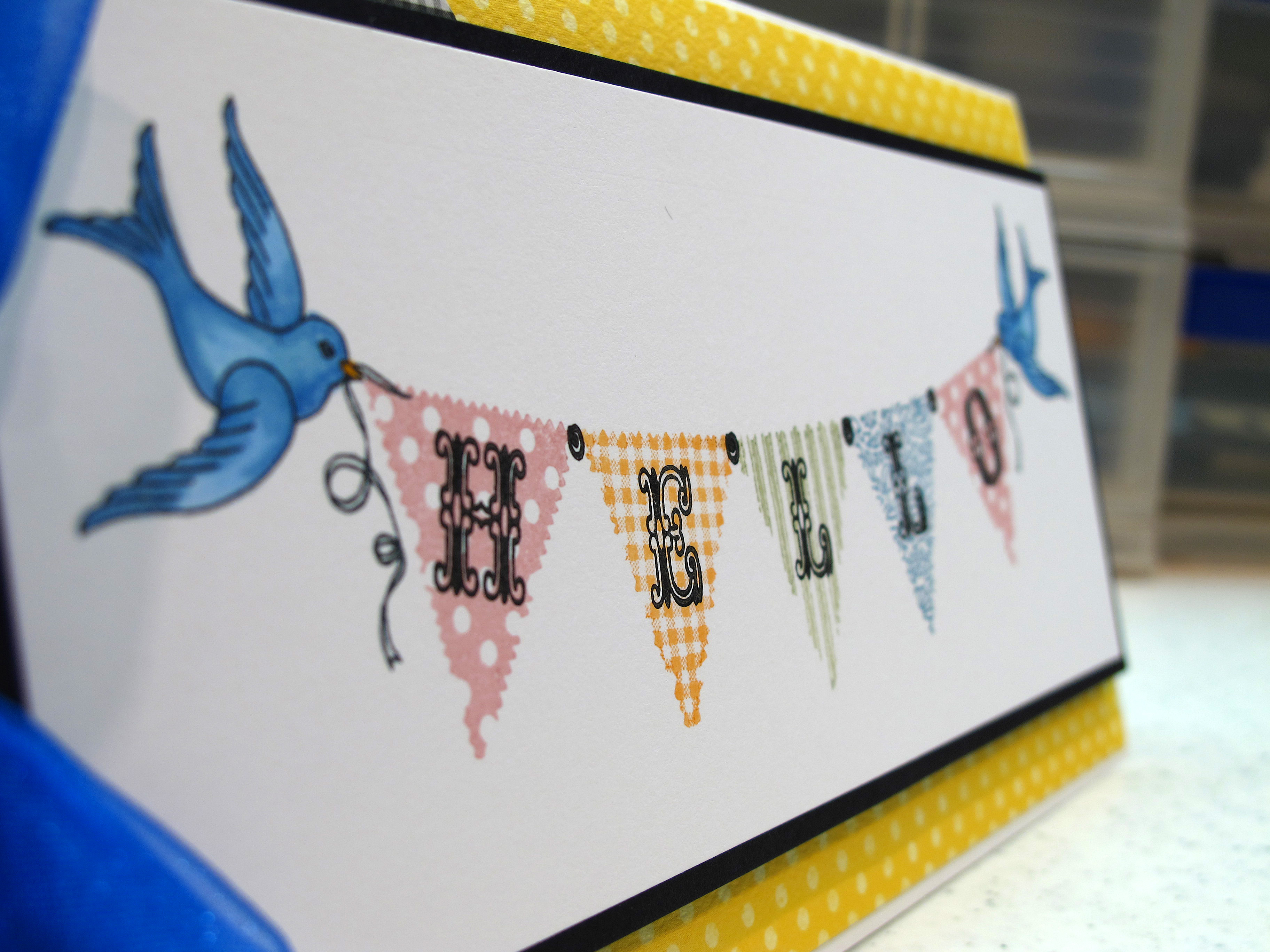
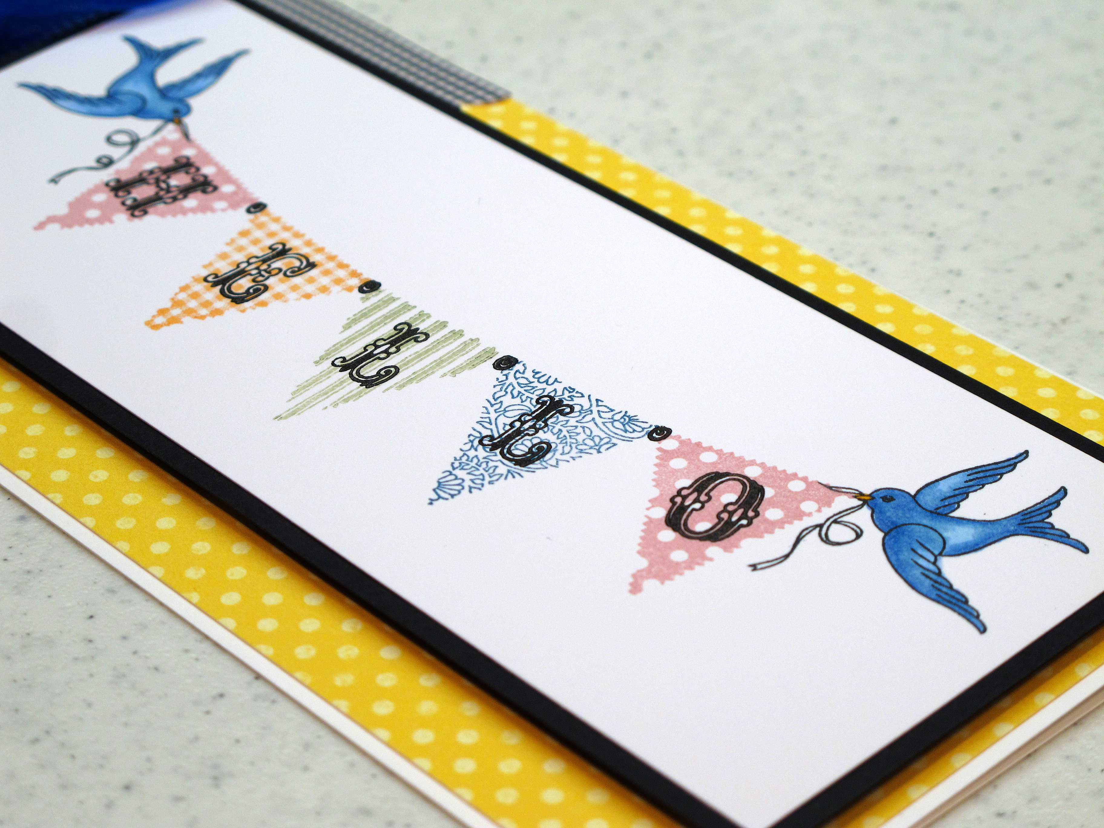
    Today's card was meant to send a happy hello to a friend who just moved to a new city. I wanted her to have some fun mail in her new mail box. I love this stamp set from Pink Persimmon with the little banners and the birdies to hold them. Each banner is a different stamp with a different pattern. Don't even get me started on the cute alphabet that fits just so inside the flags!! I know I will be using it a lot in the future.


    IMG_2035


    I colored the little birdies in with my Copics and used Versamagic ink pads for the banners. The black ink is all Memento Ink.

    IMG_2036


    IMG_2037


    IMG_2038


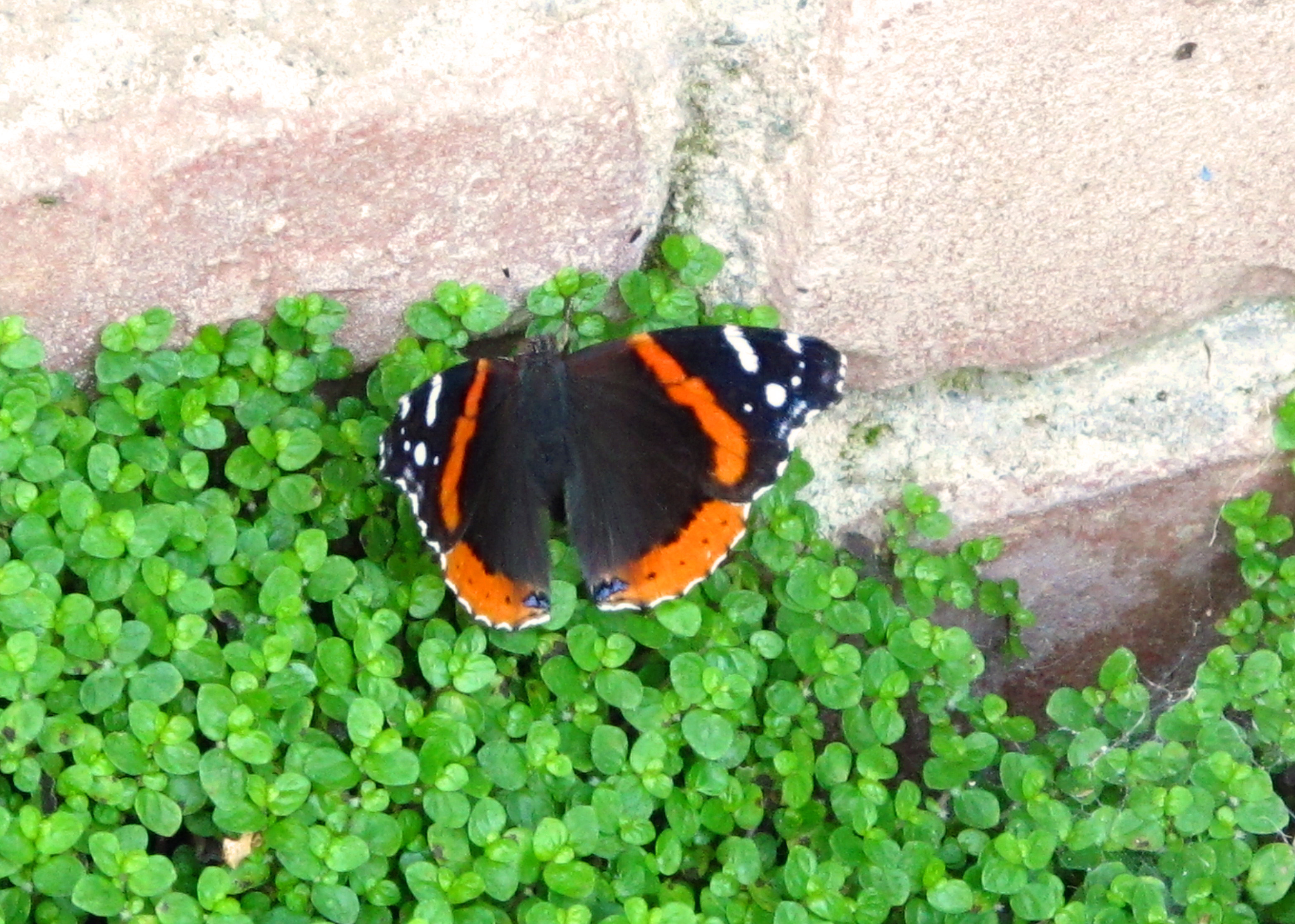
    This little butterfly fluttered by while Mark was out doing yard work! This was the only picture I could snap before she flew away…

    IMG_2094


  • A Pretty Yellow House…

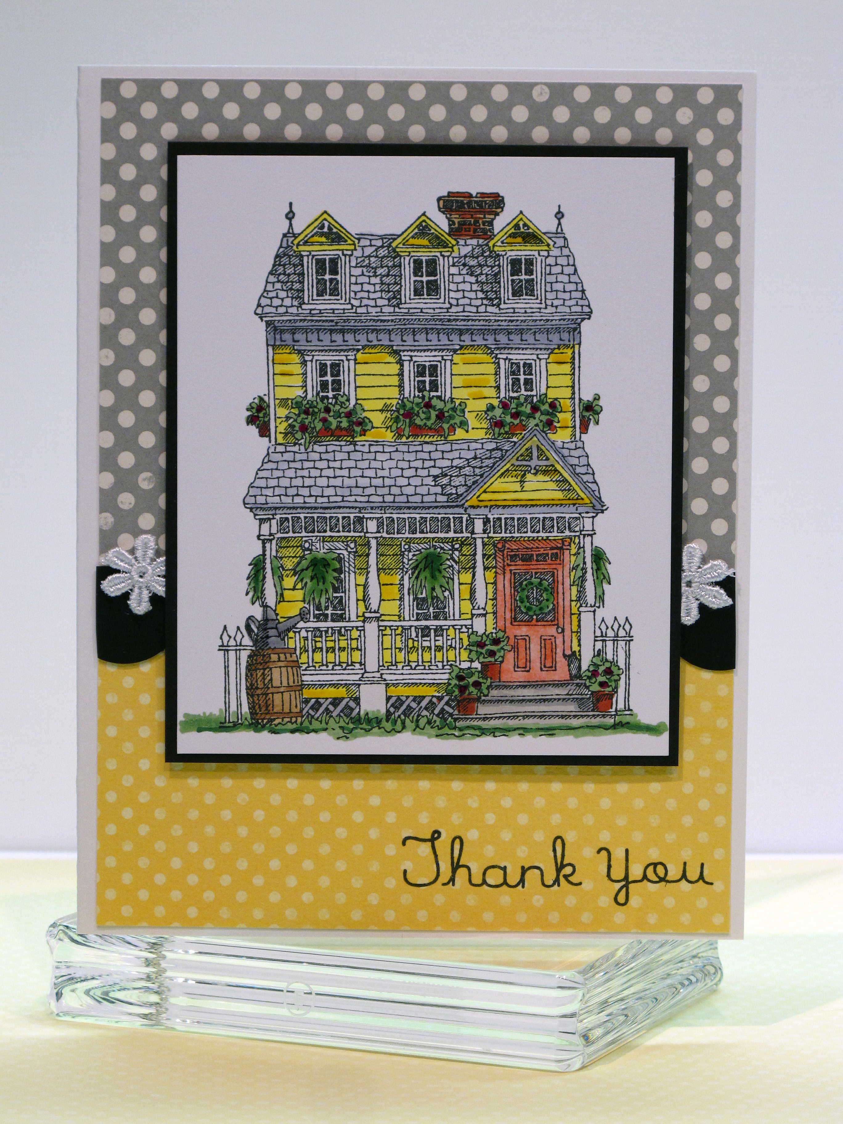
    Hi there! I have a cheerful fun card to share today! My friend Jilli Bling lives in a beautiful yellow victorian house out in the country and she was gracious enough to invite me and some friends over to stamp a while back. I wanted to send her a thank you card and I was so inspired by her wonderful home.

    IMG_2029

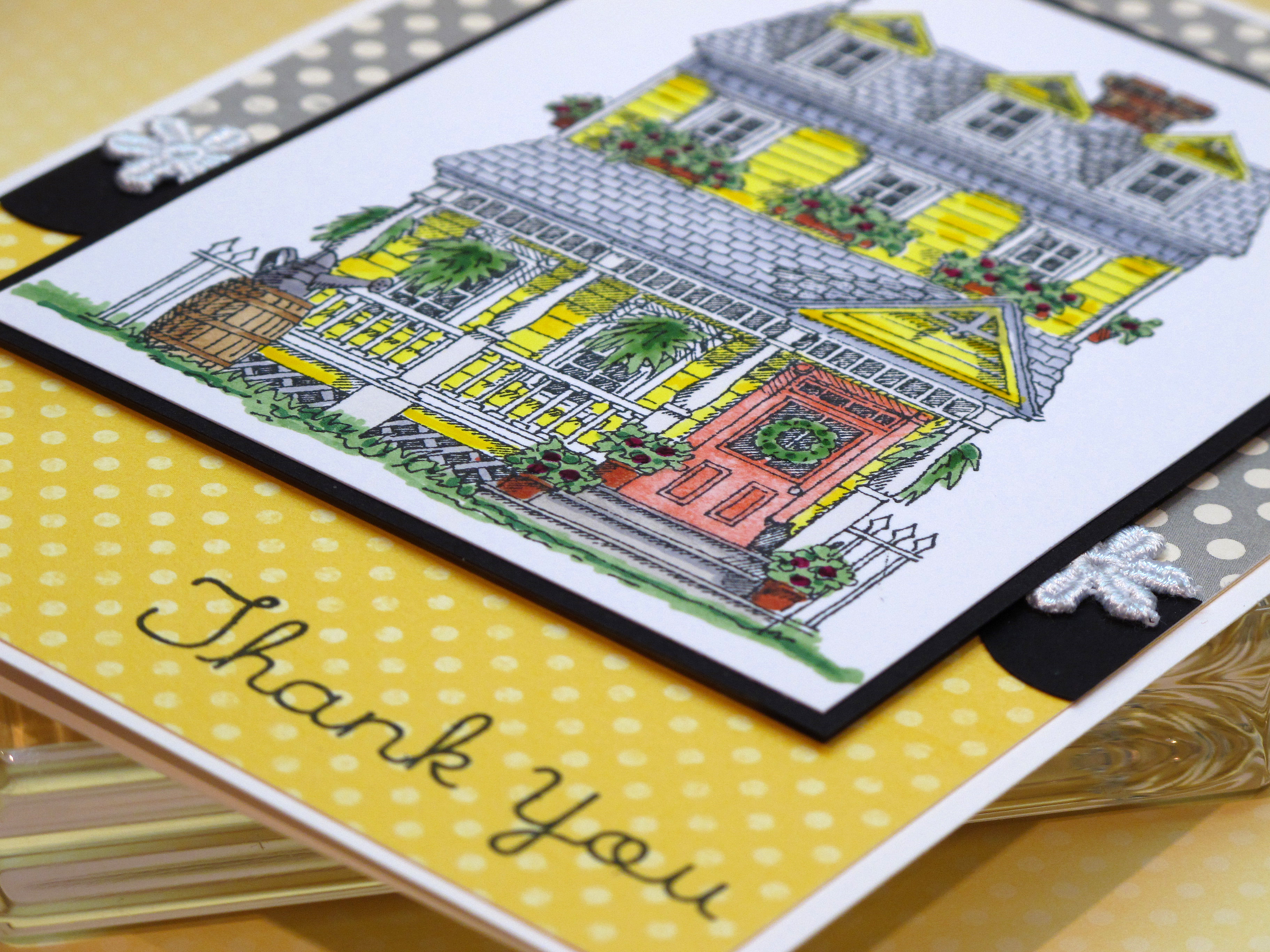
    I used my Copic Markers to color the house in…and yes…it took me a long time! I used my glaze pens to add some dimension to the leaves on the plants and some of the yellow siding on the house. I used three or four shades of yellow to get just the right color. I kept the rest of the color scheme simple to focus on the main image.

    IMG_2030

    I'm pretty crazy for polka dots lately…

    IMG_2033

  • Color Cue #5 Challenge!

    Hiya! I found another great blog with a color challenge! This one is a color challenge and you can link to the Stamp Away With Me blog by clicking here.

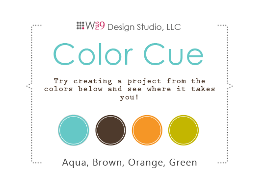
    This is the color pallette we had to work with – nice huh?

    Color_cue5

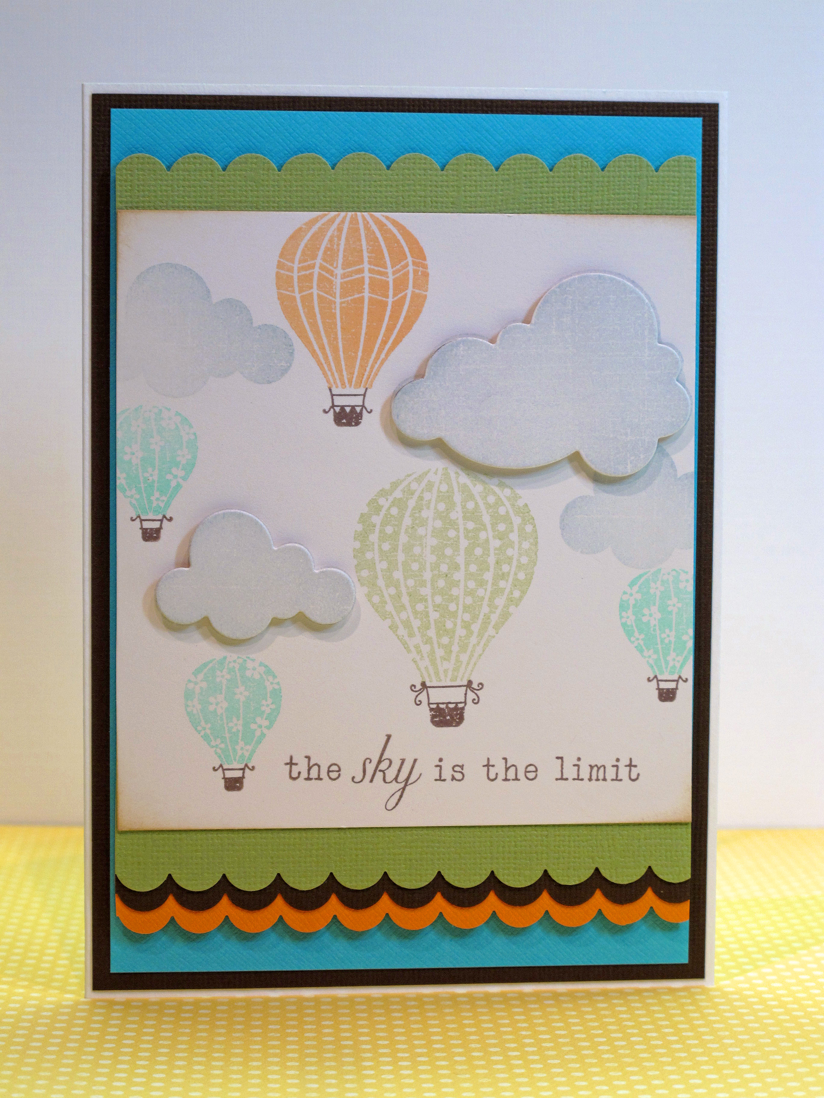
    Here is my card!

    IMG_2195


    IMG_2198


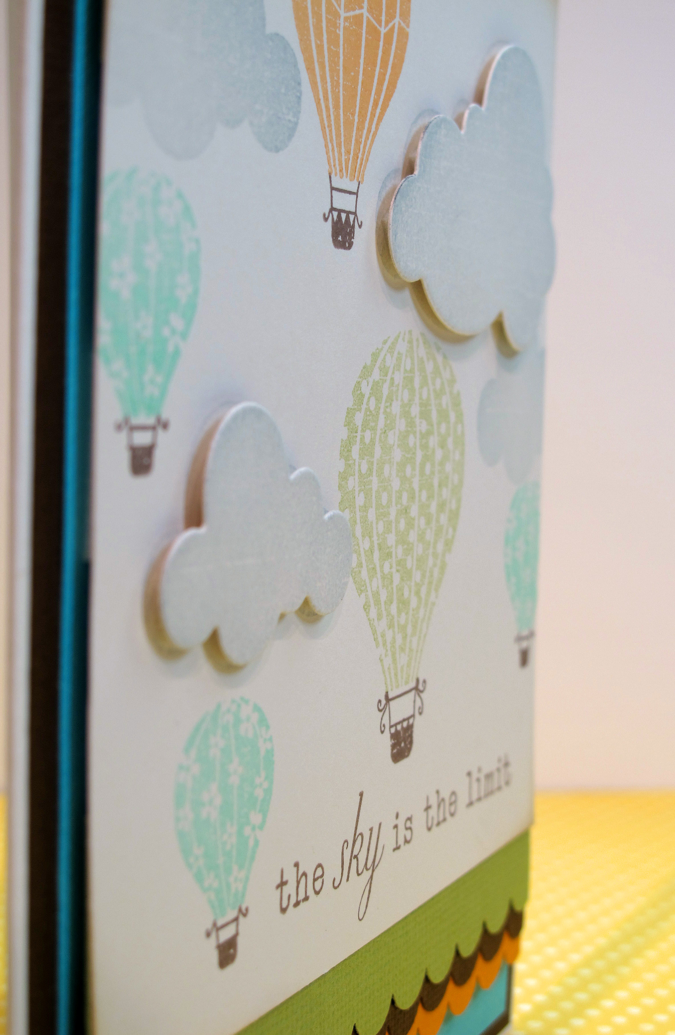
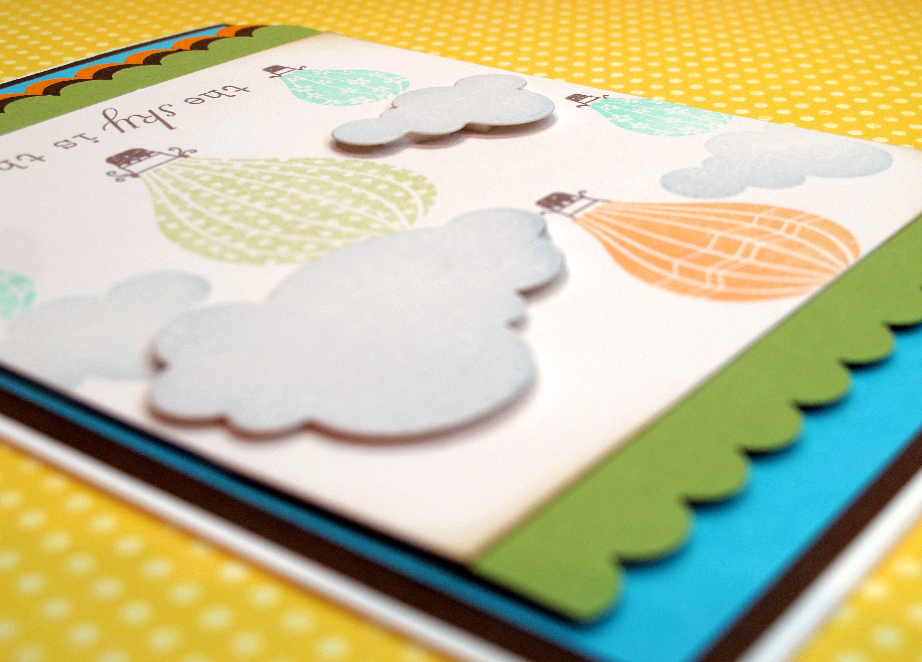
    I used the super super cute PTI hot air balloon set with the cloud die. I used my versamagic inks in the orange, aqua and chartreuse colors and then made the baskets brown. I absolutely adore this stamp set!

    IMG_2200


    I tried adding ribbon, some buttons, a charm…nothing worked…so I just left it sort of simple and clean. The images are so crisp and soft and I like the way the scallops add some dimension.

    IMG_2201

  • Shabby Tea Room Challenge, Week #14 – Summer Fun!

    Summertime, Summertime, Sum, Sum Summertime!!! Woo hoo! Normally I'm not really a hot weather person, but this year, after all the rain, I am ready for it to be nice outside. I do love certain things about Summer: Sandals, warm evenings, fresh fruit and veggies, and being outside.

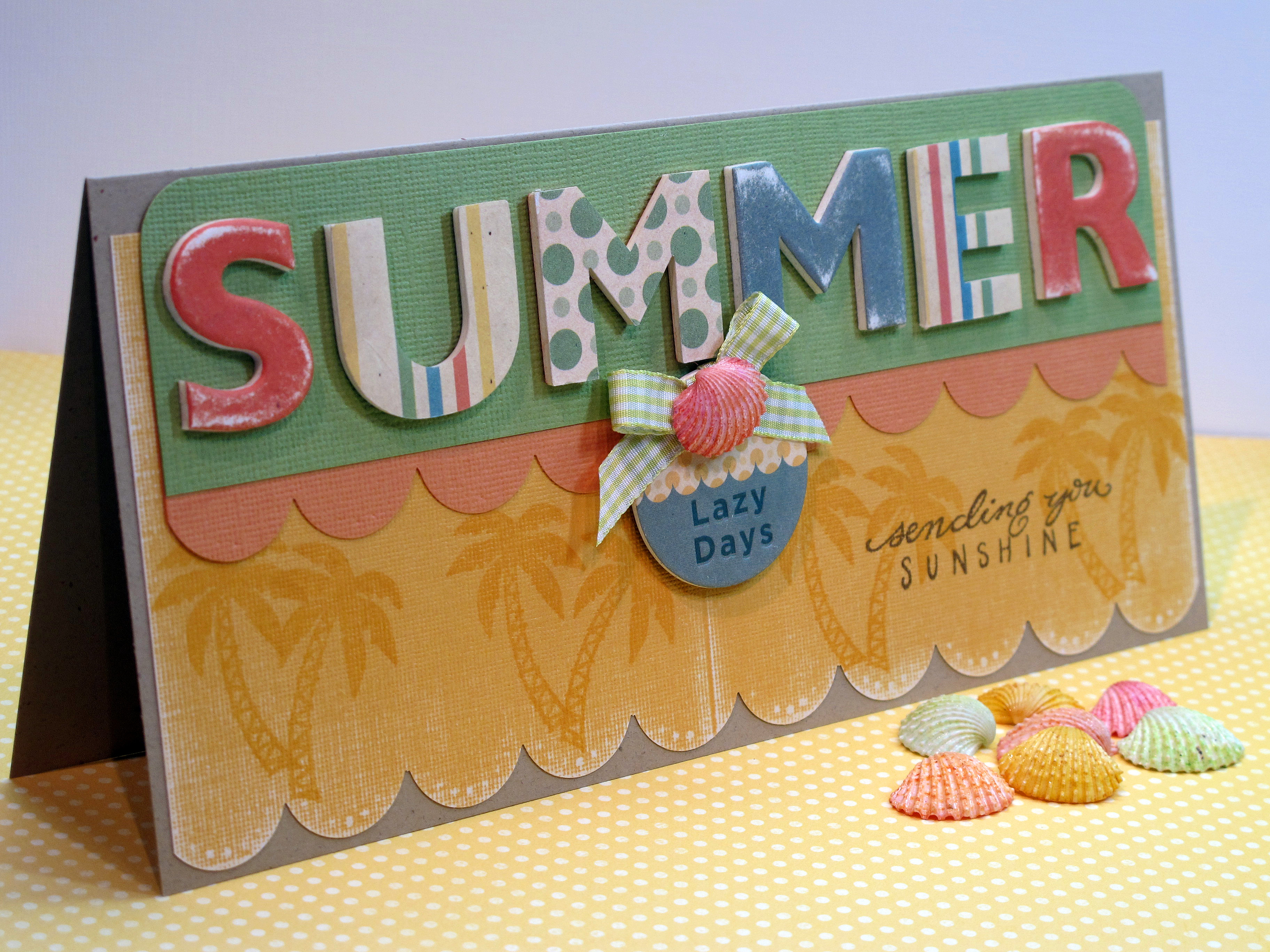
    Today's card is my entry for the Shabby Tea Room Blog Week #14 Challenge – Summer Fun! I love the Shabby Tea Room challenges! I had fun with this one and I really am happy with my card this week. I hope you like it too! It's a long card – finished size is 8" x 4". I needed all that room for the letters…

    IMG_2163


    I had these fun chipboard letters in the cabinet – have had them for a long time. I found some matching paper and some shells and ribbon all in this sort of retro Summer color pallette. Not your typical super bright colors. I sanded the paper to make it look like an old beach towel – all worn in. I stamped the palm trees in the same color ink as the paper. I tried Versamark ink but that wasn't dark enough.

    IMG_2164 (2)


    IMG_2165


    IMG_2167


    Some of the supplies I used. I created my own fun little embellishment with the chipboard, some ribbon and a pretty shell. I've also had those shells forever! Glad to finally use them.

    IMG_2168

  • Tropical Cuties Card…

    Good News! I was chosen as one of the Top Crops over at Taylored Expressions for my card from last week. (Challenge #116). Check out the announcement by clicking here! WOOO HOOO! Thanks Taylor! I love her blog so to be selected (again) is wonderful!

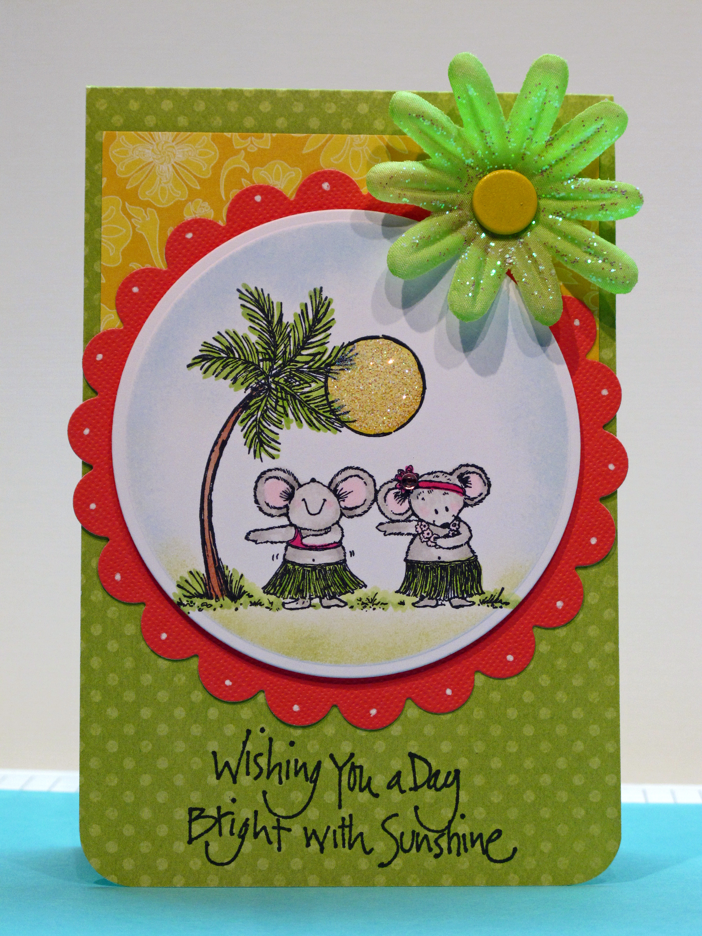
    Today's card was made especially for my sweet friend TeaDub! I just knew she would like these little tropical cuties! I colored the image first and then decided to go all out tropical with the color scheme too. I love these bright sunny colors.


    IMG_2016

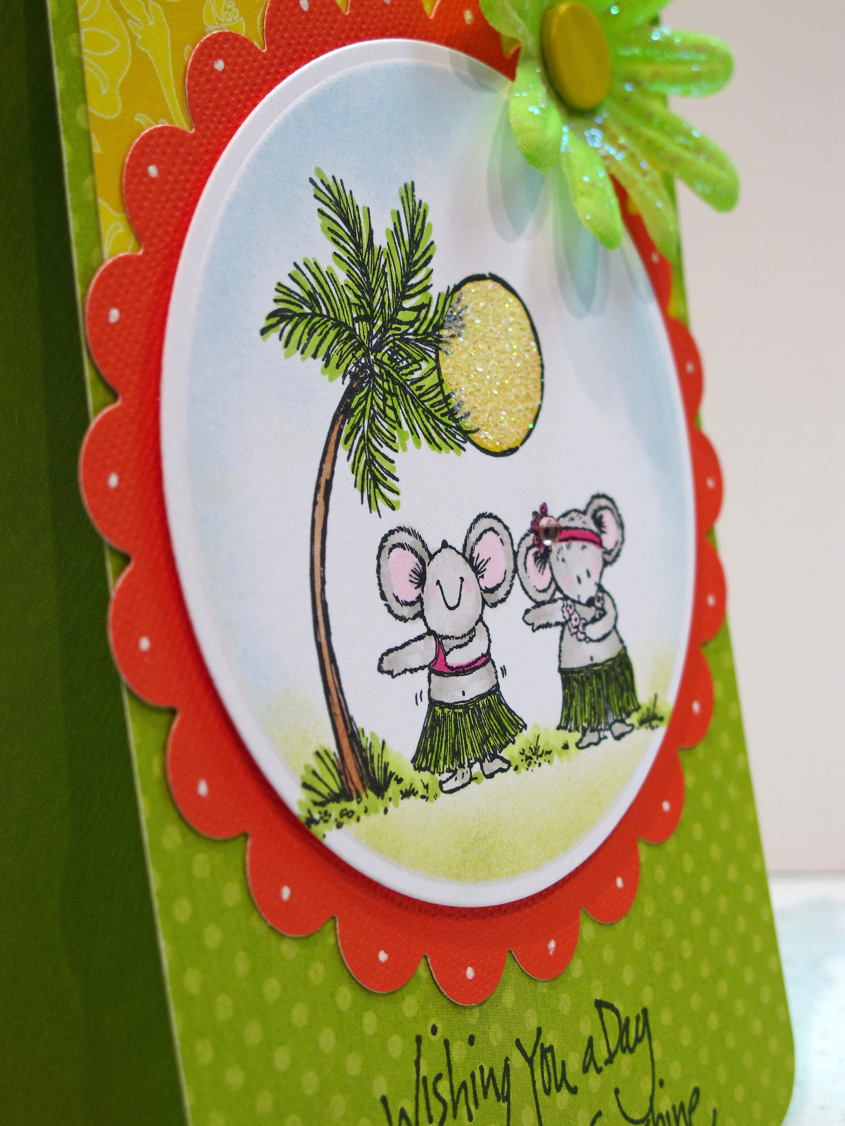
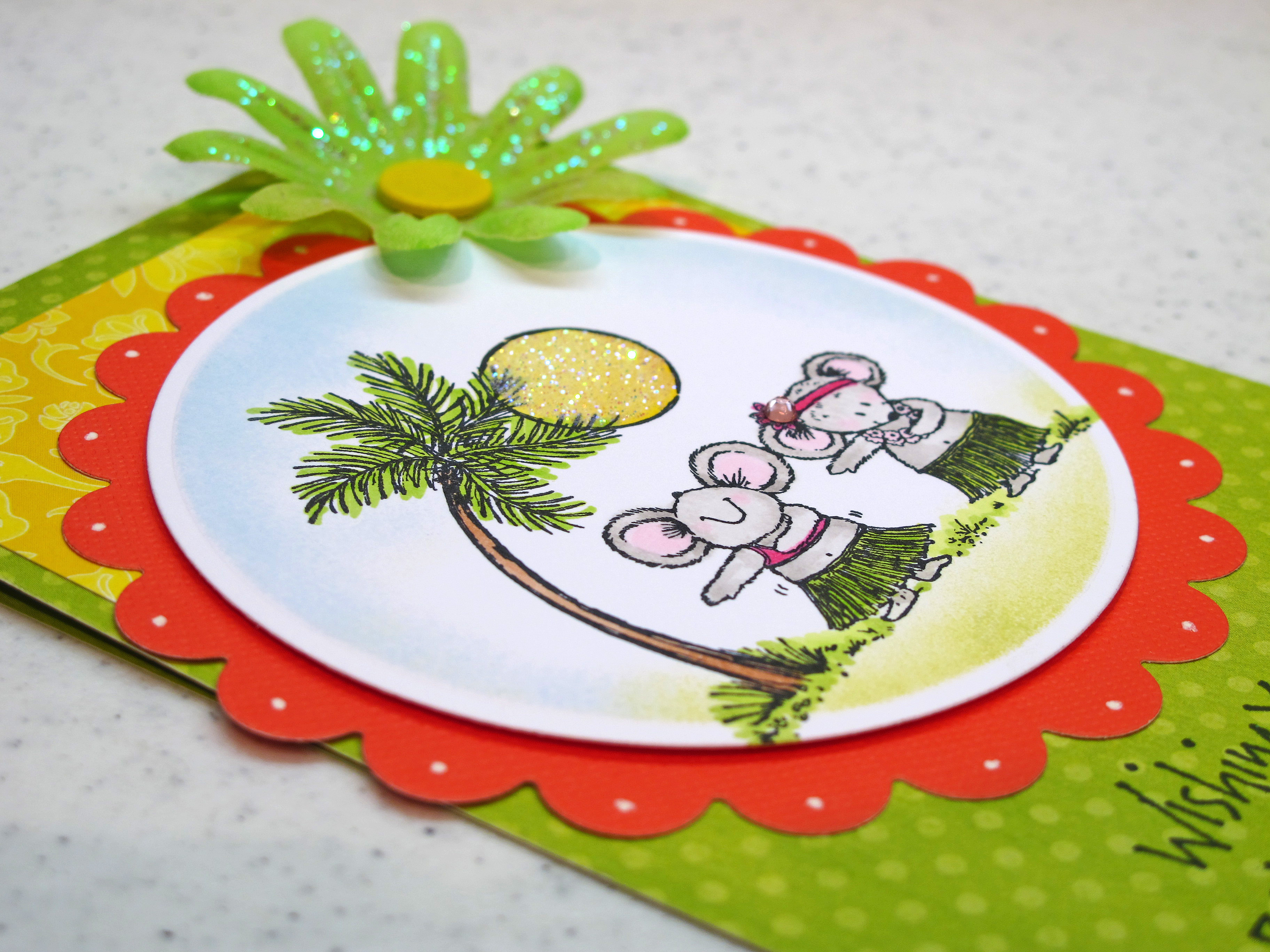
    I colored the mice with my Copic Markers and colored the sun a nice yellow hue. I added some ultrafine prisma glitter to the sun to make it shine. The flower embellishment came with the glitter already on it. I used my nesties for the circle and scallop circle.

    IMG_2020


    IMG_2021

    Aloha!


  • Two Challenges in one! TESC #117 and Embellish Magazine Color Challenge…

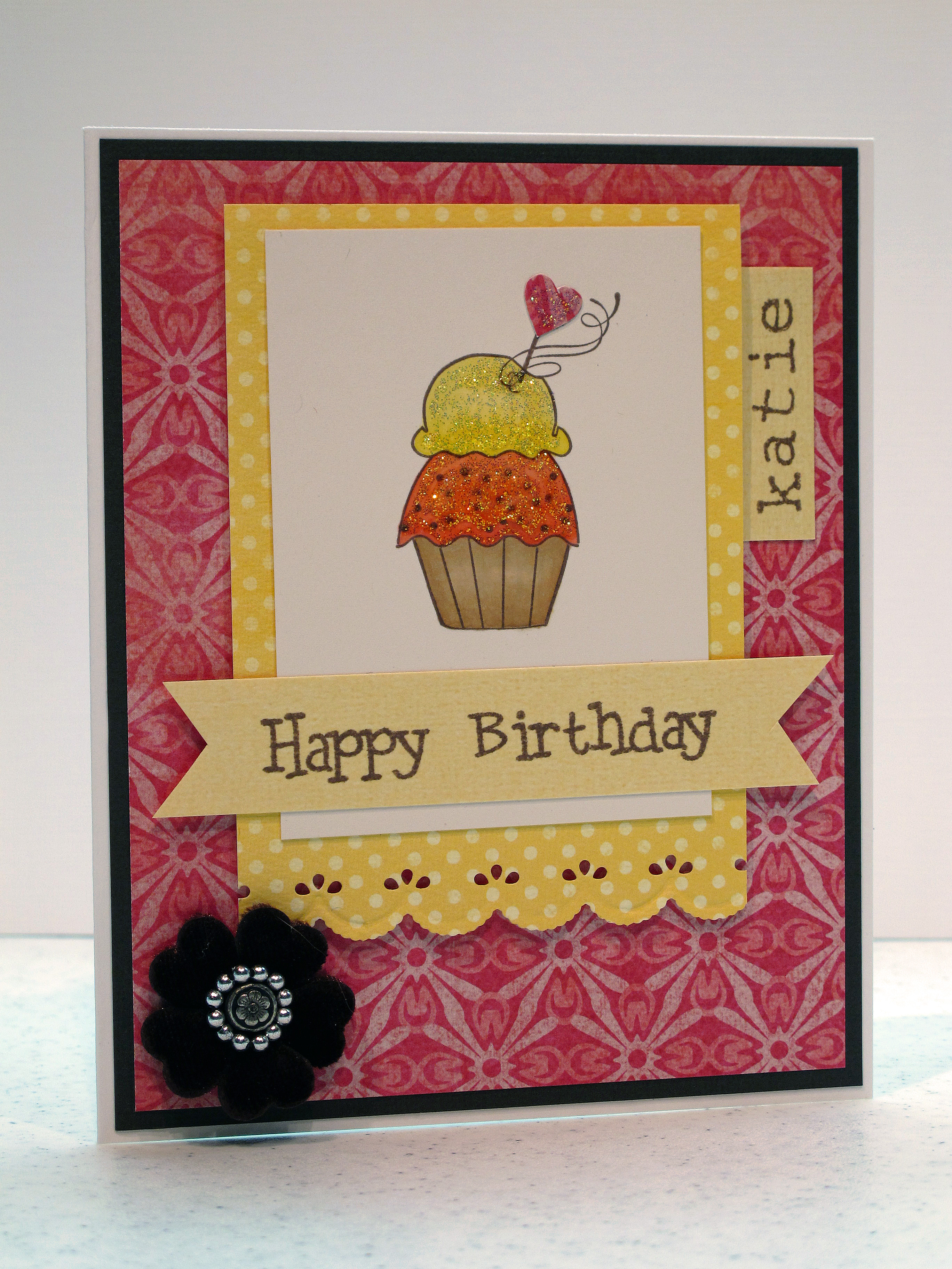
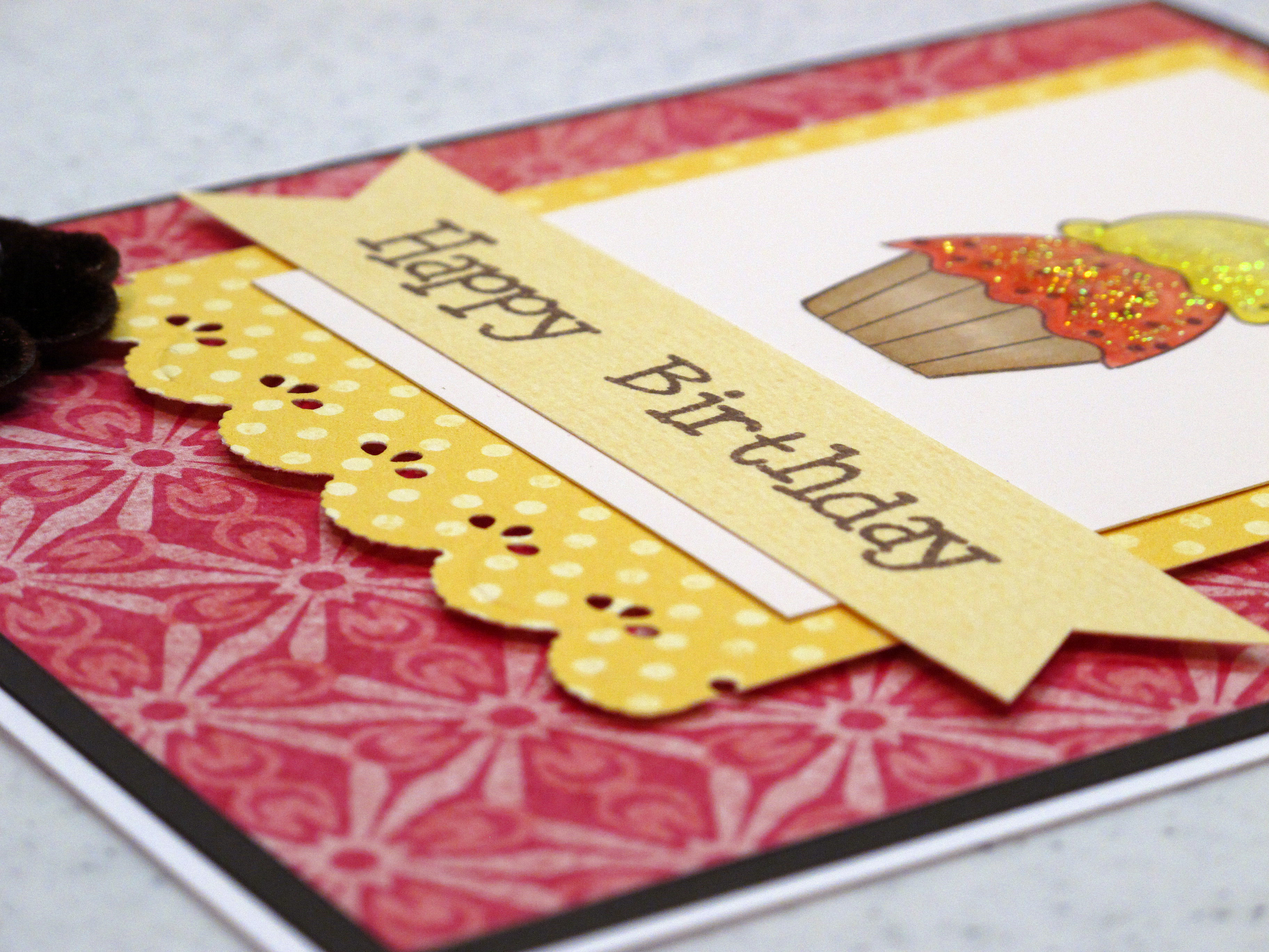
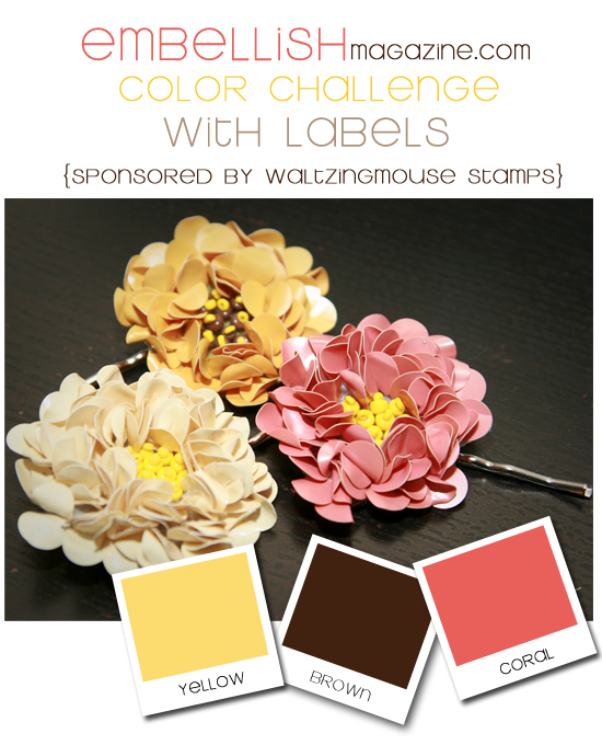
    This weekend was pretty busy and I didn't get in very much stamping time (gasp!) at home. I needed a birthday card and so I combined a color challenge with a sketch challenge to come up with one. The sketch is from Taylored Expressions (#117) and the color challenge is from Embellish Magazine Blog. I'm not sure why I can never get brown to photograph correctly?? The layer on the card, the ink and the velvet flower are all rich chocolatey brown.


    IMG_2109 

    Taylor's Sketch Image:

    TESC117[1]


    IMG_2111

    Embellish Color Image – Yellow, Brown and Coral Pink:

    Z


    IMG_2112 

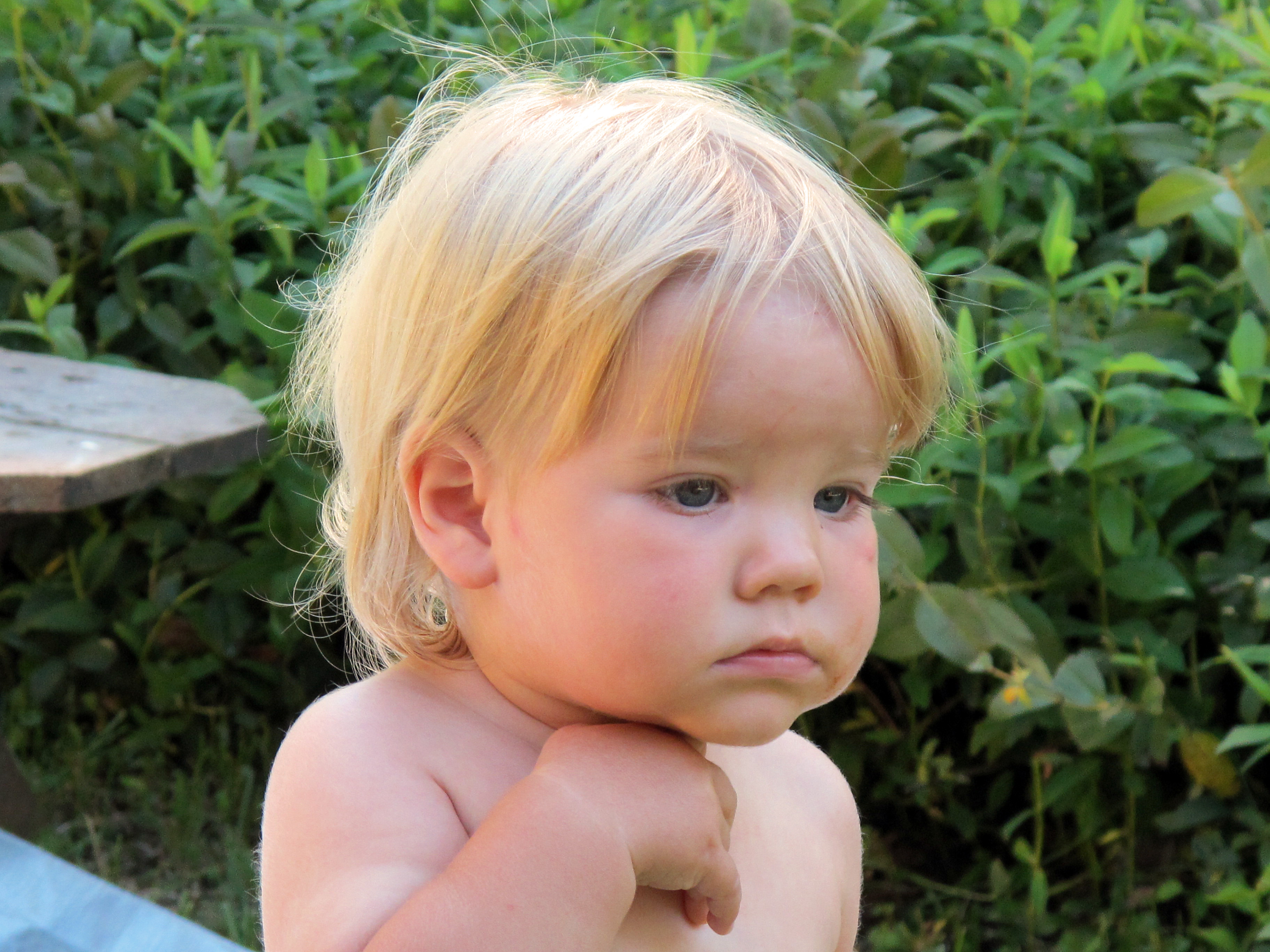
    I couldn't resist putting in a picture of my cutie patootie nephew Gabriel, who we saw at the BBQ on Sunday. He just had his one year birthday. What a face! Could you eat him with a spoon??? Oy.

    IMG_2118 

  • Birthday Hedgies!

    Greetings and Salutations! Today I'd like to share a birthday card made with those ever popular and oh- so-cute Penny Black hedgehogs! Yup, I love 'em too. I've been collecting these fun stamps for at least 12 years or so.

    Fun fact about me…I used to have a real live hedgehog! Her name was Emma and she was an African Pygmy Hedgehog. She lived about five years – which is a good life for a pygmy hedgie. She was such a fun pet! She had the cutest little feet and her tummy was soft fur. Too much fun! Only down side is that hedgies only eat live food – in the form of meal worms! EW. You know I loved her because I would go to the pet store every week to buy her food. Again…EW. Other than that she was cool and unusual and fun to have around the house!

    Emma:


    Img038

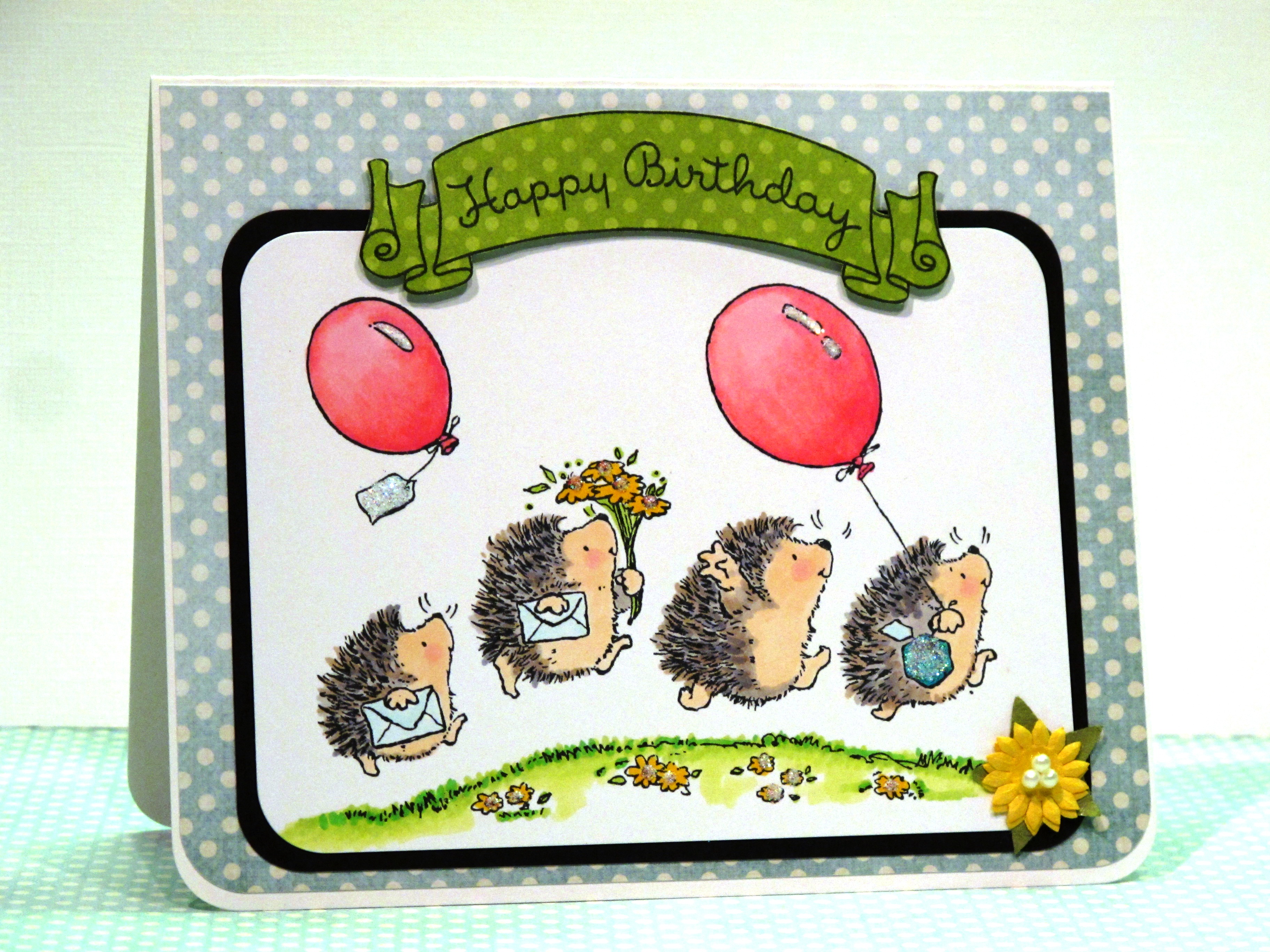
    Here's my card to share today:


    Bloggie 001


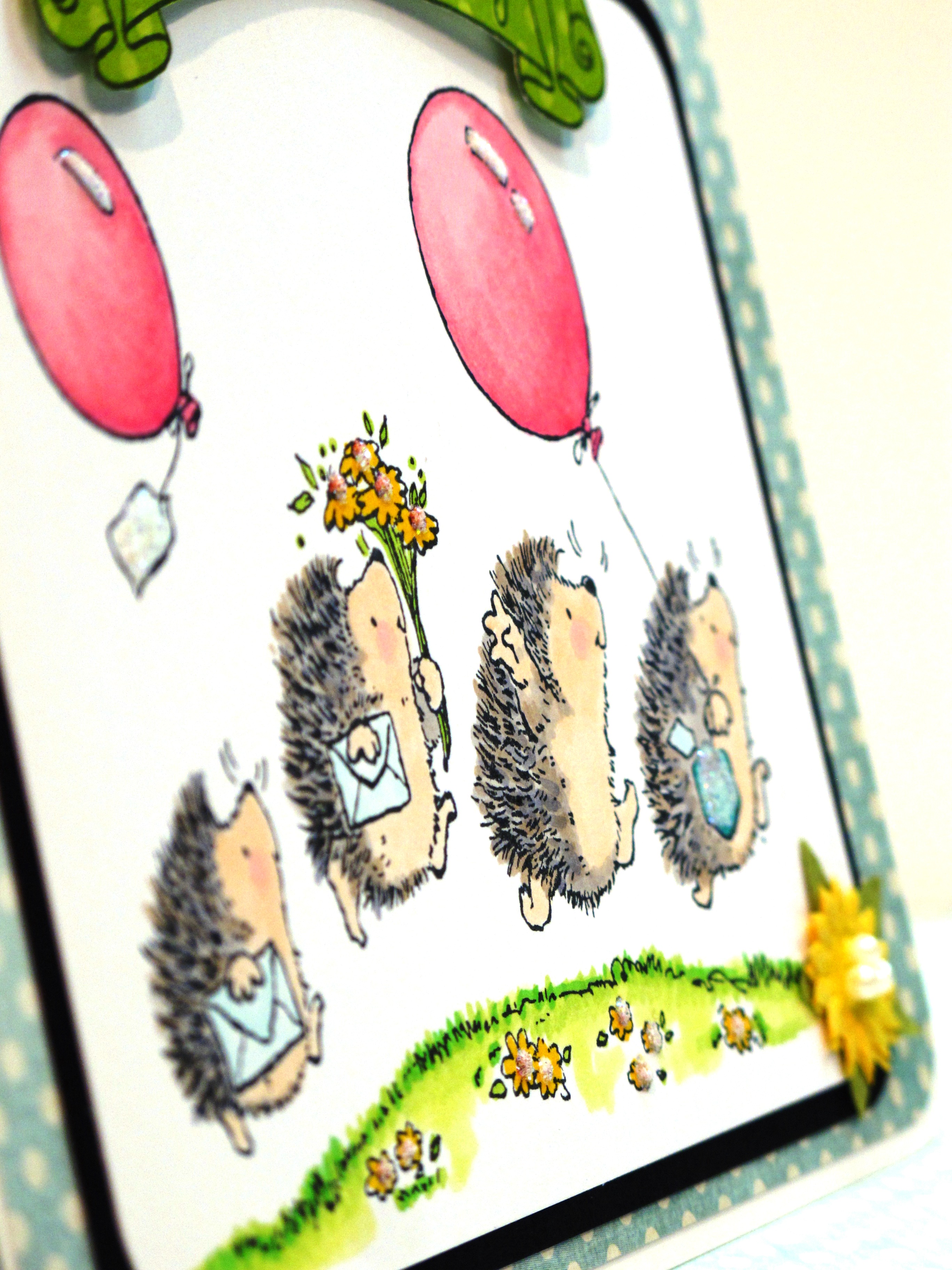
    Can you tell that I am SERIOUSLY in love with that blue and white polka dot paper? I know, two posts in a row… The hedgies were colored with Copics and then I added some glitter accents to the balloons, present and flowers. This card, again, cute and simple. I let the image speak for iteself.

    Bloggie 002

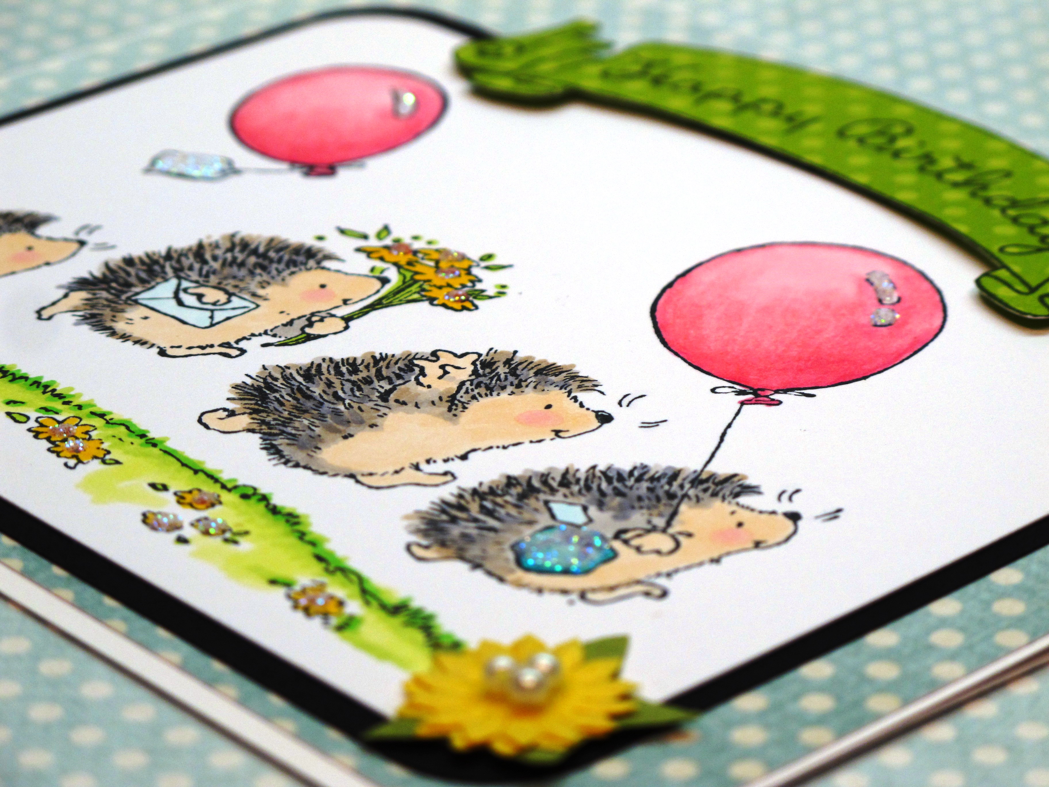
    I started coloring the hedgies with E00 for their tummies and hands/feet. I then used RV10 for their cheeks. I used three or four shades of both warm grey and cool grey to fill in their spikes. No real pattern to it, just keep going until it looks the way you like.


    Bloggie 004

    One more day…and then it's FRIDAY!