Category: Papercrafting

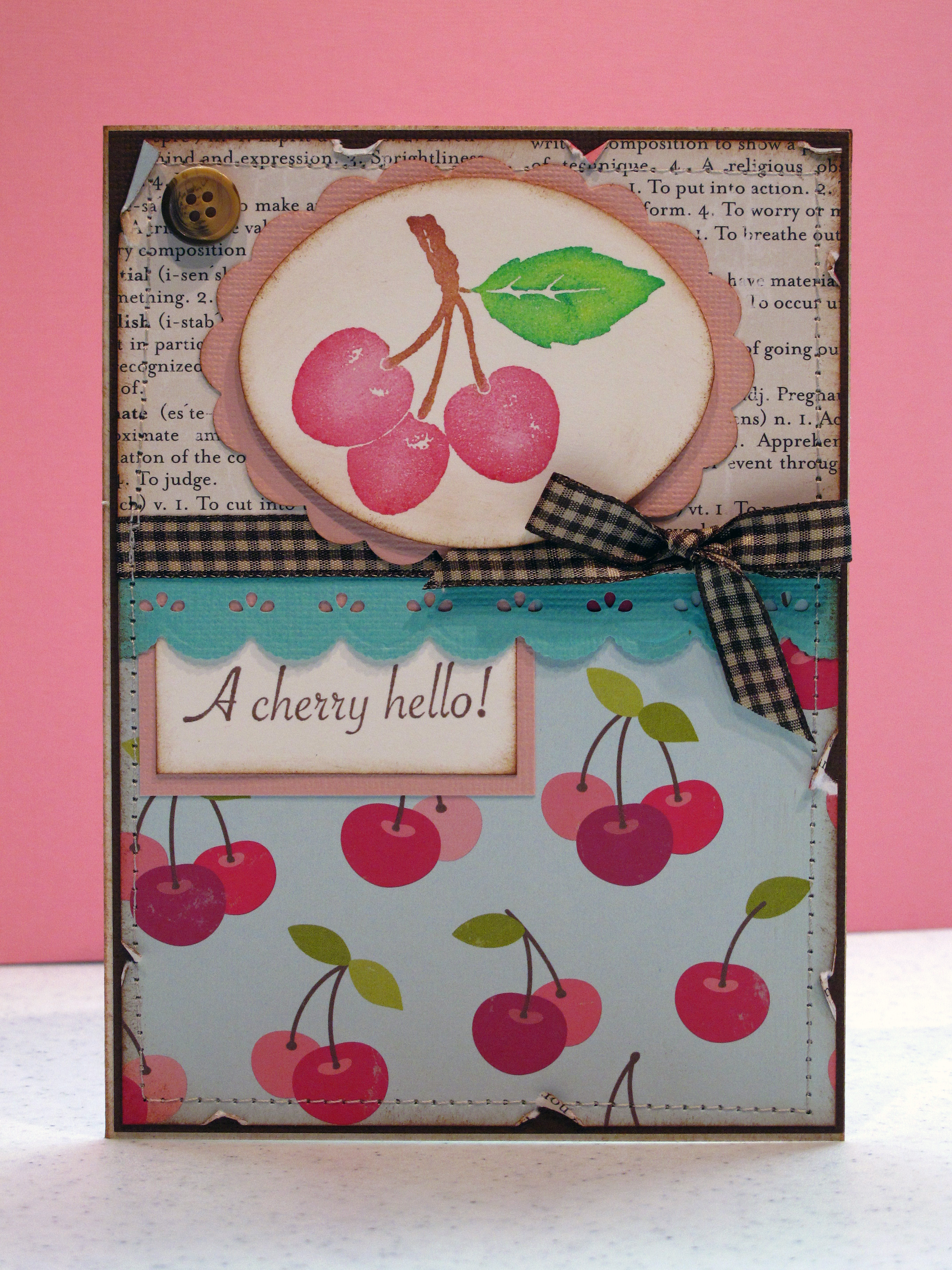
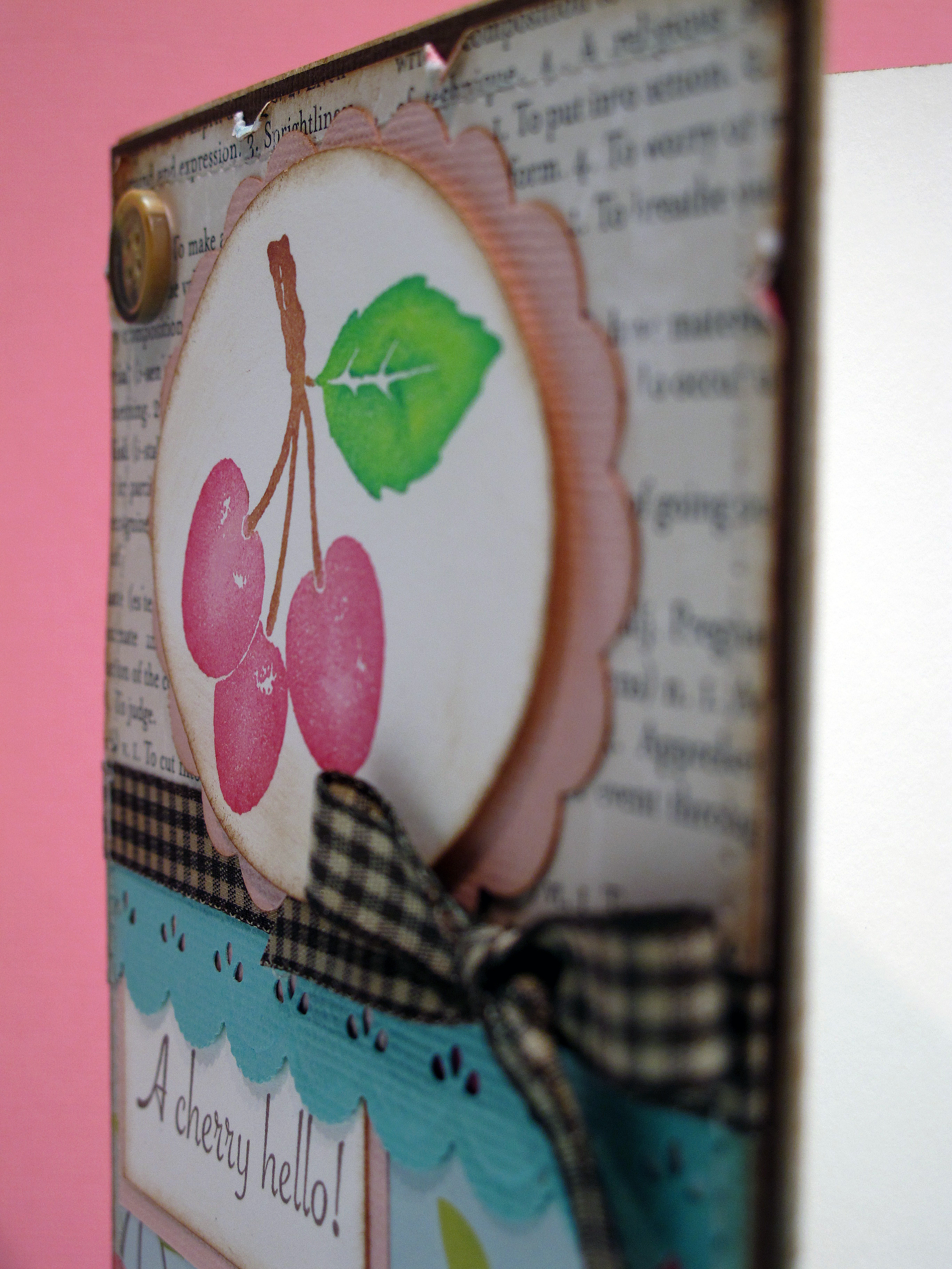
  • A Cherry Hello!

    Hi All! Hope you are having a super fabulous weekend! I went to a 50th birthday Disco party yesterday and it was really fun! The cake had a mirror ball on the top. Great music. A candy buffett! Awesome. I think the birthday 'girl' had a great time. I know I did! It kind of scared me that I still know all the words to those disco songs. Good times!

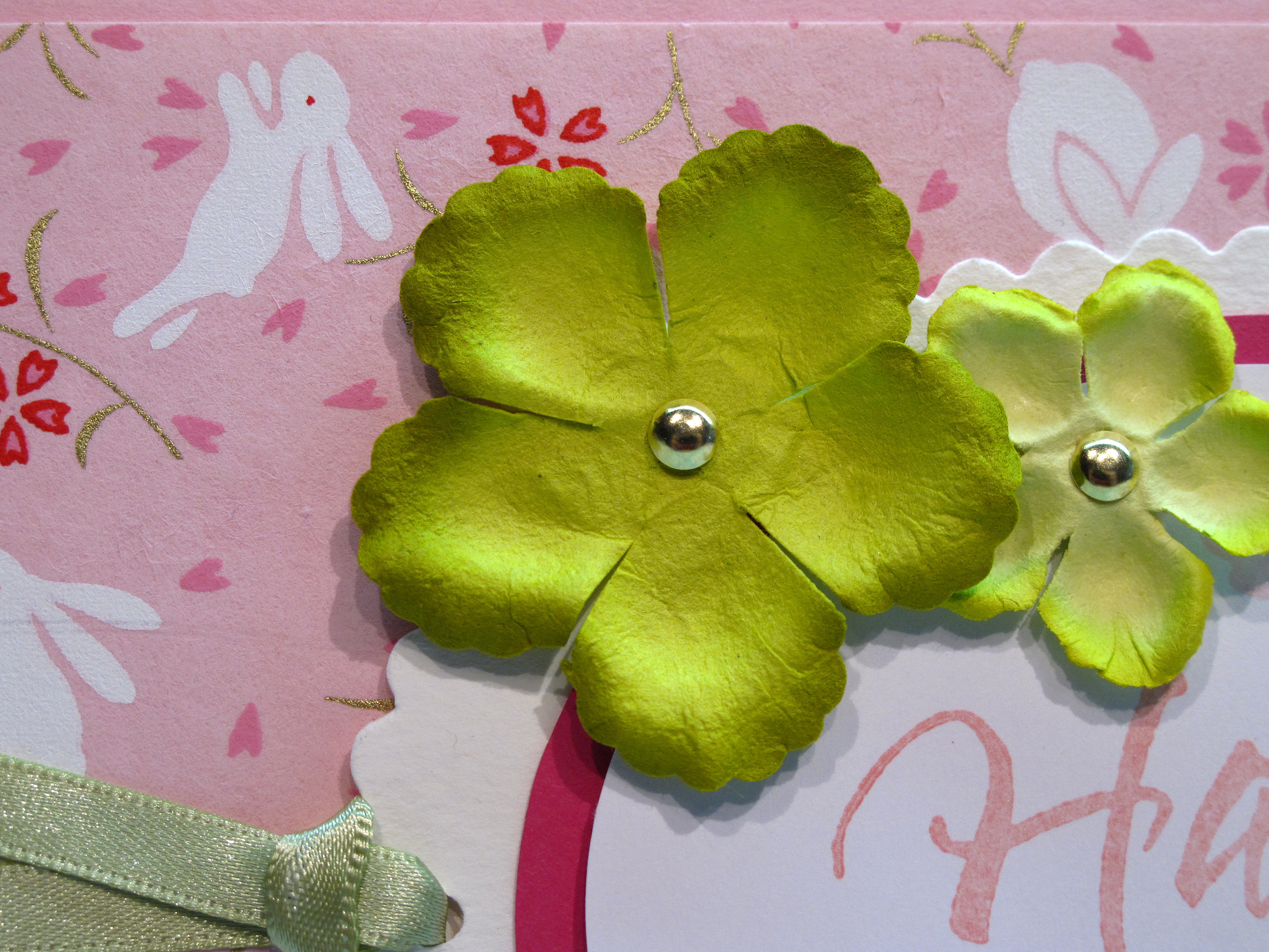
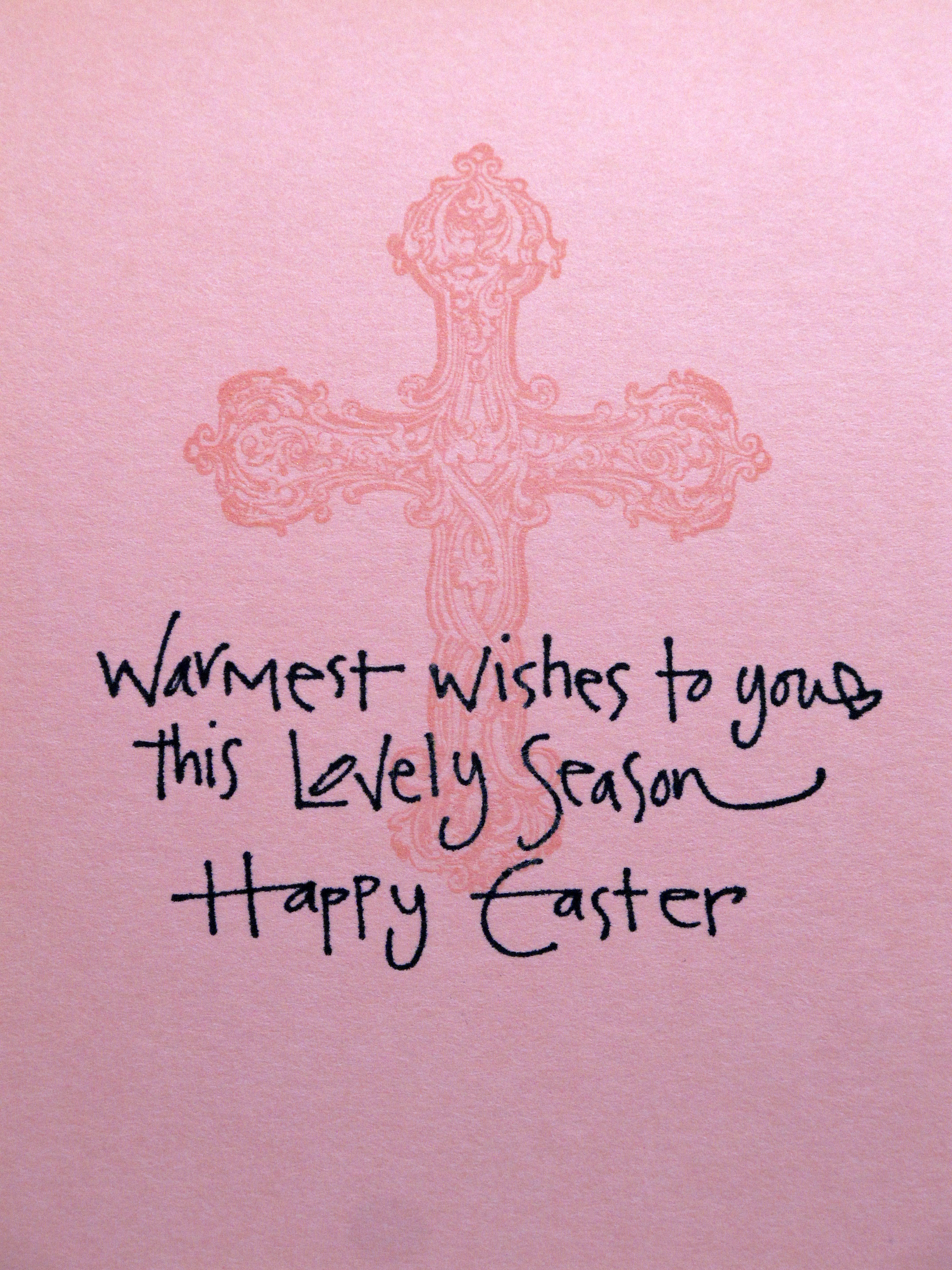
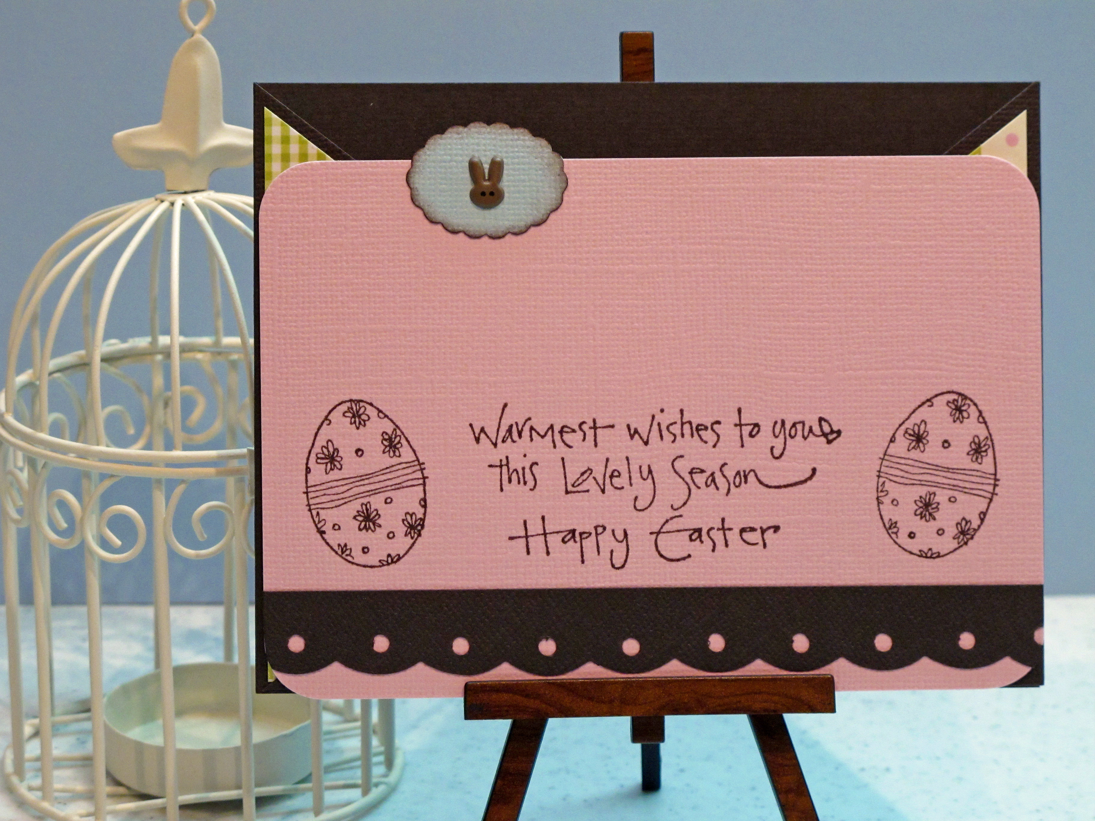
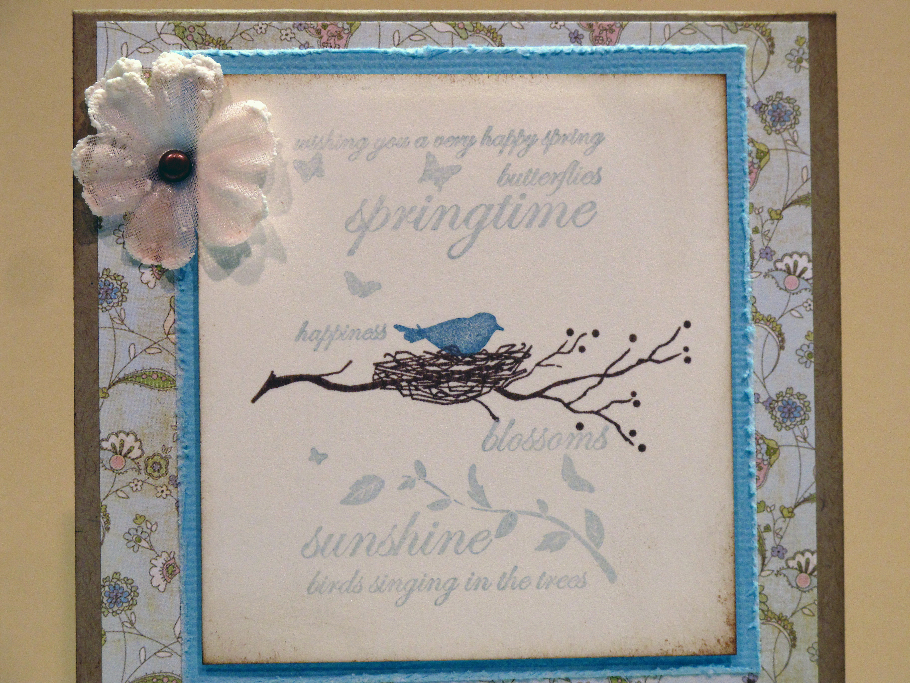
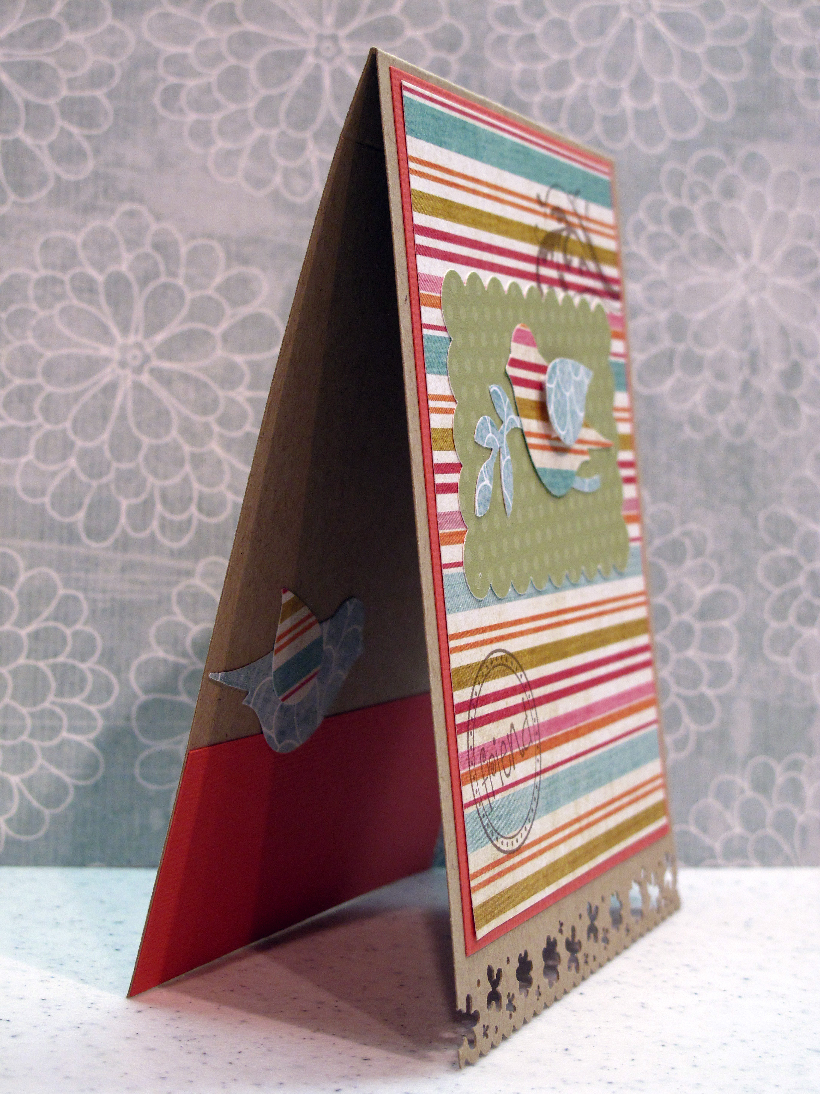
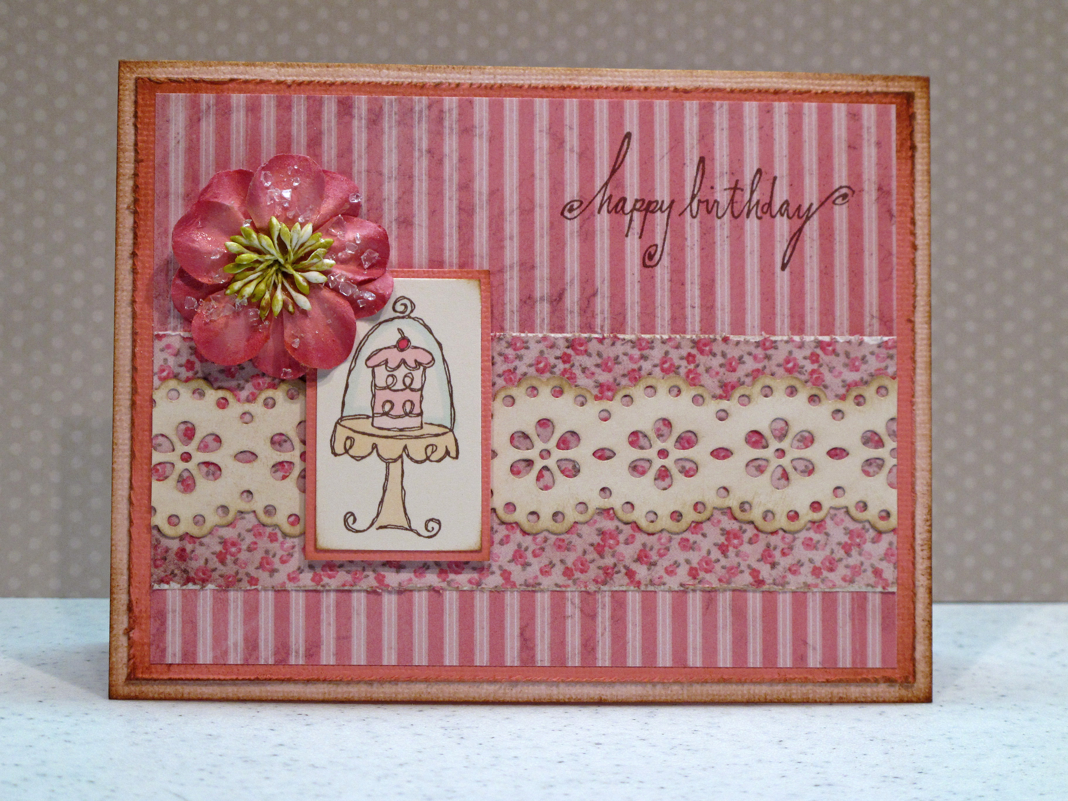
    My card for today is for two card challenges that I came across this week that called for stitching. I'm not that great with the paper + the sewing machine…but gave it my best shot. I really like this card – especially the colors. One challenge – Embellish Magazine – called for light pink, light aqua, kraft, and stitching. The other challenge – Shabby Tea Room – called for Spring theme and stitching.

    Here is my card:

    IMG_1190


    IMG_1192


    IMG_1193


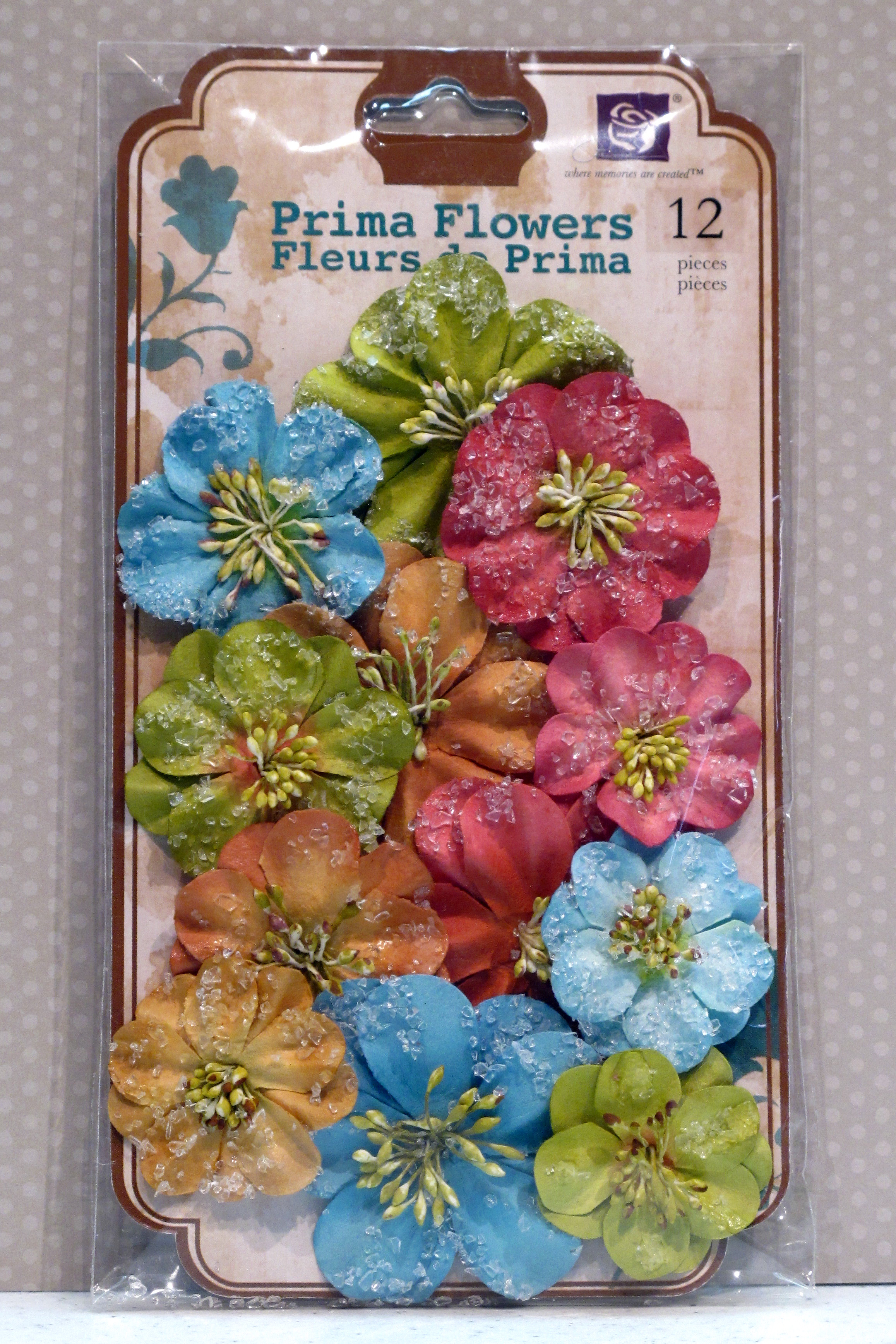
     All that stuff for ONE card??

     IMG_1186


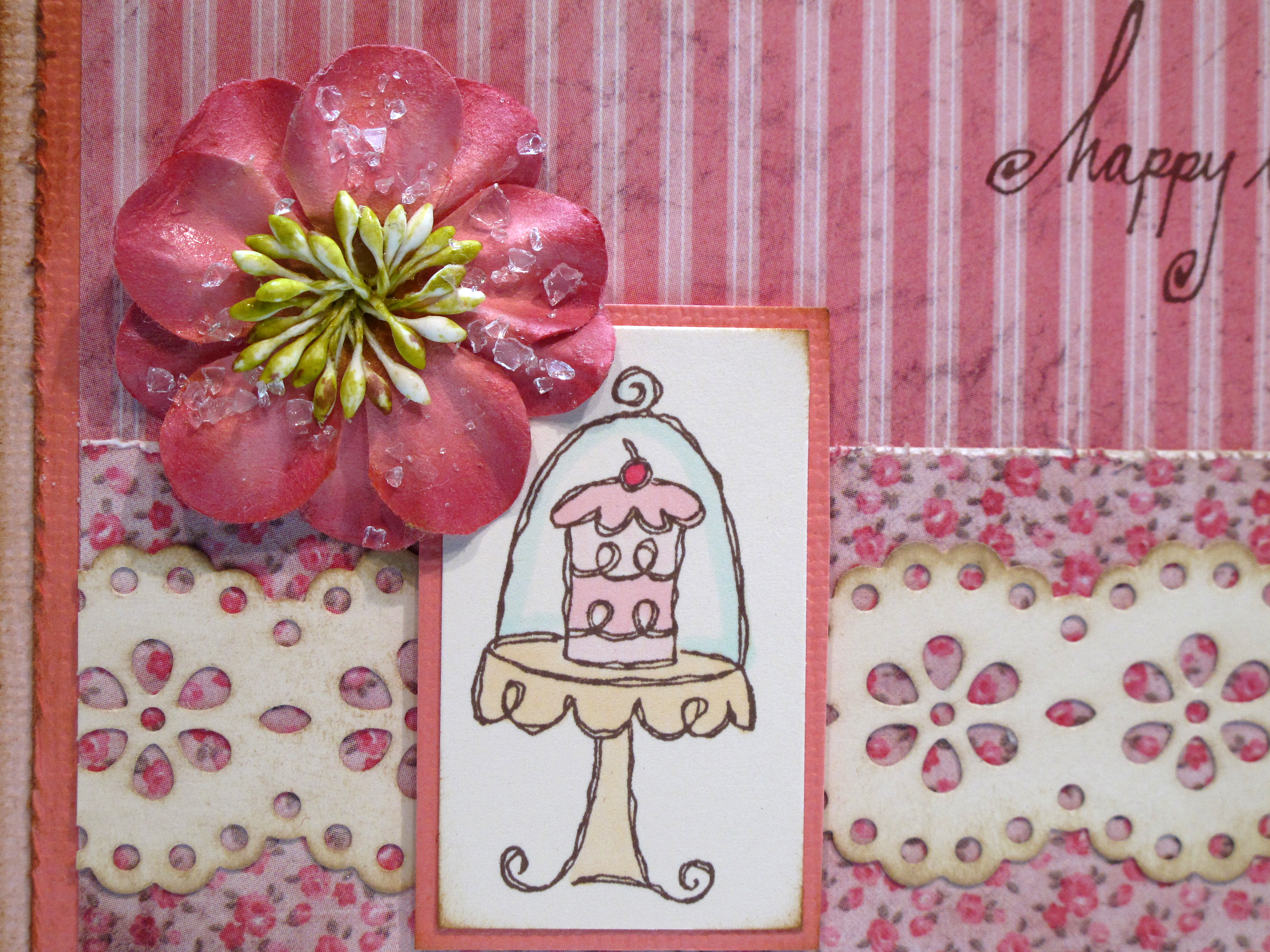
    This card feels so vintagey – so I decided to take a sepia picture of it too:

     IMG_1189

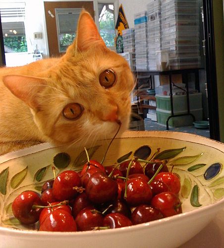
    Buddy Says…Life is just a bowl of cherries!

    Photo

  • Rain or Shine…you’re a friend of mine!

    I think it's important to honor the friends that weather life's storms with you. They are there through rain and sleet and wind and snow and dark of night. I am deeply blessed to have many such friends. Today I made a card with the simple sentiment – Friends, rain or shine.

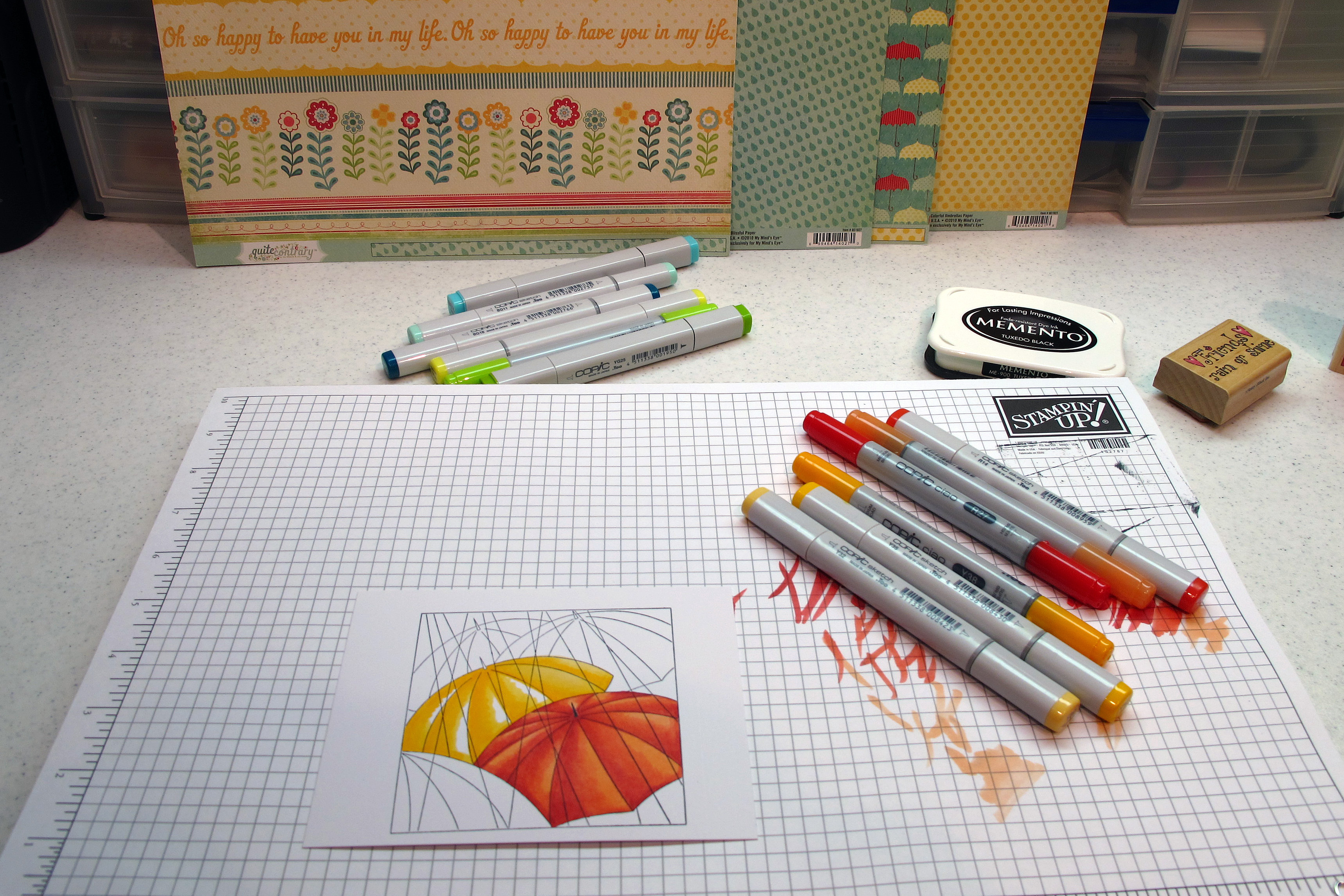
    I have had this neat umbrella stamp for years but was never able to color it just the way my mind wanted it to be. So, I decided to give it a go with my Copics. All I can say is "WOW!" I think this might be the best coloring I've done to date! It came out exactly as I wanted. I really (REALLY) paid attention to the shading and blending and took my time. I hope you like it – and I hope the fact that I'm showing the process is helpful too. It's the beginning of a nice Spring weekend. Have a good one!

    The finished card:

    IMG_1179

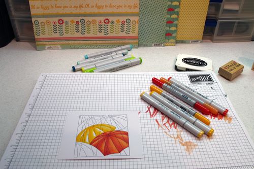
    Deciding my pallette – see all the squiggles? Four shades of red on that bad boy!

    IMG_1171


    The red is done, moving on to the yellows…

    IMG_1172 

    Yes, I used ALL of those markers…plus a few more I think!

    IMG_1173

     
    The finished image:

    IMG_1176 

    This is what the back looks like – I think that's kinda pretty too:

    IMG_1177
    I chose this blue dotted paper to look like raindrops. I decided to keep it simple with the papers and just used primary colors and no real patterned paper. Okay, that was hard! I NEED patterned paper…but it didn't work in this situation. I might get over it. The sentiment was printed on the computer.

    IMG_1180
    If you are practicing your coloring – I want you to really look at this. See how all of the lighter parts are on the same side of every umbrella? That makes your eye believe that is the direction of the sun. This is very hard for me. I have been working on it though.

    IMG_1183 

    I feel like I need to play a Rihanna song in the background right now. Under my umbrella, ella, ella, ella…  Peace out chicadees!

  • Pretty Party Dress – A Tuesday Trigger Challenge

    Ya know how I love Moxie Fab Tuesday Trigger! It's that time again! This week the trigger photo is of a pretty cotton sundress for a little girl. It just happened to be with my favorite colors (aqua, lavender and green) and plaid! I'm mad about plaid! An idea came to me pretty quickly. Here is the trigger image first:

    Easterdress[1] 
    What came to my mind was a pretty preppy Spring party dress for a soiree out on the lawn…Close your eyes…can you imagine the twinkling white lights and the champagne? And the lanterns hanging from the trees and the jazzy ensemble… Oh yeah, wait, come on back to me. Come back! I said COME BACK! Whew.

    Okay, so here is my card-

    IMG_1168
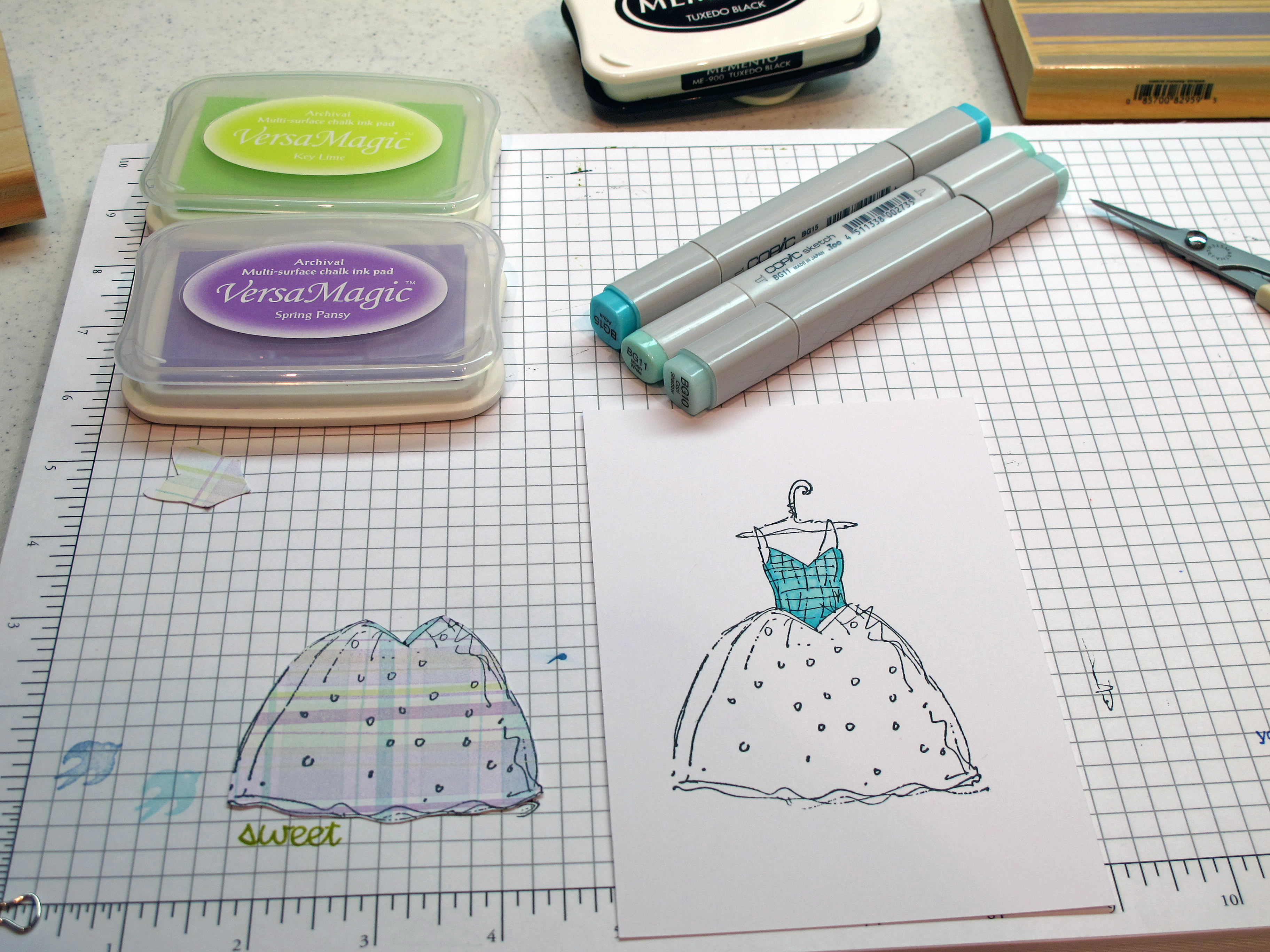
    Behind the scenes of making the plaid skirt for the dress…Giant stamp from Hero Arts. Three favorite colors of Versamagic ink. I only used a tiny bit of green and then criss crossed the other two colors.

    IMG_1162
    Then I stamped the dress in black onto my plaid 'fabric' and cut it out. I stamped the dress again on my main paper and colored the bodice with my Copics – three shades. 

     IMG_1163
    When I attached the skirt part I put the upper part on with mono-adhesive and the lower part with double sided foam tape to look like the skirt had some movement. The argyle pattern is stamped on the lavender card stock with versamark ink (Judikins stamp). I glued on a pretty pink flower corsage and a polka dot bow…There ya have it!

    IMG_1167

    This would be a nice card for a special gal pal or even a bridal shower. So feminine and sweet!

    IMG_1166

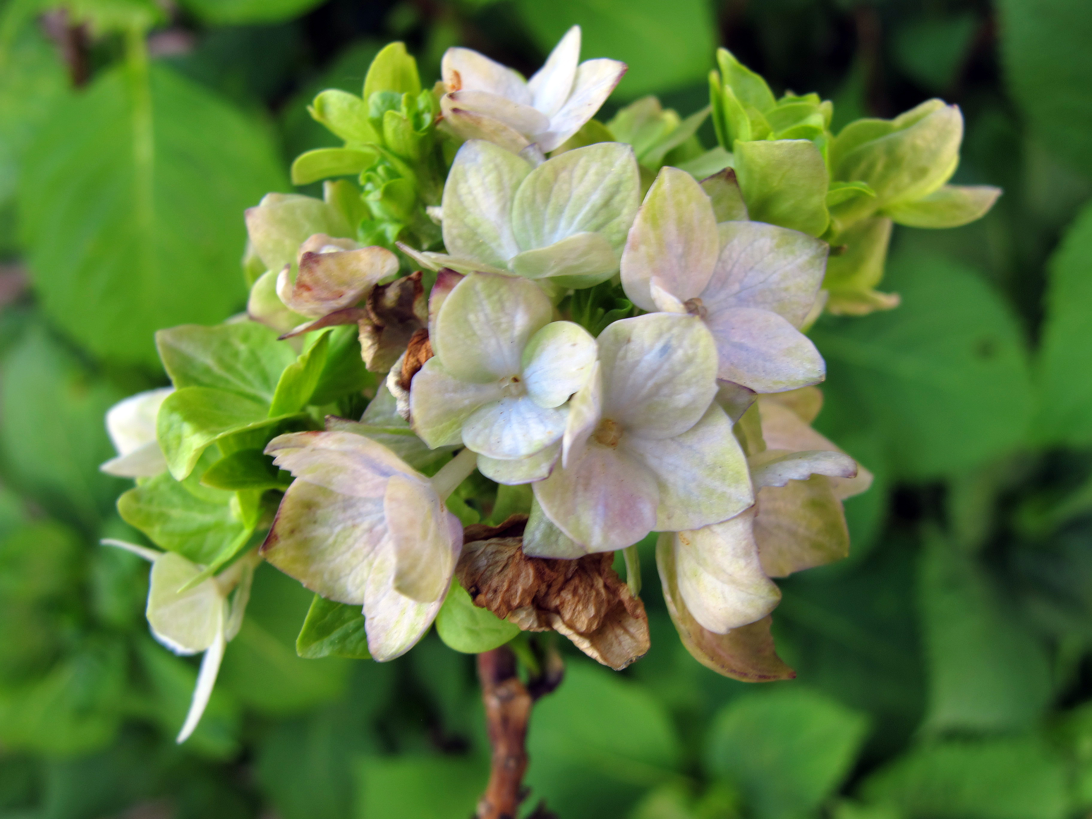
    Here's what's going on out in the front yard with my babies…my giant Nikko Blue Hydrangeas…I can't wait for their giant periwinkle pom poms to come out to see me! Here is a good start. Nature at it's finest, don't ya think?

    IMG_1152 
       

  • Margaritas Anyone?

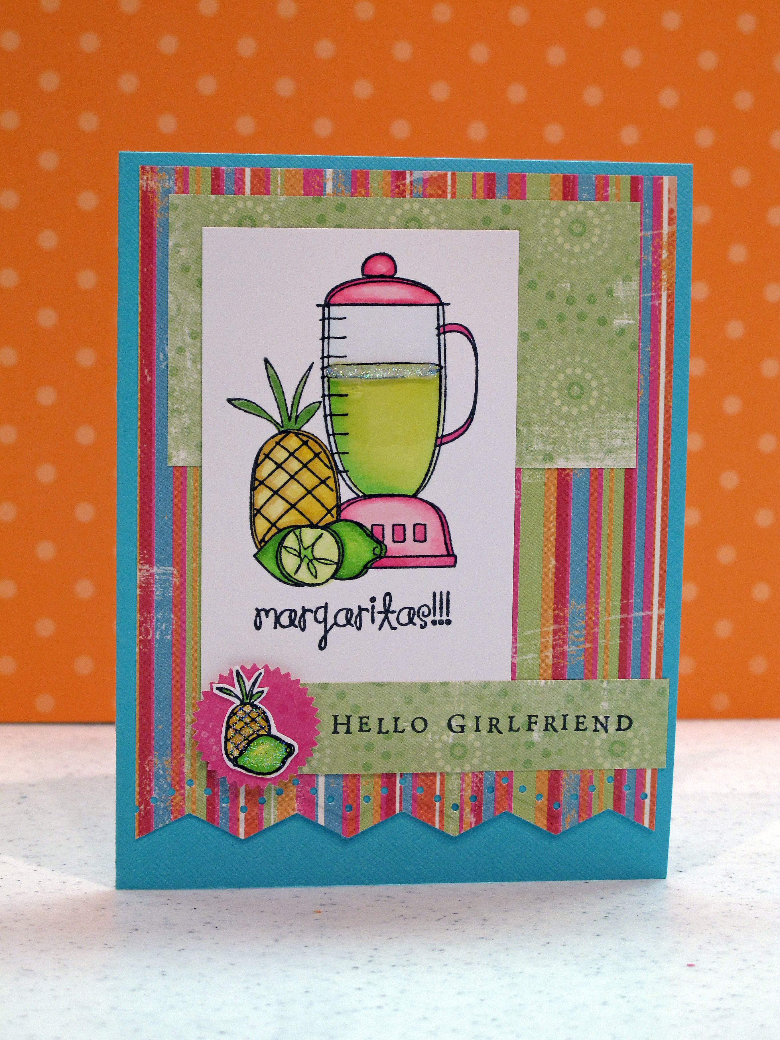
    I knew that would get your attention! Hahaha. It was really warm this weekend here in Sac-town and a refreshing margarita would have been very nice. Maybe next weekend… This card is my entry for Taylored Expressions sketch challenge #105. I was having low crafty mojo today. I went through all my clear stamps and found this cute margarita set from Unity, and thought it would be fun to color. I then found a 6×6 paper pad from Junkitz called 'Salsa!' I knew it was meant to be.

     Love these bright cheery colors – hope you do too.

    IMG_1119
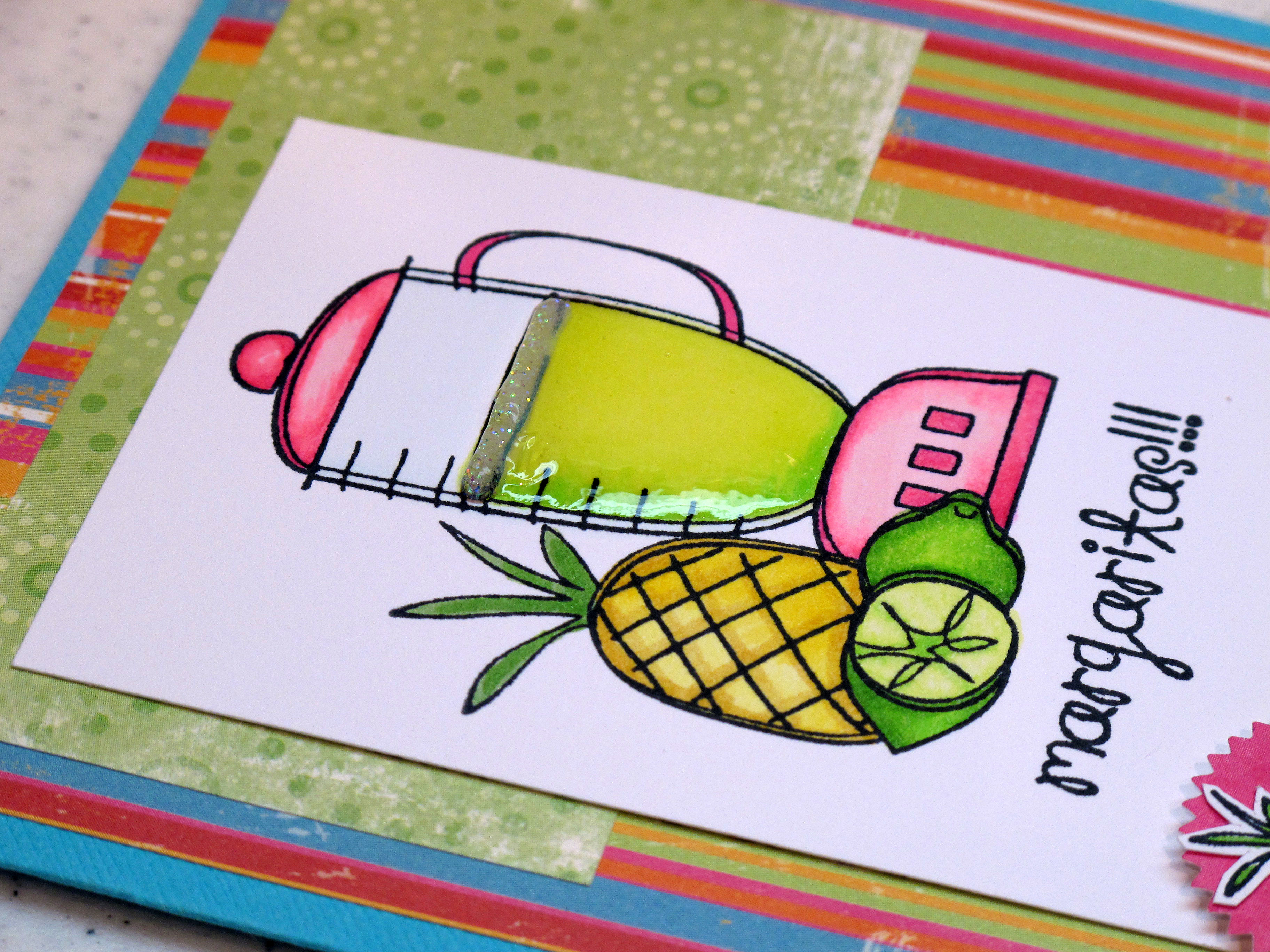
    I used my Copic Markers to color everything and then used Judikins Diamond Glaze over the contents of the blender to make it look shiny and 3-dimensional. I also added a ribbon of glitter to the top.

    IMG_1121

    Who wouldn't love a hot pink blender like this???? 

    IMG_1123 

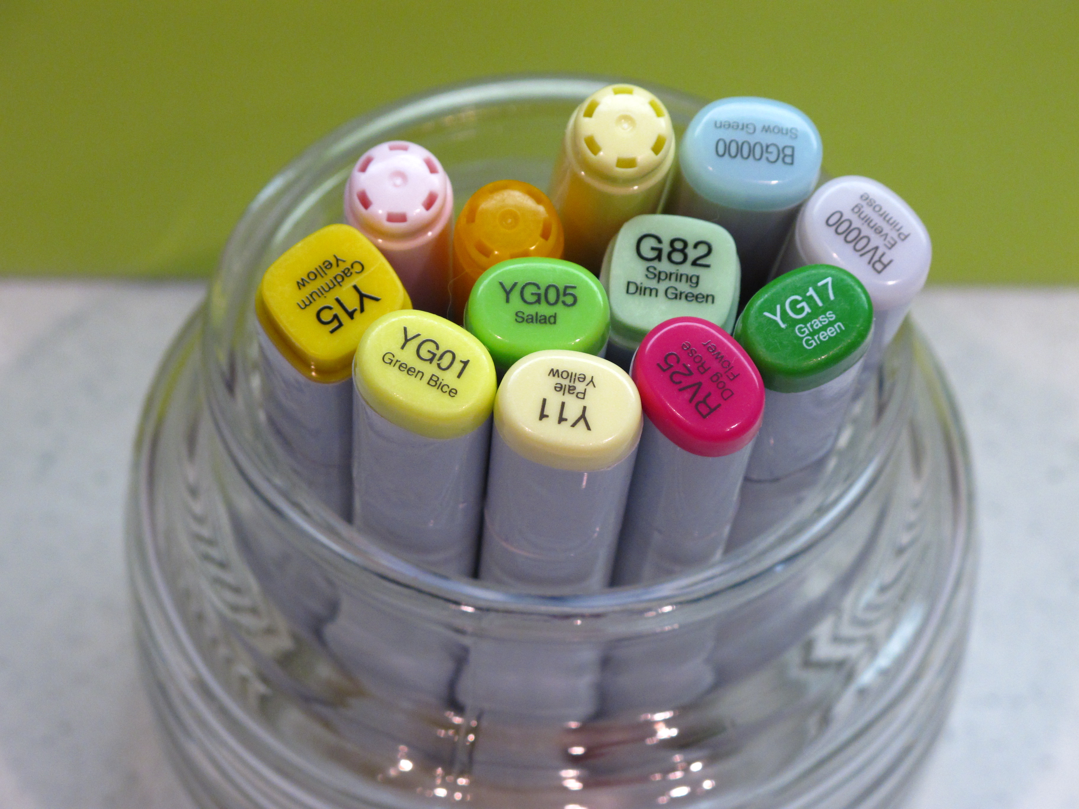
    My color pallete:

    IMG_1112
    Another view… Don't be afraid to make your own embellishments! I didn't have anything that I thought would work for the accent, so I made my own. Colored and cut out another part of the stamp set and popped it up with some double sided foam tape. Oh..and some glitter too.

    IMG_1125 

    Hope this made your Monday a bit brighter. Have a good week!

  • Since you asked…What are Copics?!

    Hi There and Happy Saturday to everyone! We are immersed in March Madness at our house since Cal is in the dance this year and we won our first round game! Woot woot! BUT….we have to play Duke tomorrow – the #1 seed in our bracket. I have a glimmer of hope – because this is the time when anything can happen! Right? Okay, enough basketball talk.

    Over the past few weeks I have had several people ask me "What's the dealio with the Copics?" I thought I would take some time today to give a brief run down on Copic Markers. First of all – I love my markers and would save them in case of fire or earthquake. I'm attached. For life. Using Copics has improved the quality of my work by leaps and bounds. I have been a stamper for 16 years and had always used colored pencils or watercolor pencils up until I discovered Copics. Now they are my weapon of choice.

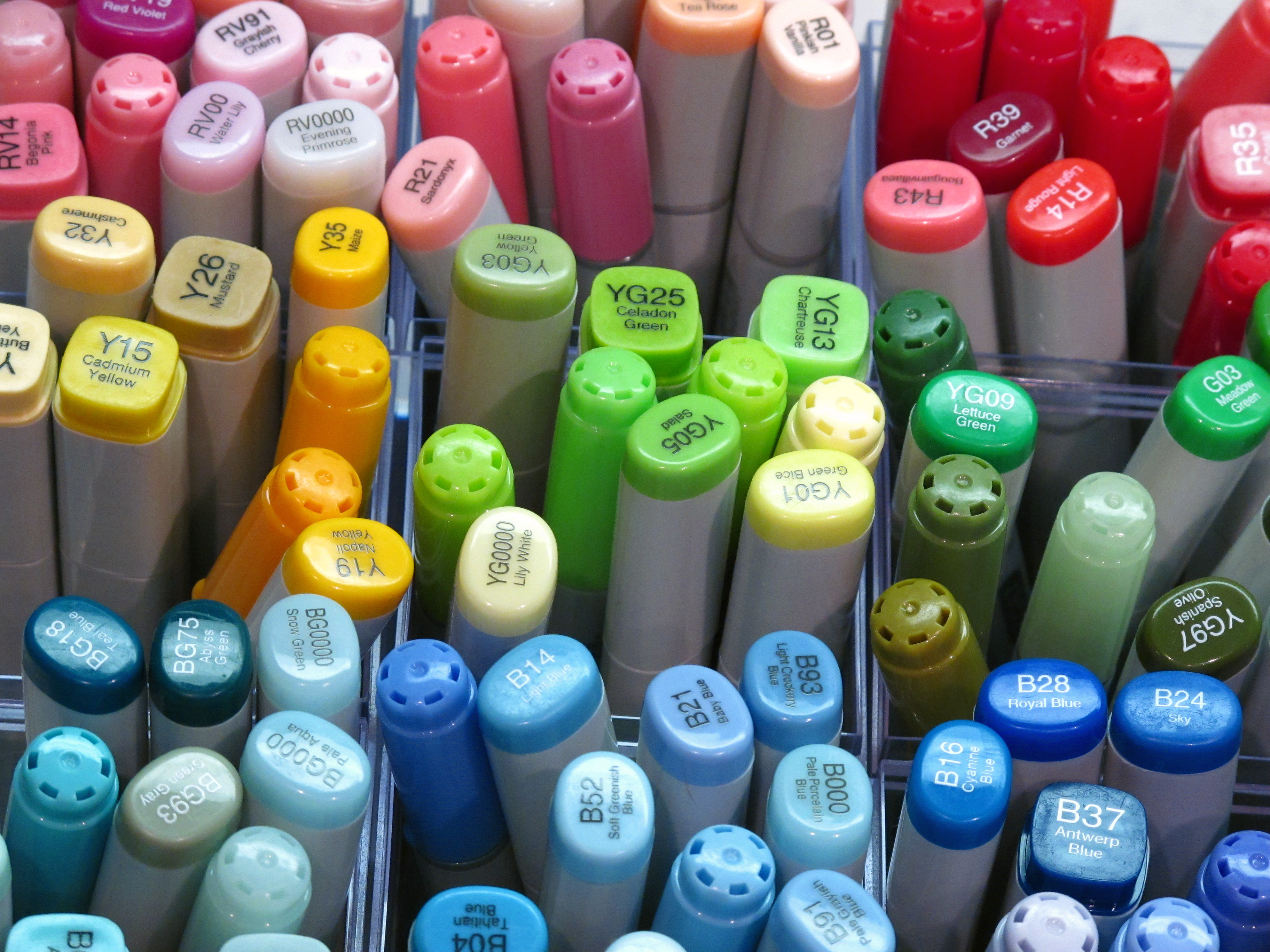
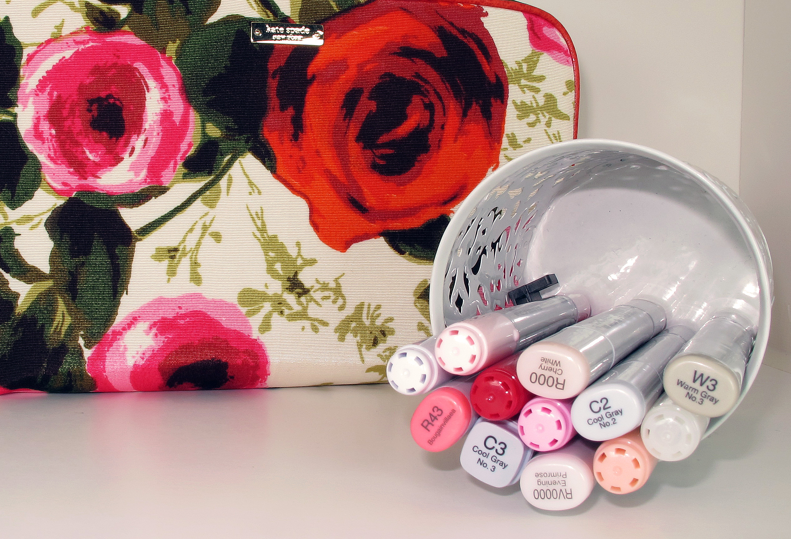
    This is my personal stash – so far –

    IMG_1074

    Copic Markers are alcohol based art markers from Japan. The Manga Comic Book and Anime artists use them for their incredible images. Do a google image search for Manga and you can see some of the amazing work they do! With markers! More and more local art stores and stamp stores are starting to carry them. They average about $5.50 each. They come in three different shapes with different tips. I prefer the oval sketch markers which have a brush tip on one end and a highlighter type tip on the other end.

    Copic Markers come in 350 colors. Yes, I said 350. (gasp). That is the best part! This makes it possible to blend 5-6 different shades of the same color together to get those real-looking results. The markers are labeled with a color name but also with color numbers to allow you to select the same color family for blending.

    IMG_1075 

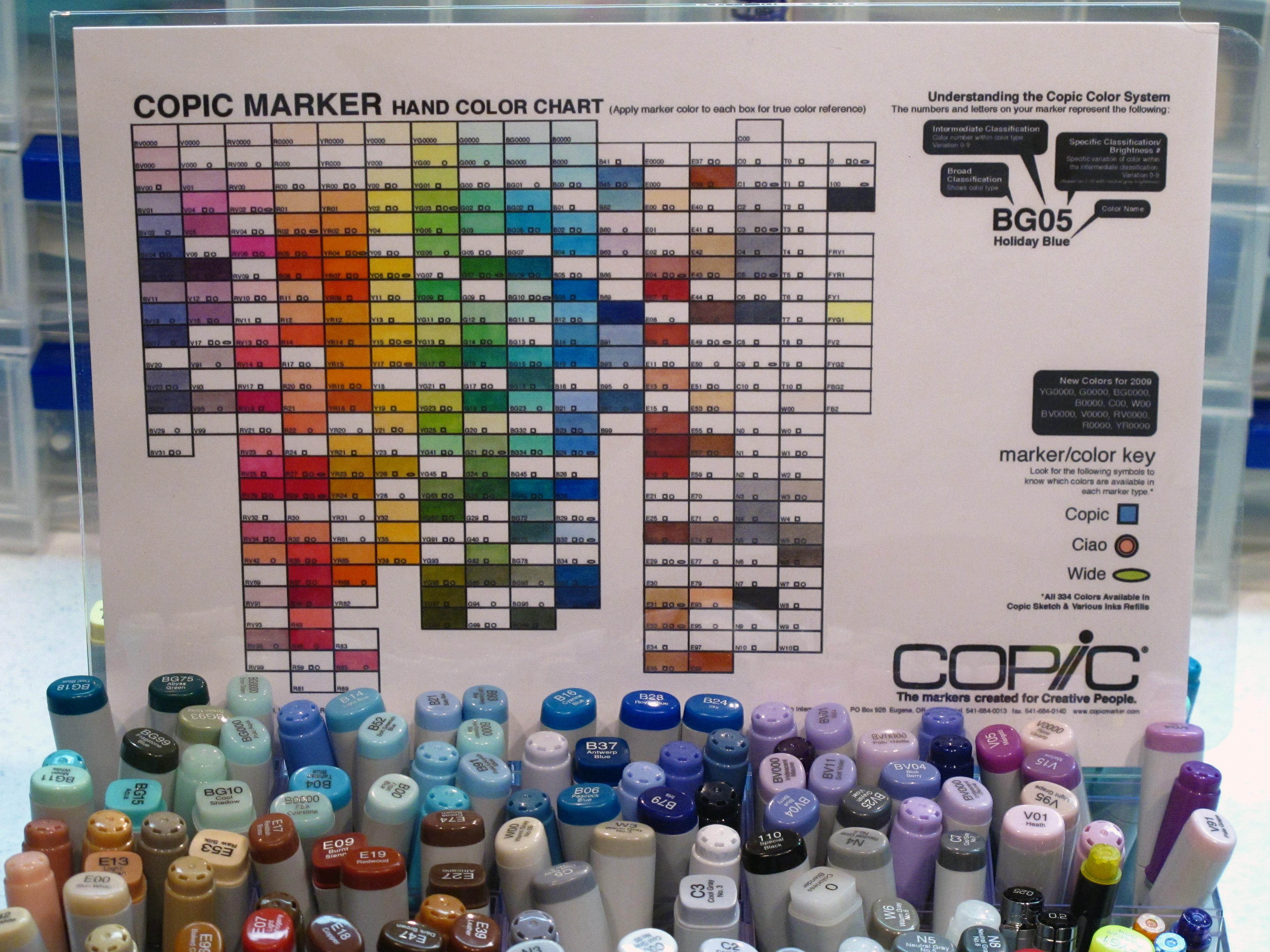
    I have a color chart that I use to help match patterned paper for my card projects. It's easier than trying to guess with my eye. I copied my chart onto the kind of paper I color with the most so that I know ahead of time what I will get. I then can hold the patterned paper up to the chart and see exactly what shade matches.

    IMG_1076
    When I color something, I use a minimum of three shades of the same color. A light, medium and dark shade. Copics also have a colorless blender pen which acts like an eraser of sorts in case you need to lift color off or if you make a mistake. It takes a lot of practice but I believe the results and the enjoyment are worth it!

    If you happen to live in Northern California and are interested – I am teaching Copic Marker classes at my home the weekend of May 1st and 2nd. Email me and let me know if you would like an informational flyer and I'll get one to you.

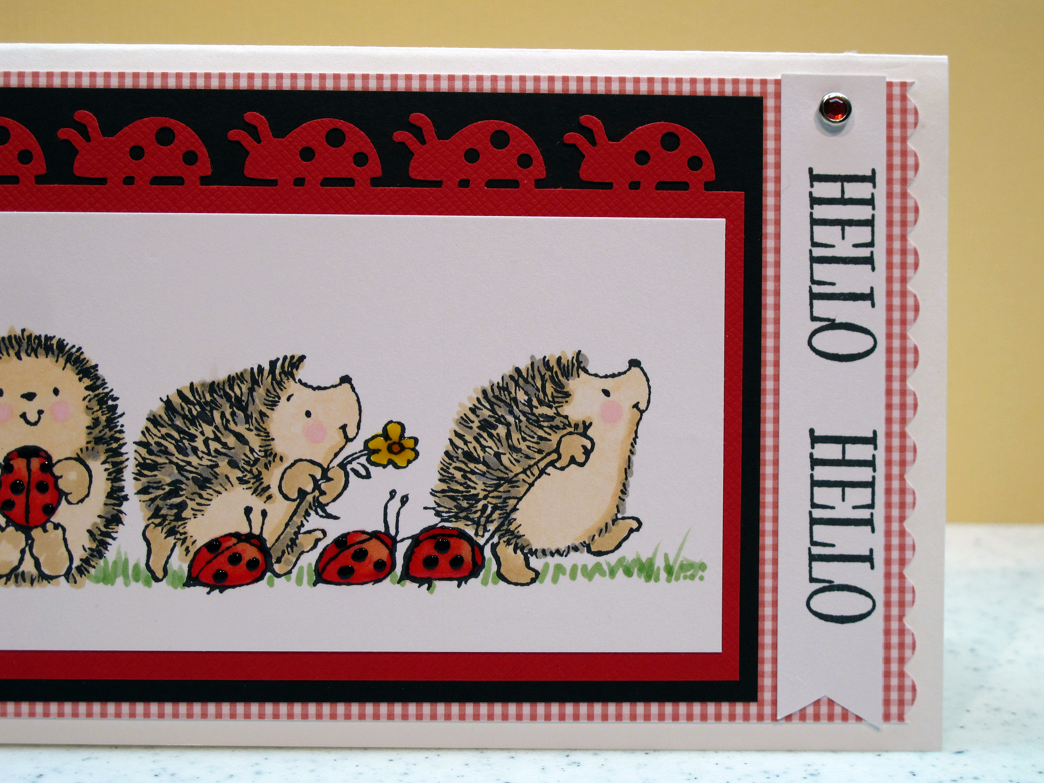
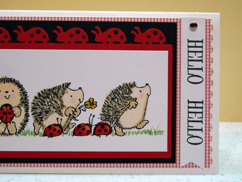
    So, I had to make a card today and I thought this cute hedgie image from Penny Black would be a good one to use to illustrate coloring tips.

    IMG_0984

    I used warm grey, cool grey, browns, and tans to make the hedgie 'fur' on top. Their faces and tummies are with a very very light red and some pink for their cheeks. The ladybugs are actually colored with two shades of red and a pink. The grass was not in the picture/stamp but I thought they needed to be grounded. I used three shades of green and drew it in. This is much easier than it sounds – really.
    IMG_0985

    Yeah, I bought the Martha Stewart Ladybug edger punch…..you know I did…. After the ladybugs were colored, I went back with a clear gel pen to make them shiny. Then, I went back over the dots with a black gel pen to make them pop!

    IMG_0986


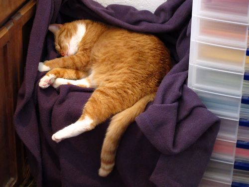
    And this is how BTC (aka Buddy The Cat) spends his Saturday in the craft room. He has his own bed with a heating pad and a fleece from Old Navy. But he's not spoiled. Nah.
    IMG_1064
    I hope I have answered some of your questions today. If you have more, feel free to email me. Have a great weekend everyone!

  • Another Sketch Challenge! #104 from Taylored Expressions…

    In follow up to my post from yesterday…Here is another card I made over the weekend in my crazy quest to enter all these challenges! This one is from Taylored Expressions. Check it out! Enter a card too! This one was good because it is a forum to use lots of different patterned papers…gotta love that! I used a new color combo for me and I love the layout. I may make another one of these…

    Here is my card:

    IMG_0988

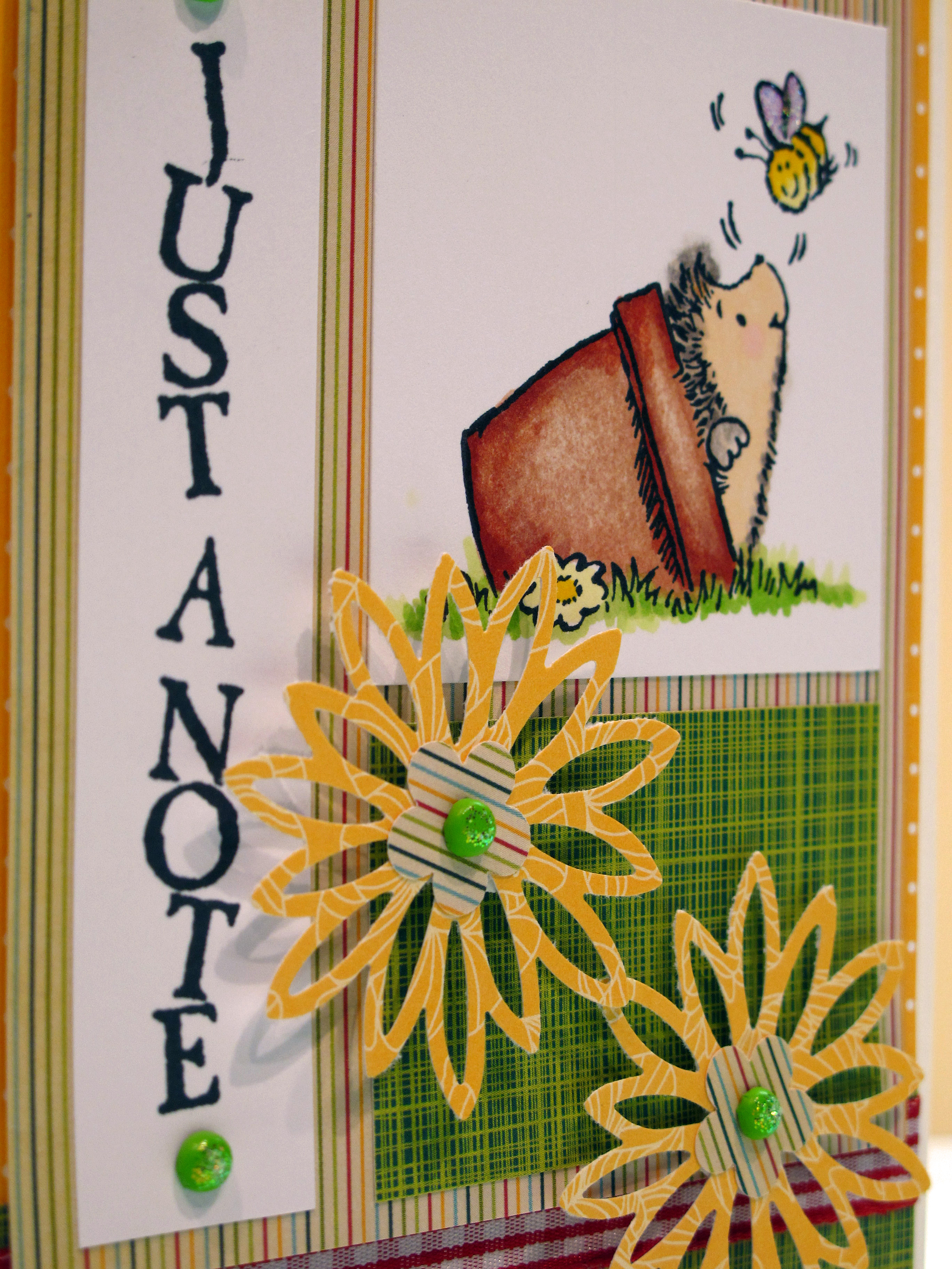
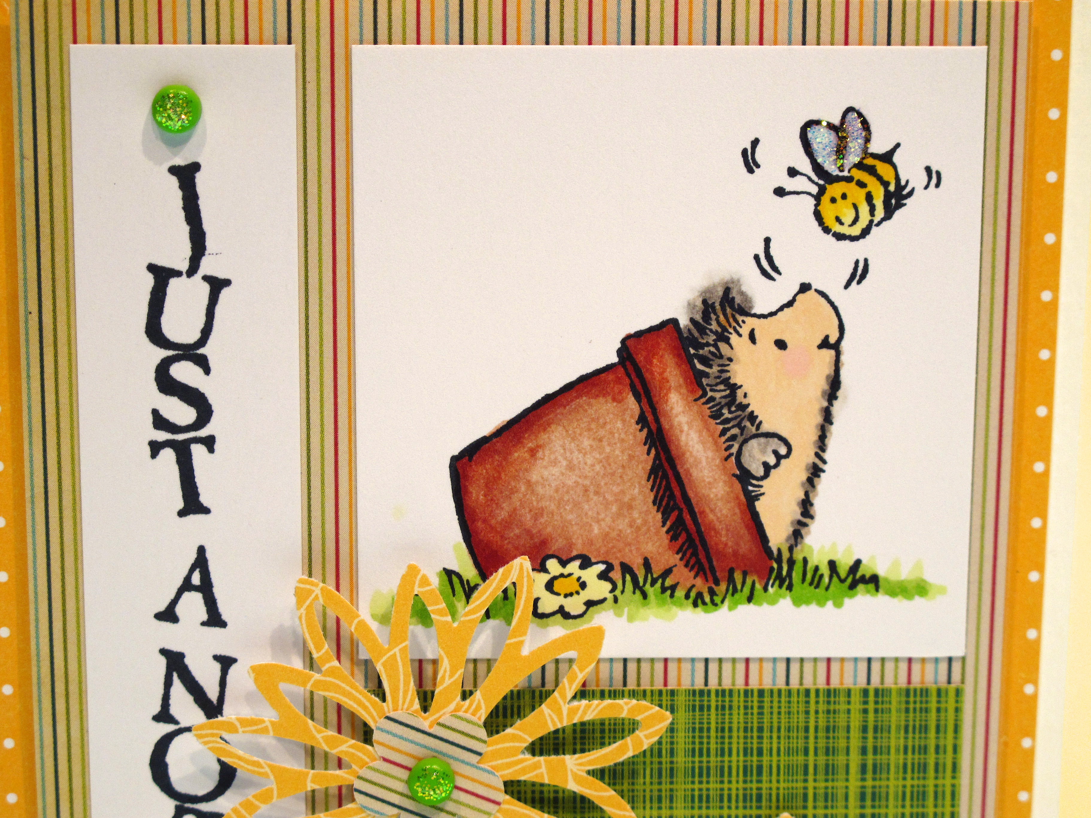
    Sweet little Penny Black hedgie in a pot! Colored with my Copic markers of course! A bit of glitter on the bee wings to make it sparkle.  The flowers are a new Martha Stewart punch…are you sensing a trend? Hahaha. My Martha Stewart punch addiction is a whole blog post by itself!

    IMG_0991

    If you notice, I put a little glitter glue on top of the brads too!

    See how the center of the pot looks faded? You do that by coloring in your entire image and then going back with the blender pen and taking away some of the ink. I used 5-6 colors of brown for the pot and two shades of green for the grass.

    IMG_0989 

    Mixing patterns is okay as long as the scale is similar and the colors all go together. As you can see, there are four patterned papers and a patterned ribbon in this card.

    IMG_0992 

    Here is the sketch recipe image:


    TESC104[1] 

  • It was a stamping frenzy today!

    Here in the old craft room today it was a crafting, stamping freny! I made cards for FIVE card challenges! I will post two tonight (the other one is in the post below this one) and the rest during the week. I had a great time pushing myself to come up with very specific cards to meet the criteria. The one posted here is for Cards Magazine Blog. This is a great  magazine – so I hope they like this one! The theme is simple – make any card with birds…

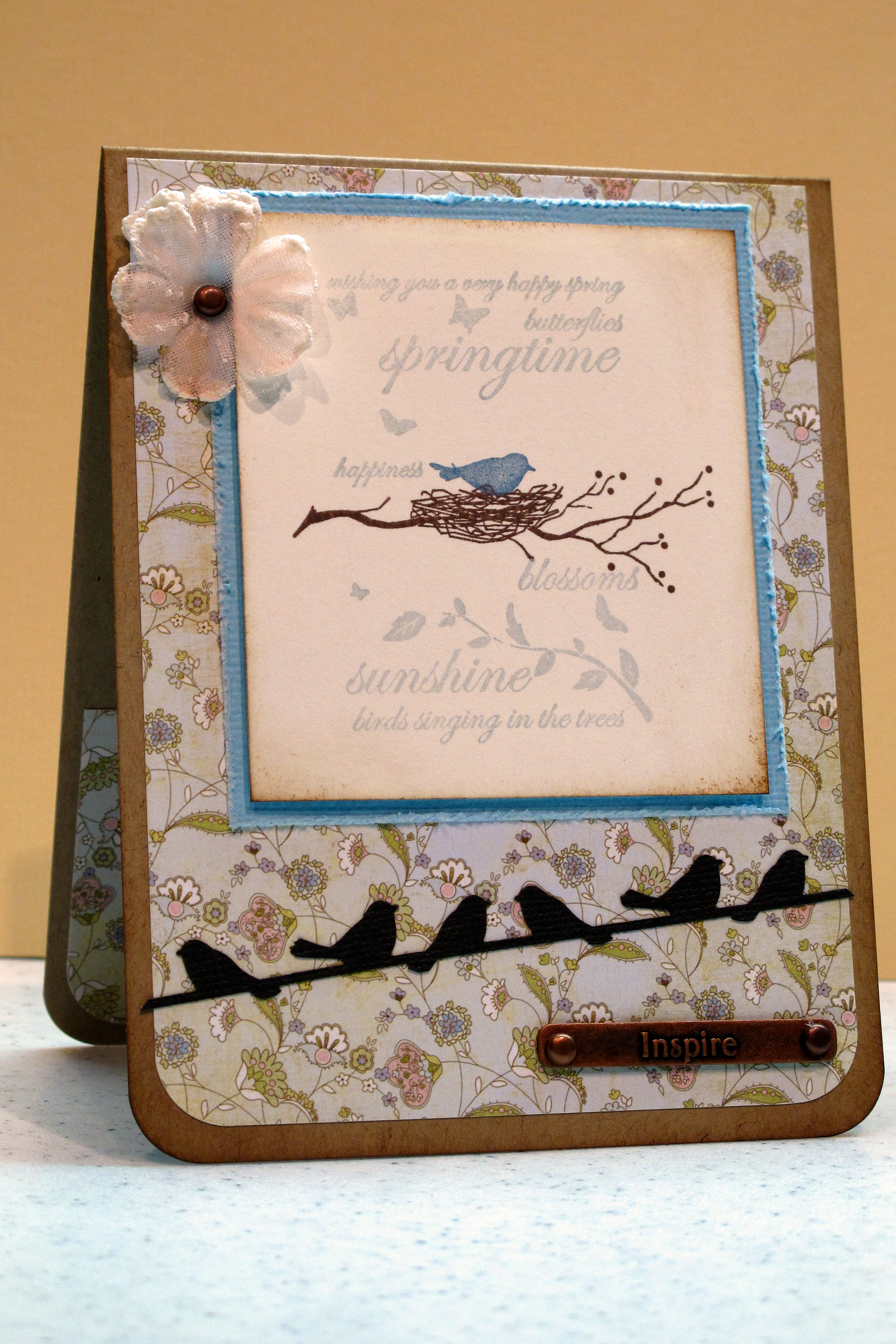
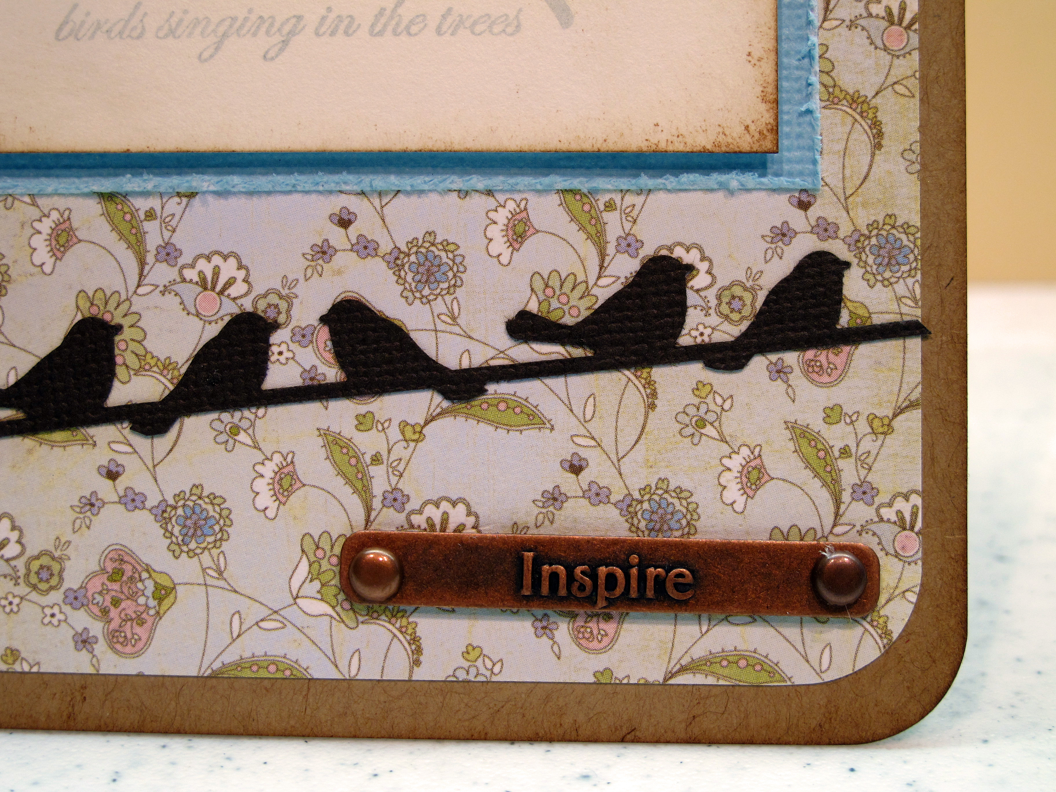
    I have about a gazillion bird stamps – my favorite – so the only hard part was picking what to use. I decided to go my Memory Box stamps and use soft spring colors. I used my new Martha Stewart Birds on a Wire punch too. OMG. Love it!

    Here is the card:

    IMG_0976

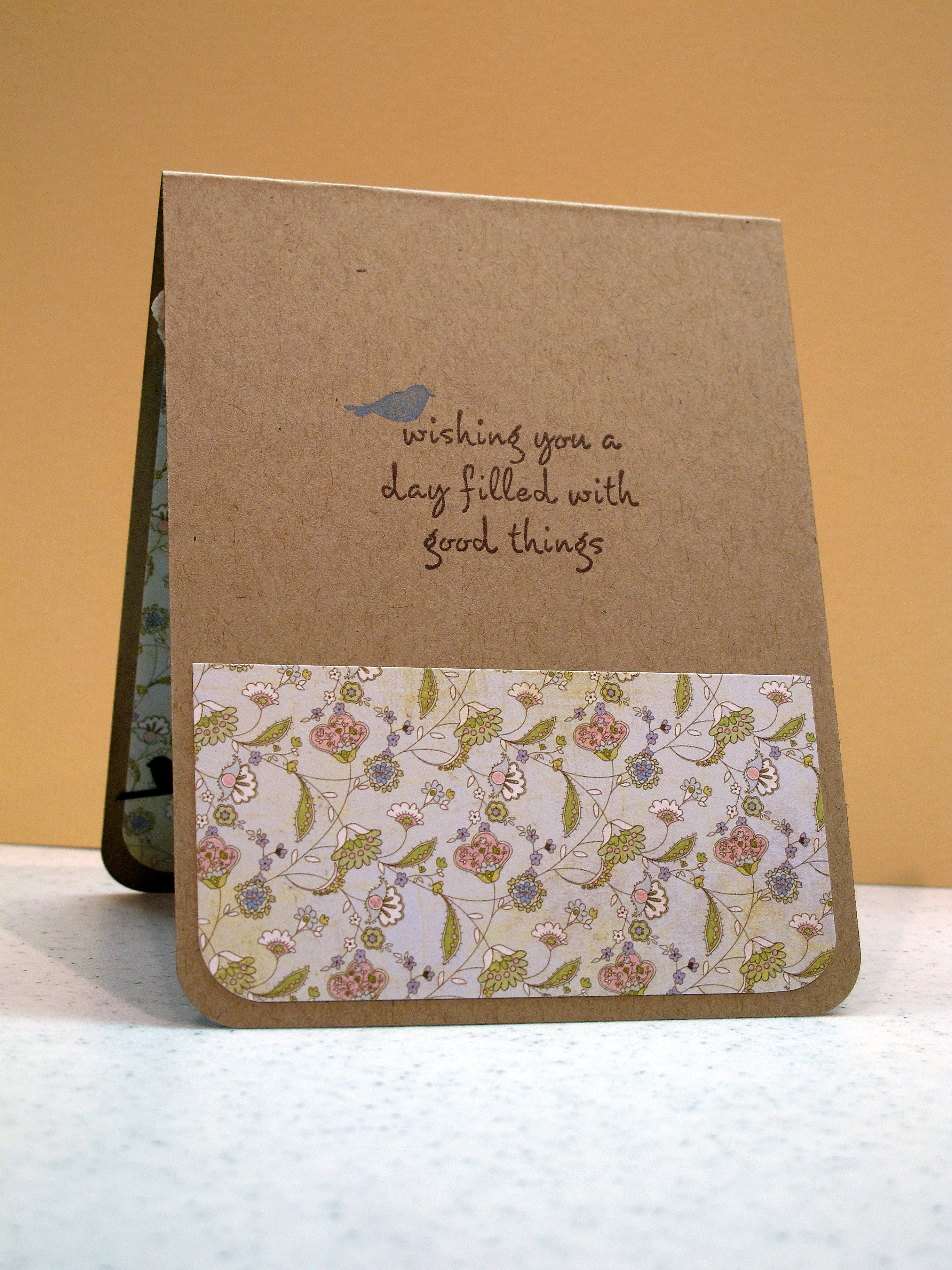
    The Inside:

    IMG_0977

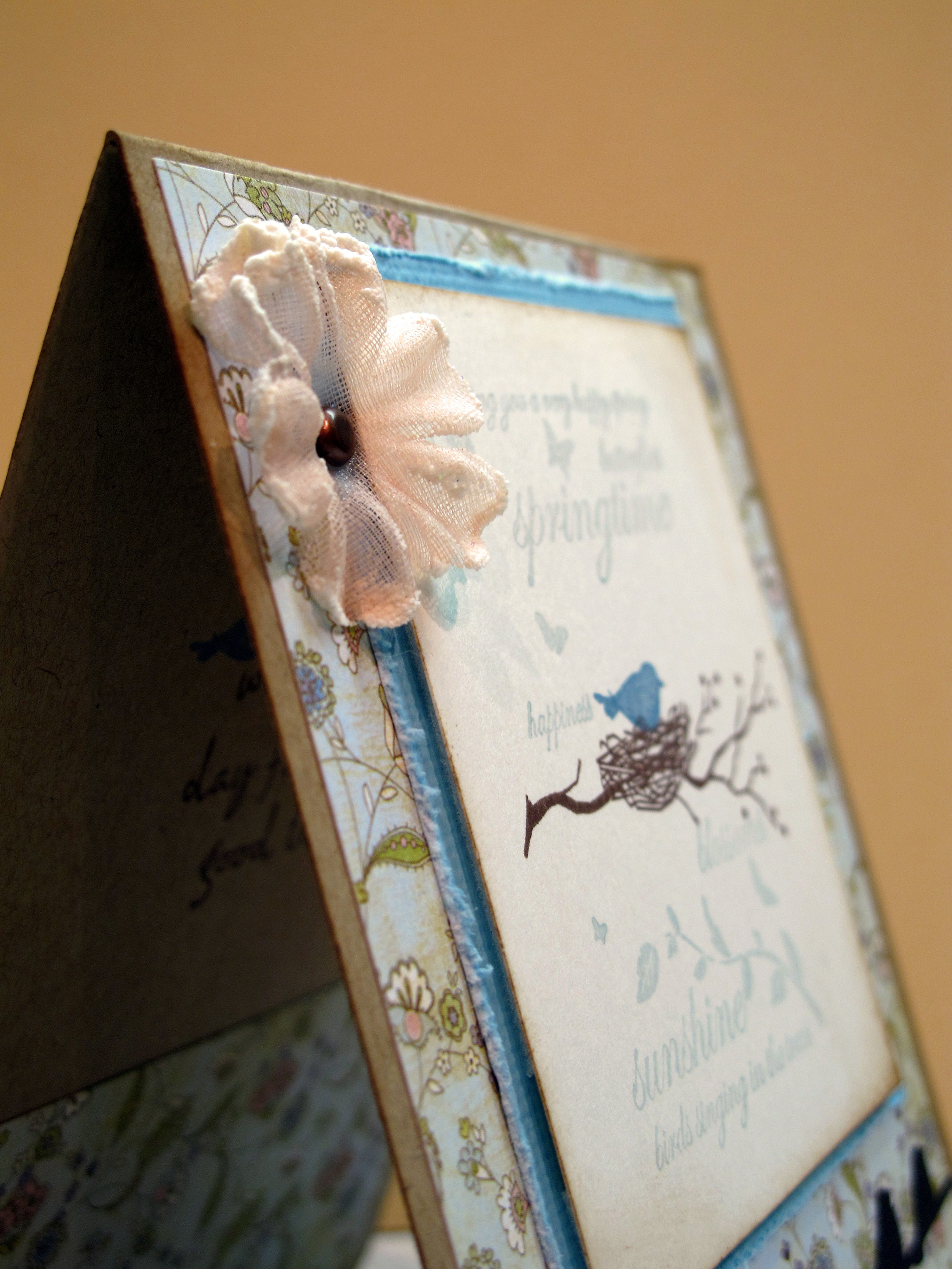
    Close up:

     IMG_0980


     IMG_0978

    The birds are punched out of dark brown paper –
    it's photographing really dark here:

     IMG_0982 
     

    IMG_0981


    This is not related to stamping, but I had to share anyway! I was at my friend Stephanie's paper/stamp store (Paper Garden) Friday night and when I walked outside, this is what I saw!!! It had rained all day and this was the sunset after the clearing storm. AMAZING, don't ya think?  I've never seen a parking lot look so pretty.

    IMG_0913

    Have a great week ahead. Oh, by the way, I want my hour back! 
  • Get Sketchy Card Challenge #29!

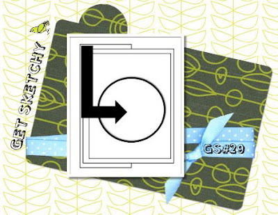
    I found this cool website called Get Sketchy that has card challenges based on design layouts. The way this works is that the blog gives you a layout, or sketch, and you make it your own. I decided to give this one a go! Here is the sketch:


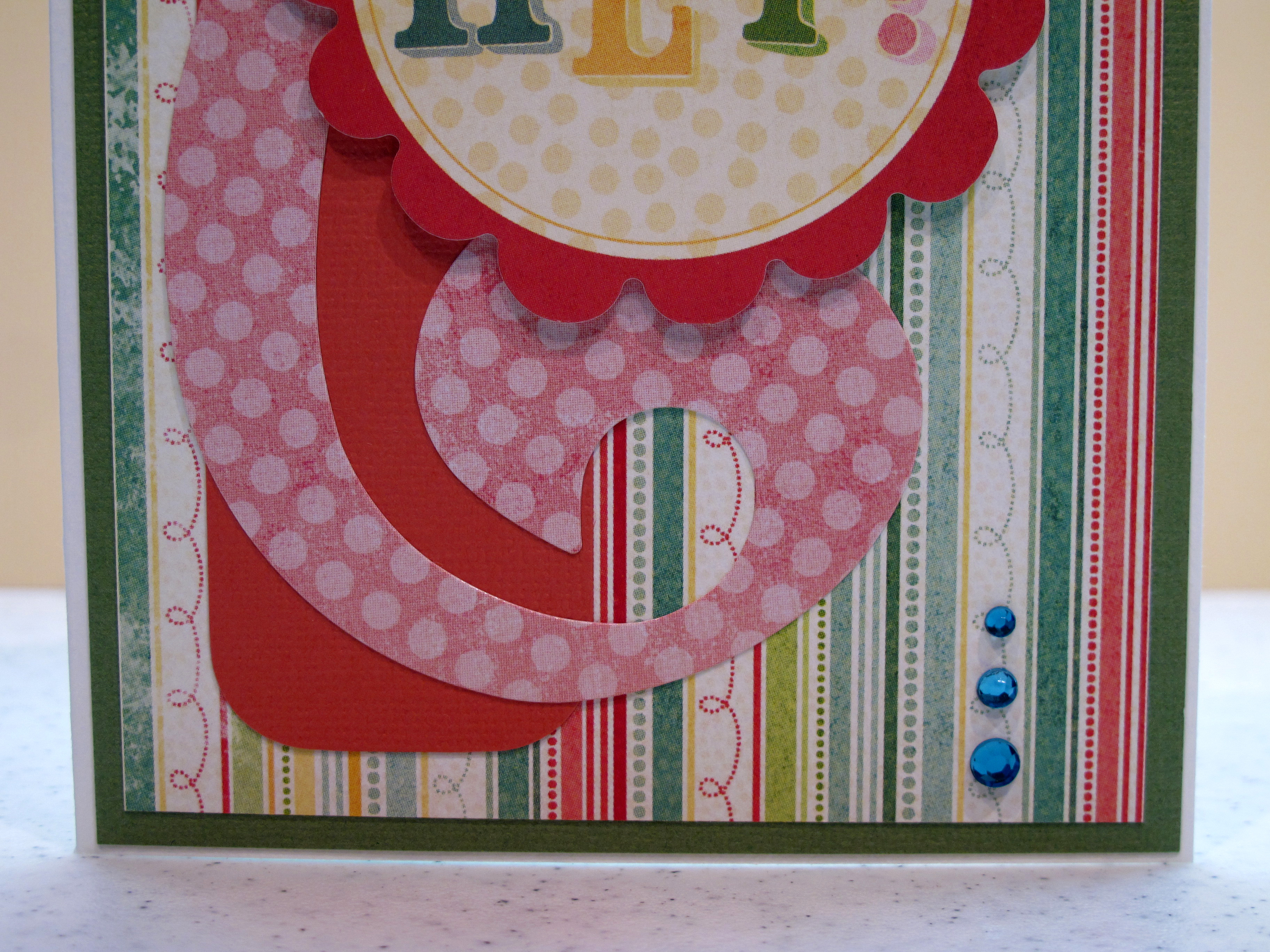
    And here is my take on it:

    IMG_0996


     IMG_0995

    Thanks for stopping by to see my cards today!  

  • Pretty Green Toile – Tuesday Trigger

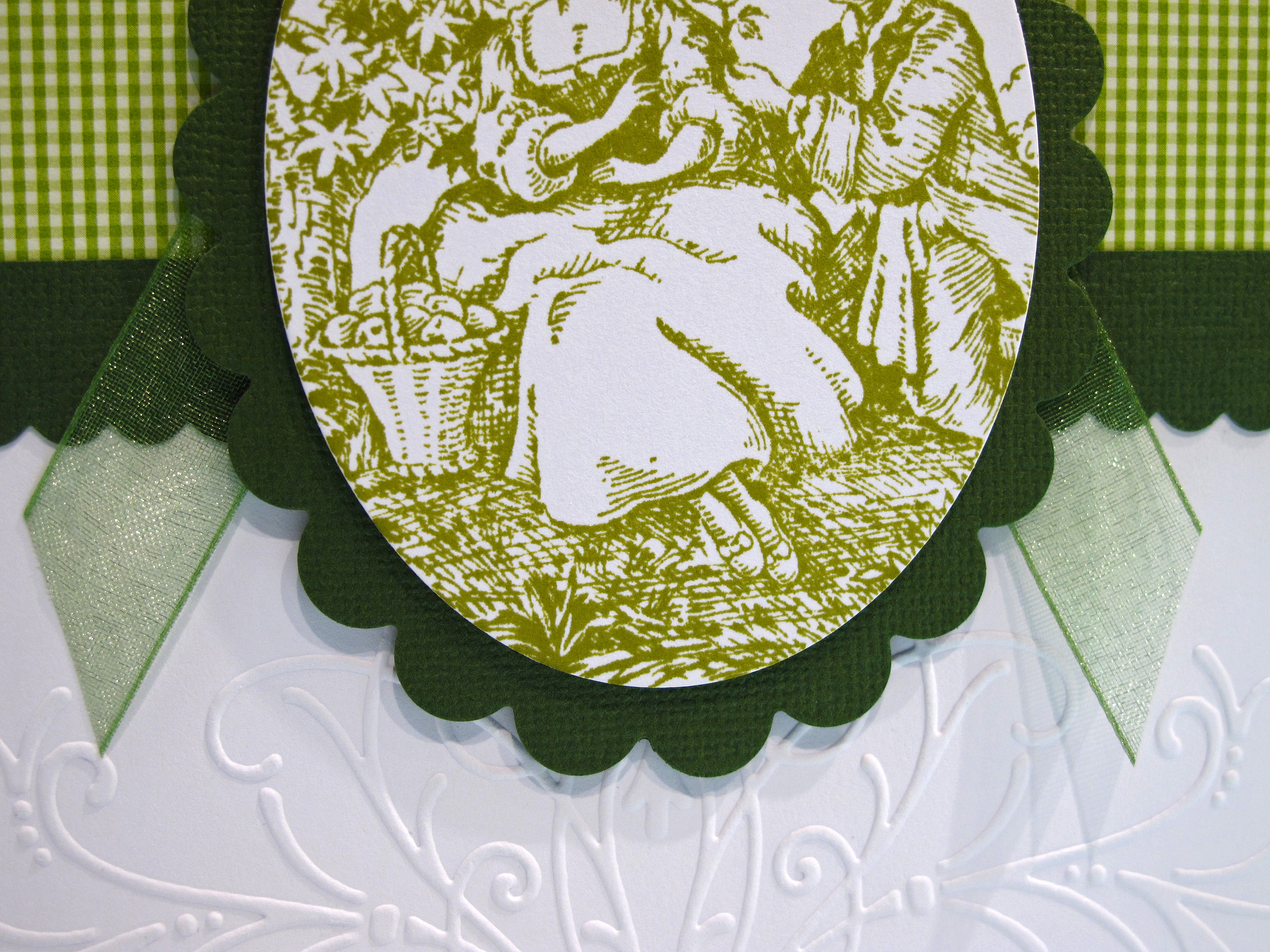
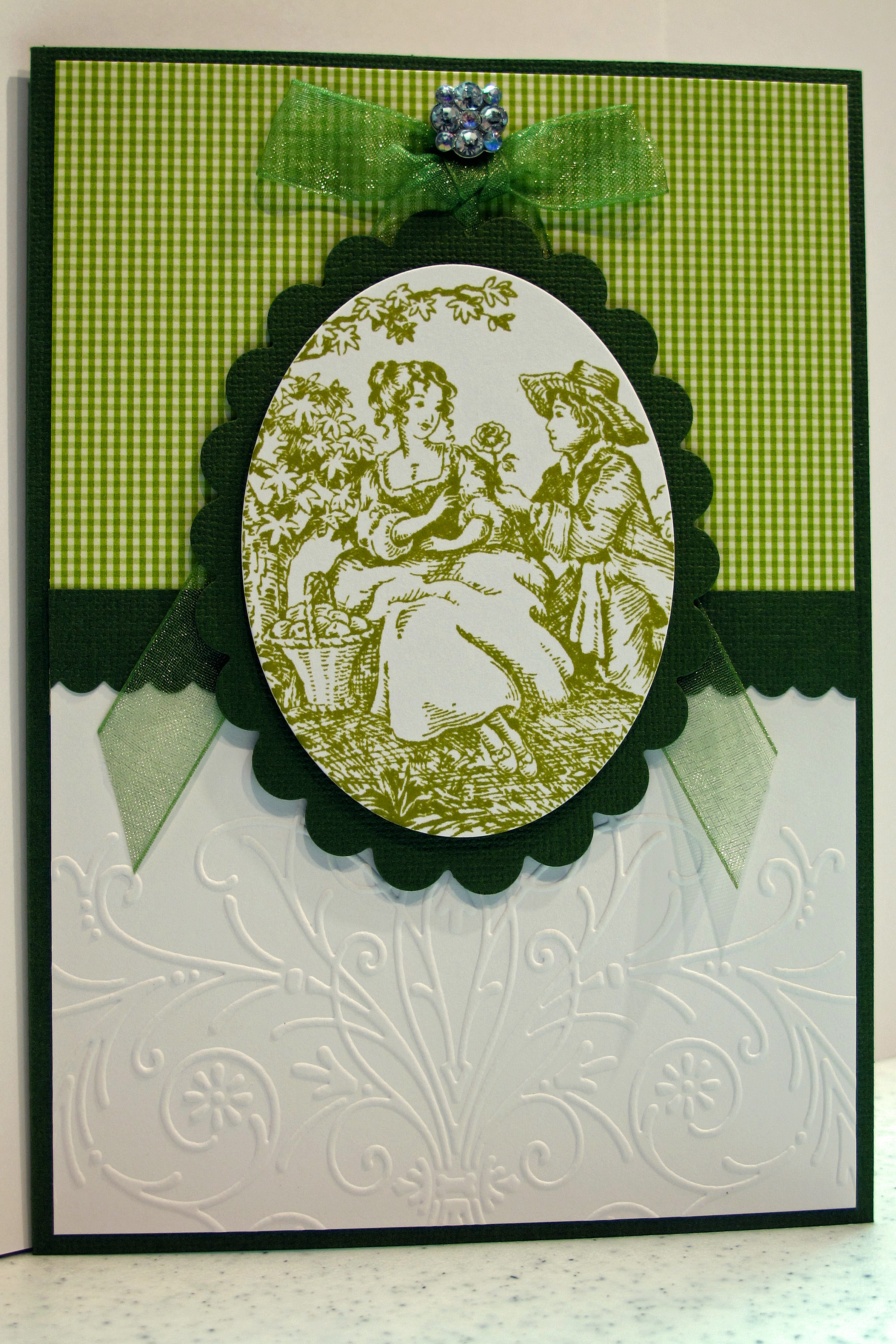
    I'm throwing my hat in the ring for another Tuesday Trigger Card contest over at Moxie Fab World. One of my favorite colors is green so I knew I had to make a card. I immediately remembered I had this old stamp of a toile scene. It took me a while to dig it out of the stamp cupboards…but I found it! I used my nestabilities to make the pretty ovals and I used a cuttlebug folder to impress the white part of the card base. Add a little bling and voila!

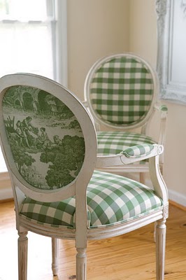
    The trigger image is so pretty – here it is:

    GreenToileChairs 

    Here is my take on it:

    IMG_0842


    IMG_0845


    IMG_0840 


    IMG_0847 
    Okay, so I have to tell you that I cut out that white oval and then got the scene in there on the first try!! Can you believe it? I don't think I could have planned it better. I might have to use that stamp to make some other stuff. I'm thinking it would look nice in a pretty brick red color. 

    On a side note – here is a pretty picture I snapped in the parking lot of the gas station today at lunch! Gotta keep your camera with you at all times! Happy Friday everyone and have a great weekend.

    IMG_0887
    Here is a little shout out to my sweet pal S.A. who is working on finishing up her Master's Degree in the next couple of months. Good luck! I miss you!

  • Another Tuesday Trigger Challenge Card!

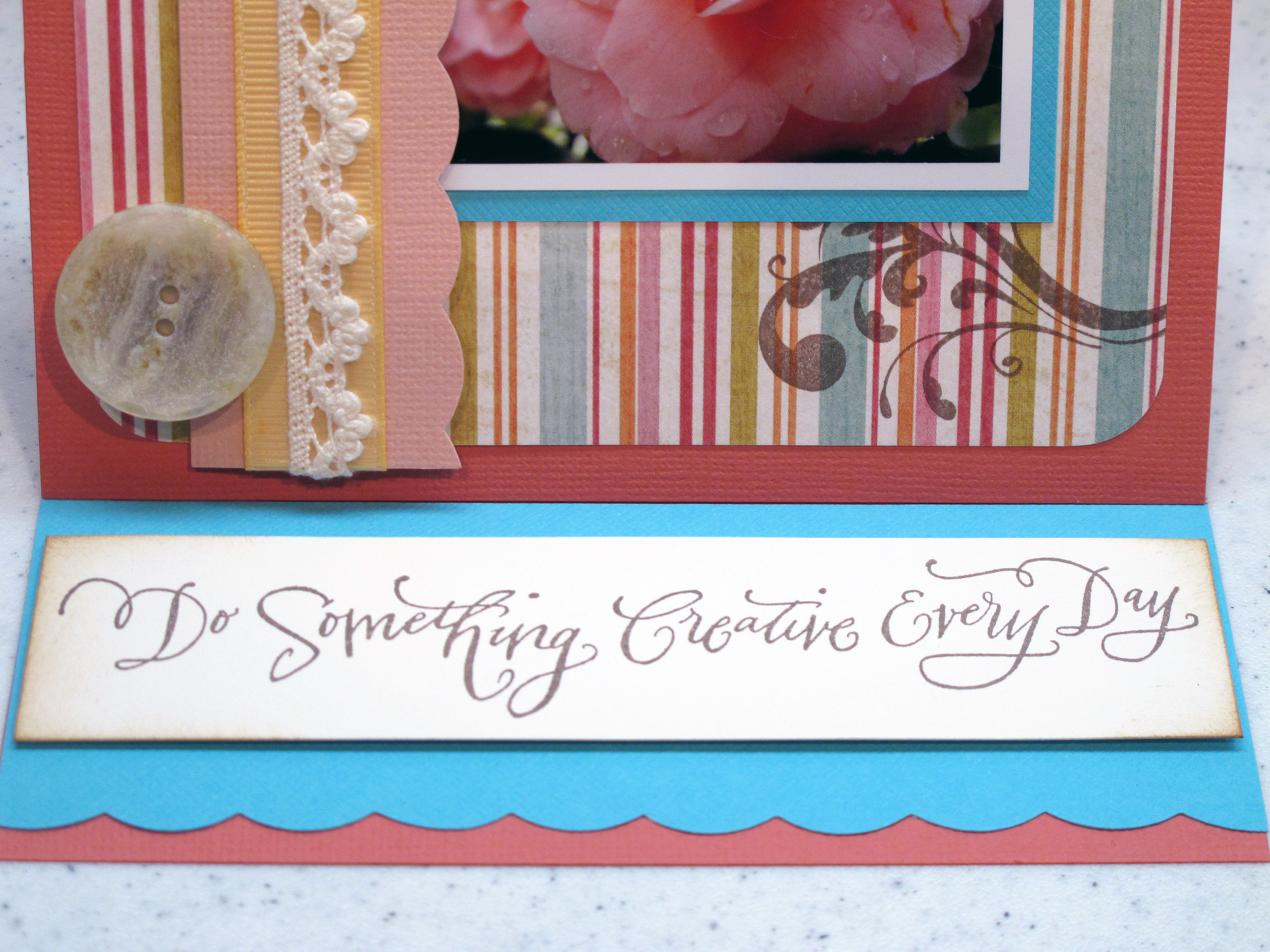
    DO SOMETHING CREATIVE EVERY DAY! I have been trying to live that statement this year. Take a picture, cook something new, make a card or a handmade project…Something creative each day. It has made me a happier person. I carry my camera around with me now. I take the time to sit down and create things I am proud of. I try to help others in their crafty endeavors. It's been wonderful.

    When I saw the Tuesday Trigger image from Moxie Fab this week I gasped – SO gorgeous. I adore that color pallete! Such a beautiful collage of items. Here it is for you to enjoy:

    Aqua_pink_wedding

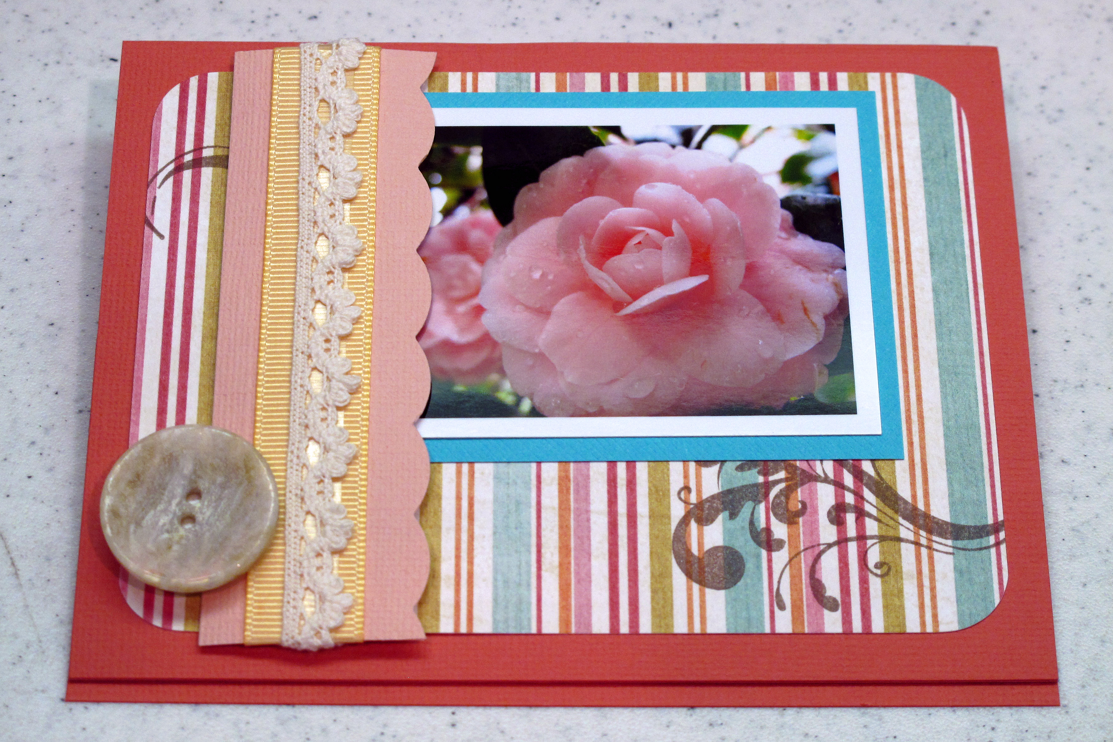
    I mean really, can you stand it? I could have made 50 cards from this inspiration. What caught my eye most was the center image on the right hand side with the pink flowers. I had recently taken a gazillion photos of the most amazing camellias blooming near my work. So, I decided to combine a photograph with my stamping. I hope you like my card!


    IMG_0808_edited-1 
     

    The closed front of the card – yup, another easel card, folks!

    IMG_0812


    IMG_0801 

     IMG_0804


    Card pic

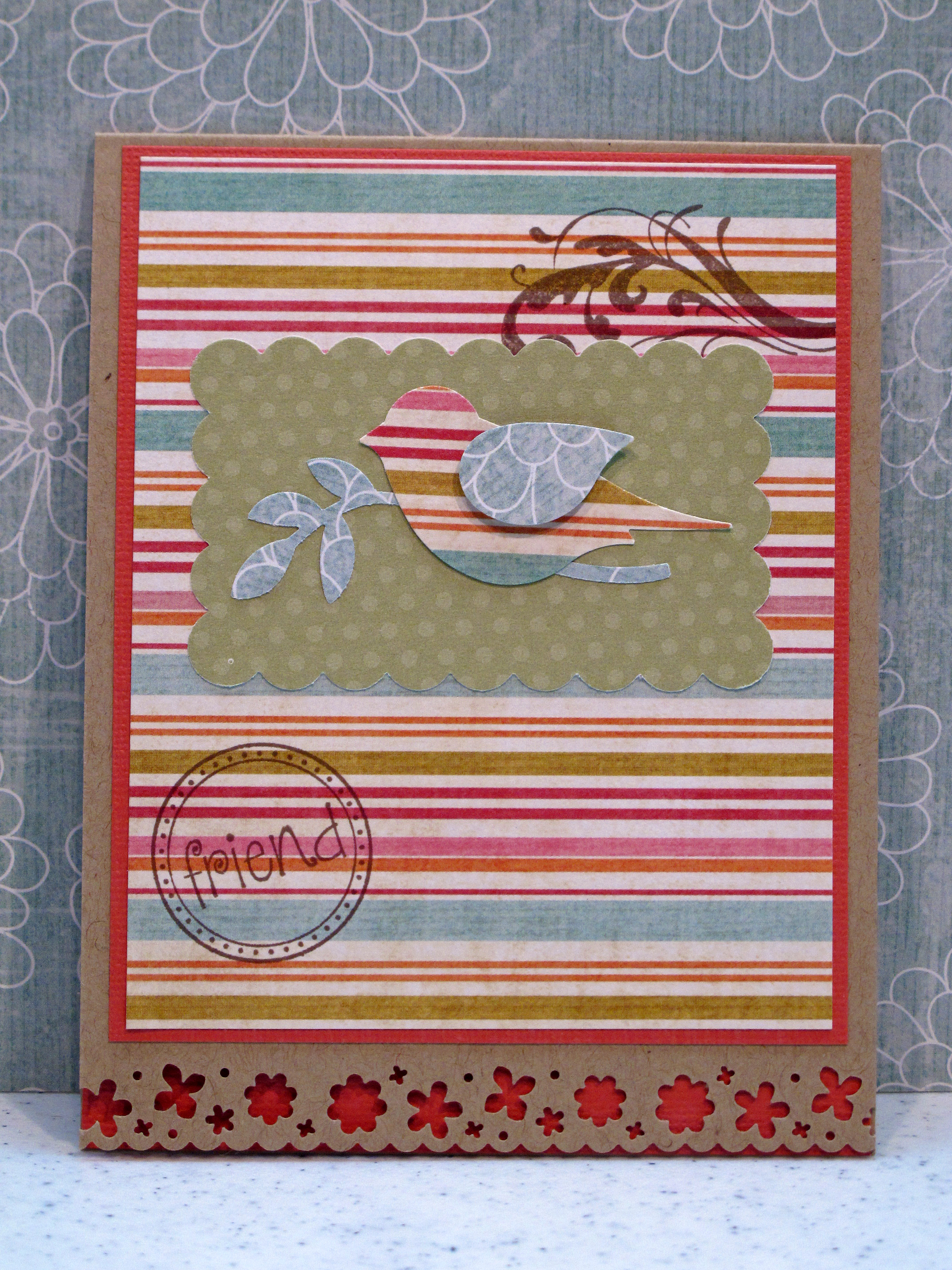
    I had some paper left after finishing my TT card, so I decided to make some more cards with the same color scheme. Here is one I'd like to share with you!

    IMG_0819


    IMG_0820 

    Here are some of the fab women who help me do something creative every day! Love this crazy bunch!

      IMG_0799_edited-1 
    I will do another post, hopefully soon, with all of the pictures from the Camellias blooming. I have some favorites…Have a Creative Day!

  • Love these new Prima flowers!

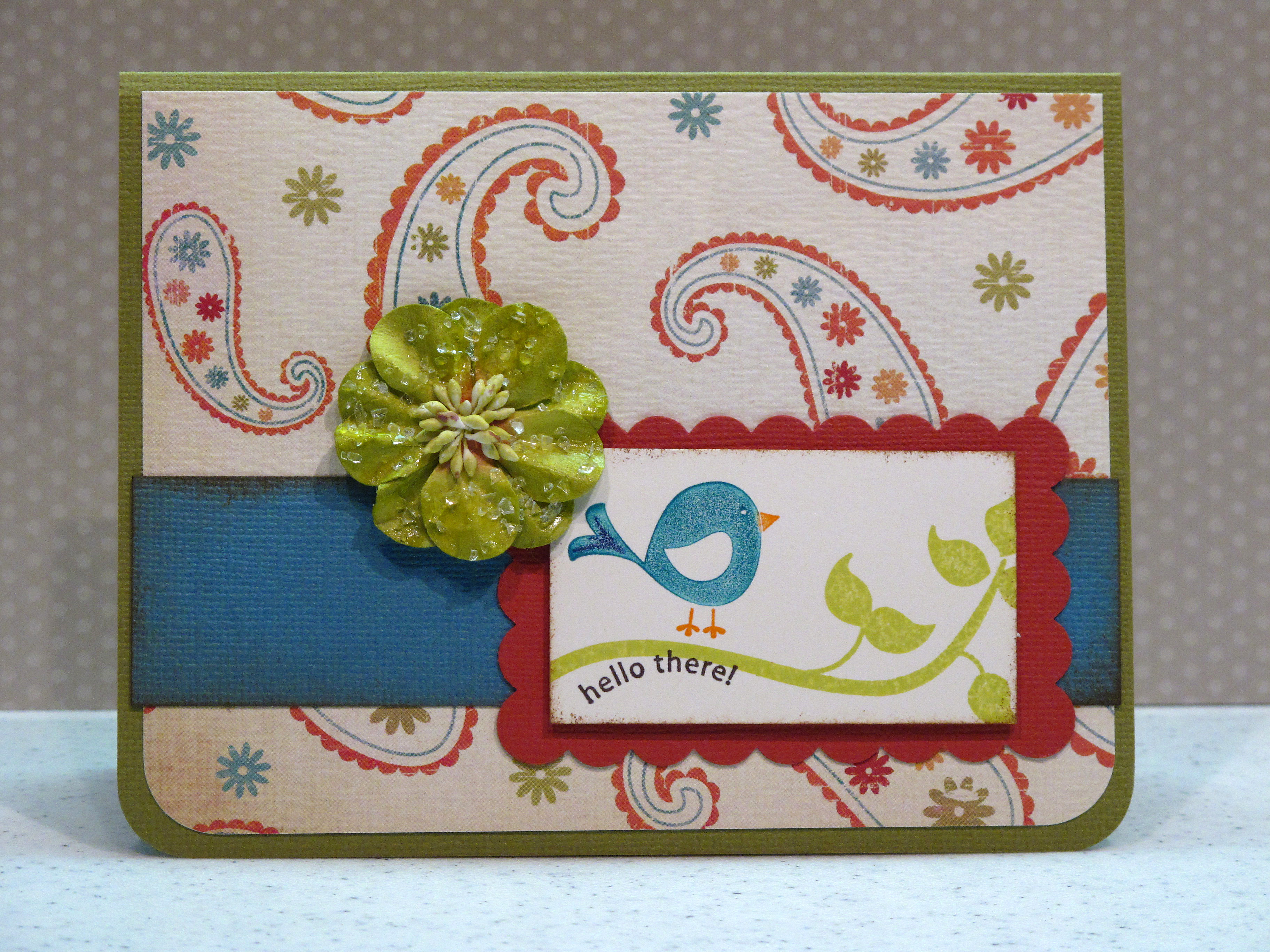
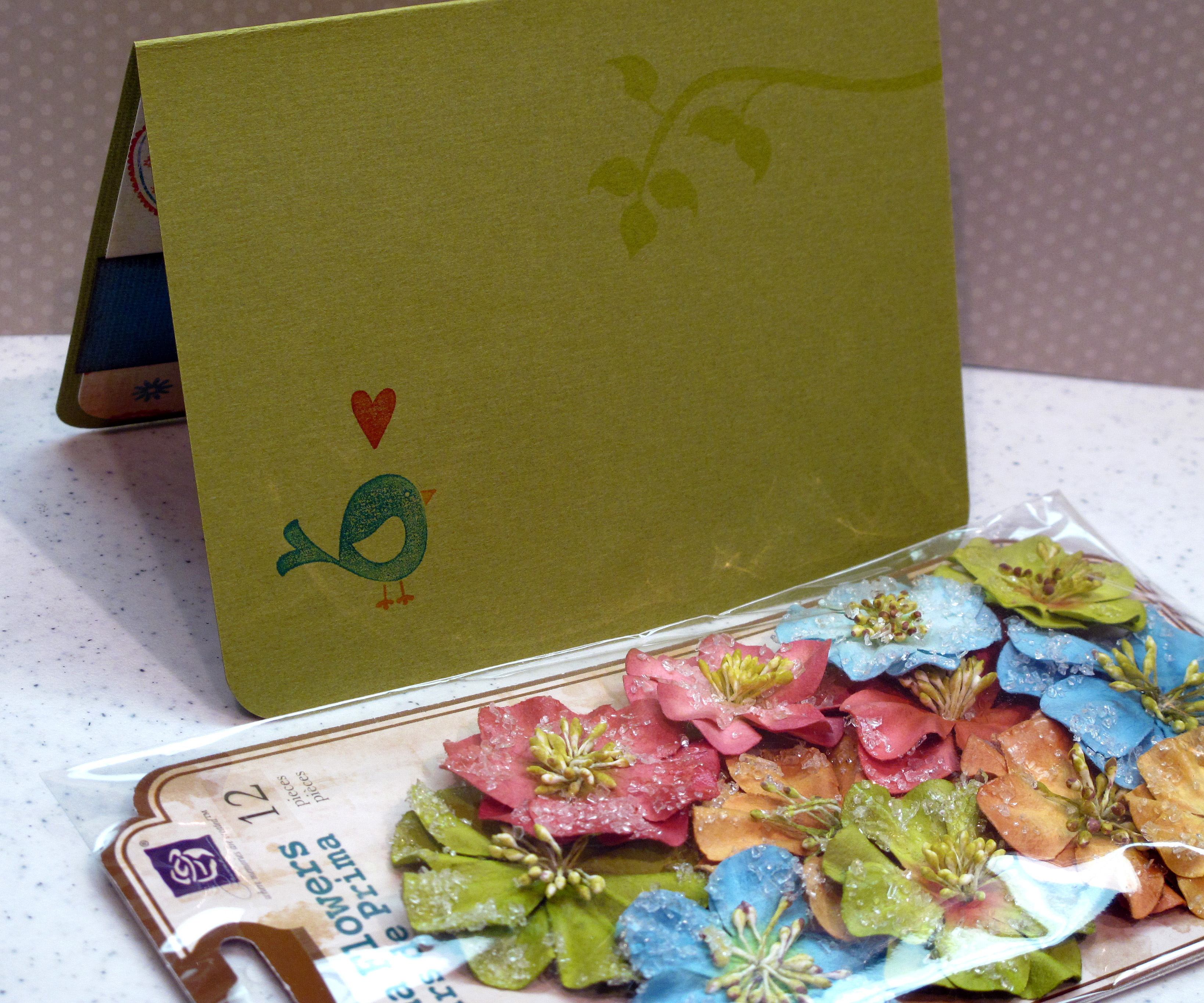
    I got these beautiful Prima flowers at Michael's a while back. I love the muted colors – they are not super bright or pastel – the perfect in between. I made a shabby chic birthday card and a cheery hello card using them. Hope you like them too!

    IMG_0773

    The shabby chic birthday card - made with pretty pink and rose tones. The stamp is from a Stampin' Up set and the border is a Martha Stewart punch. I colored the image with my Copic markers.

    IMG_0774


    IMG_0775 
    Here is the cheery hello card. Stamp set is from Stampin' Up and I used Marvy Markers to color directly on the stamp before stamping it onto the paper. 

    IMG_0778 

    IMG_0779


    IMG_0783


    My lovely photography assistant, NOT helping, by putting his boo-tay directly on top of what I'm trying to take a picture of! He says he is much more gorgeous and photogenic. What do you think?

    IMG_0792


  • Sweet Strawberries…

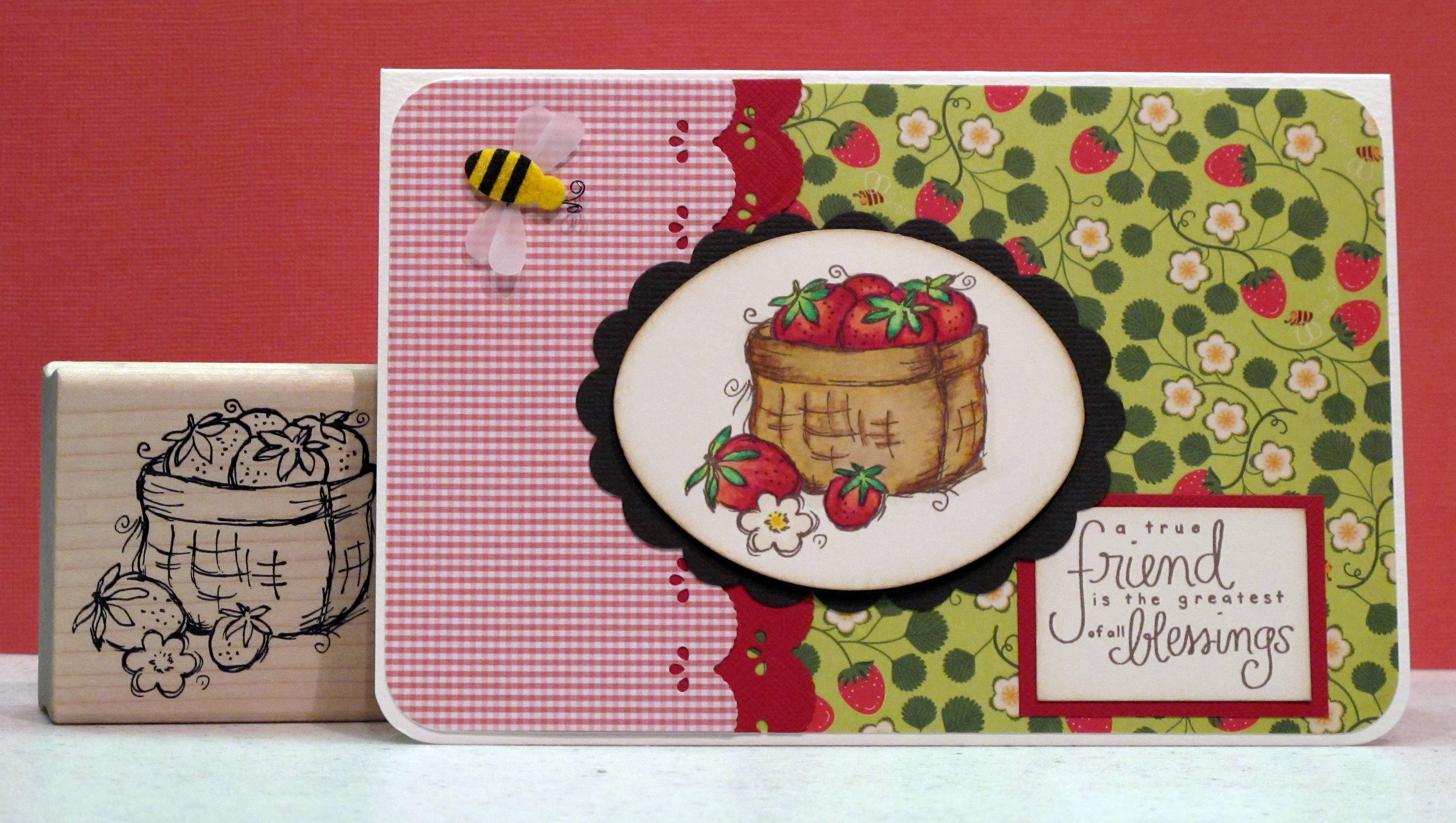
    Okay, so my OBsession with the cute tiny checked paper continues… I made a nice, sweet card using it in red this time. Lovely basket of strawberries image is from Magenta. The saying is from Amuse – another fan favorite! New patterned paper from Cosmo Cricket (I think). I used my Copic markers, of course in three or four shades of brown and gold for the basket and four shades of red and pink for the berries. I had one leftover bee so he could buzz on into the picture.

    IMG_0587

    IMG_0588

    IMG_0590  
    Thanks for stopping by for a looky loo today!

  • Embellish Magazine Challenge – Spring Colors –

    I found a nice challenge on the Embellish Magazine blog – to make a card with some pretty Spring colors - Pink, Peach, Moss Green and Yellow. Here is the idea image:

    VerveCC

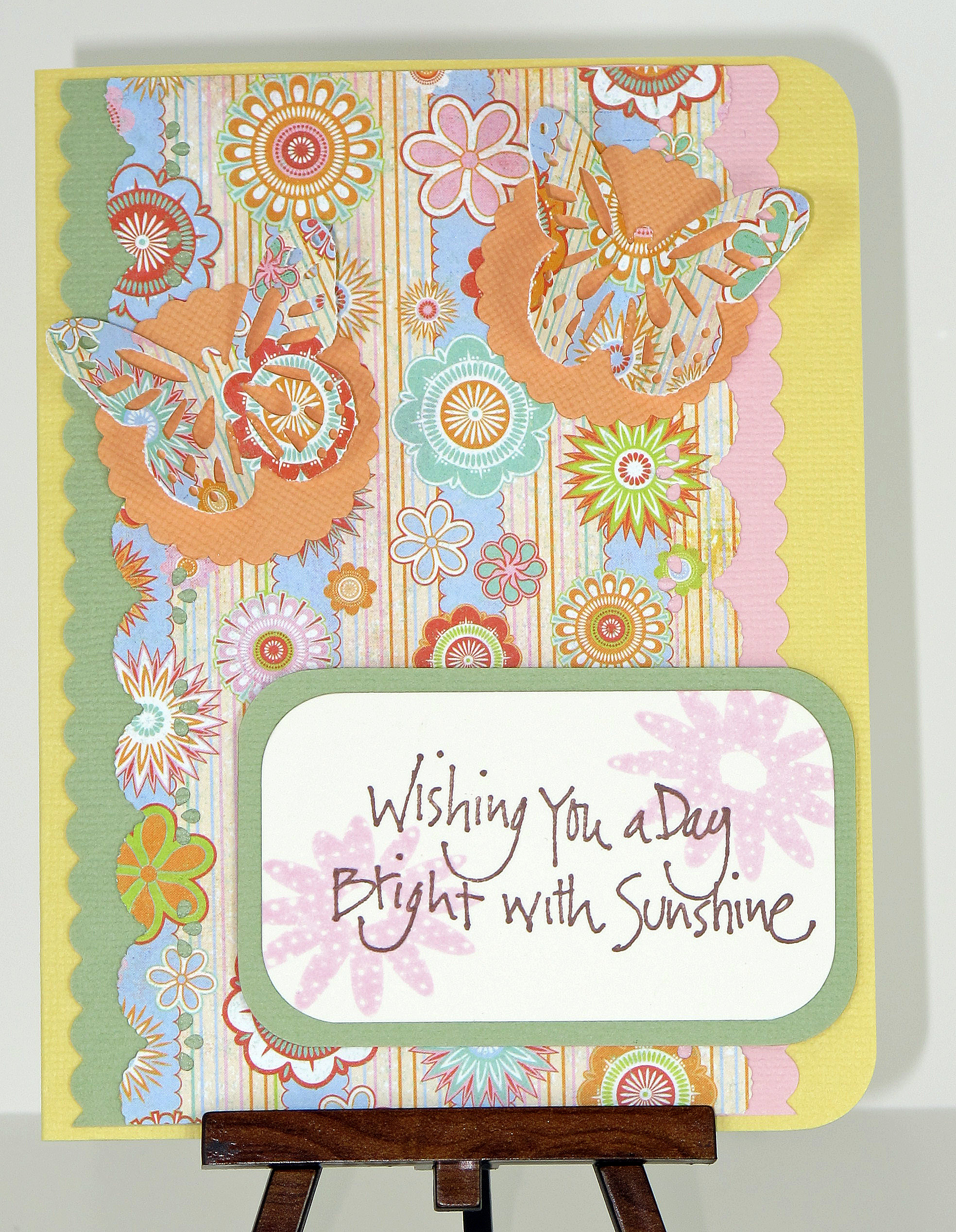
    I really like these colors anyway, so this wasn't a hard card to make. I pulled out some pretty Basic Grey patterned paper, and my trusty Martha Stewart Punches! Bazzill cardstock…Here is my card!

    IMG_0572
    Here is the inside:

    IMG_0579

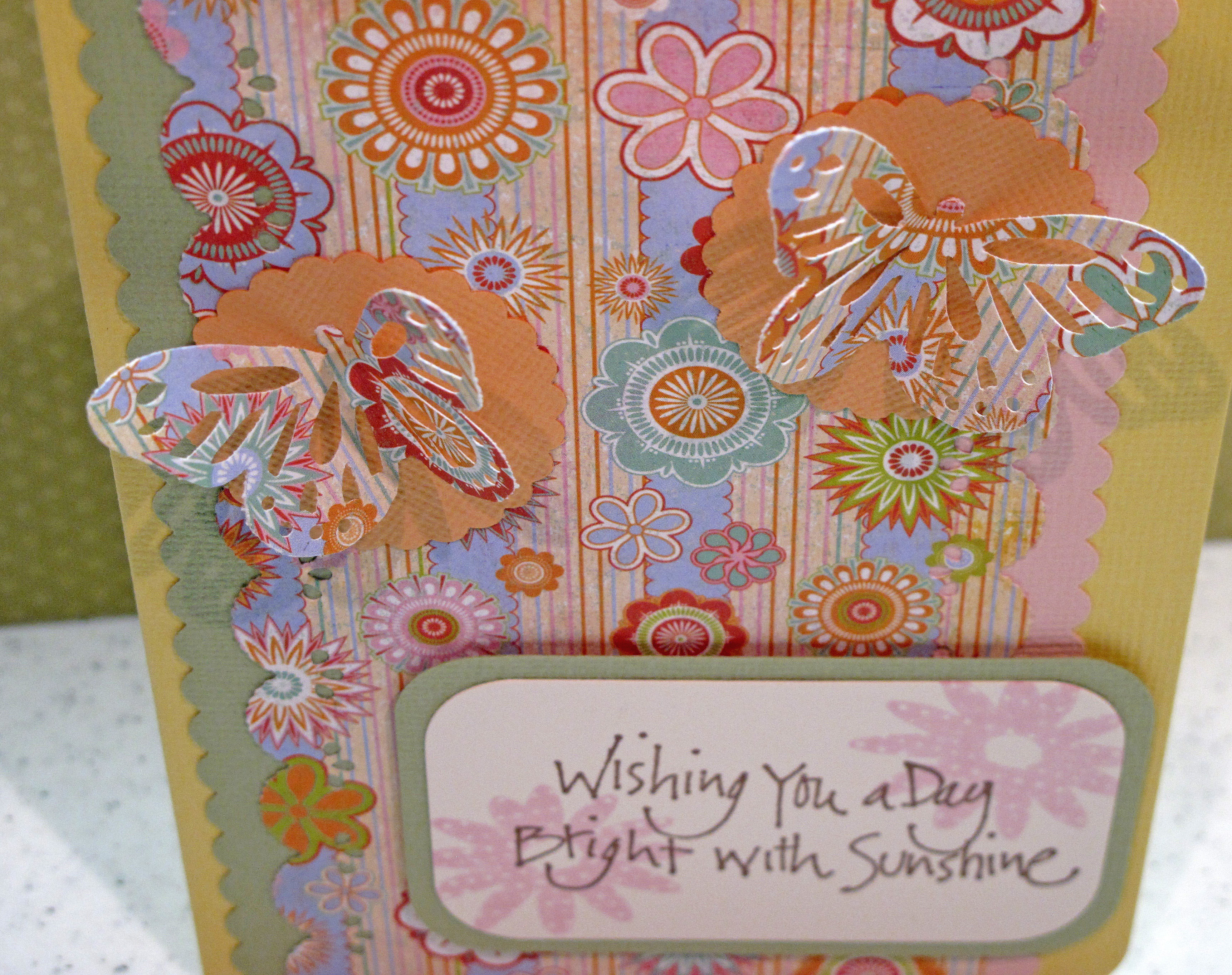
    I punched out the butterflies and then folded them in half. I used a glue pen to glue just the center of the butterfly onto the paper. Then I folded their wings up to make them pop!

    IMG_0576

    IMG_0567 
     Until next time…

  • Sunday Cards!

    Hi everyone! I made some cheery, happy cards for this day. Feels like Spring outside. My hydrangeas are going crazy – there is even one tiny flower already! Love it. After the rain on Friday the air is crisp and clear.

    I am in LOVE with this tiny checked paper! It just seems to go with everything and is a nice patterned neutral – if that makes sense. That checked paper is the common element for these three cards. I also tried to keep it simple and sweet.

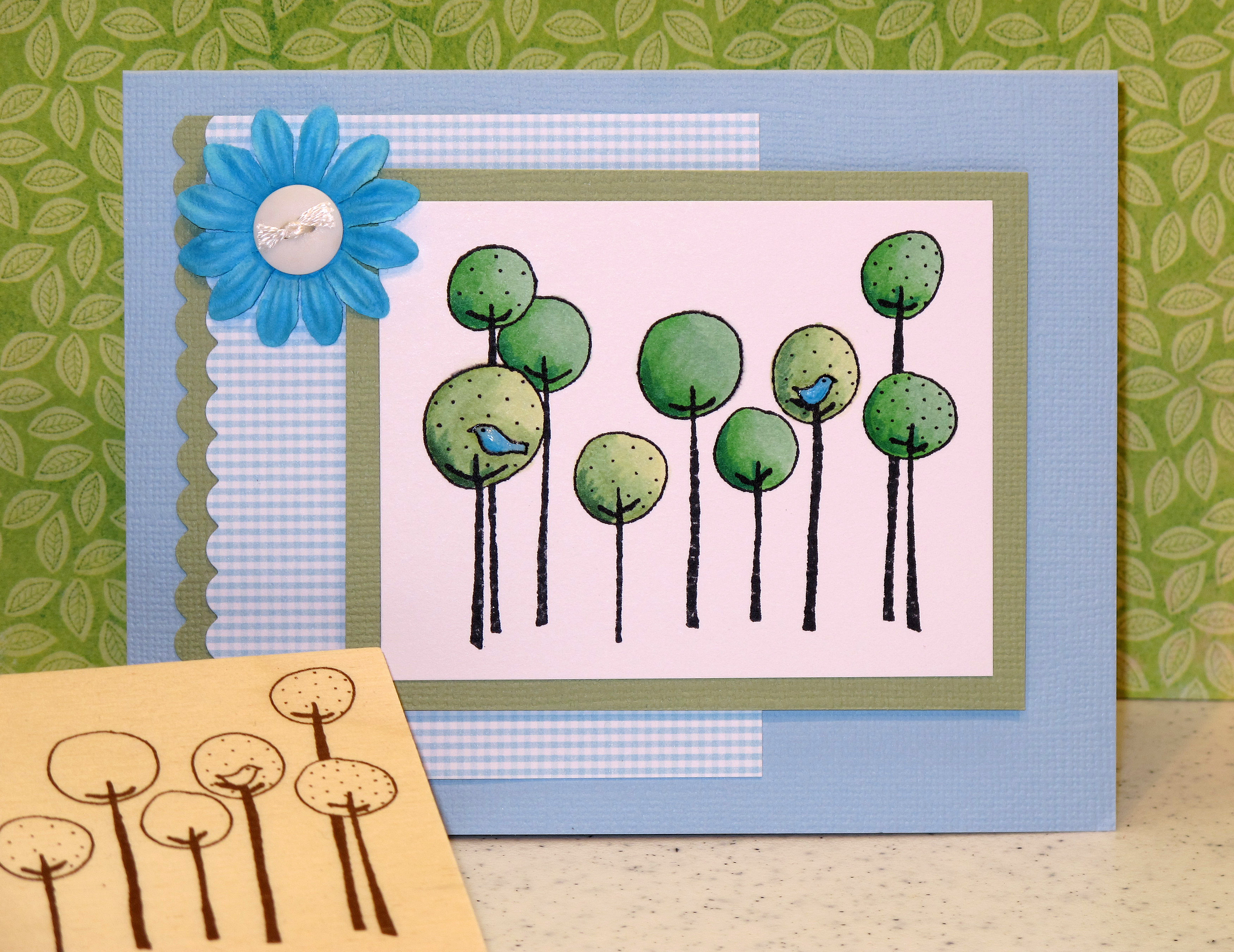
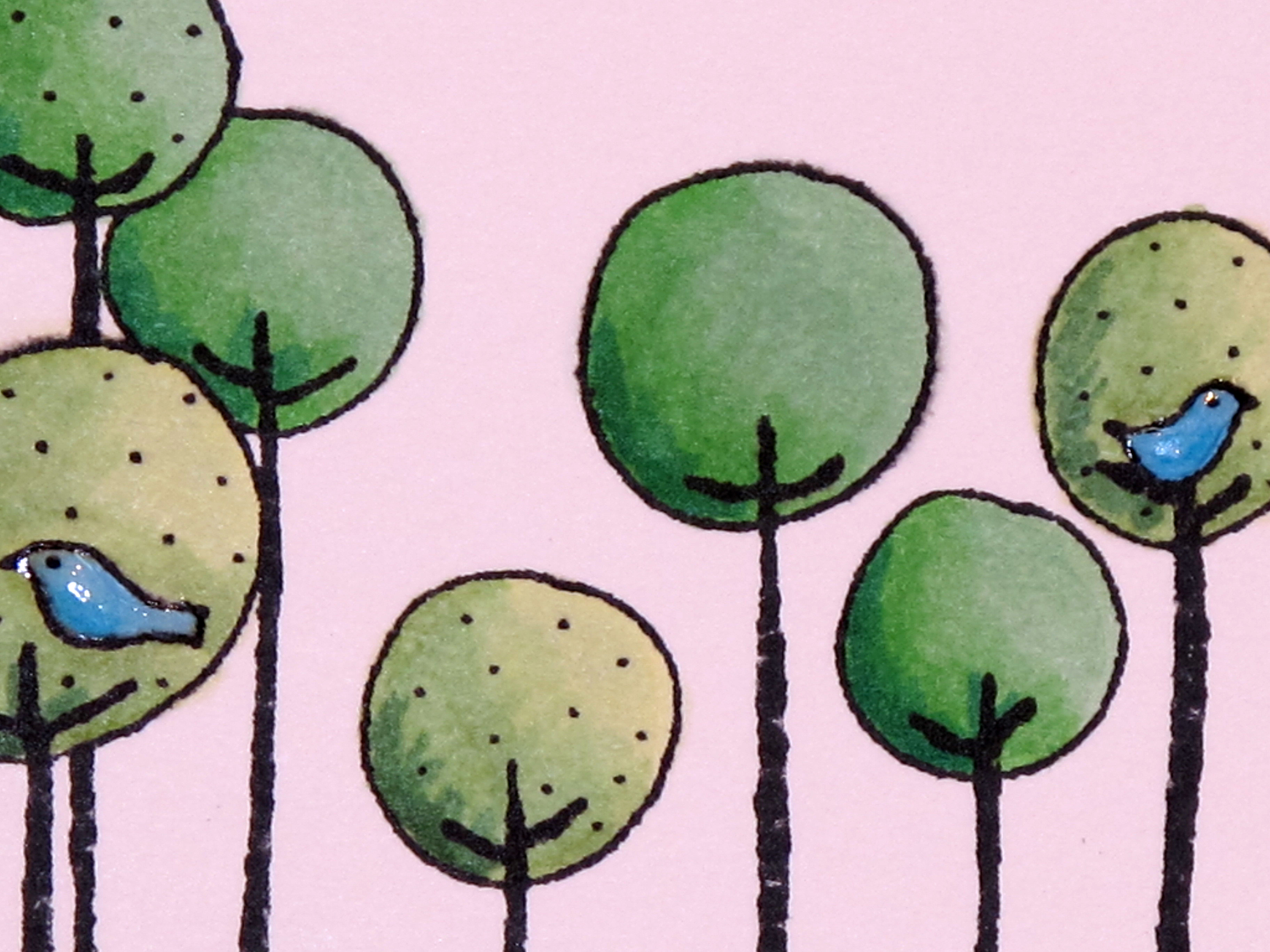
    The first card is made with some cute trees that I colored with my Copics. Each tree has three shades of green ink. One is with the Green color family and the other with the Yellow Green color family. I kind of like the contrast and visual interest that gives. The tiny birdies are colored with two shades of blue and then coated with two coats of diamond glaze to make them pop off the trees.

    IMG_0525

    IMG_0527 
     
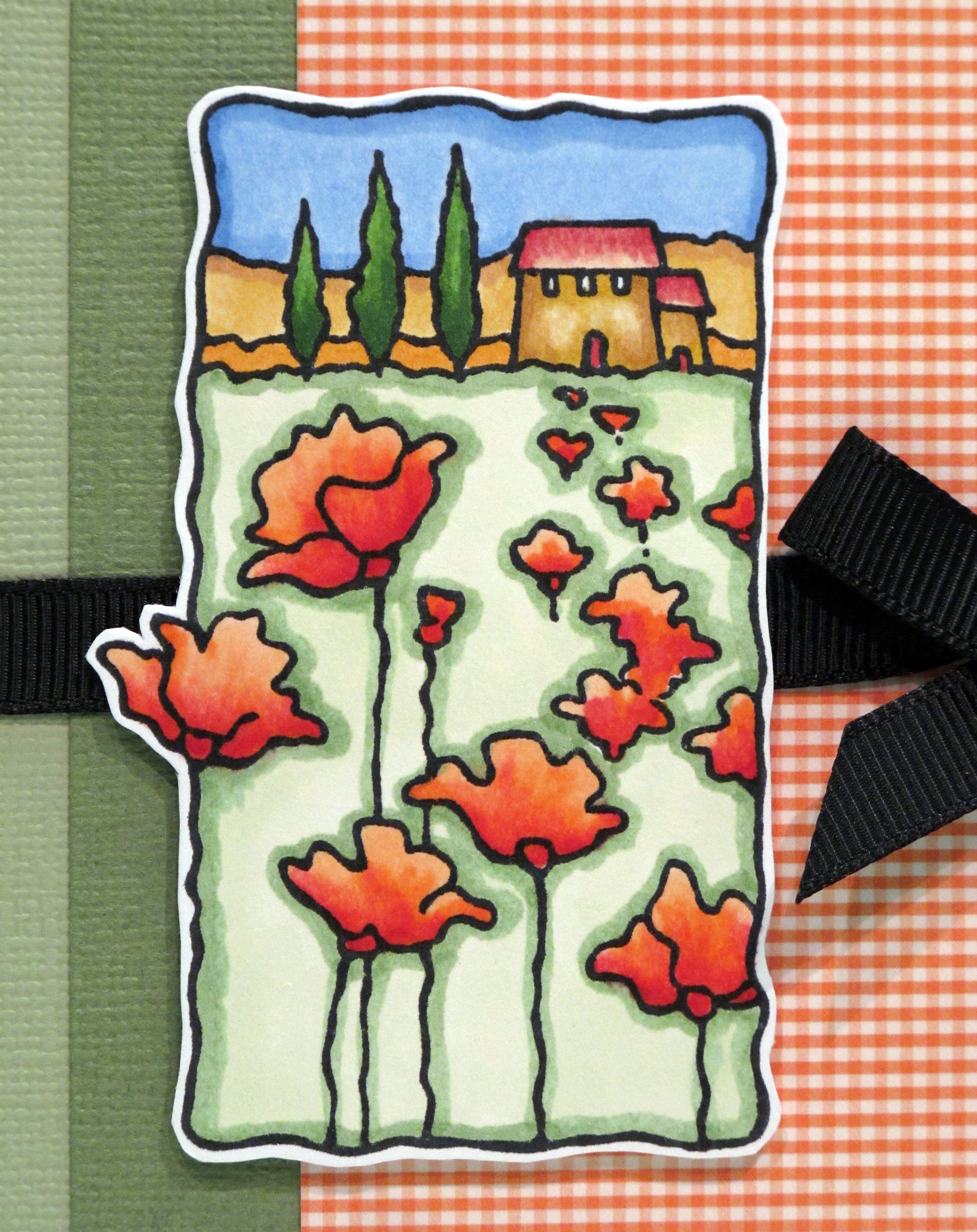
    The second card is made with this beautiful new stamp I got last week from Stampendous. It reminds me of a California winery with the poppies in the foreground. I also made this my first easel card. I have been admiring others and finally made one! You should try it! Super easy. Directions are on Splitcoast Stampers.

    IMG_0531

    IMG_0537

    IMG_0538 
    IMG_0536

    The third card is made with some Martha Stewart bee/hive stickers I got at Michael's a long time ago. I added glitter glue (diamond stickles) to the wings to jazz them up a bit. I always like black and yellow together for cards. Very striking. Another easel card. Maybe I'm hooked…

    IMG_0539

    IMG_0541 
    IMG_0547


    IMG_0540 

    Thanks for buzzzzzzzing by my blog today! 

  • A Happy card for today!

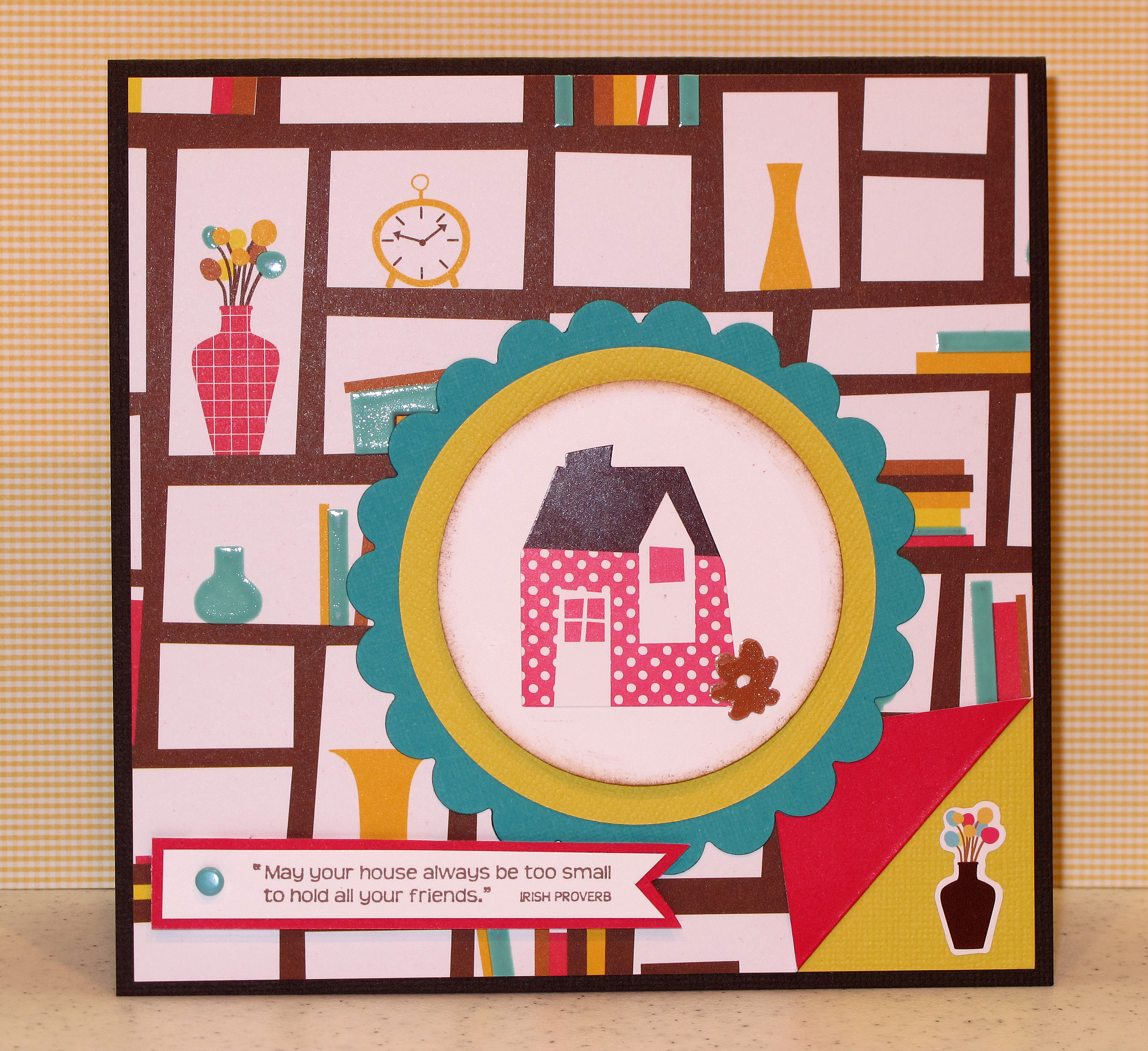
    I LOVE this new line of paper, stickers and rub-ons from American Crafts…It's called Abode. Hot, fun, bright colors and adorable images of books, vases, cups, etc. I used it to make a housewarming card for a friend who just moved into a new apartment. I had fun playing with these colors, because they are not the norm for me. I am addicted to my nestabilities now that I finally figured out the best way to use them with my Cuttlebug. Hope you likey!

    IMG_0430

    Inside:

    IMG_0432

     IMG_0431 
    The finished card is 6×6 square. I wanted to make it a big card to use more of the images from the paper in the background. Toodles…

  • Stamp Show Finds…

    Spent the day on Saturday with my dear friend Caroline at the Rubber Stamp Show in Vallejo. It was a small show, as those things go, but very fun nonetheless. Ran into a lot of stamping friends there and found a few bargains.

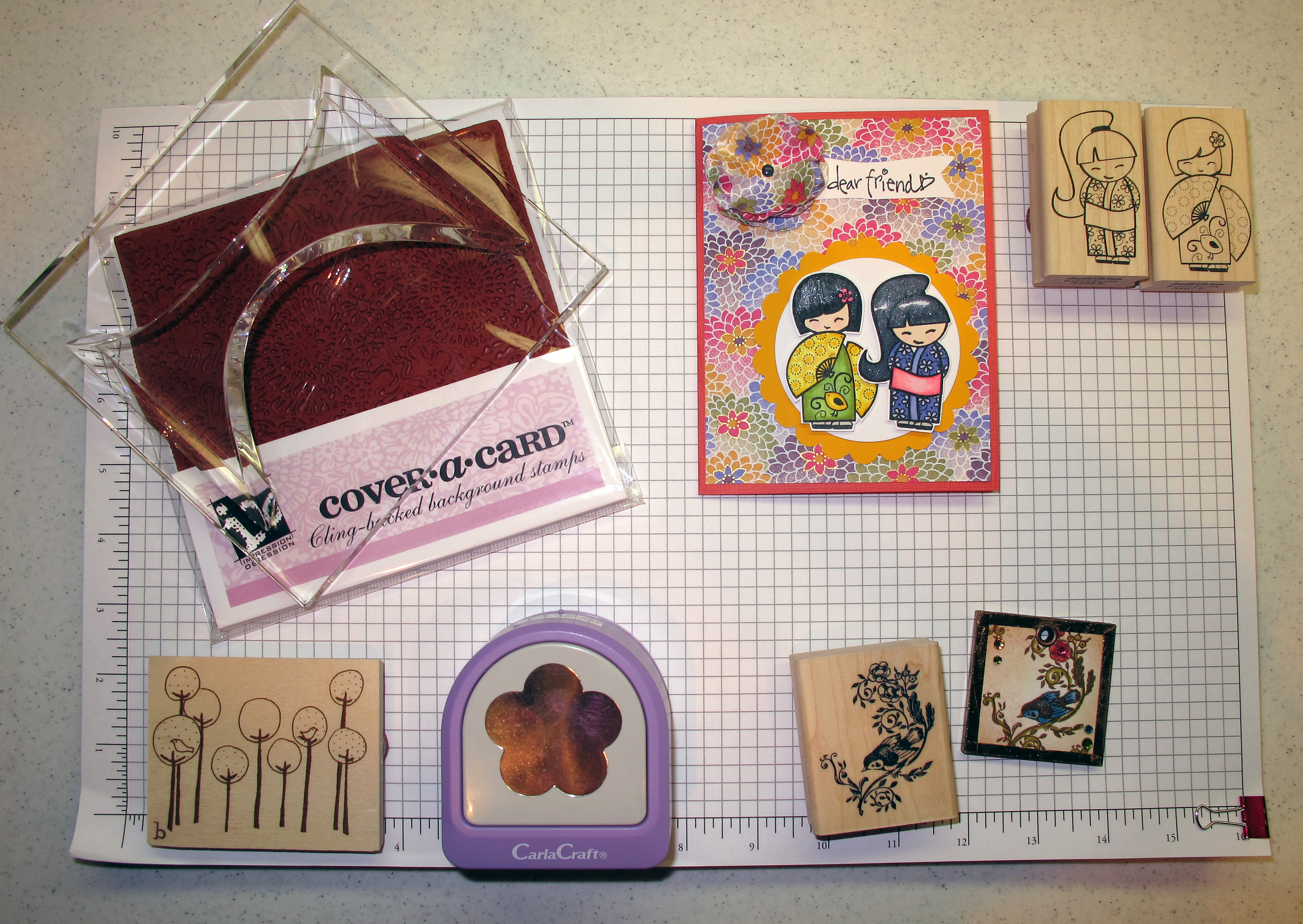
    Here is the loot along with the projects I made yesterday:

    IMG_0417
    In the upper left corner is a GIANT clear block to go with the gorgeous new background images from Impression Obsession. Love this! On the upper right are two new Judikins sweet Geisha girls. Lower left is a new funky stamp from Unity. Lower right is a Kodomo stamp from Hanko and a necklace I made using the stamp. So pretty! Also bought the five petal flower punch I've been trying to find for a while.

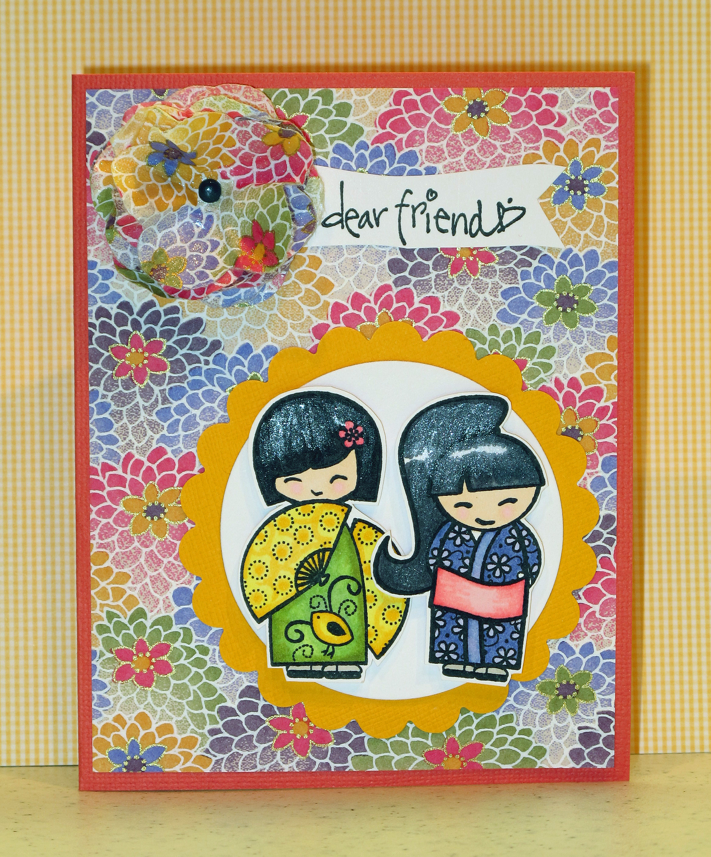
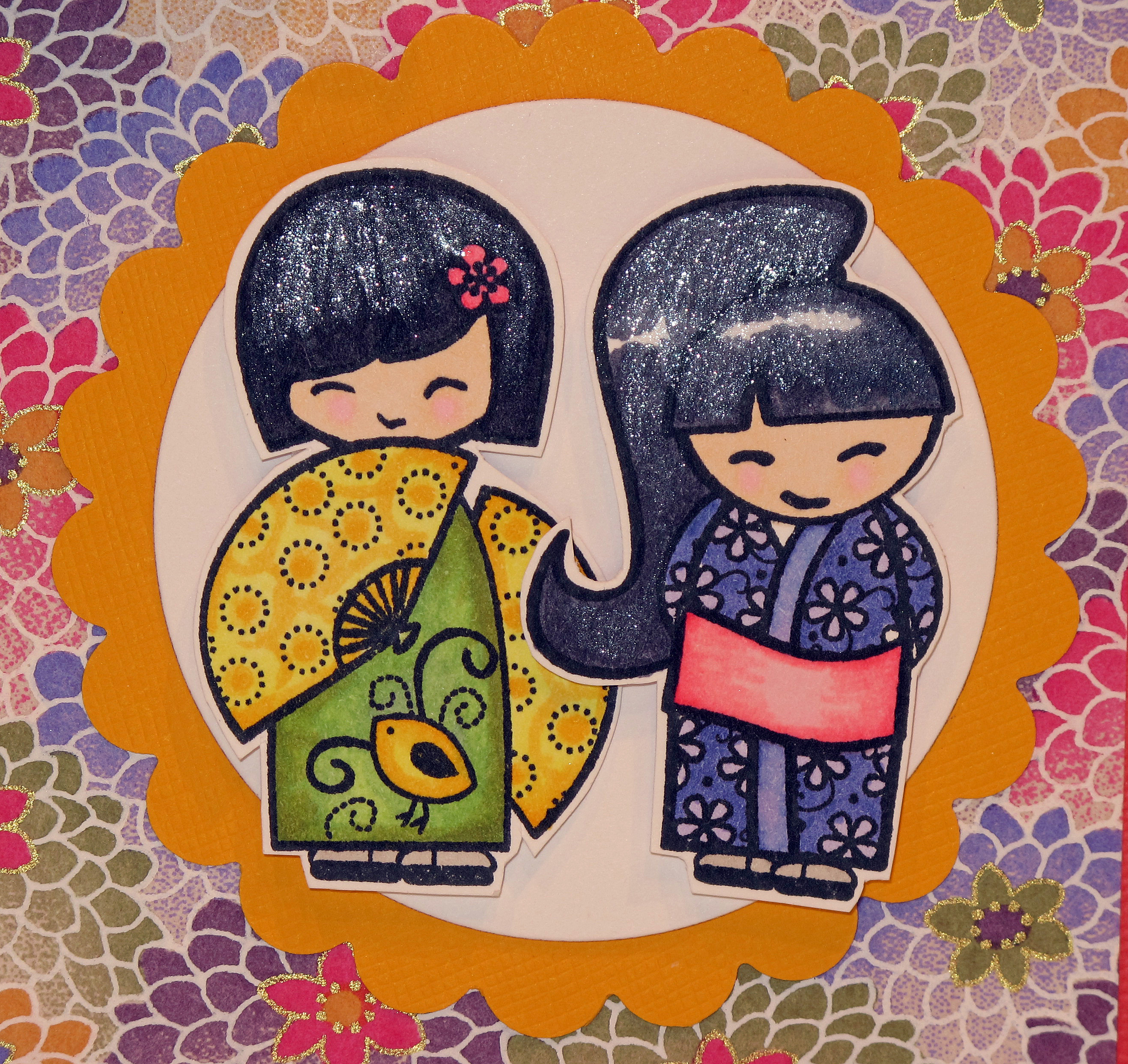
    Here is the Geisha card…colored with Copics and cut out…layered with Nestabilities…some sparkly shimmer in their hair to make it shiny:

    IMG_0419

    IMG_0422

     IMG_0424

    Here is the necklace that I made using the bird/branch stamp. I used my crop-o-dile to punch a hole and set a large eyelet for the chain. Stamped with Memento Ink and colored with Copics. Sponge the edges with Distress Inks. The edges are super tape with brown metallic foil folded over! Add some bling… and voila!

    IMG_0426 
    IMG_0427_edited-1 

    I hope your week is off to a great start! Enjoy the day!  

  • Happy Valentine’s Day!

    Happy Valentine's Day! Hope you are spending the day in the company of people who love you – spouses, friends, family… Also a good day to watch the Olympics. I have lots of Valentine's stuff to share and I'm sending some blog love your way. Hope you eat too much chocolate today!

    First off…My Furry Valentine…Mr. Buddy looking quite debonair on the craft room counter:

    DSCN1946

    Some cupcake treats I brought to work on Friday:

    IMG_0311 
    I made the little doo dads for the tops from the Stampin' Up "Love Bandit" set and some other VD stamps I had around. Scallop circles, and voila! Cupcake toppers!

    IMG_0312

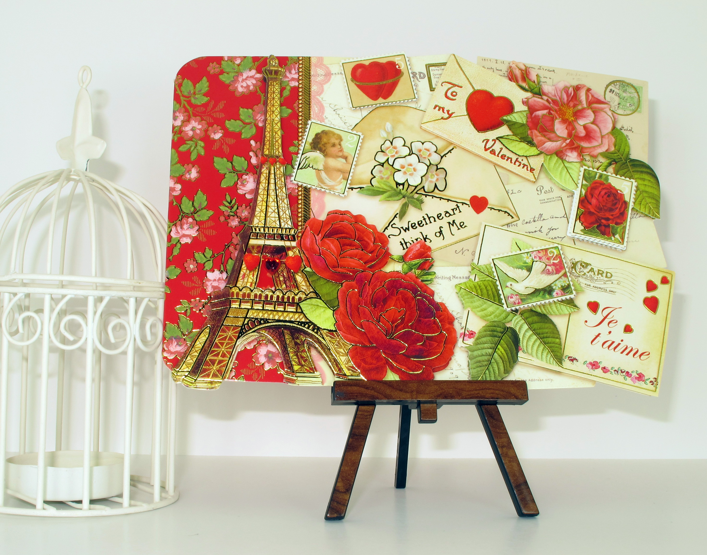
    A cool Vintag-ey Valentine I found at one of my favorite stores. I thought it was so pretty and old fashioned:

    IMG_0269

    IMG_0271

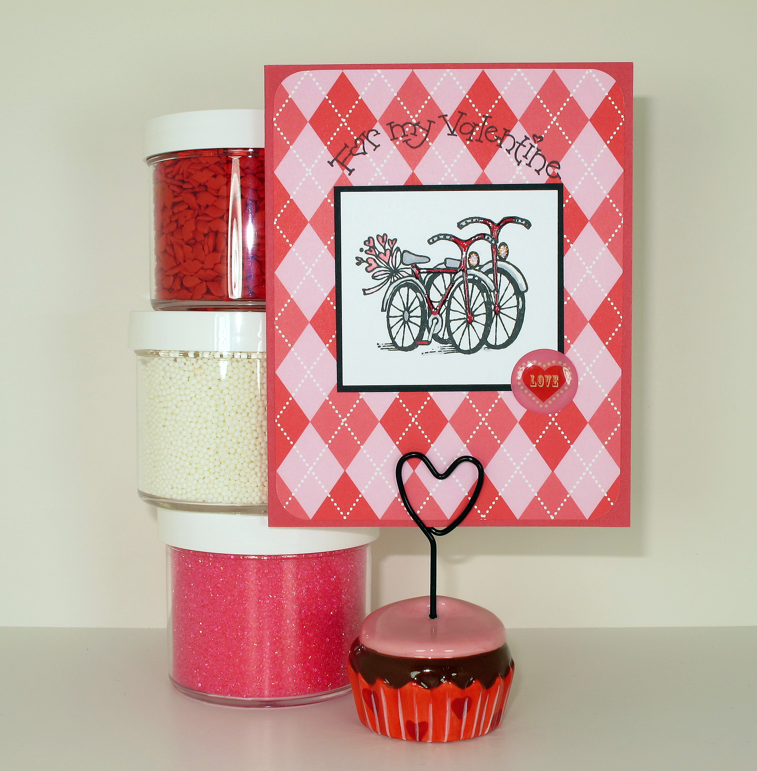
    And Finally, the last of my Valentine Cards for this year:

    IMG_0265

    IMG_0267

    IMG_0268

    IMG_0273


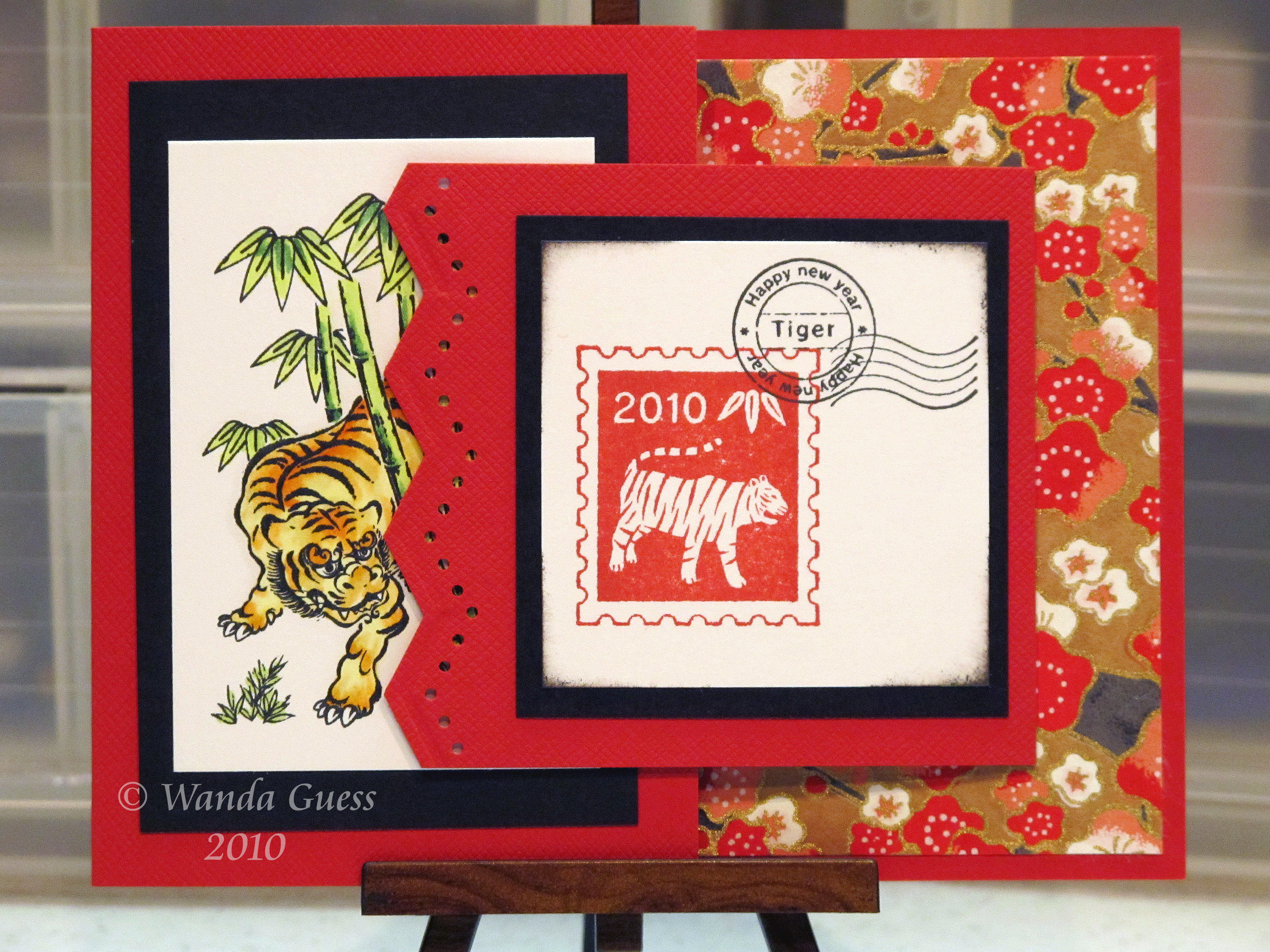
  • Year of the Tiger – Gung Hay Fat Choy!

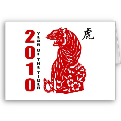
    2010_chinese_paper_cut_year_of_the_tiger_card-p137186029947311076q0yk_400

    2010 is Year of the Tiger! Gung Hay Fat Choy friends! This year the date for Chinese New Year happens to fall on Valentine's Day so I'm posting a day early. The date is set by the moon. Read more about the history here: http://en.wikipedia.org/wiki/Chinese_New_Year.

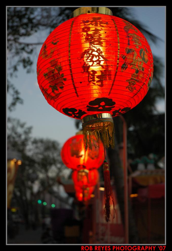
    Bob-reyes-chinese-lanterns 
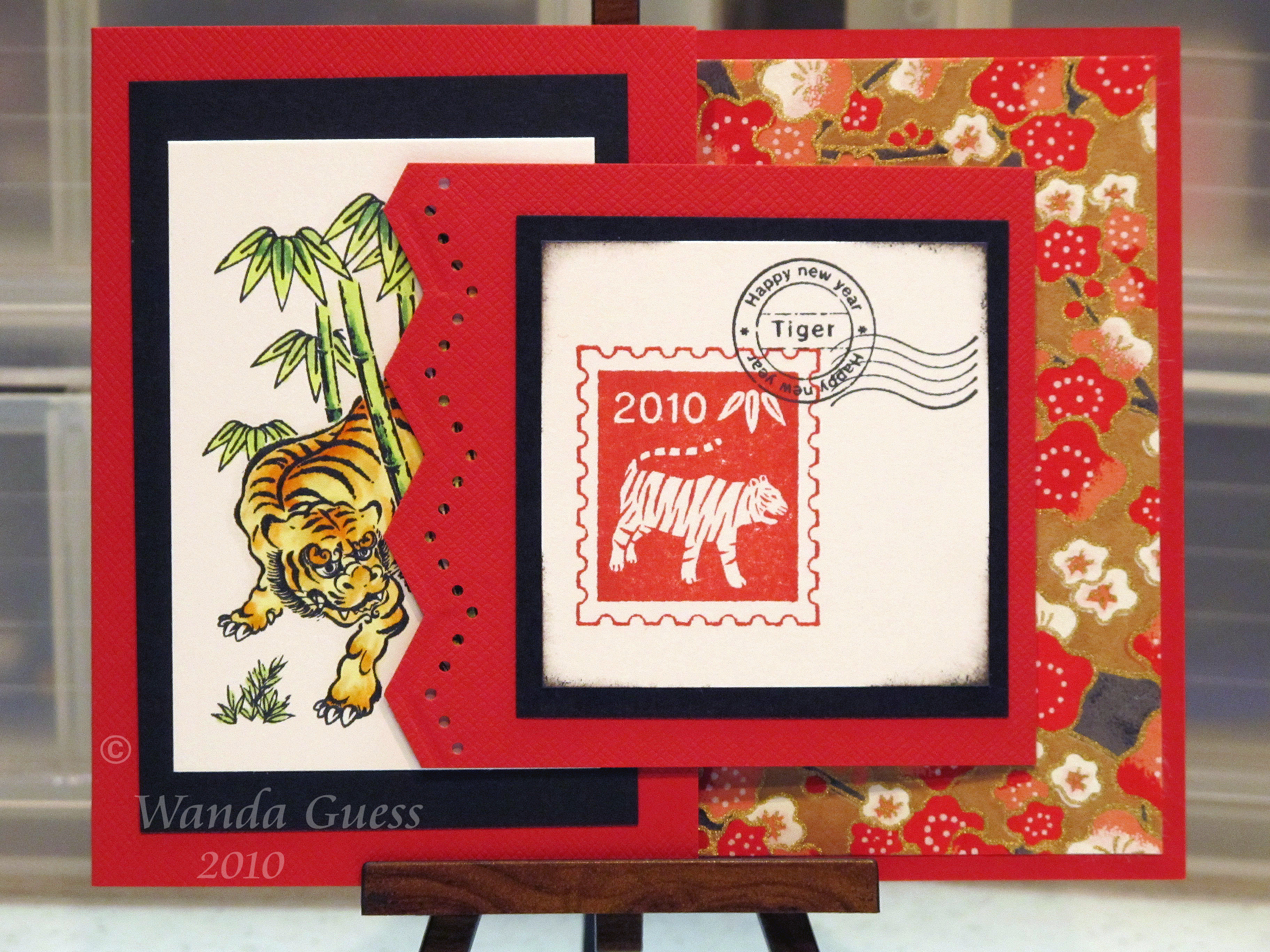
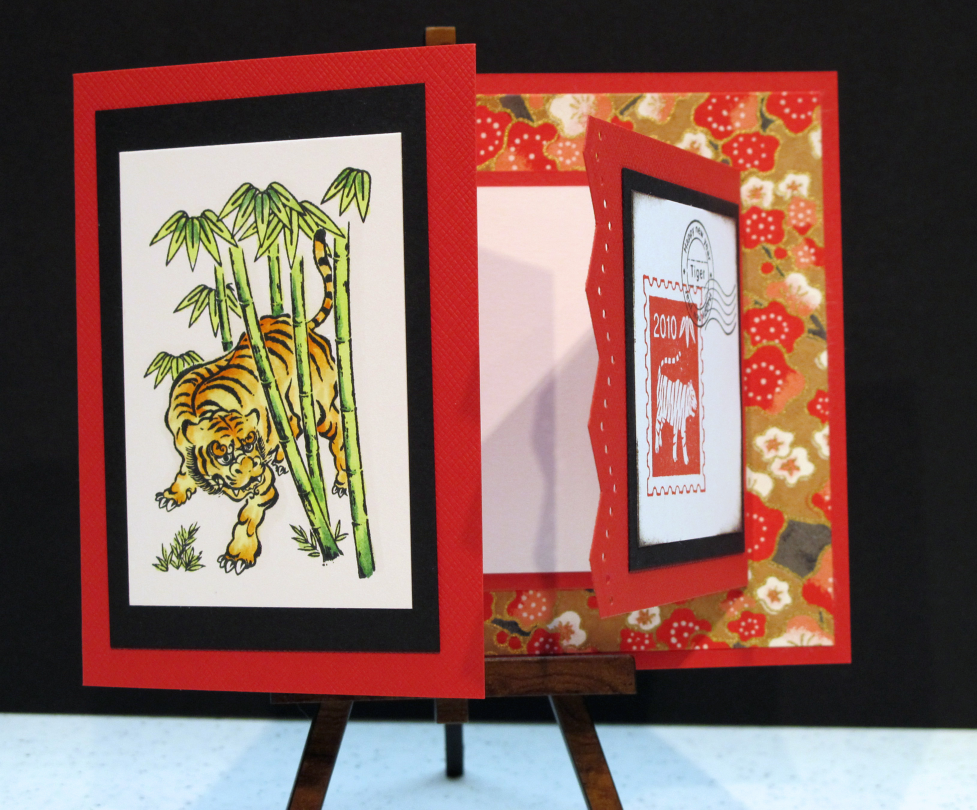
    Now, I like a celebration of any kind, and since I have many Chinese friends, I always make cards for this special occasion. I absolutely love the vivid red set against black and gold. Gorgeous. This year my creation is made with the popular joy-fold card concept. I hope you enjoy looking at this post.

    This is the full card when it is closed:

    Watermark And partially open:

    IMG_0122_edited-1

    and further opened:

    Watermark2 
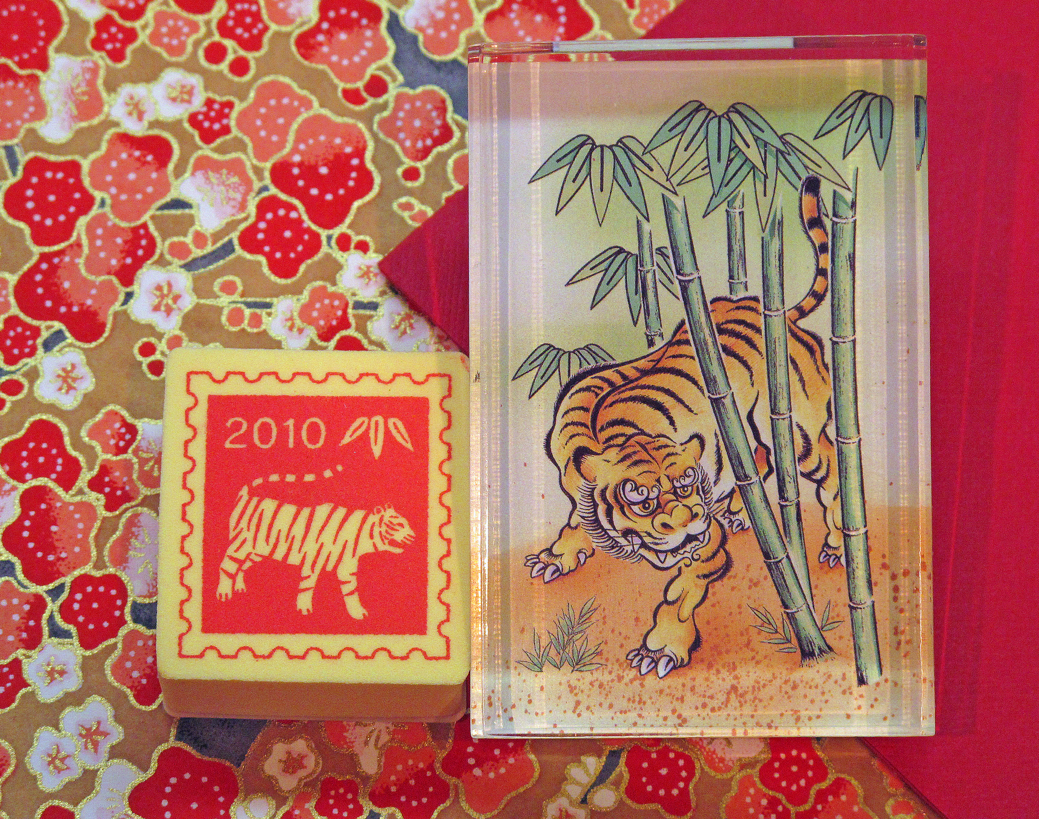
    Stamps from Kodomo and Papers:

    IMG_0111_edited-1

    Copic ink colors:

    IMG_0119_edited-1

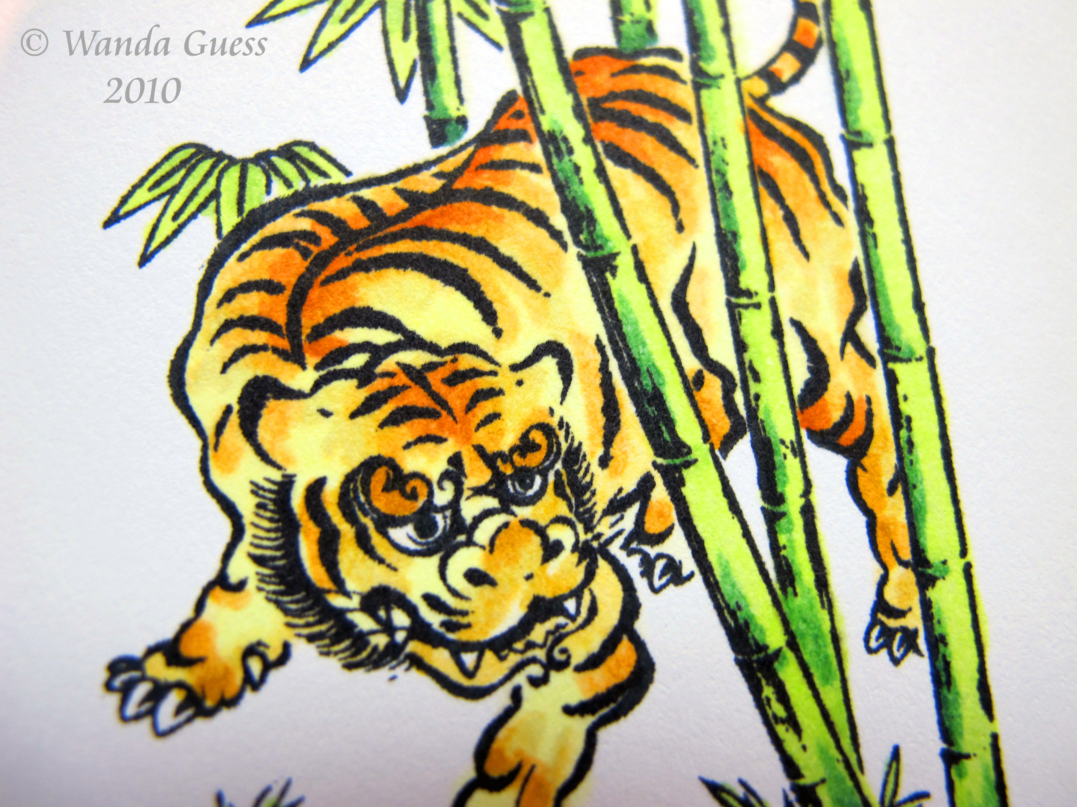
    Close ups of the coloring process:

    This chart helps me when I am making/coloring more than one of the same image. I can check the colors until I get exactly what I want.

    IMG_0116_edited-1

    Using the darkest color sparingly only for the center of his back and brow:

    Watermark 7
     Four shades of green…oh how I love green…

    Watermark 5

      Watermark 3 

     Thanks for stopping by today and Happy New Year!

  • Signs of Spring…

    It stopped raining long enough for me to get out in the front yard and photograph the first signs of Spring at our house!

    The daffodils bloomed about a week ago and I have been waiting for some nice light ever since – to show off their wonderful sunshine color. They are the first cheery signs of a change in the season…

    IMG_0294

    See the nice, even, bright color? Contrary to what you would think, wait for an overcast day with nice even light. Bright sunlight would not have worked here. These pix are straight out of the camera.

    IMG_0290

    IMG_0287
     Some Spring bokeh for Pioneer Woman:

    IMG_0295

    I love the contrast of the bright yellow against the brick and the green:

    IMG_0296

    Here is a close up of one of my prized Nikko Blue Hydrangea blooms left over from last year. They say not to prune them…so I didn't. Love love love the texture of this:

    IMG_0298

    The sure sign that more gorgeous blue hydrangeas are on the way! Yippee!

    IMG_0297

    So, all this Spring folly sparked my creative juices in the craft room. I have been waiting for the right opportunity to use my new bird/branch punch from Stampin' Up and the new Memory Box Papers. The key to this card? Lots and lots of layers….

    IMG_0276  
      Close up of my little birdie friend:

    IMG_0280
    Some of the supplies:

    IMG_0284 
    I hope Spring is headed your way too – especially my friends on the East Coast. Have a wonderful week ahead. Take care. 

  • It’s February Already? Valentine Stuff, Part One!

    The year is flying by already and it's February 1st! Whew…almost time for Valentine's Day! And…if you live in Northern California…time for allergies to start. Spent the weekend with a gnarly sinus headache. Start the Claritin I.V. stat!  

    I have two Valentine Cards to share today. I will have more as the day approaches. I've also been cooking up some cute cupcake toppers for my work treats.

    This first card is for my monthly stamp club swap cards. Our meeting is on Wednesday night:

    IMG_0224

    LOVE the new cuttlebug embossing folders for Valentine's Day! Took my white gel pen and made a little accent on the heart in the middle of the "O". The heart stamps are from an old Stampin' Up set. The black border on the card is a Tim Holtz background stamp.

    IMG_0222

    This card has a totally different color scheme and feel to it. It's based on an Amuse card I saw in my local paper store. The awning is made by folding the paper and then putting pop dots underneath!

    IMG_0227

    The little birdies and the glass are colored with Copic Markers. The whip cream is filled in with fine prisma glitter. I use Copic BG000, BG10 and G0000 whenever I want to make something look like glass.

    IMG_0230 
    More Valentine's to come. Stay tuned.

    I have to mention that my favorite band - Green Day – won a Grammy last night! Wahooo! The song they performed was from their musical version of American Idiot, which we saw at The Berkeley Rep Theater late last fall. We recognized a lot of the cast – and now they're Broadway bound!