Author: stampcatwg

  • Taylored Expressions Blast from the Past Spring Blog Hop Day!

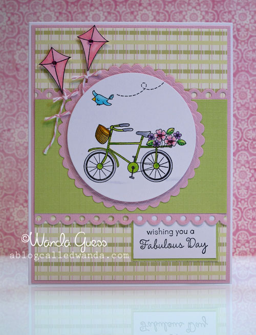
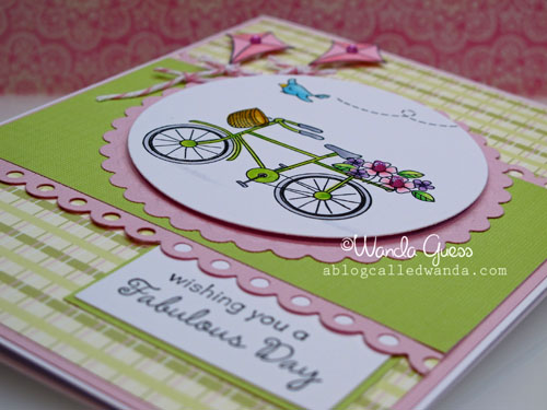
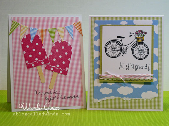
    Hi! It's that time again! Time for the super fun Taylored Expressions Blast from the Past Blog Hop! The theme this month is Spring. I know I'm ready for Spring…aren't you? Spring to me is all about color, and especially the soft pastels of Easter. So, my card for today features my favorite Spring color theme of pink and green. I used the In the Park stamp set from TE and also the pretty scalloped eyelet border die! I hope you will take some time to hop around and see all the cool cards from today! Thank you for stopping by!


    Untitled 


    IMG_5932


    IMG_5931


    IMG_5933


    IMG_5934


    IMG_5935 

    Won't you take some time out and check out everyone's entries?!


  • You ROCK!

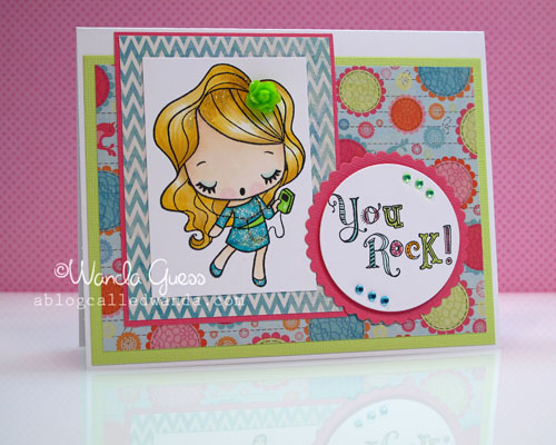
    Rock on girlfriends! How adorable is this stamp! Go on over to iCopic store and check out all the wonderfulness they have from TGF!  The images from The Greeting Farm are so fun to color and guaranteed to put a smile on your face! Today's girl is Chelsea, and she is just so cute with her ipod rocking out to her tunes. I knew I had to use bright fun colors for this one! Today's Wednesday, so it must be time for me to post over at the iCopic blog! Have you gotten your new colors of Copic markers yet? Twelve new colors? Are you kidding me? Thanks for stopping by today. I will also have one more post for today for the big blog hop at Taylored Expressions. It's a busy day…and I'm not even home! hahaha. Still sending you my love and greetings from Miami…


    IMG_5864
     

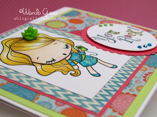
    I stamped her, as always, with my Memento Tuxedo Black Ink and then colored her with Copics…not too much shading on this one because I knew I was going to make her dress sparkly with glitter…like a disco queen! haha. The hair color is exactly the same formula as the retro Birthday Anya card from a few weeks ago. I am liking this blond combination.

    IMG_5866


    A pretty resin flower for her hair…those are from Michael's. The You Rock stamp is from a Stampin' Up set that I have had for a few years.
     
    IMG_5867


    IMG_5868
     

    Birdie signature! 

  • Thinking of you from across the miles…

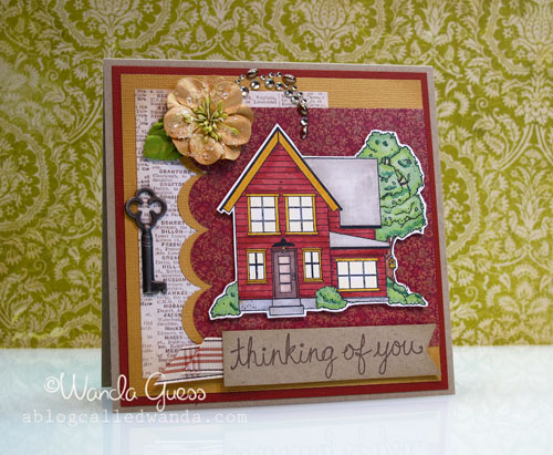
    Hi peeps! I'm still in Miami right now…scheduled this post before I left. I thought by now I would be homesick so I'm posting a card of a pretty house… This is one of my design team projects for the Eat Cake Graphics blog and I've used one of their gorgeous house images. This card would be great for a new home card or a missing you card. Hope you likey!


    APrevious Post


    I used my Copics to color the house in some browns and golds and greens. The key and flower were already in my stash of goodies. I thought the patterned paper fit nicely since it is phone book listings! How fun is that? I cut the image out and popped it up wiwth some foam tape.  

    IMG_5875


    IMG_5876
     

    Birdie signature! 
     

  • Top O’ the day to you! Happy St. Patricks Day!

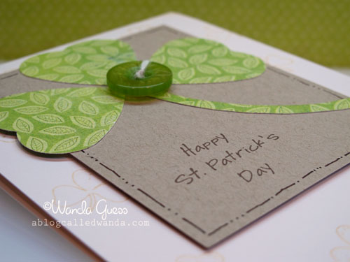
    Are you wearing green right now? I sure hope so! You don't want to get pinched! Happy St. Patty's Day to you one and all…it's the day when we are all a little Irish and can have a little fun! What are your traditions? Green Beer? Corned Beef dinner? I don't usually do anything special, but I do like to wear green. I always have struggled with making cute St. Patrick's Day cards…Nothing ever seems to come out just right. This year I saw examples online and in magazines where people made shamrocks out of heart punches. I decided to try that and make it my own. I am happy with how they turned out! Simple and sweet. I hope you have fun today!


    IMG_5928


    Here are my hearts and stems. I cut the hearts with a punch and then freehand cut out the parts for the stems. I used some pretty patterned paper with green leaves. Not too overboard with the green…a nice soft shade. 

    IMG_5927
     

    The card base is cream color and I inked up the corners. I used some light brown ink to stamp a shamrock background. The kraft paper is the focal part and I used a fine tip brown pen to draw the lines around the edges. This is an easy way to add a frame. It looked too plain before I did that! Added some twine to the center of a pretty green button and there ya go!

    IMG_5929


    IMG_5930


  • Spring has arrived in Northern California!

    Just a note before my post: I am going to be in Miami for a couple of weeks for work. I am wondering if anyone has suggestions for me as to places to go, stamp/craft stores, restaurants, whatever?? Please leave me a comment if you would be so kind!  I have planned some blog posts while I’m gone, and when I get back I hope I have cool pictures to share!

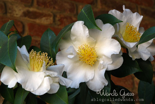
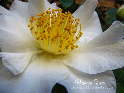
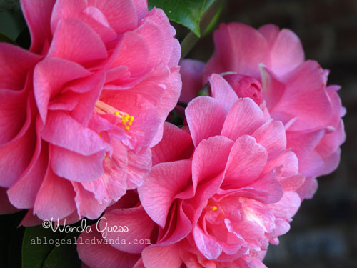
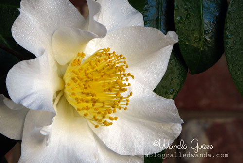
    Spring has definitely arrived here in my part of the world! My allergies are in full effect but I consider that a minor nuisance compared with all the beauty that surrounds us this time of year. The hills are turning green, the trees are making new leaves, the cherry blossoms are spectacular and, here in Sacramento, it’s Camellia time. I took a gander out in my front yard yesterday morning and then grabbed my camera so I could share with you. I know a lot of you are still in the throes of Winter…so I hope this makes you warm inside. Have a wonderful day!


    A


    B


    C


    E


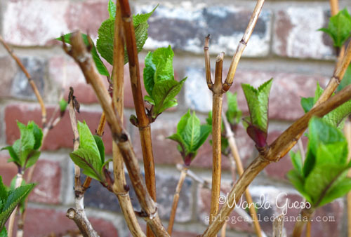
    These fresh green buds mean that my prized Nikko Blue Hydrangeas made it through another cold Winter. These are my favorite plants in the yard. I can’t wait to see their happy pom pom faces!
     

    F


    G


    H


    I 
     
    From our home to yours…Happy Spring and have a blessed day!

    Birdie signature!


  • Sweet as Pie!

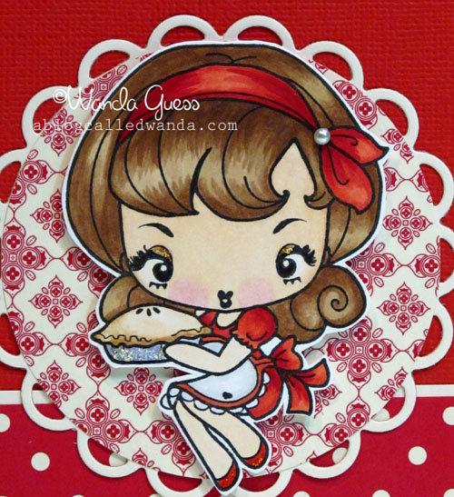
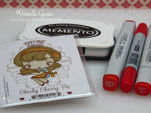
    Hi! It's time for my weekly iCopic Blog Design Team post! Today's card features the lovely Cheeky Cherry Pie stamp from The Greeting Farm! She is too too cute! Love her retro hairdo and her sweet eyelashes! I had fun getting out all the gorgeous red Copic Markers to ink her up! I always use my trusty Memento ink pads for using with my Copics. A list of my marker colors is at the end of the post. I can think of many uses for this card…I think it would make a pretty thank you card for a gal pal…


    A 

    Here is a close up of my coloring. Shading with red and brown is hard…If you try it and get discouraged, don't give up! Keep practicing! Use the darkest colors sparingly and blend, blend, blend.

    B


     Some of my supplies…

     Bb


    C


    D


    Isn't she just Sweet as Pie? The sentiment is from a cute cooking set from Hero Arts and I stamped a red heart in the middle of it. The flower is from Prima and I added stickles to it to jazz it up a bit. The paper is from Stampin' Up and I've been hoarding it…but I made myself use it!
     

    E 

    Marker colors: Hair: E42, E43, E57 and E31. Skin: E00, E000, E11 and RV10. Red parts: R29, R27, R24 and R22. Pie tin: C2 and C1.

    Birdie signature! 
     

  • Thanks a bunch card!

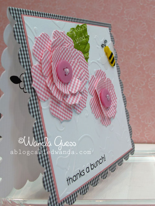
    Hello! How are ya?! It's been a rainy Sunday here in Northern Cal. I've been holed up in the craft studio busy as a little worker bee…making design team projects for Eat Cake Graphics and iCopic! I will have some fun stuff to share with you in the weeks ahead. I've been a copic-coloring fool…all day… What have you been up to this weekend? I hope you've been having fun and doing whatever it is you like to do.

    I have a sweet, pretty thank you card to share today. I made this card for Stephanie, the owner of Paper Garden, to thank her for so graciously having me be a guest instructor at her fab store last weekend.


    A


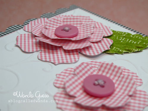
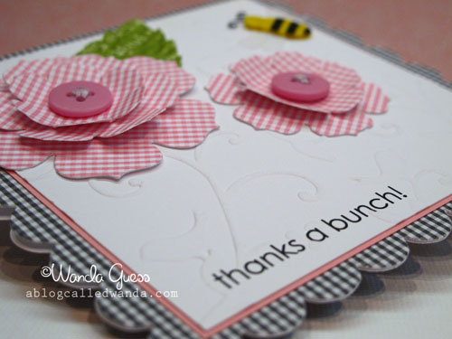
    Here are my supplies! I cut the black and white card base out of a big Sizzix square scallop die. The flowers were cut using a flower die from Papertrey Ink. The buttons and bees were in my stash already. The embossing on the white is a Cuttlebug folder. I couldn't decide between branches/birds or polka dots and ended up choosing the branches/birds one.
     

    Bb

    You can see I added the tiniest pink border around the white…just makes it pop off the black! I added one pretty leaf and one little bee.  

    C


    D


    IMG_5751


    IMG_5752
     

    Birdie signature!  

  • Curtain Call Challenge #71! Two cards for the price of one!

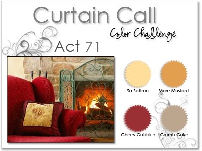
    HELLLLOOOOO! Well, it's late Thursday evening…which is practically Friday in my book. It's Friday Eve you might say. Just like Christmas Eve only it comes every week! I'm hanging out in my stamp room tonight watching American Idol (it's so good this season, don't you think?) and finishing up my blog post  to share with you. I made two cards for today, one kind of shabby chic and full o' stuff and one kind of clean and simple. I was inspired by Stacey's Stamping Stage Curtain Call Color Challenge #71! The colors are: Kraft, Cherry Cobbler red, Yellow/Gold and Mustard. MMMM. Yummy. When I saw the challenge colors, I instantly knew which papers I wanted to use. Therein lied the problem…

    My favorite color paper from Stampin' Up is cherry cobbler! LOVE love LOVE it. That part was easy. Then I picked out some nice Kraft paper from my stash and then some mustard polka dot paper. Then…dun dun dun…I got out the Webster's Pages Spring Market Collection papers. OMG. Really? Seriously? Maybe the prettiest paper I've ever seen. I ain't lyin'. So, every molecule and fiber of my being is telling me "you must hoard this paper and you must not make pretty cards with it, because then it will be all used up." Do you have that voice too? But, I made myself cut this gorgeous paper in half, and then half again…sigh. I have declared 2011 the year of no hoarding of craft supplies…and I was proud of myself!

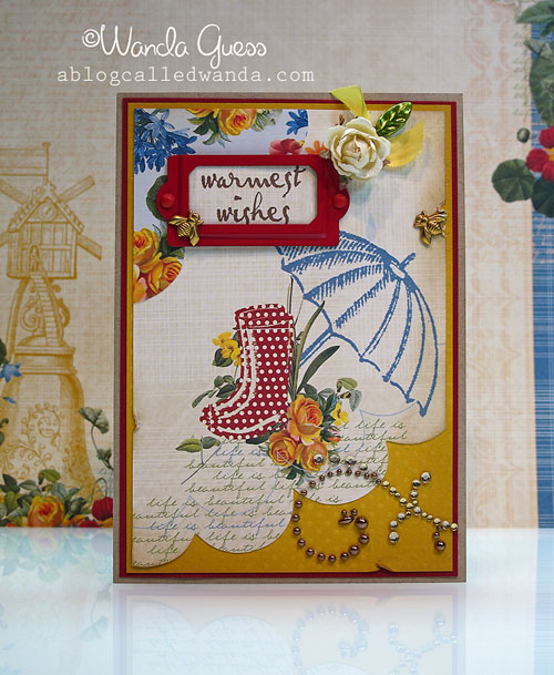
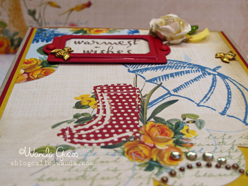
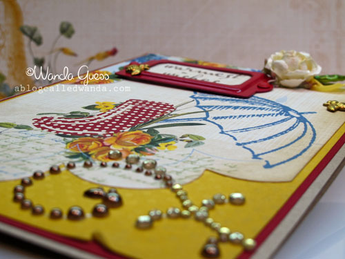
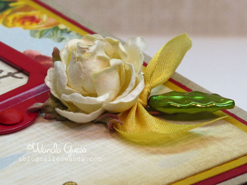
    Okay…you're probably like…get to the cards already Wanda! Here is card #1…Those little bees have been in my stash for years! I found a pretty red label holder…and a rose…I really wanted that gorgeous paper to be the star of the show. Used a Kraft card base and edged the papers with distress ink.


    A 
     

    Here is the Curtain Call Color image:

    Curtain call 71 red chair at raftertales_com


    B


    C


    D


    E
     

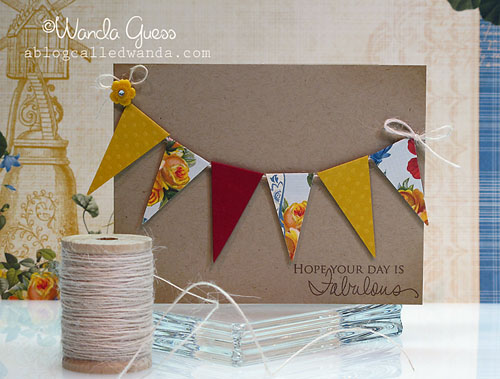
    Here is card #2…the clean and simple version…made with the same exact supplies and color scheme! You don't know how hard it was for me to resist.the.bling!! I like it too, though. Love the banners with the roses, especially! I might do more of this…make a second card…hmmm. Got me thinking…


    F


    G


    H 
     

    Happy Weekend Peeps! 

    Thank you so very much for coming by!

    Tada_banner6_9 


  • Some stuff…

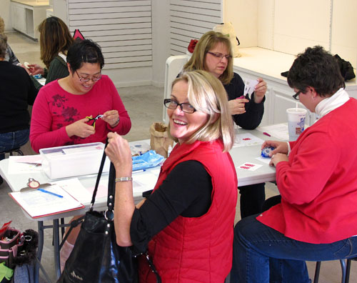
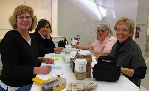
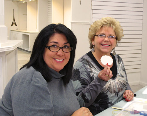
    HI!! Haven't seen me around here for a few days!! It's been a very busy weekend…full of good times, stamping and great friends. I'm just sitting down to watch the Oscars and update the old bloggy blog. My stamp classes at Paper Garden over the weekend went really well. A good mix of people. I had a dad show up to stamp with his daughter…which was super adorable! I met lots of new people. Many of my friends took class too. It was a blast! I snapped just a few pics so I wanted to share with you. Thanks to everyone who came – for making it so much fun!


    A


    IMG_5793


    IMG_5794


    IMG_5795


    IMG_5796
     

     This is some pretty new silk ribbon from Japan – oh my!

    Z


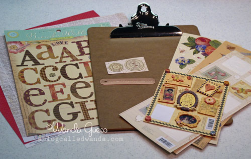
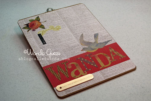
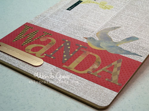
    I have a quick and easy project to share today too. I needed a clipboard for my classes – to use for my email sign up sheets and such. You know, being a crafty gal and all, I couldn't just have a plain old clipboard! I had purchased a bunch of these plain clipboards on ebay a while ago and they were super cheap. I got out some patterned paper and some cool stickers that all went together…and voila! A cute clipboard in about an hour!
     

    A


    B
     

    IMG_5740


    IMG_5741

     
    IMG_5742 
     Okay peeps! Have a great week! Thank you for stopping by today!

     Birdie signature! 
     

  • Birthday Anya card!

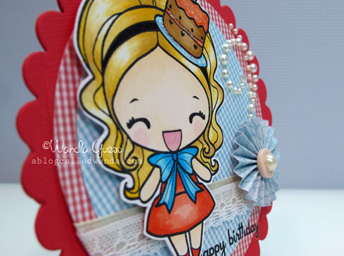
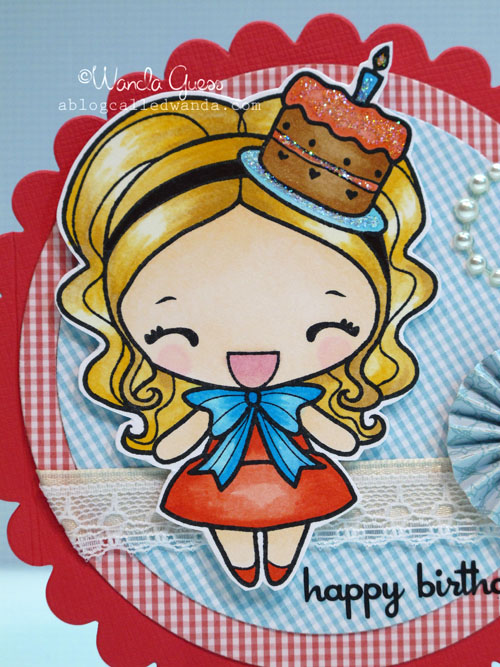
    It's Wednesday…you know what that means! It's my turn to make a project over on the iCopic Blog! Today's card features the lovely Birthday Anya stamp and a retro color palette with a new shape. I used tons of markers on this one…and I tried a new color of hair. Let me know what you think!

    The finished card is about a four inch square. I used the largest size round scallop nestie and then fit the smaller circles inside. I put one gingham circle with the pattern straight up and down (red one) and the other gingham circle on a diagonal (blue one) for visual interest. I crammed a lot of stuff on that little card – lemme tell ya!

    Aa


    Aaa


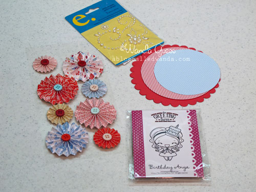
    This entire card was inspired by those little pre-made rosettes! I just fell in love with the colors and they made me think of the 40's so I made Birthday Anya feel kind of retro with her golden hair and some vintage lace and pearls. 
     

    B
     

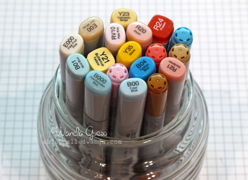
    These are all the Copics I used on this one! 

    C
     

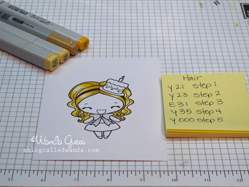
    I tried a new color combination for hair this time, so I thought I would share it. I wanted really soft light golden hair. You'll see that all of my colors were not from the same color group. I was winging it!

    IMG_5714
     
    IMG_5716
     
    IMG_5717
     
    IMG_5718


    The final result and close up of the coloring:
     

    IMG_5723


    IMG_5728
     
    Birdie signature!
     

  • New and fun technique!

    Hi everyone! Today is the start of a super busy week here on the bloggy blog! I have a post today, Wednesday will be my latest iCopic Blog creation and then Thursday is another Blog Hop for Taylored Expressions! Good times! There is still time to join in on the Taylored Expressions "Going Green" blog hop! Click on the link and check it out!

    Today I'm sharing cards I made a week or so ago for the Papertrey Ink facebook contest. I'm so excited that they started doing contests where customers can send in our cards and share with everyone else. There is some hecka talent out there and I've really enjoyed looking at the items posted. The contest series is called Make it Monday and they put a new technique on facebook every Monday…you then have all week to enter for a chance to win some PTI swag.

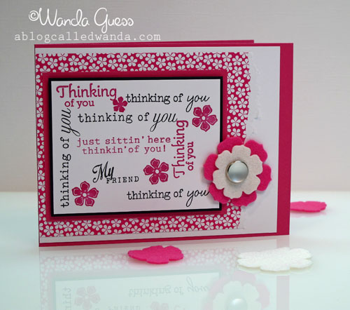
    This first Make it Monday had the technique of taking lots of related word stamps and stamping them in a pattern, combining fonts and styles. It was really fun. I ended up sending in three entries. I didn't get a chance to blog them back then so I'm doing it now. Hope you like them and hope you will try this new way of using your stamps! All supplies, in all three cards are from Papertrey Ink.

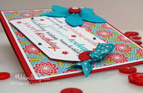
    Each of those phrases is a different stamp! All combined into a great image! I used a sweet tag and these gorgeous colors…oh my…


    IMG_5545


    IMG_5548


    IMG_5555


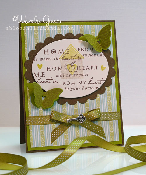
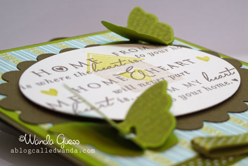
    This one was my favorite of the three. I really love all those phrases and I loved combining them all with the cute house stamp. I stamped everything first and then used my oval nesties to cut out the center panel. Those butterflies and ribbon in chartreuse…love that. This is going to be a housewarming card for my bestie who just moved into her dream house. Can't wait to give it to her tomorrow!

    IMG_5550
     

    IMG_5553 
     See you soon!

    Birdie signature!
     

  • Announcements on a Sunday!

    Hi friends! I have some announcements for this Sunday morning…and then I'll be back with some cards tomorrow. Hope you are having a wonderful weekend! We have been kind of lazy so far, but in a little while we'll be heading out for some errands and a nice lunch together.

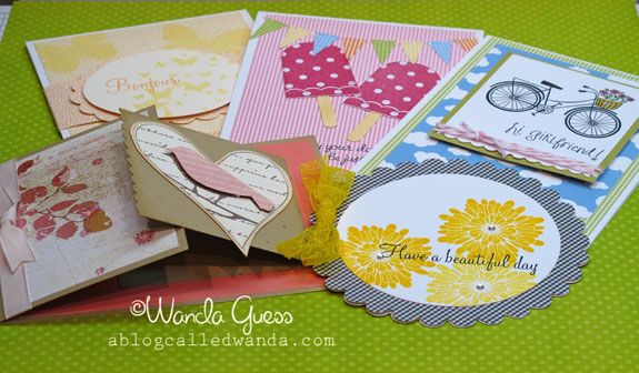
    First announcement is just a reminder that I am teaching two Spring Cards classes next weekend at the Paper Garden Boutique! I'm very excited and there are a few spots left. Please CLICK HERE for all the information about signing up. Below are some pictures of the projects we're making. Five cards with a cheerful Spring theme. I'm using brand new stamps and papers from Memory Box and some favorites from Impression Obsession, Amuse and Hero Arts. Hope you can join me!


    IMG_5387


    IMG_5382


    IMG_5380


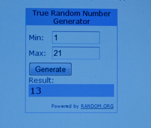
    Second announcement: Thanks to everyone who left a comment on my last blog post about the Sucre goodies and giveaway… The winner is lucky comment #13! Renee! WOO WOO! Congrats Renee! If you read this before I email you, send me your address so I can pass it on to Sucre. YAY!

    IMG_5729 
     (I couldn't figure out how to get this darn thing on my blog, so I took a picture of it!!!)
     

    Lastly, I just wanted to share this cool poster/image from Mary Engelbreit. It made me happy! Have a fabulous day everybody! 🙂

    4771 
     
     Birdie signature! 
     

  • Valentine Goodies…a photo essay…

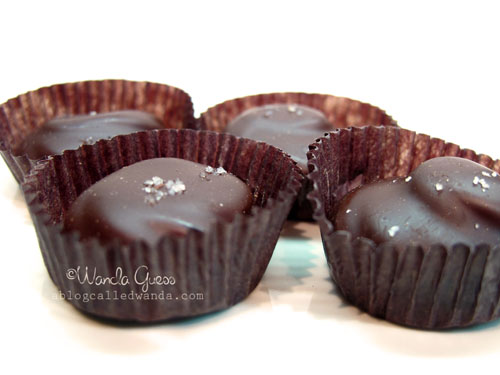
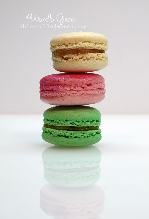
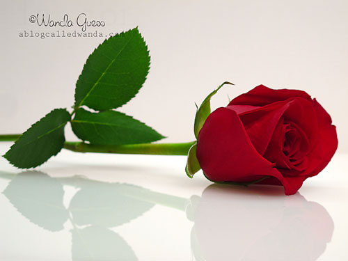
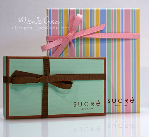
    Hi friends! F-R-I-D-A-Y! Thanks for stopping by today to see me. Well, you know how I love to take pictures of stuff!? Today's post is a photo essay of my Valentine loot from my sweet DH. He is too good to me and always has been a romantic at heart. This year for Valentine's Day he bought me the most gorgeous red roses and some WAY yummy sweets from Sucre in New Orleans. What a treat! It was so hard to stop and take pictures of everything before devouring it! I really just wanted to rip the box open and go for it! I had fun getting all artsy with the colors and textures and had a real full-on photo shoot right here in the craft room. 

    UPDATE! The DH sent the company a link to my blog post and they wrote back with an amazing proposition! Sucre has very graciously offered a FREE GIVEAWAY to one of you! Please leave a comment below, any time before midnight PST on Saturday. I will randomly pick a comment/winner and Sucre will directly mail you some goodies! Sa-weet! Be sure to leave me your email address so I can get in touch with you. I will let you know on Sunday if you're the lucky winner!

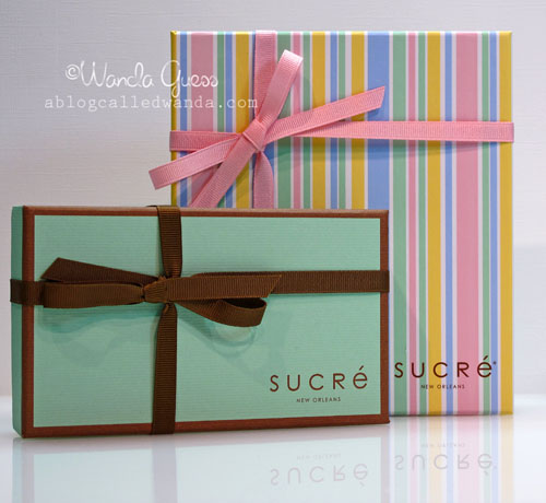
    Even the boxes are so pretty and inviting… 
    A


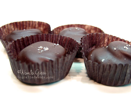
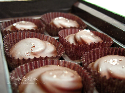
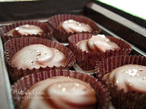
    These are dark chocolates with a pinch of sea salt on top…They were in the aqua box…
     

    C


    D


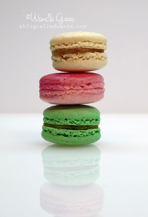
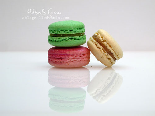
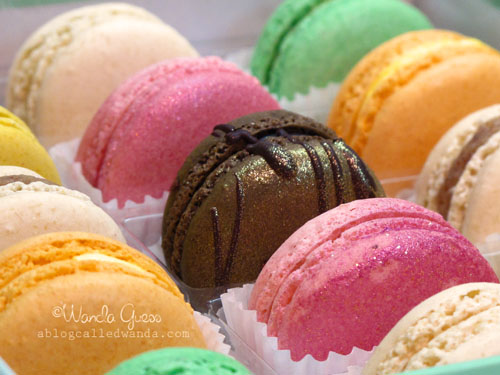
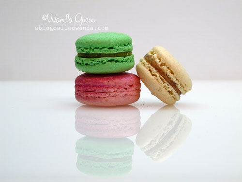
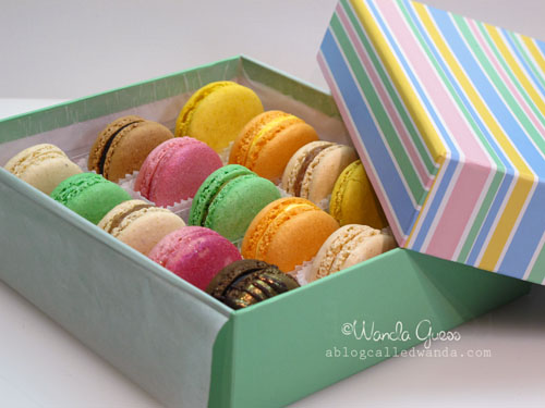
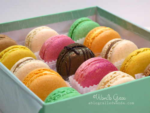
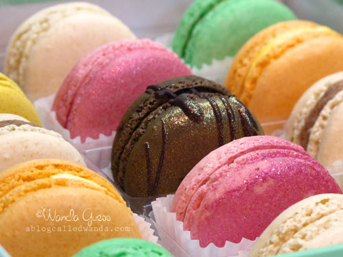
    These are French Macarons. O.M.G. Truly. Seriously. O.M.G. Some of the flavors are pistachio, orange, lemon, almond, and strawberry…The pink strawberry ones are covered in sparkly stuff. Almost too pretty to eat. Almost.
    Dd


    Ddd


    Dddd


    Ddddd


    E


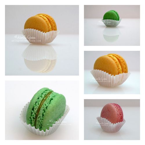
    I could have taken about 100 more pictures of these Macarons. I love the graphic nature of them on the glass and the colors are so inviting. I had fun working with the reflections.
    I

    These are the healthiest roses – hearty and strong and the most vivid shade of deep red. Just how Valentine's Day roses should look. They are still going pretty in the vase five days later. I picked out the best one to shoot some pictures.
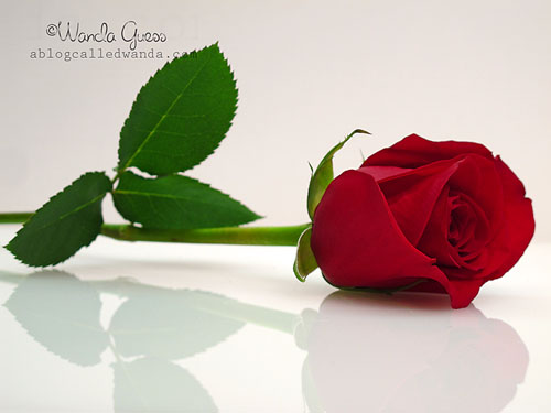
    Ii
     

    Do something creative every day! Have a wonderful weekend! 
     
    Birdie signature! 
     

  • Lovely Perfume Bottles…

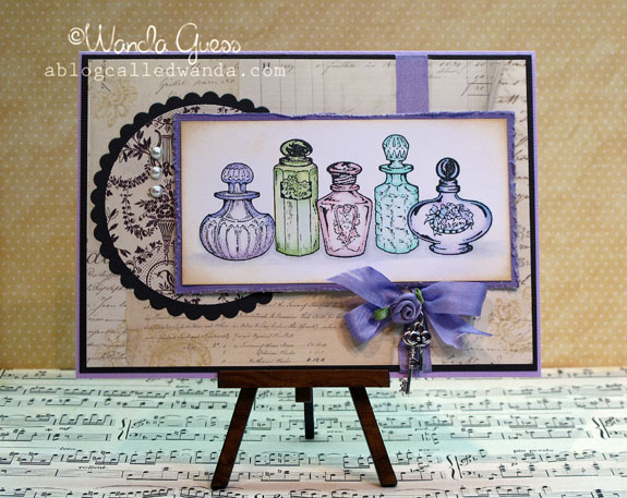
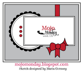
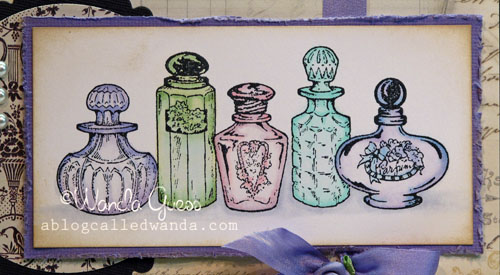
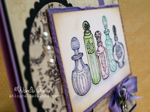
    Today's post has a lot going on! This is my weekly post for the iCopic Blog and also I used a sketch from the Mojo Monday blog to get my layout started! I colored this image quite a while ago and it is one that I use as an example in my Copic classes. I finally turned it into a card! A shabby, vintagey card! I think it nicely illustrates a different way to use your Copic Markers to achieve a soft, glassy feel. This is a super super old stamp from PSX.
     

    A


    Here is the sketch!  

    Aa


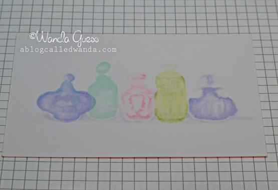
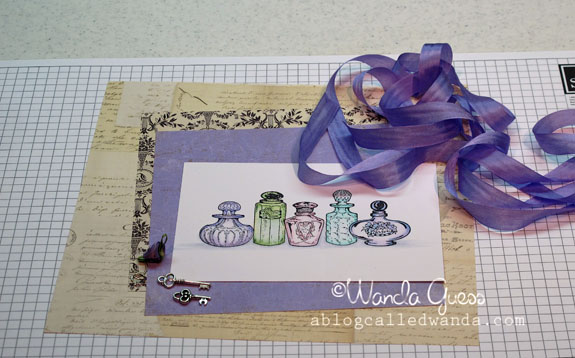
    Here are the colors that I used – you can see I used very light shades in four different color families. When coloring, I left a lot of white space in the center of the bottles. I did this so that the images would appear see through, just like glass. I used my colorless blender pen extensively to push the color out the back of the paper (see pic below) so that just a very small amount of color was left.  
     

    B


    Here is the back side of my image. See that there is more color on the back than on the front!? That is because I kept using my blender pen over and over until I got the effect I wanted.

    C


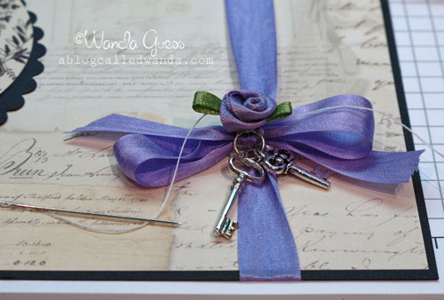
    Are you in love with this seam binding ribbon like I am lately? Ooh La La. I found some keys in my stash and a pretty lavender flower. Then, I dug up some vintagey papers… I have been doing a bit of reorganizing in my craft room and found some good stuff!

    D


     Here is a close up of the coloring of the bottles…

    E


    For the life of me, I could not get that ribbon, flower and keys to stay put! I had a needle and thread on my craft table left over from another project…so I actually sewed all that stuff right onto the paper! That'll teach it! Hahaha.

    F


    G


    H 
    And…finally…this card is my entry to the MOXIE FAB Stamping with Markers Challenge!!! I hope you will go on over and check out the post and enter…because…you could win 36 Copic Markers!!! WOO WOO! Have a wonderful day. 
      Birdie signature! 
     

  • Happy Valentine’s Day!

    Happy Valentine's Day to you! The DH and I have the day off work and we are planning to spend the day together doing something fun…not sure what yet…but it will be fun! hahaha. Hope you have something planned with your loved ones for Valentines. It's all about pink and candy and cuteness! You've seen me post some other cards with this great collection from We R Memory Keepers. I decided to use up most of my stash of it to make Valentines for my girlfriends. They are basically the same, but each one just a little different too. LOVE IT!


    A


    B


    C


    V


    W 
     Tada_banner6_9 
     HAPPY VALENTINE'S DAY

    FROM ME & BUDDY!

    RSCN1952

  • You’re the cat’s meow!

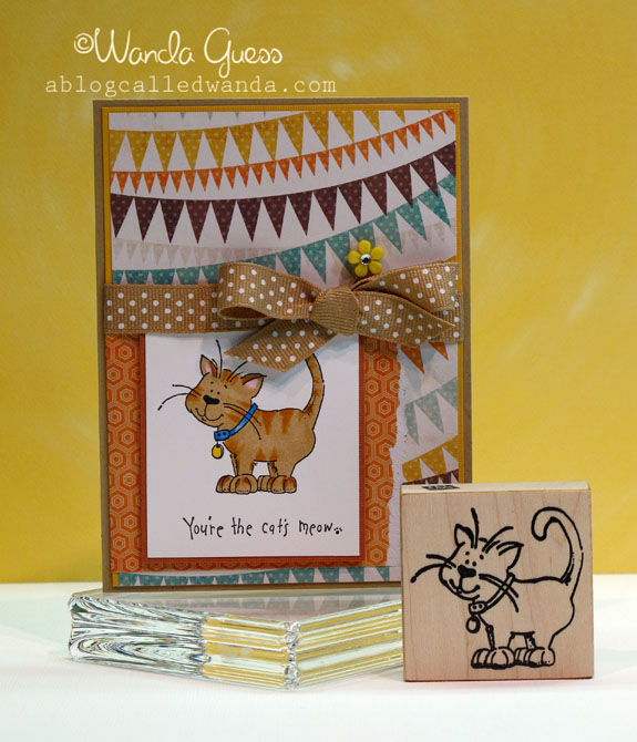
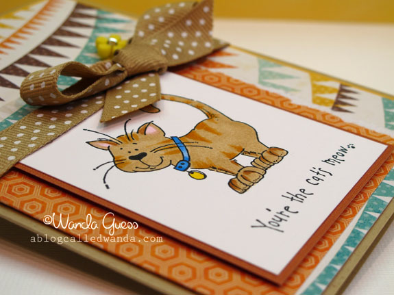
    So…I have noticed that every single card on my blog lately is PINK PINK PINK! Must be because I'm in Valentine mode! Sheesh. Okay, so today I made a card that has no pink and is actually a very warm and masculine color scheme! It's one of my projects for the Eat Cake Graphics Design Team. Cutest little kitty stamp with the most precious look on his face. I colored him in to look like my Buddy boy. {smile}.


    IMG_5469 


    IMG_5468


    I colored him in with my Copics to look like Buddy! Turns out Buddy is YR14 – Caramel! Hahaha. I added stripes in the YR14 over E31 and then some RV10 pink for his ears. Pretty easy coloring job… 

    IMG_5472


    IMG_5473


      Look at this face! Yup, YR14!

    DSCN1954 
     Birdie signature!  

  • Introducing Miss Geisha Anya!

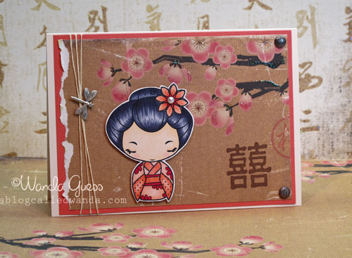
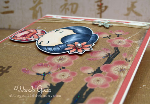
    Today's Wednesday! My day over at the iCopic Blog! WOO WOO! Today I am sharing sweet Geisha Anya with her pretty kimono and shiny black hair. I found just the perfect piece of patterned paper to use with this card to make her a pretty little cherry blossom scene. I think I might possibly be addicted to coloring these Anya images now! Seems I can't stop!


    A


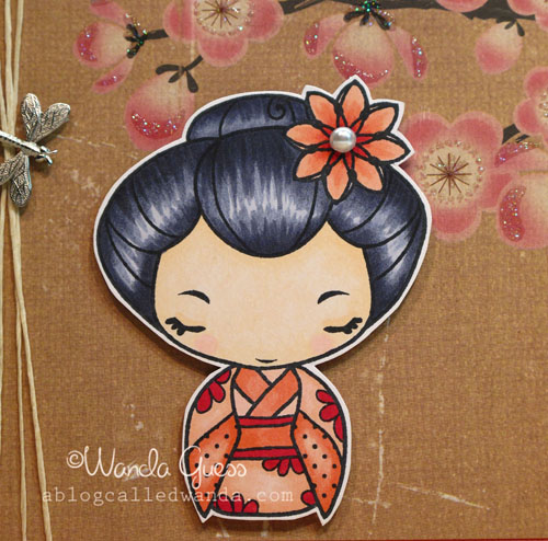
    Here is a close up of her hairdo! NO BLACK was used to color her hair! Black is too harsh and will come out flat. Instead I used cool grey tones: C2, C5 and C7. Her flower and Kimono were colored with pretty shades of: R12. R14 and R17. For the hair, I started with my lightest shade first to lay a foundation of color. I did leave some white space, as you see. I went back over with my medium shade and finally streaked in some of the C7. Practice "flicking" your brush pen tip to feather out from thick to thin lines. It's an optical illusion that your eye sees black when really it's grey.  

    B


    IMG_5517


    IMG_5519
     
    Birdie signature! 
     

  • Happy Birthday Cupcake! Fun with Pink Persimmon Stamps!

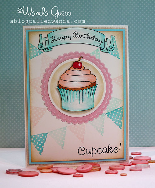
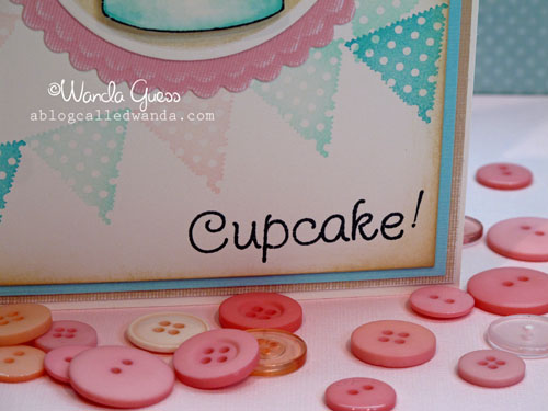
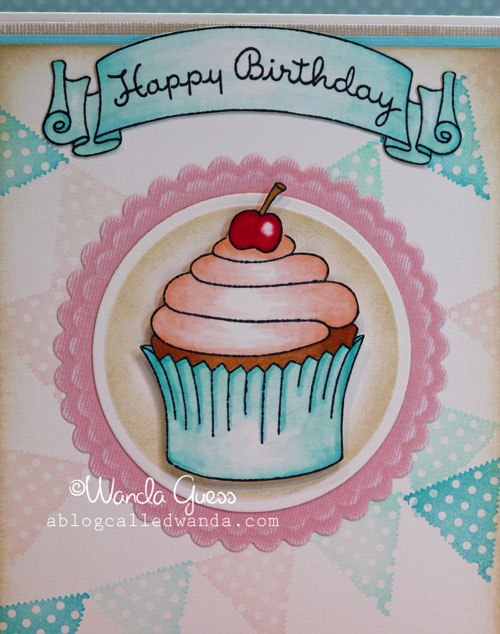
    HELLLOOOOOO! Monday already? Yup! Well…nothing we can do about it I guess. Today I'm posting a card using some SUPER cute stamps from Pink Persimmon!  I fell in love with their stamps last year and the wonderful Darcy was nice enough to recently mail me some new stamps to play with. (Thank you Darcy!) I adore their vintage images, and the stamp quality is superb. They stamp perfectly right from the package. I hope you will take a minute to hop over to the Pink Persimmon shop and check out the images. You will want some for sure! Today's card is a sweet cupckae birthday greeting done in vintage shades of pink and aqua. I don't normally say this…but I love how this card came out! Hope you likey!


    A


    B 


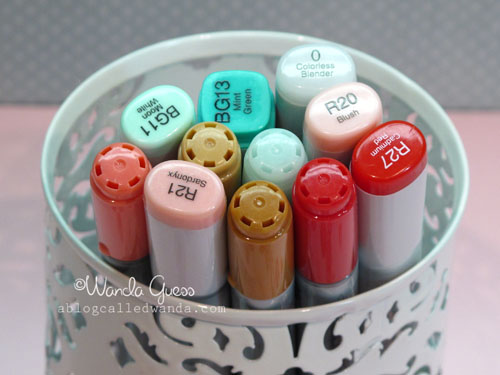
    Here is a close up of the coloring of the banner and the cupcake. My Copic shades are shown below. I went sparingly with the markes and then "diluted" my coloring by going over it with my blender pen. I think it looks sort of soft and watercolor-ish.

    C


    D


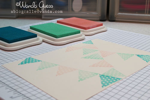
    The first thing I did was to make my own background paper using the banner set and some cream cardstock. MMMMMMM. YUMMY! I used Versamagic inks for a soft matte finish. Kept the color palette simple.

    IMG_5532


    Here are the Copics I used for the cupcake and banner: 

    IMG_5538


    These are the four stamp sets I used for my card. You can see how they all coordinate perfectly and are about the same scale and style. The combinations are endless. The banner set is a personal favorite! 
     
    IMG_5539


    Z 
     Have a great week cupcakes!

    Birdie signature! 
     

  • Red Hot Valentine!

    Happy Saturday everyone! I hope your weekend is off to a good start! The sun is shining here and I think once this post is done I will grab my kitty and go take a nice long nap. The DH and I spent the morning at H&R Block getting our taxes done. Ick. Aren't you always so happy when that is over for the year? I know I am. Such a relief…and a nice tax refund coming to us in a few weeks. Gonna try and save the money… We will have our ten year wedding anniversary (18 years together) this year and we really want to try to save for a vacation to celebrate. It's been a good long while since we went on a vacay. Anyhoo…I seriously digressed right there. I have a card to share!

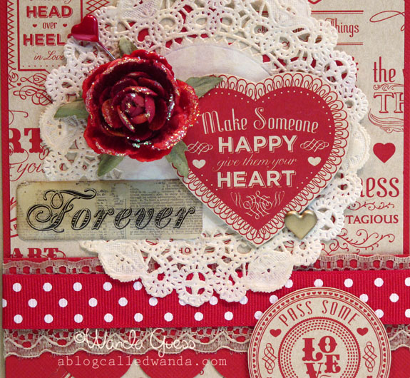
    Today's card is a red hot number – a Valentine made with the mostest prettiest and cool paper and ribbon from American Crafts!   I am a fan of their cardstock – as you know from a previous post. And this red/kraft designer paper is off the hook! The polka dot ribbon too! YUM.


    IMG_5508


    As I have been prone to do lately…got out everything but the kitchen sink and put it on this card! Pretty red Prima flower, a glossy sticker, a heart brad, a doily and a red stick pin. The paper heart on the doily was cut out from the patterned background paper. Isn't that sweet?
     

    IMG_5509


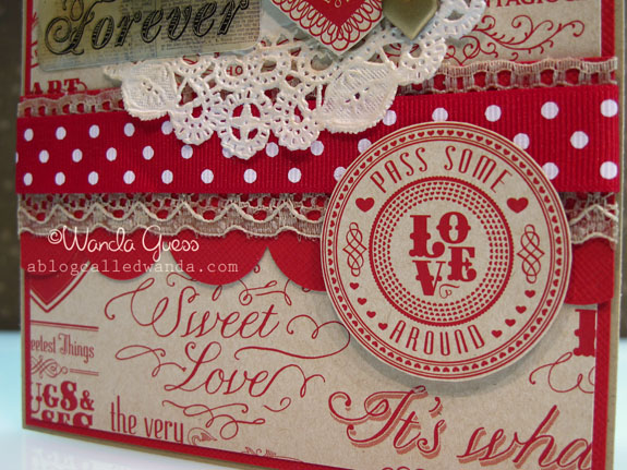
    I added glitter glue to the top of the rose petals to jazz it up. The horizontal element is a piece of red cardstock layered with some lace and then polka dot ribbon.
     

    IMG_5510


    The circular piece is again – cut from the patterned paper. I could make fifty cards with this pretty paper. I shoulda bought more. The rule for 2011 is NO HOARDING…so I'm using it! hahaha. 
     

    IMG_5511


    IMG_5513 
     I hope you have a happy heart today!
    Birdie signature! 
     

  • Year of the Rabbit – Gung Hay Fat Choy!

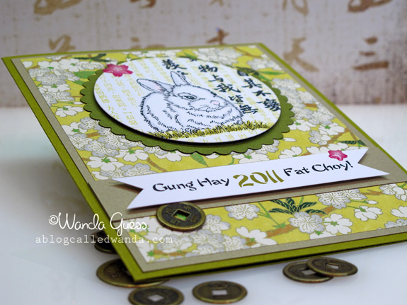
    One of the things I enjoy doing every year is making cards for Chinese New Year. I have many wonderful friends who are Asian and I love to make cards to send them to celebrate the New Year tradition. Gung Hay Fat Choy! 2011 is the Year of the Rabbit! Are you a Rabbit? I am a Dragon myself!

    Usually my Chinese New Year cards are very strong and use red and black and gold (click here to see my cards from last year) but this year I went with a different color scheme. My card was all based on this wonderful sheet of paper I've had in my stash that is chartreuse. Since it's the Year of the Rabbit I thought I would shake it up, and go with a Spring/green theme.


    1a


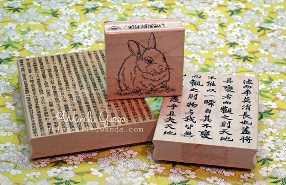
    I stamped the Hero Arts rabbit in black first and then masked it. Then I stamped the small Chinese lettering background in chartreuse ink…then I put the larger lettering over that with black ink. I ran the whole image through a circle nestability.  

    2a


    B


    C


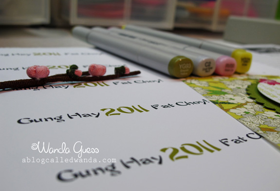
    I printed out my saying from the computer so it would have a pretty font and the right color for the year. I do this a lot since I'm a font-a-holic! I think this looks pretty.  

    E


     G


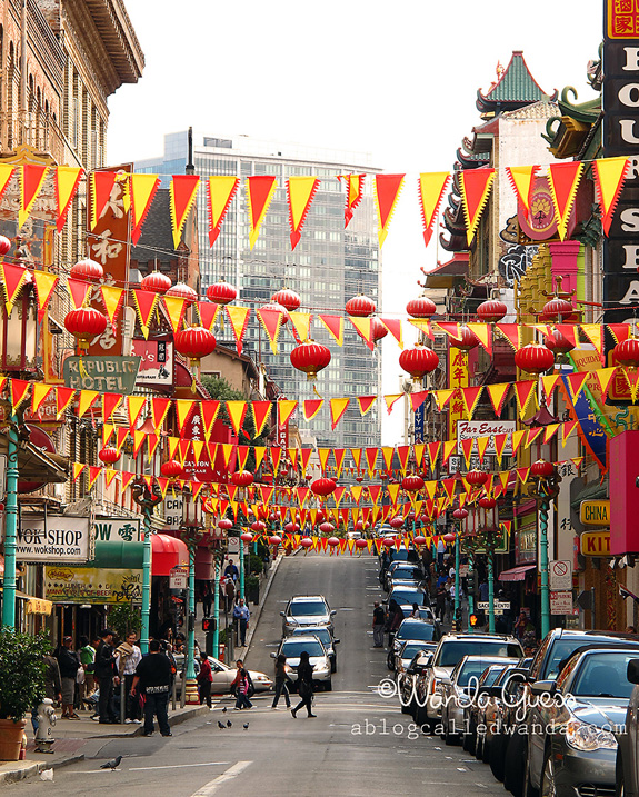
    This is one of my favorite shots of San Francisco's Chinatown that I took in October of last year. It captures the exact feel and color of the area. Love to go here and eat and shop and take pictures!

    H 


    HAPPY NEW YEAR!  

    I
     

    Birdie signature!