• Art from the Heart

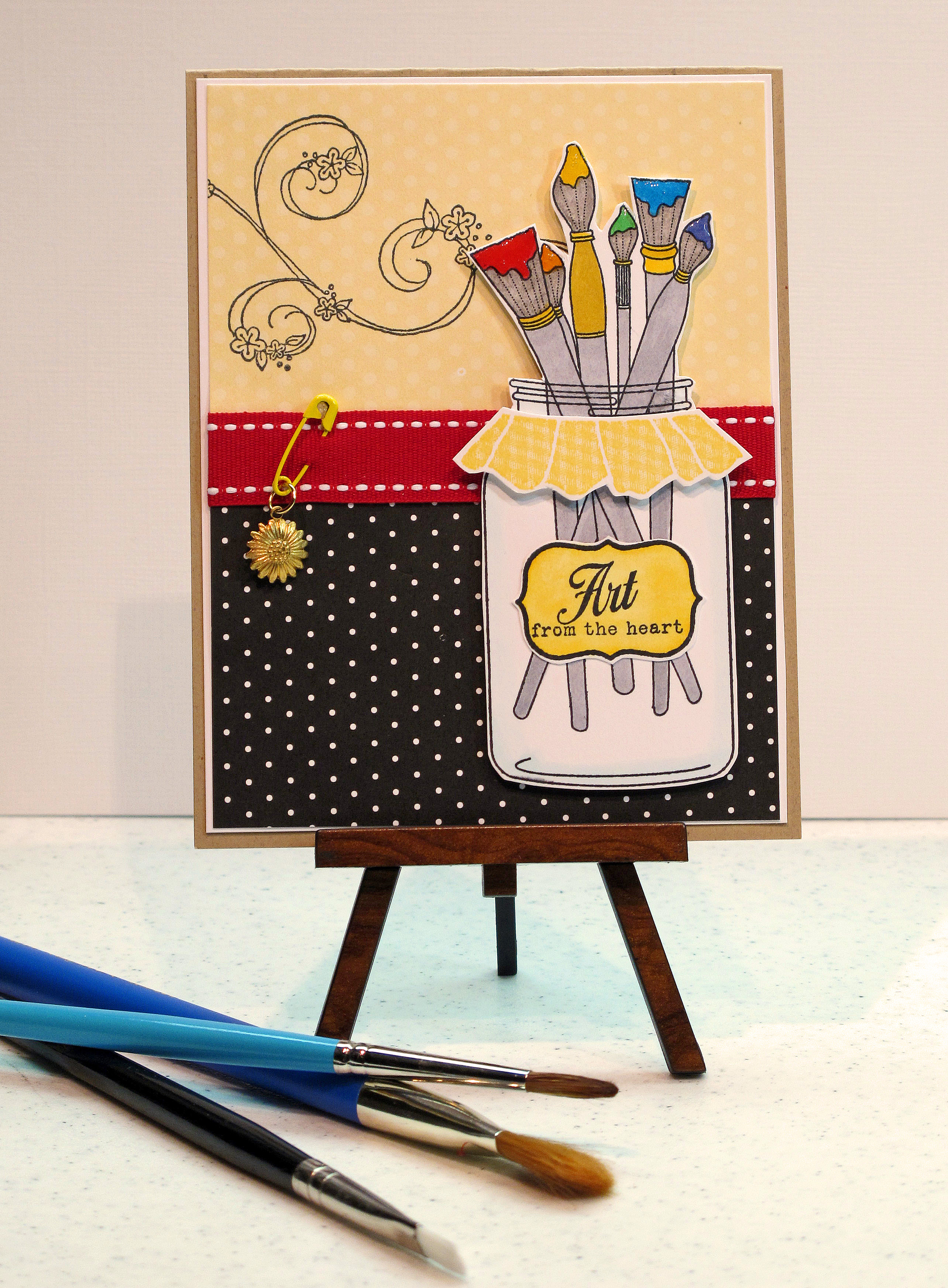
    Happy 4th of July!!! Hope you are having a nice holiday weekend and enjoying time with friends and family today. I got in some stamping time this morning – before we get ready to head over to my brother in law's house for fireworks later! I made a card using PTI's new sets "Friendship Jar" and 'Friendship Jar Additions." Really cute stuff!

    The jar, label, paintbrushes, and cover are all separate clear stamps. I cut out the label and the cover to add some dimension. I colored in the paintbrushes using colors of the rainbow in bright primary shades. Used my Copics…of course.
    IMG_2251_edited-1

    The ribbon is also from PTI – Poppy is the color. Here are my Copic colors. I didn't do shading since I wanted the color to look rich and bright. I did a little shading on the label with two shades of yellow. I used the lightest blue green color around the edge of the jar to make it look like glass.

    IMG_2250

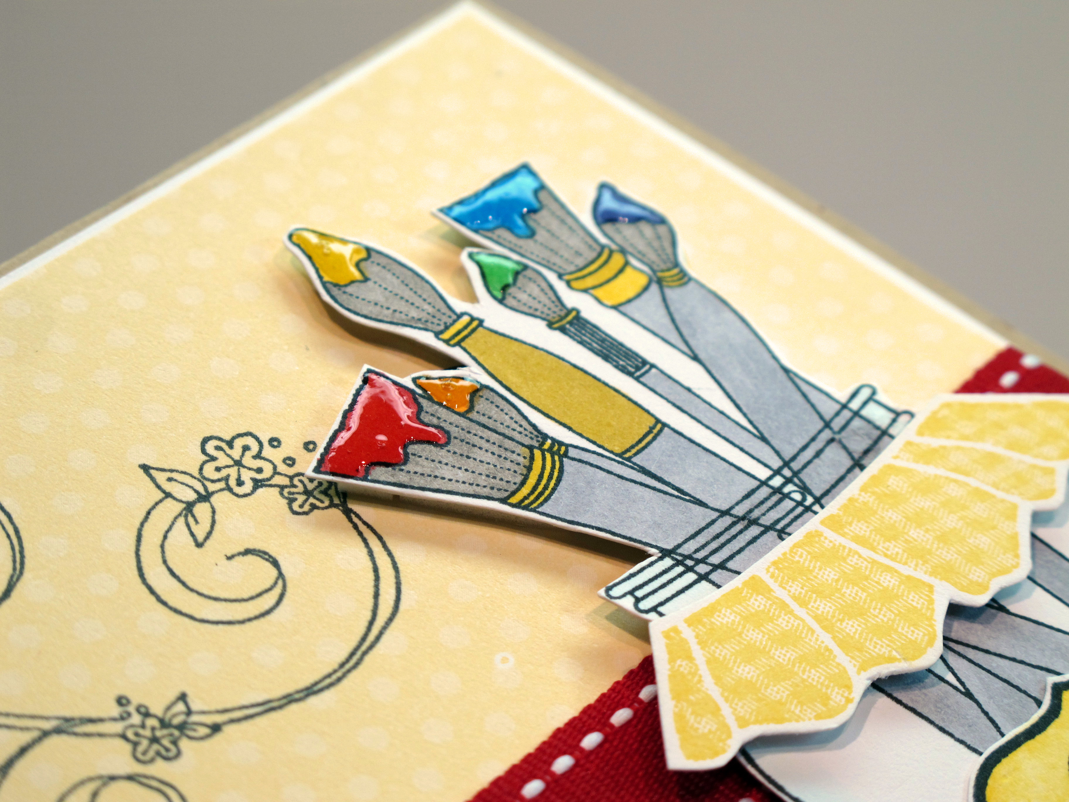
    I added diamond glaze to the paint to make it look like wet paint! I colored the bristles with warm grey and the handles with cool grey. You could do so much with this set! I can't wait to make stuff in different color schemes.
    IMG_2255

        Bye everyone! And again…Happy 4th and God Bless America!
  • Sweet! Two challenges in one!

    Hey everyone! I'm kinda short on stamping time this week. We are trying to refinance our house and do all that comes with that…paperwork, appraisal, etc. It is a long process, but one that will hopefully work out and be a good thing in the long run. Send some good vibes our way.

    Since stamping time is at a premium, I combined two challenges in one! A color challenge from the gals over at Shabby Tea Room and a sketch layout from Taylored Expressions. The colors are bright and happy: Lime green, hot pink and aqua blue Love those colors… and I always love a sketch from Taylor.

    Check out Shabby Tea Room Challenge #16 by clicking here. AND Check out Taylored Expressions Challenge #118 by clicking here.

    TESC118 

    I used this super fun paper collection from K & Company called Citronella. It has all the bright, juicy colors called for in the challenge and has fruits and drinks and all kinds of yumminess! The drink is a big sticker! The limes and strawberry on the right were cut out from the patterned paper. I used hot pink bazzill paper and some white paper for my layers. The polka dot ribbon is from PTI – chartreuse.

    IMG_2238


    IMG_2241


    IMG_2244

    Cocktails anyone??? Yes, please!!!

  • 4th of July Cards!

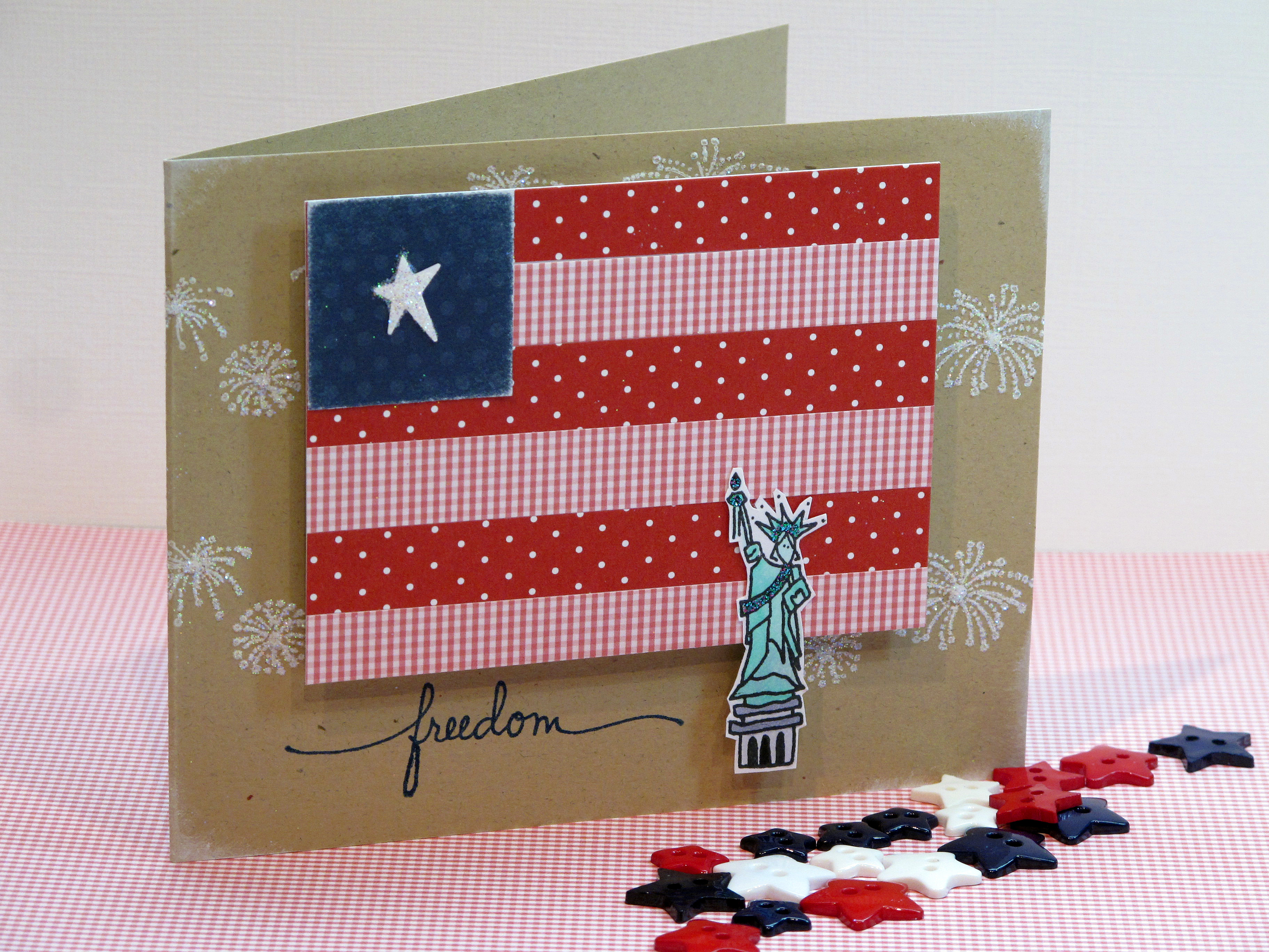
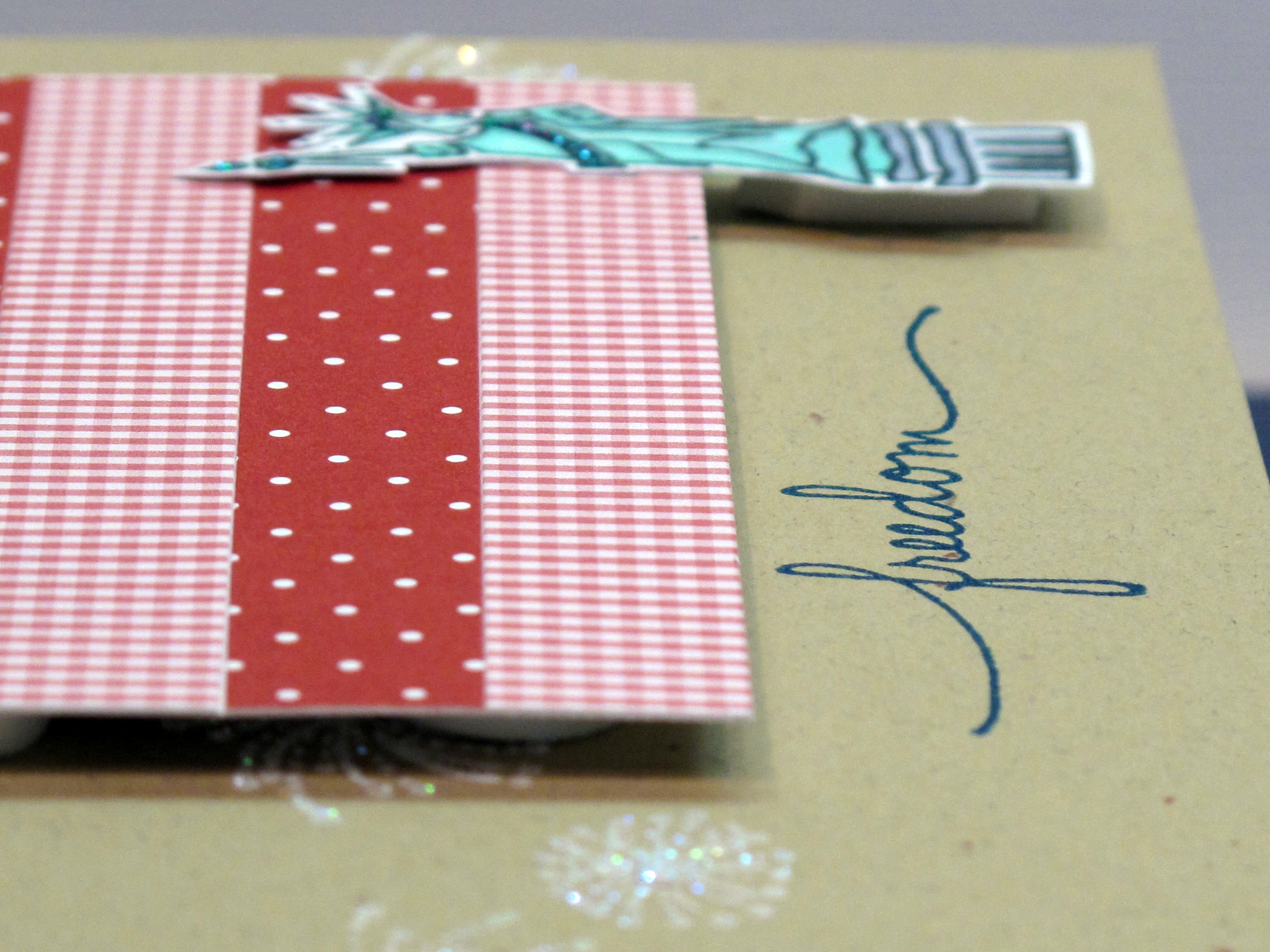
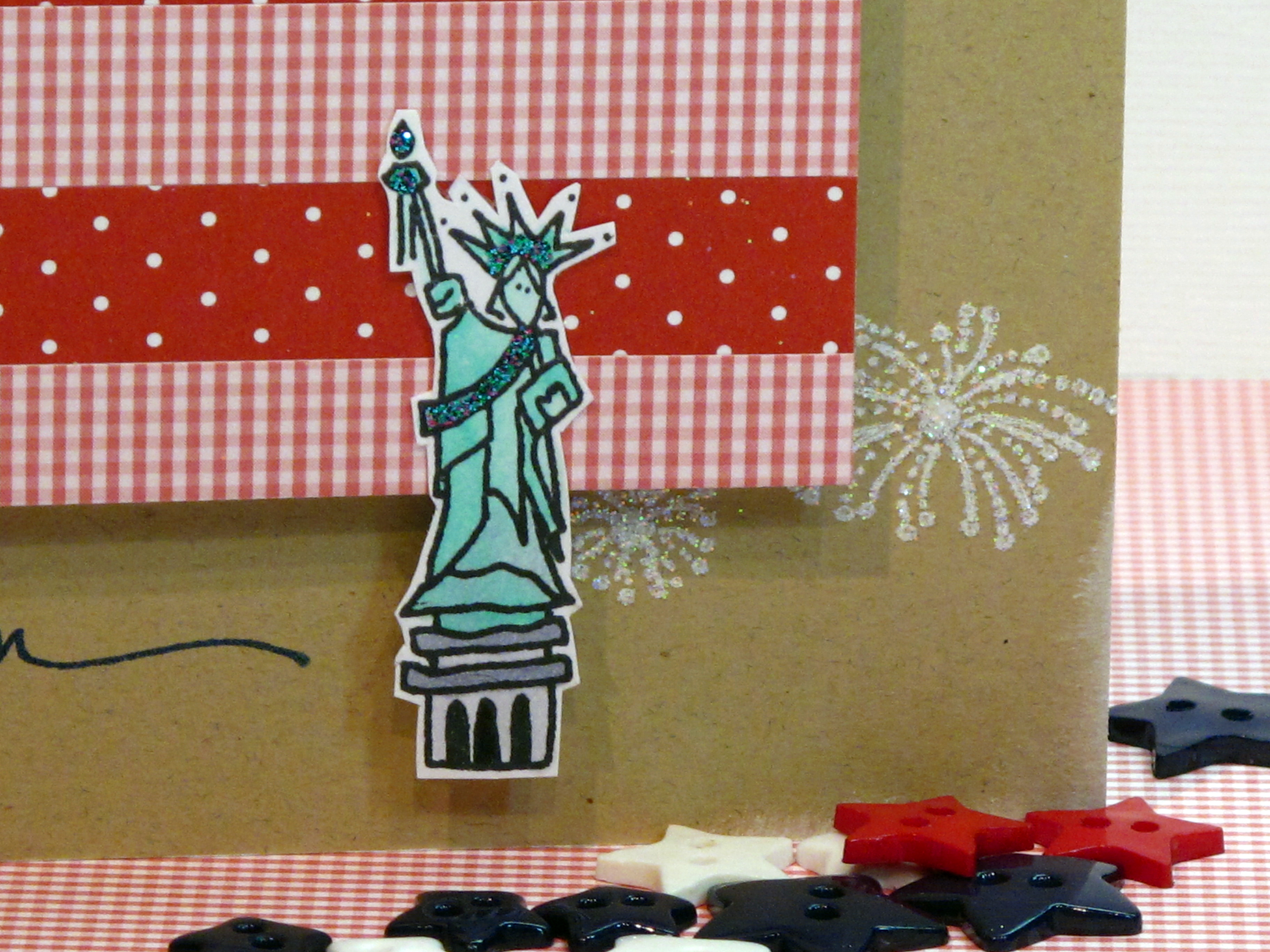
    Let Freedom Ring! Today I'm posting my 4th of July cards to share with you. I love making patriotic cards – as you've probably noticed from my blog! For my 4th of July cards this year I called upon an idea from a card I made a while back for Shabby Tea Room. (click here to see that card). This time I made the flag much smaller and also more geometric.

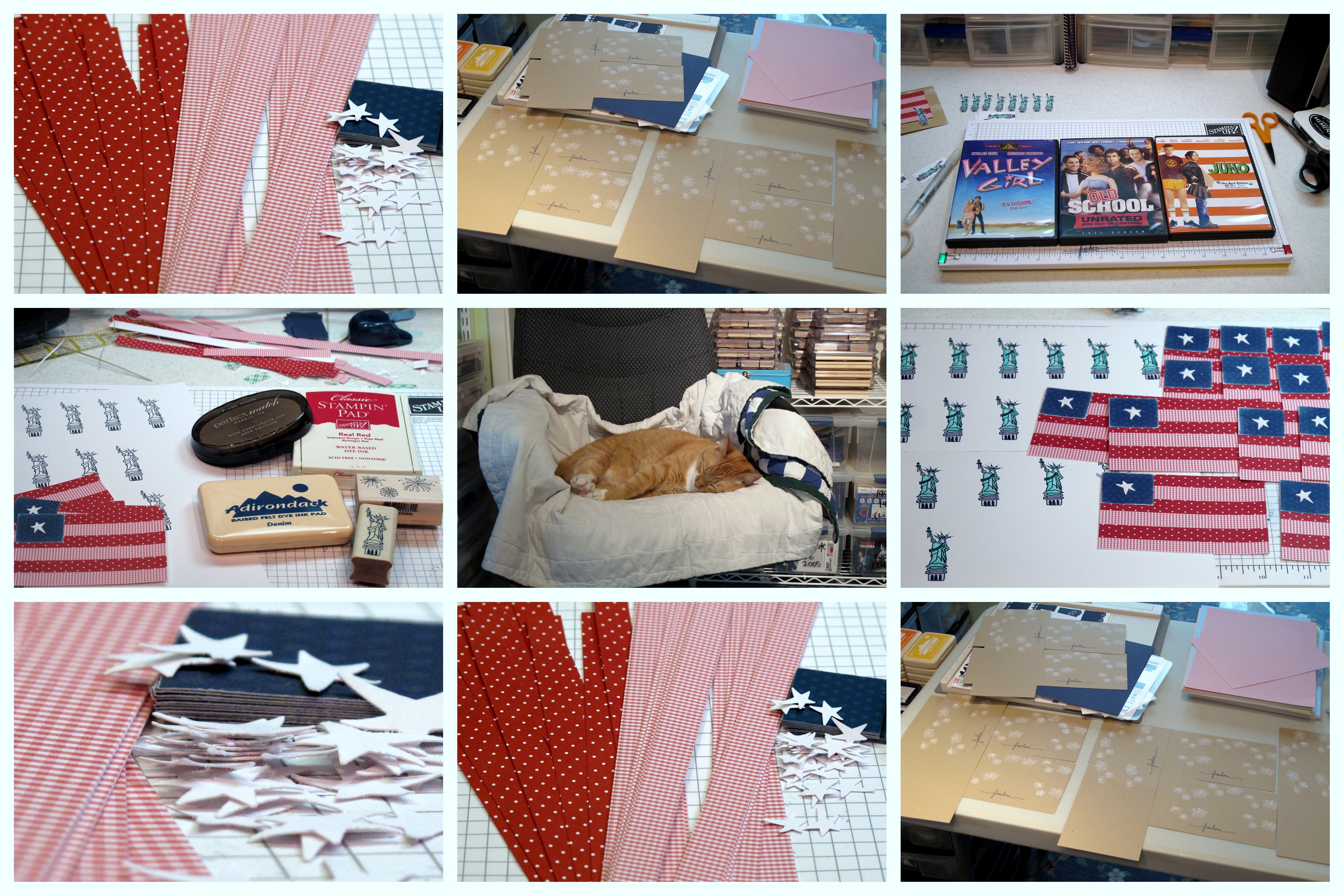
    Okay, I have to say that making one of these was okay….but making 16 of them!? Not so much! I had no idea how long it would take me with all that glitter and cutting, and punching, and gluing! Oy. I do like how they came out though, so I guess it was worth it!! And I got to watch THREE movies…hahaha.

    The card:

    D


    The Process:


    Collage 


    IMG_2191 
     

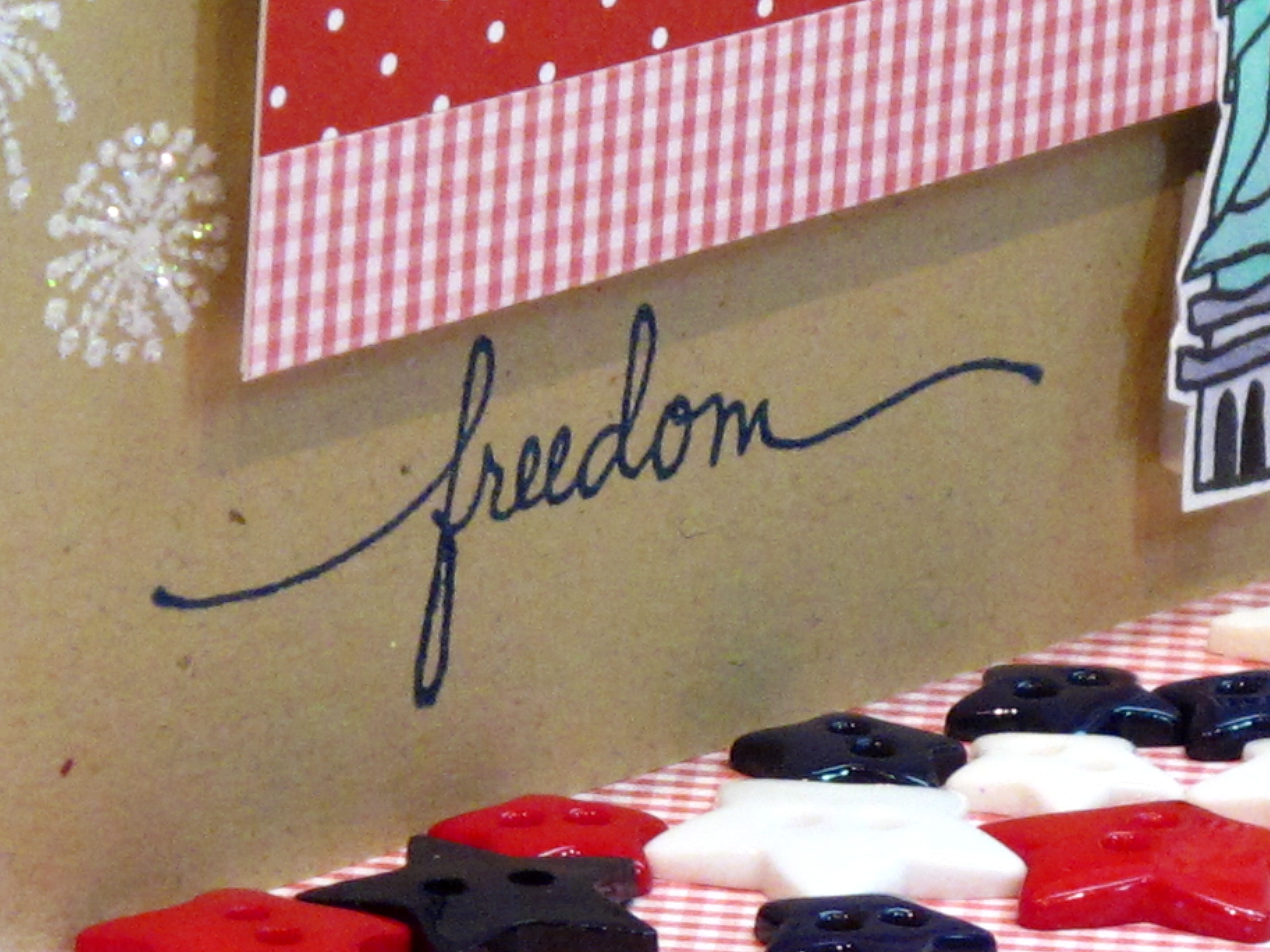
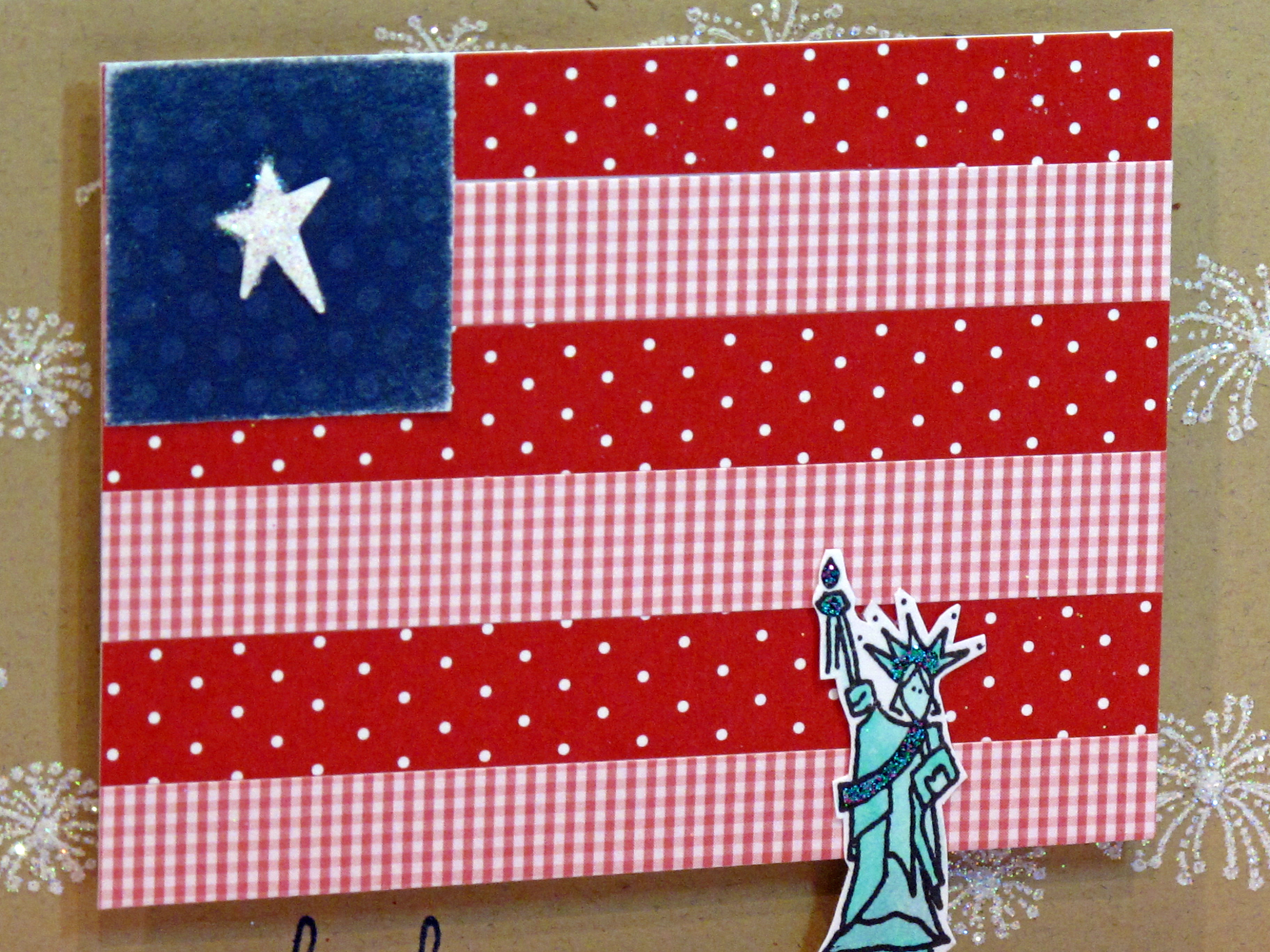
    The finished flag is 4" x 3". The blue part is a 1" square punch. the stripes are 1/2" wide. It was fun to combine two of my favorite things right now: polka dots and gingham! The Statue of Liberty is from Amuse stamps! I colored her with my Copics and then put on some 'mermaid' glitter glue. The fireworks were stamped in white ink and then glittered up!

    IMG_2192


    IMG_2182


    IMG_2189 
      

    God Bless America! Happy 4th of July week!
     
    My card just happened to fit into the Curtain Call #36 Challenge too!
     
  • Punch Drunk!

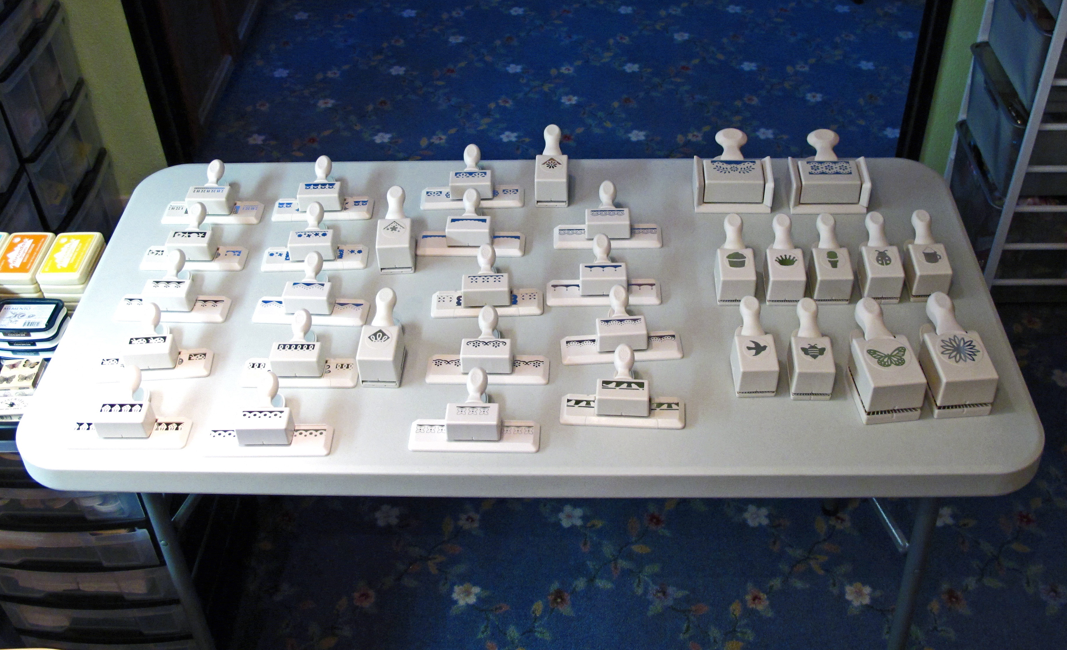
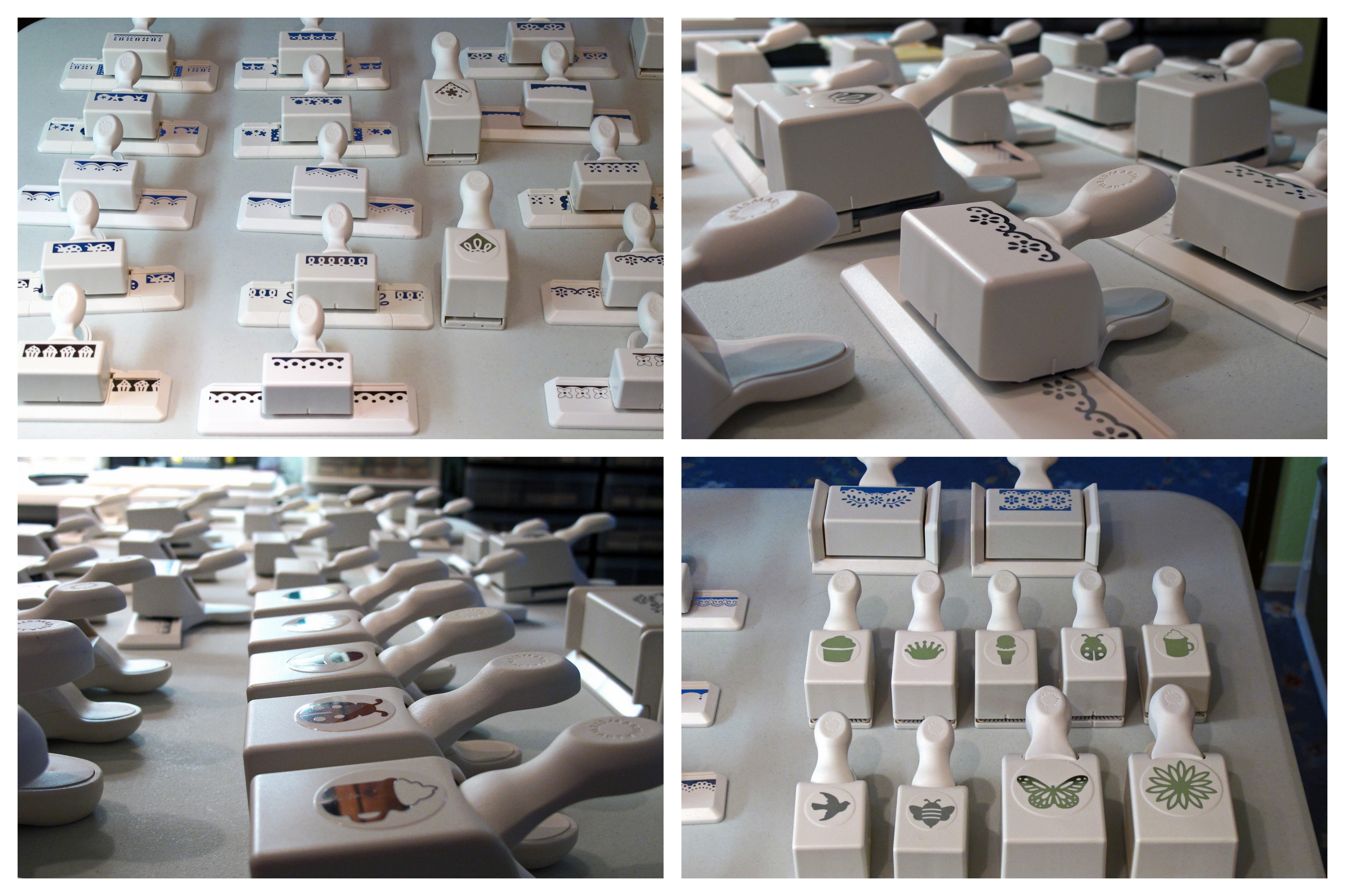
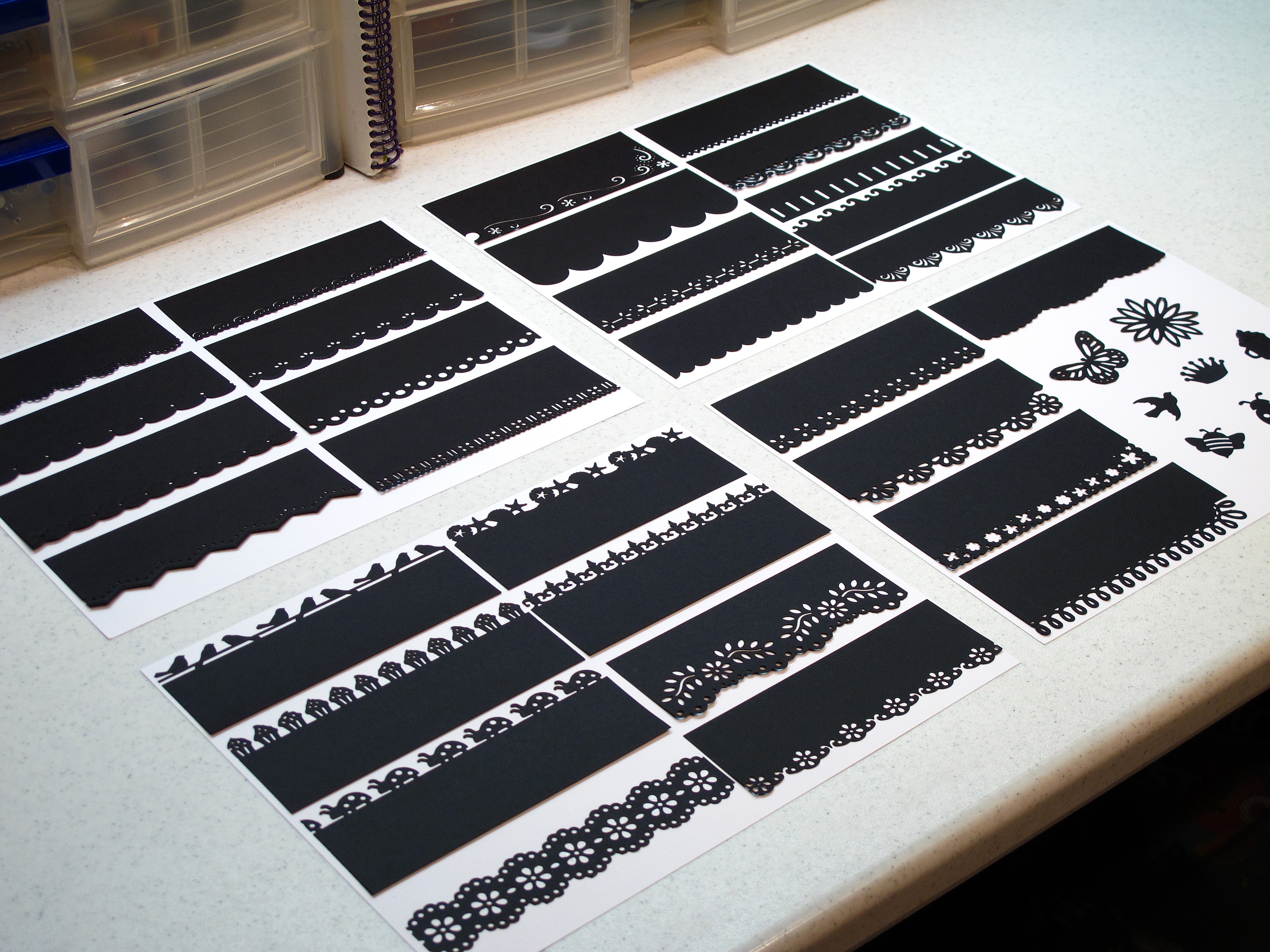
    Today I'm going to share an obsession… I've alluded to it in the past and you've seen the results of my obsession. Today I'm putting it all out there – my addiction to Martha Stewart punches! I'm buying the entire Martha Stewart punch collection one 40% off coupon at a time!

    For a long time I have wanted to catalog them somehow so I could have a reference while I'm making a project. Today I decided to finally do it. First I got out all of my punches and laid them out on my extra table. Oy. Don't make fun of me…

    A


    Aa

    Then I cut strips of black paper into 5.5" x 2" and punched out all the edge punches. This way I can see what I have at a glance without having to dig through the punch drawer. It was kind of fun to see them all at once and remember what's in there.
    IMG_2156


    Then I put each of the strips onto white paper…and voila! Here is the end result! I think I will try to find some plastic covers to put the sheets in. I think this will help me use them all instead of just choosing my favorites all the time.

    IMG_2157


    IMG_2160

    What do you think? Do you have a craft obsession? Are you willing to admit it? Thanks for sharing this with me today. Have a good one!

  • Hello!

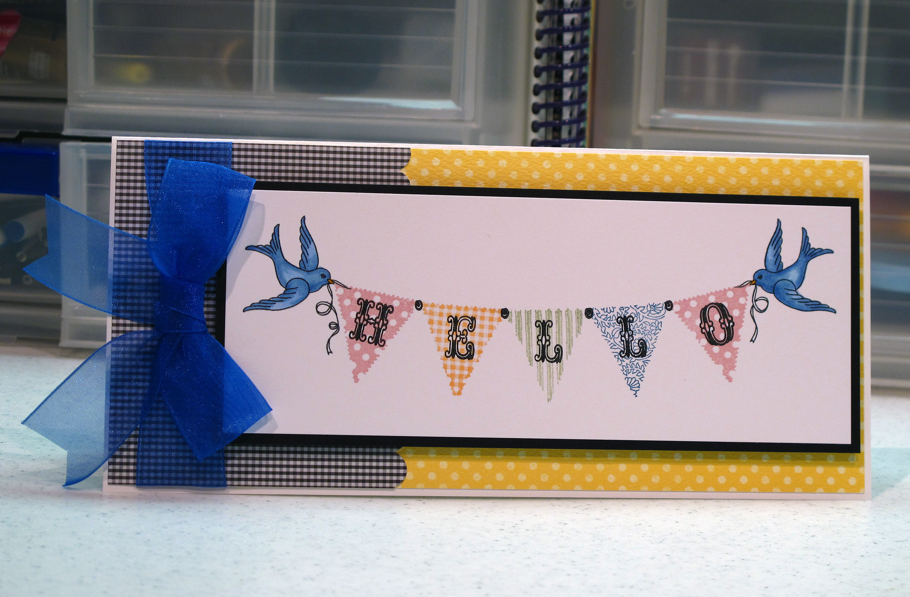
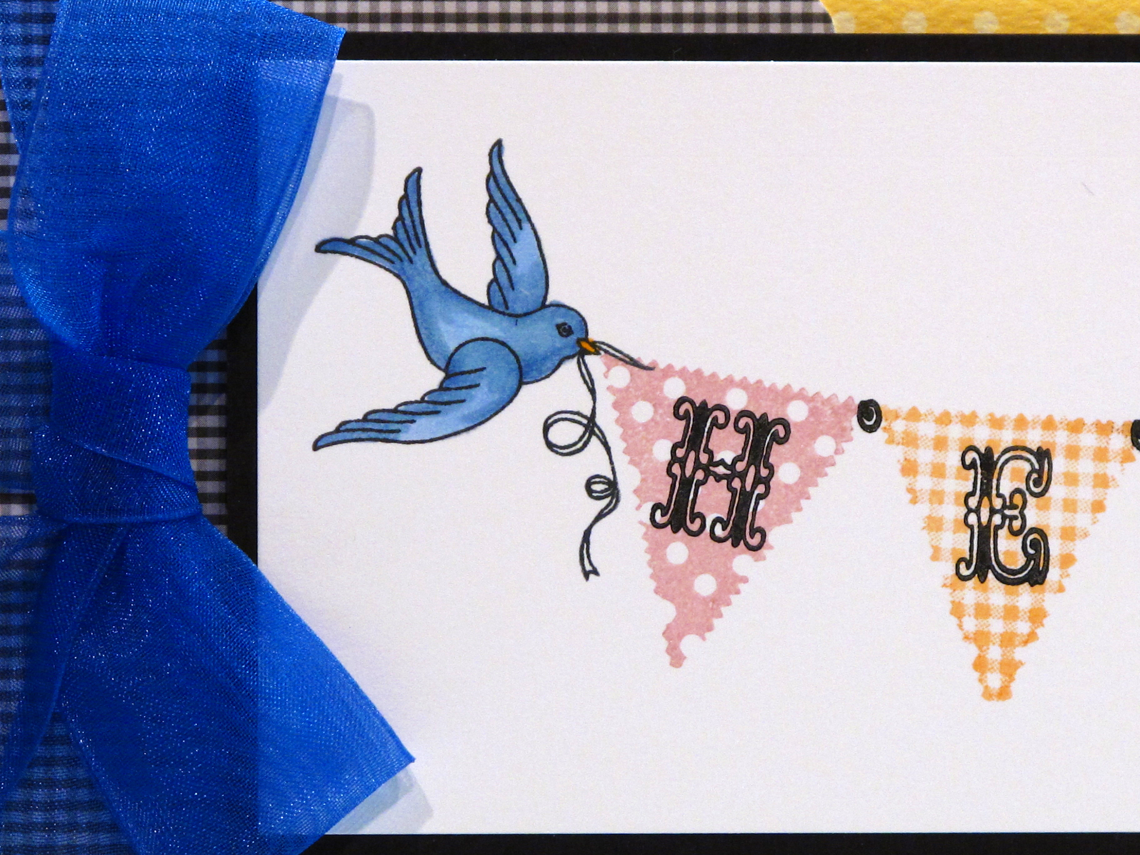
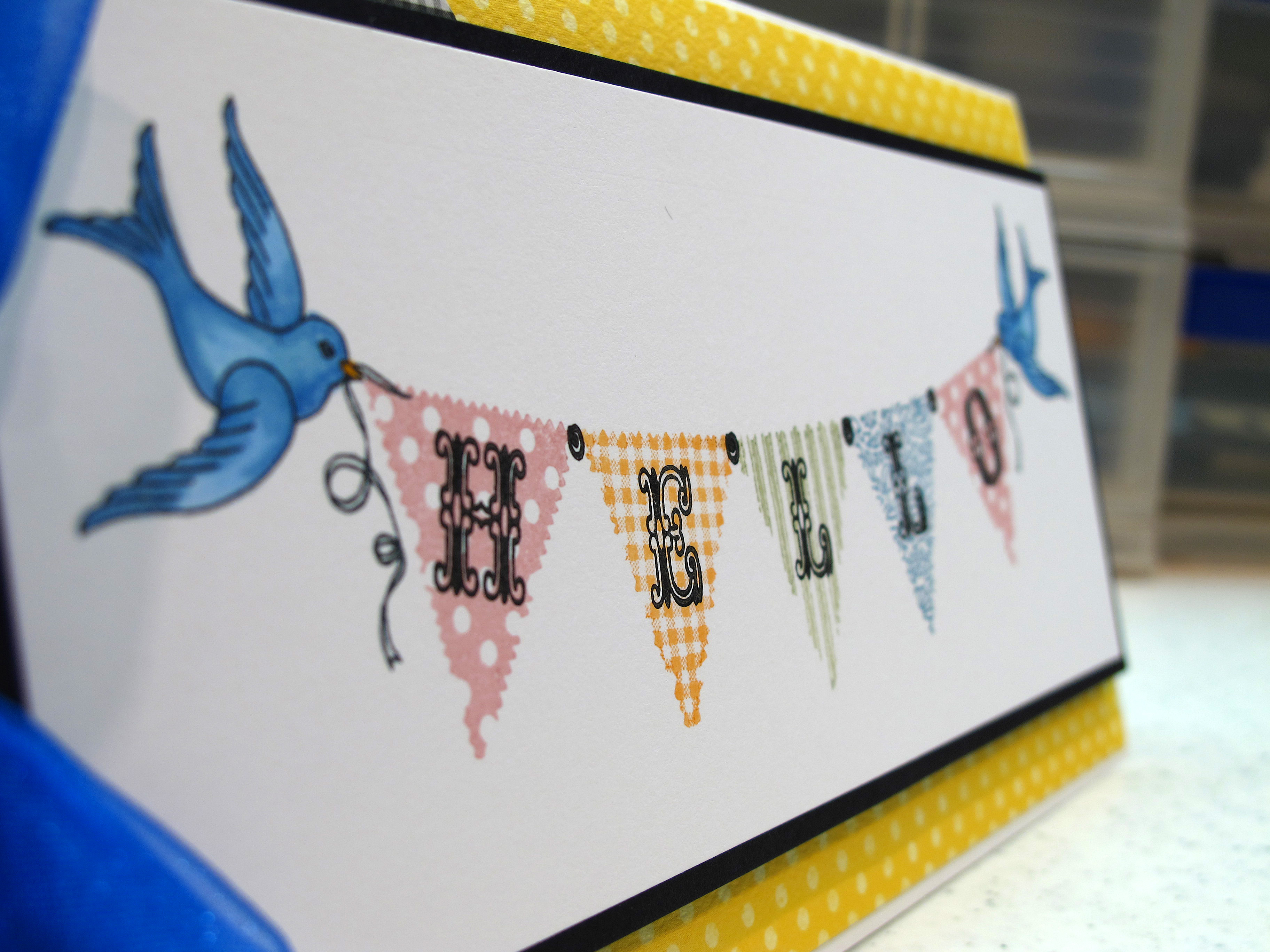
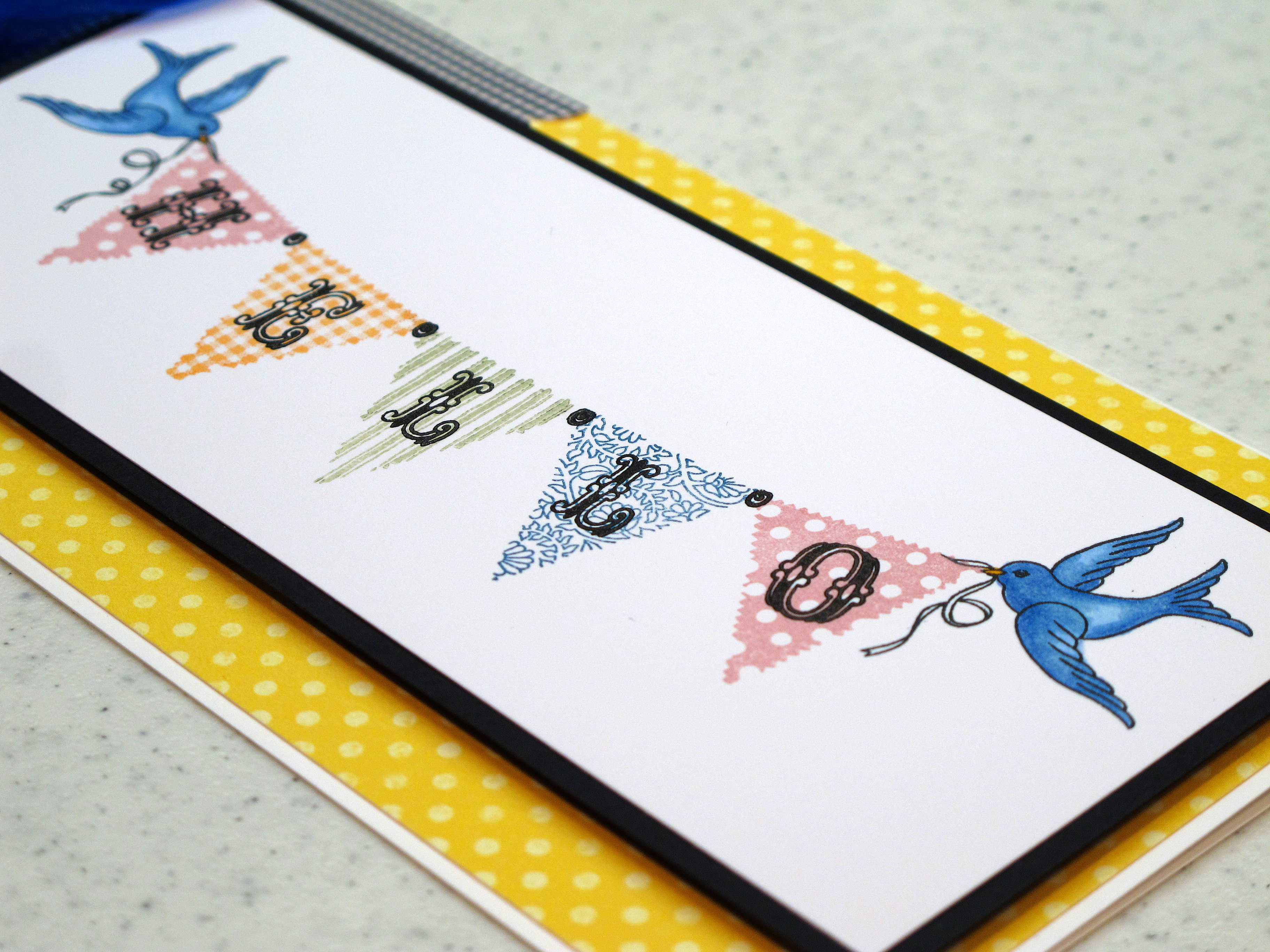
    Today's card was meant to send a happy hello to a friend who just moved to a new city. I wanted her to have some fun mail in her new mail box. I love this stamp set from Pink Persimmon with the little banners and the birdies to hold them. Each banner is a different stamp with a different pattern. Don't even get me started on the cute alphabet that fits just so inside the flags!! I know I will be using it a lot in the future.


    IMG_2035


    I colored the little birdies in with my Copics and used Versamagic ink pads for the banners. The black ink is all Memento Ink.
    IMG_2036


    IMG_2037


    IMG_2038


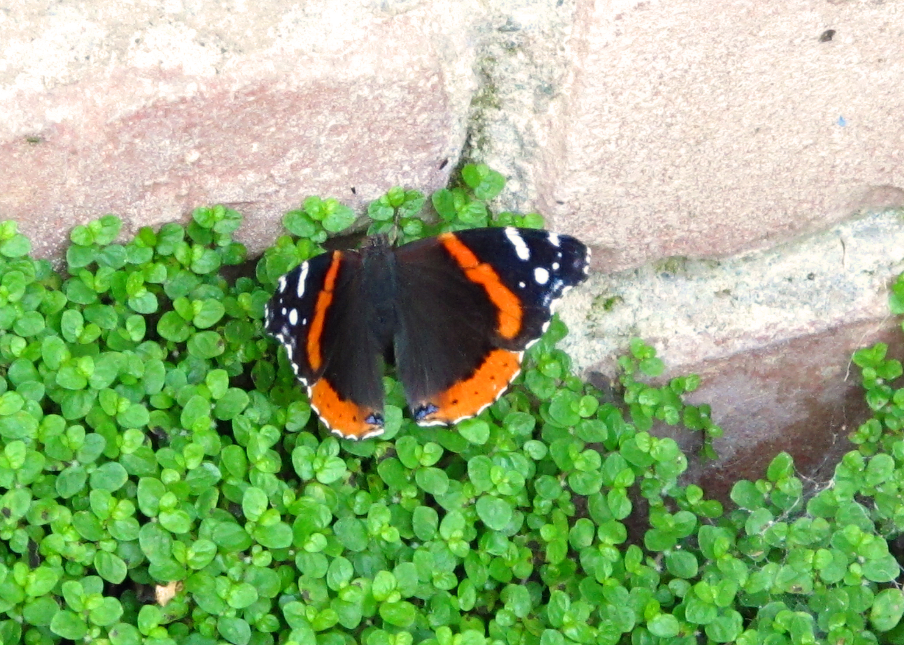
    This little butterfly fluttered by while Mark was out doing yard work! This was the only picture I could snap before she flew away…

    IMG_2094


  • A Pretty Yellow House…

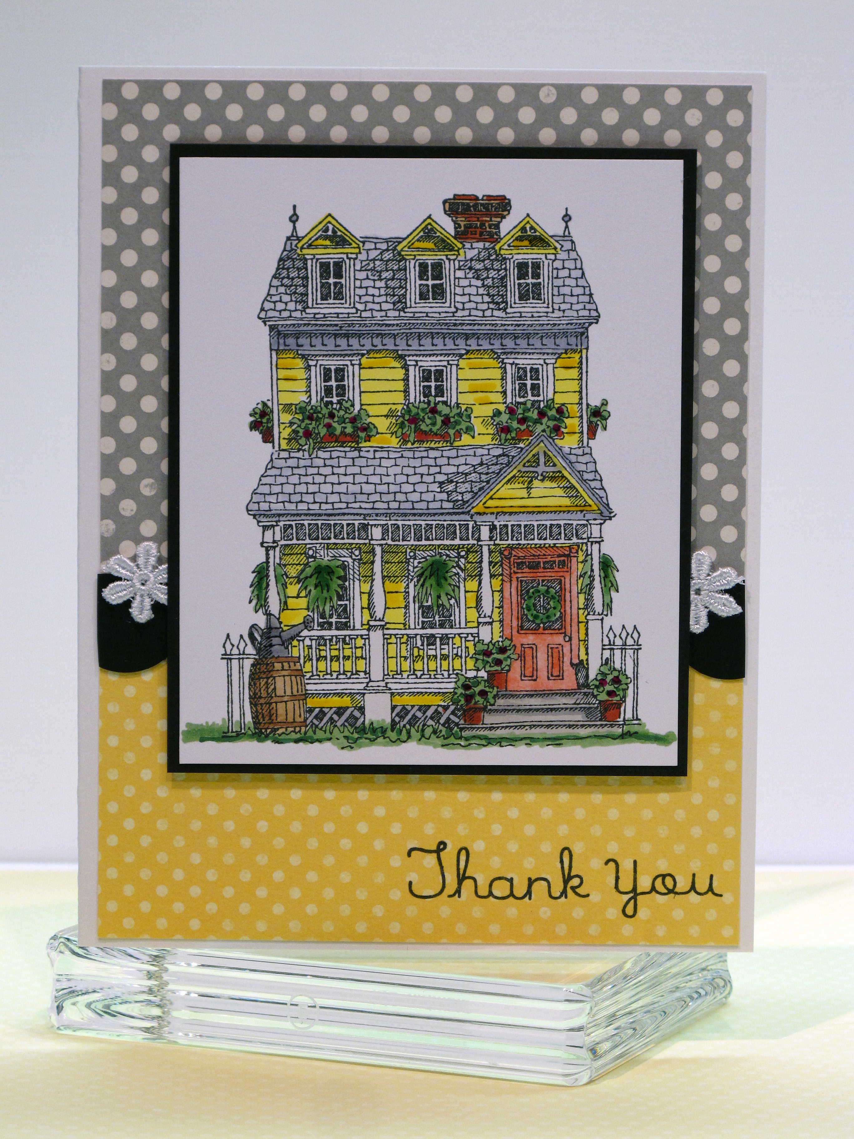
    Hi there! I have a cheerful fun card to share today! My friend Jilli Bling lives in a beautiful yellow victorian house out in the country and she was gracious enough to invite me and some friends over to stamp a while back. I wanted to send her a thank you card and I was so inspired by her wonderful home.

    IMG_2029

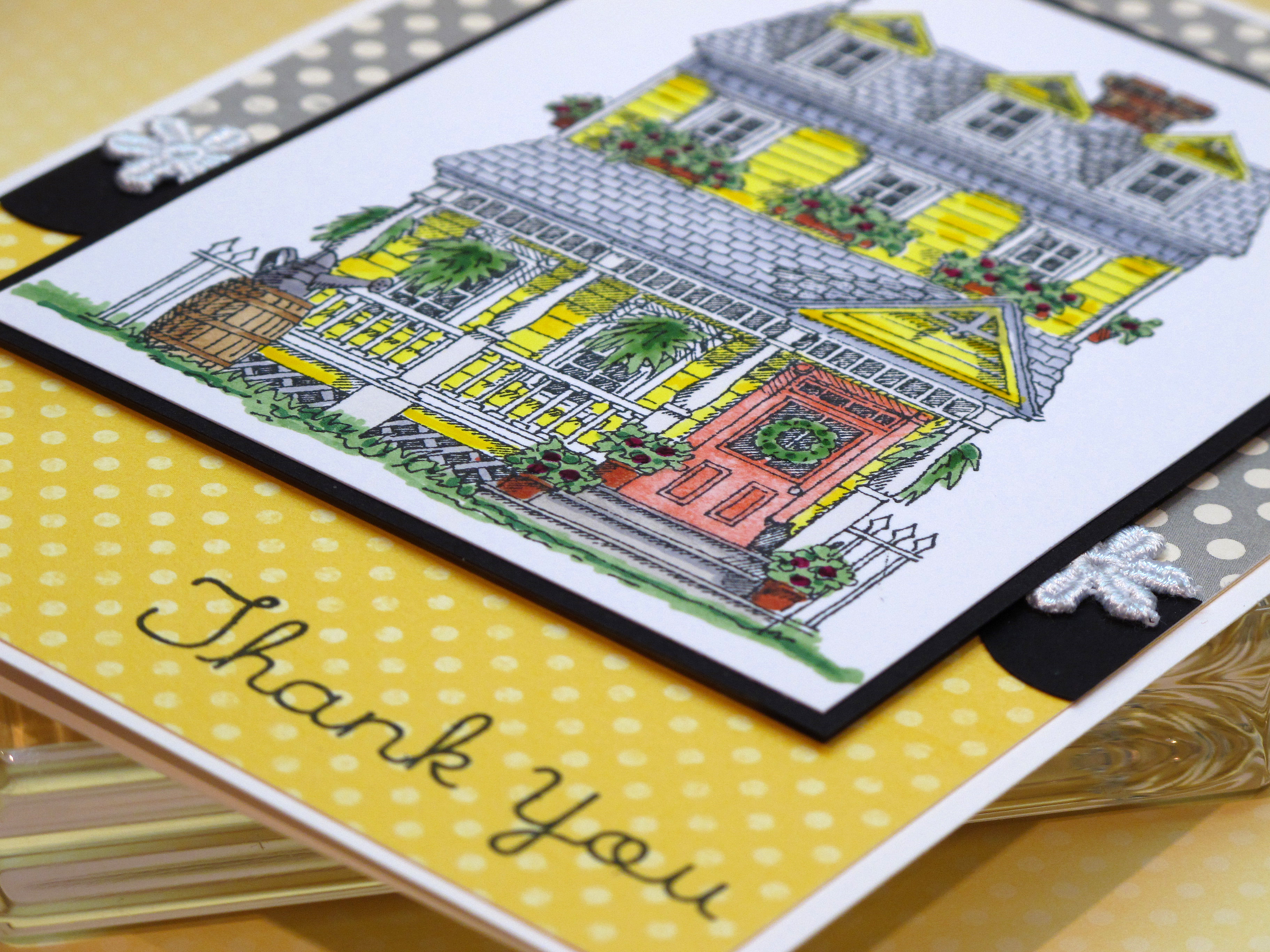
    I used my Copic Markers to color the house in…and yes…it took me a long time! I used my glaze pens to add some dimension to the leaves on the plants and some of the yellow siding on the house. I used three or four shades of yellow to get just the right color. I kept the rest of the color scheme simple to focus on the main image.

    IMG_2030

    I'm pretty crazy for polka dots lately…

    IMG_2033

  • Color Cue #5 Challenge!

    Hiya! I found another great blog with a color challenge! This one is a color challenge and you can link to the Stamp Away With Me blog by clicking here.

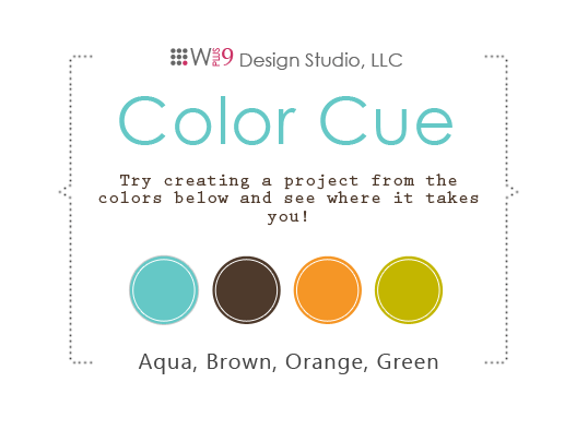
    This is the color pallette we had to work with – nice huh?

    Color_cue5

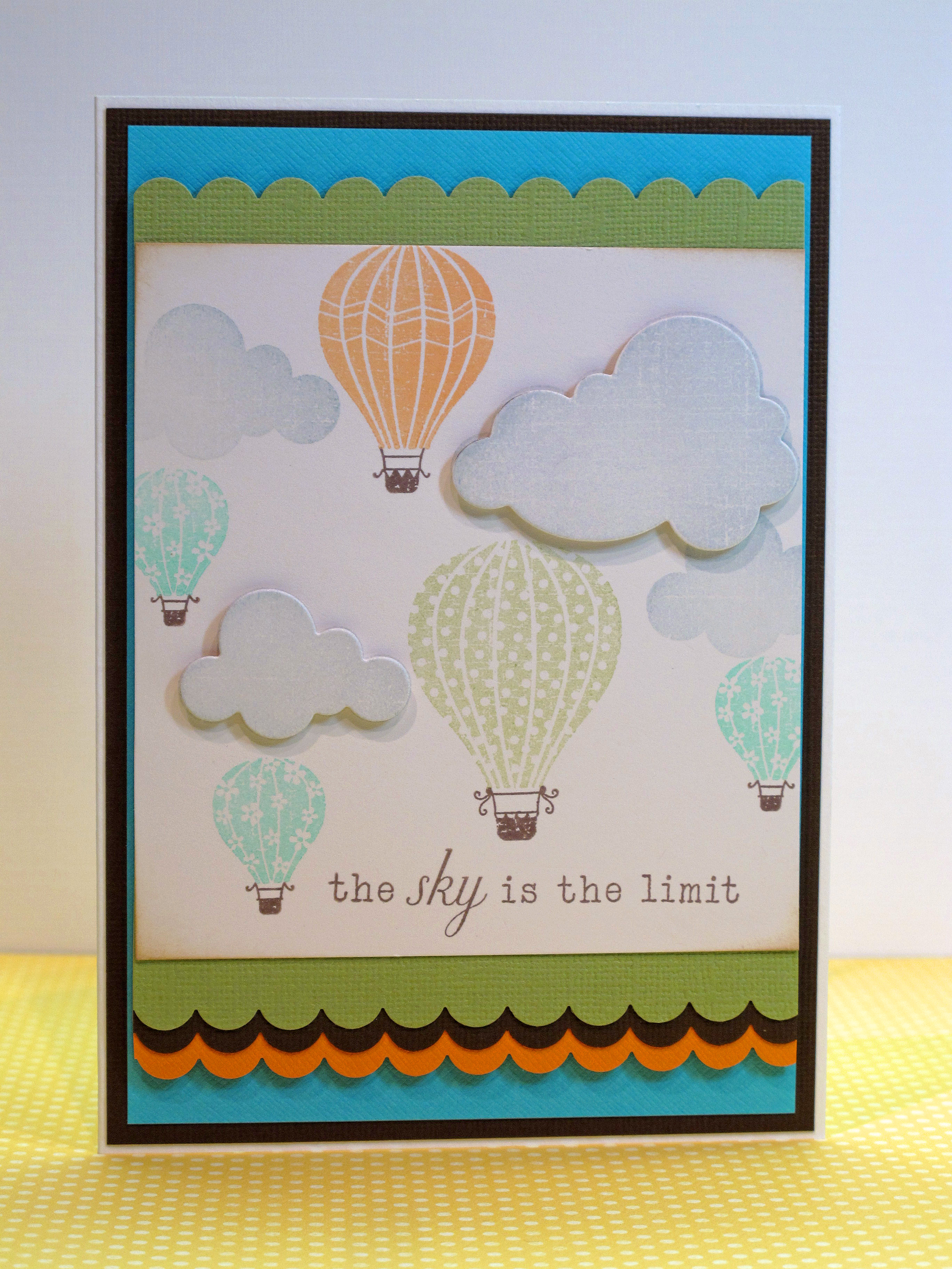
    Here is my card!

    IMG_2195


    IMG_2198


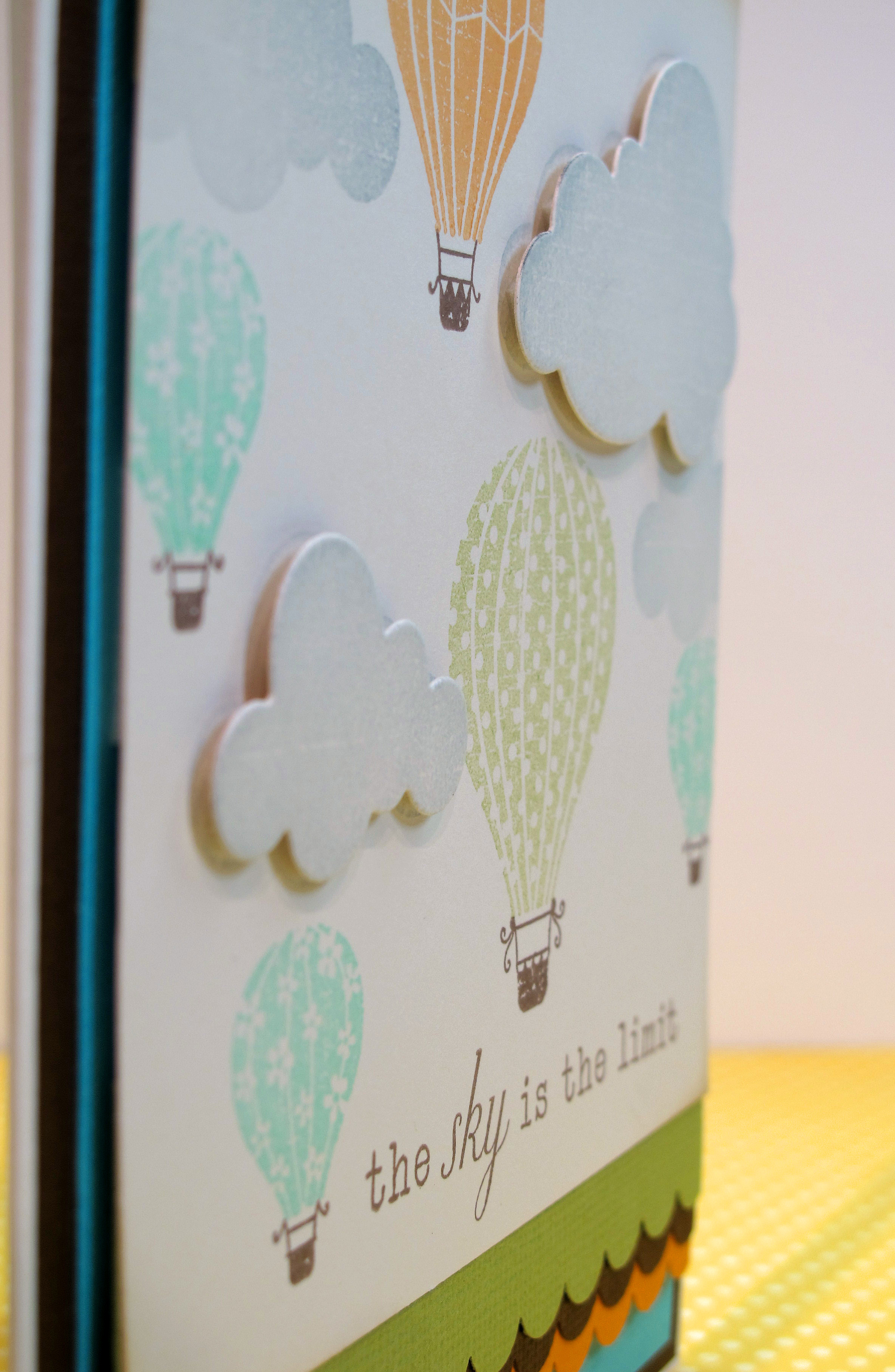
    I used the super super cute PTI hot air balloon set with the cloud die. I used my versamagic inks in the orange, aqua and chartreuse colors and then made the baskets brown. I absolutely adore this stamp set!

    IMG_2200


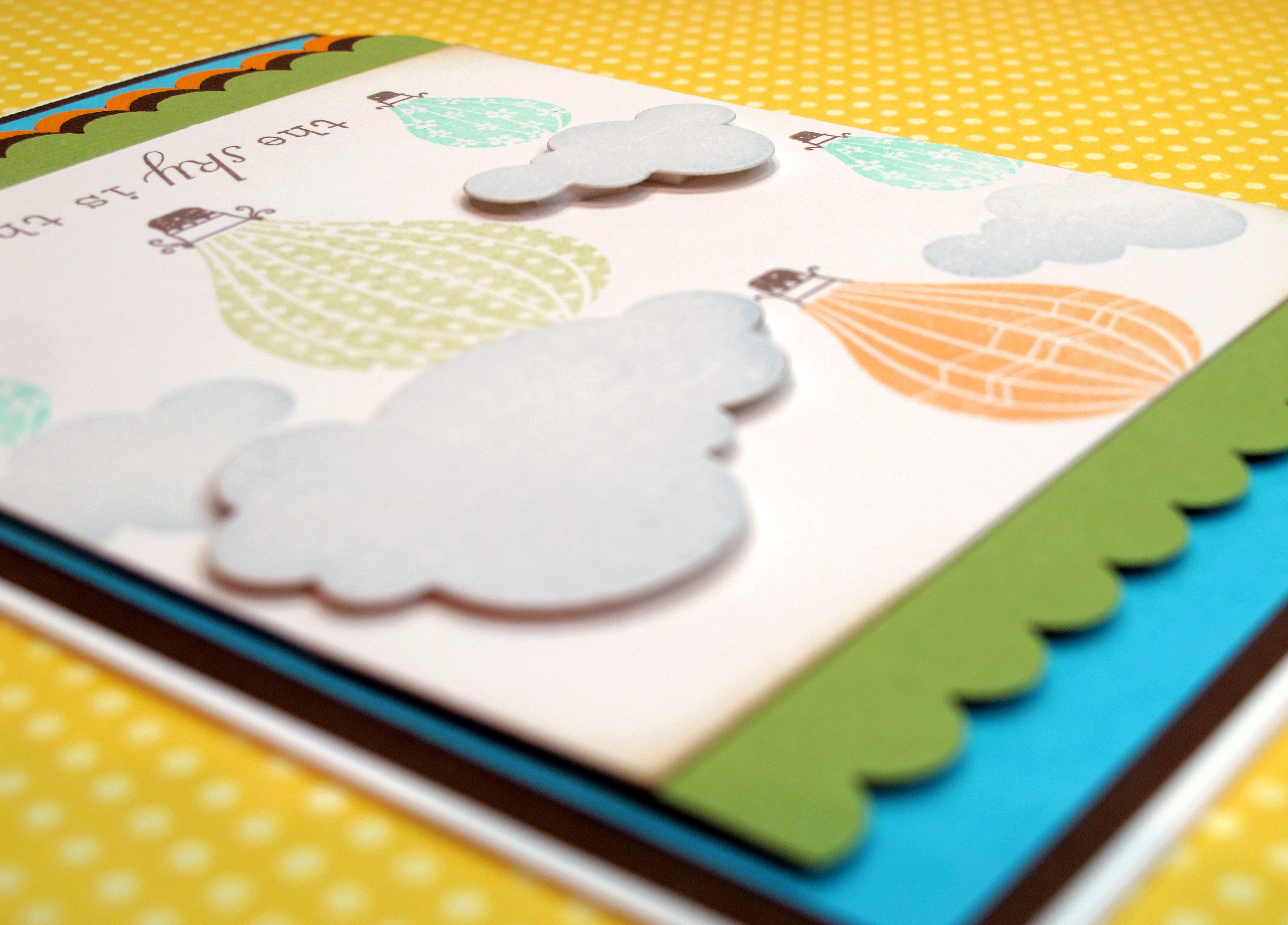
    I tried adding ribbon, some buttons, a charm…nothing worked…so I just left it sort of simple and clean. The images are so crisp and soft and I like the way the scallops add some dimension.

    IMG_2201

  • Warning…you’re going to be hungry after you read this!

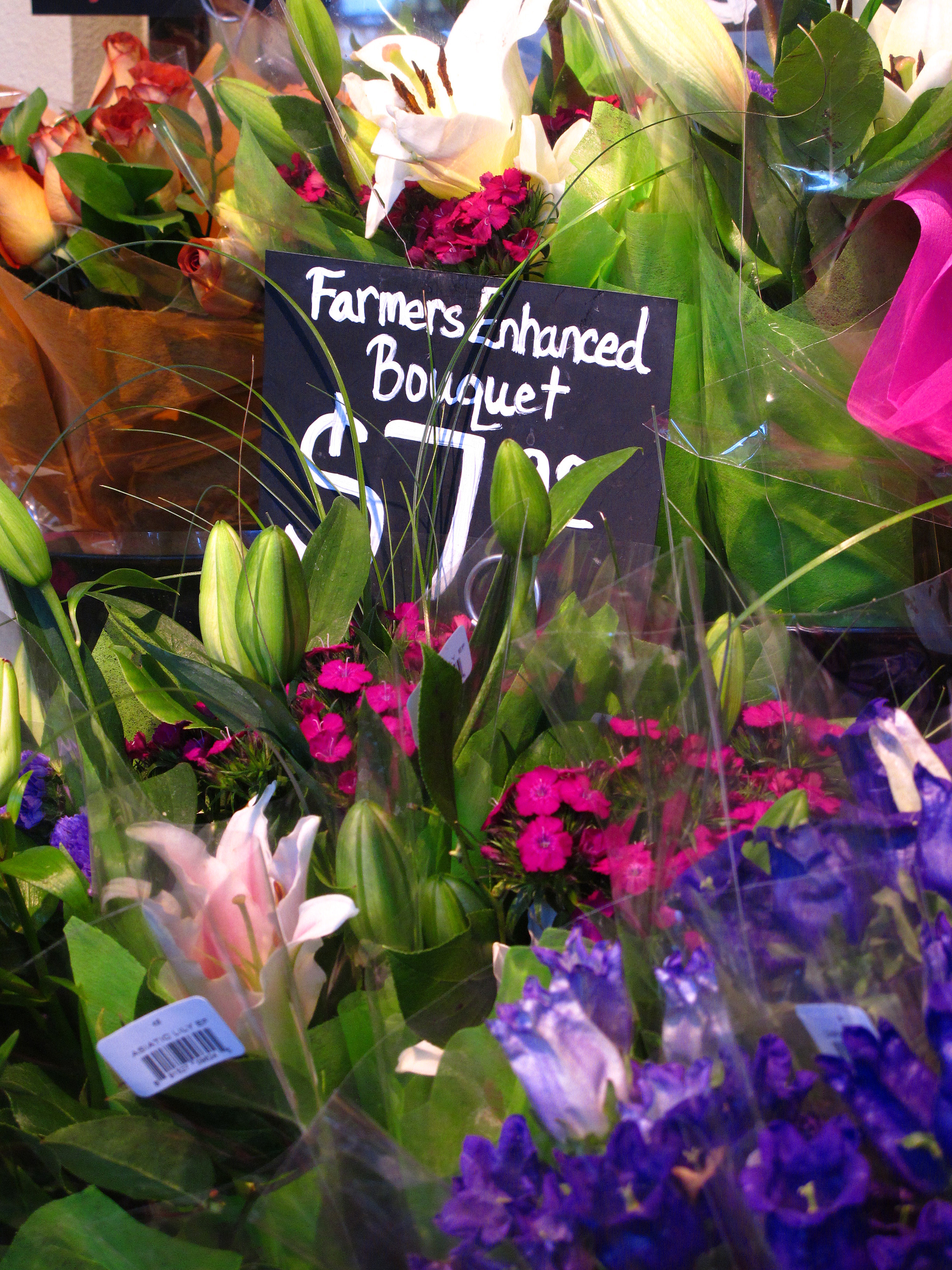
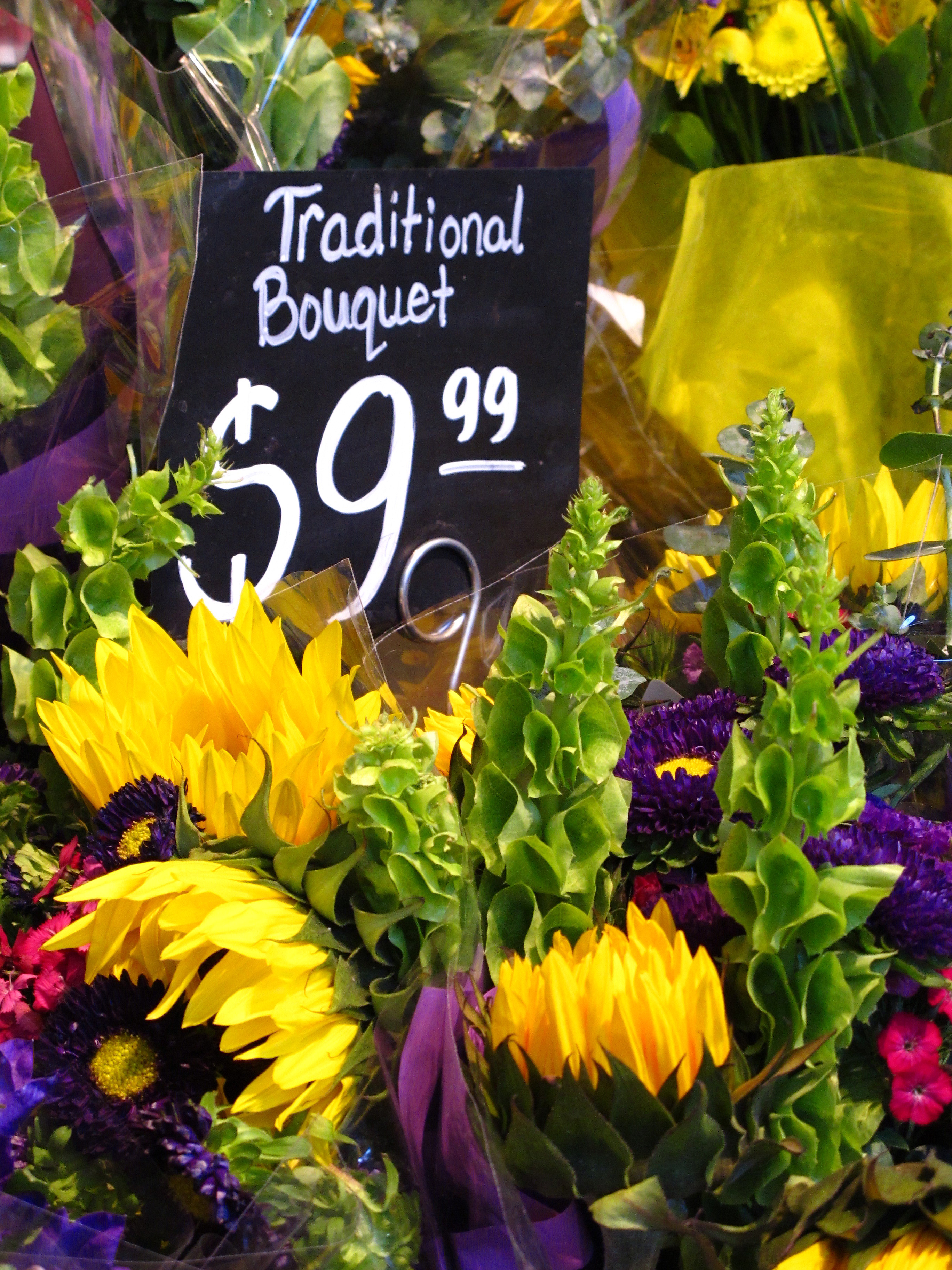
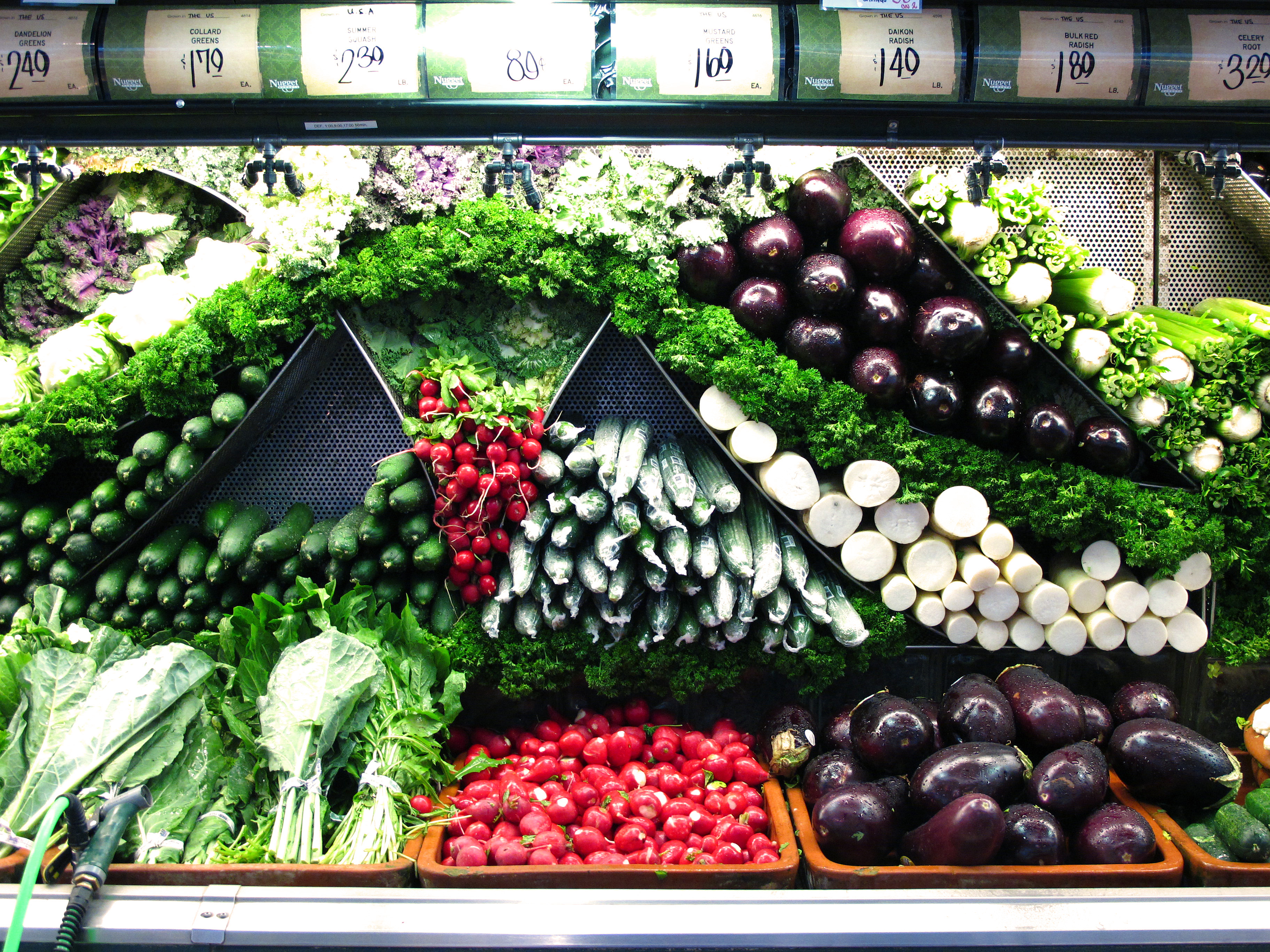
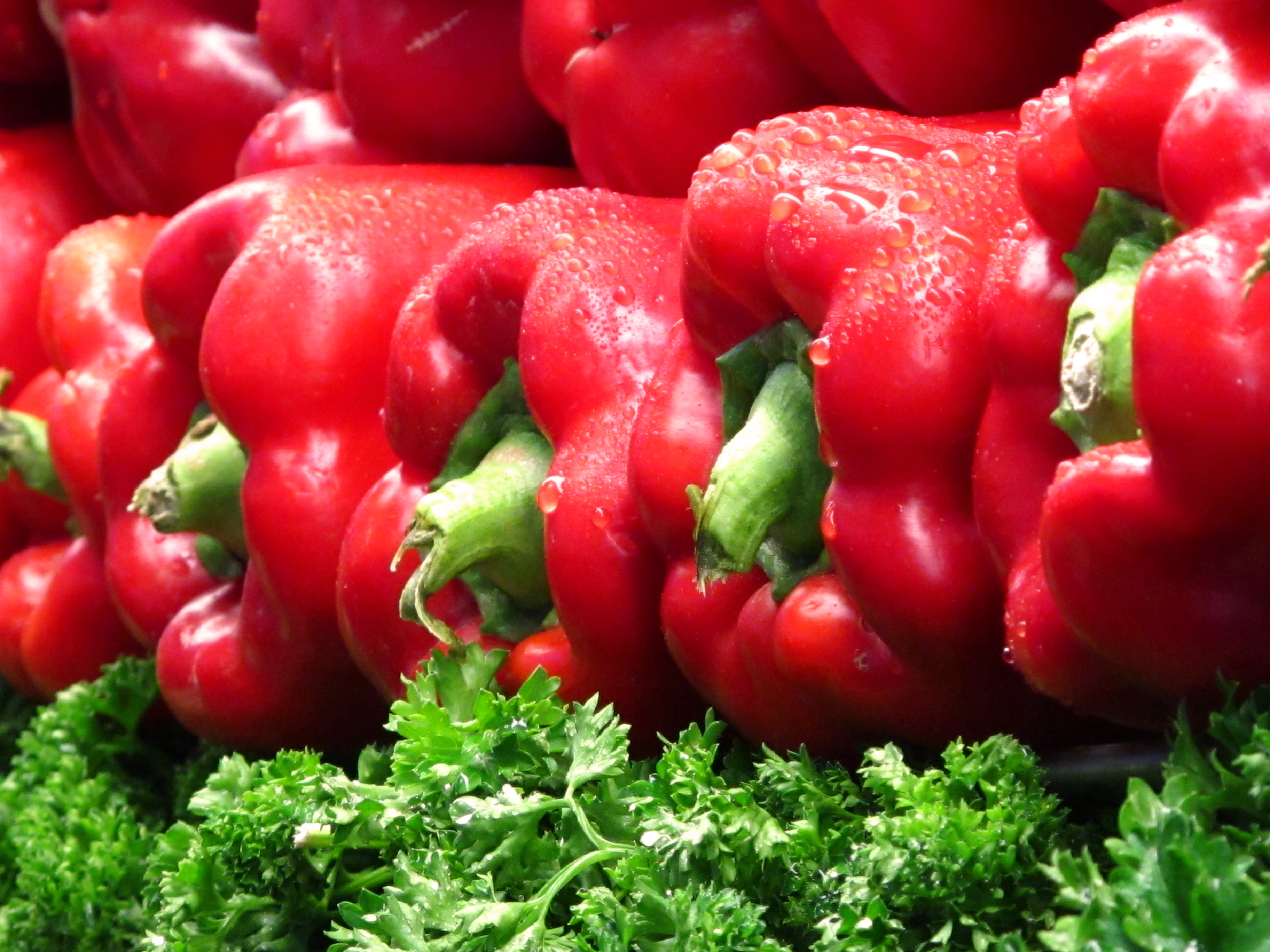
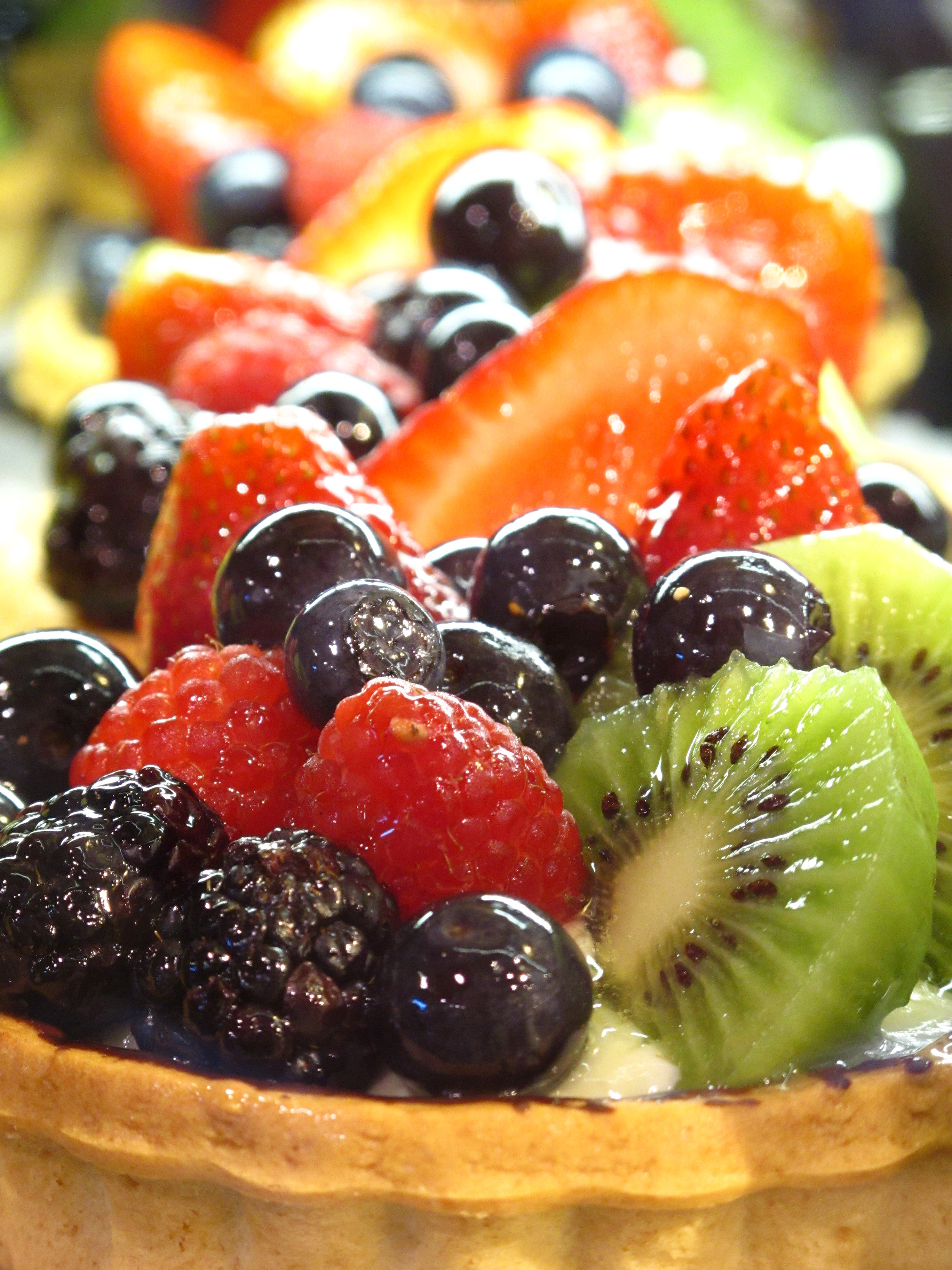
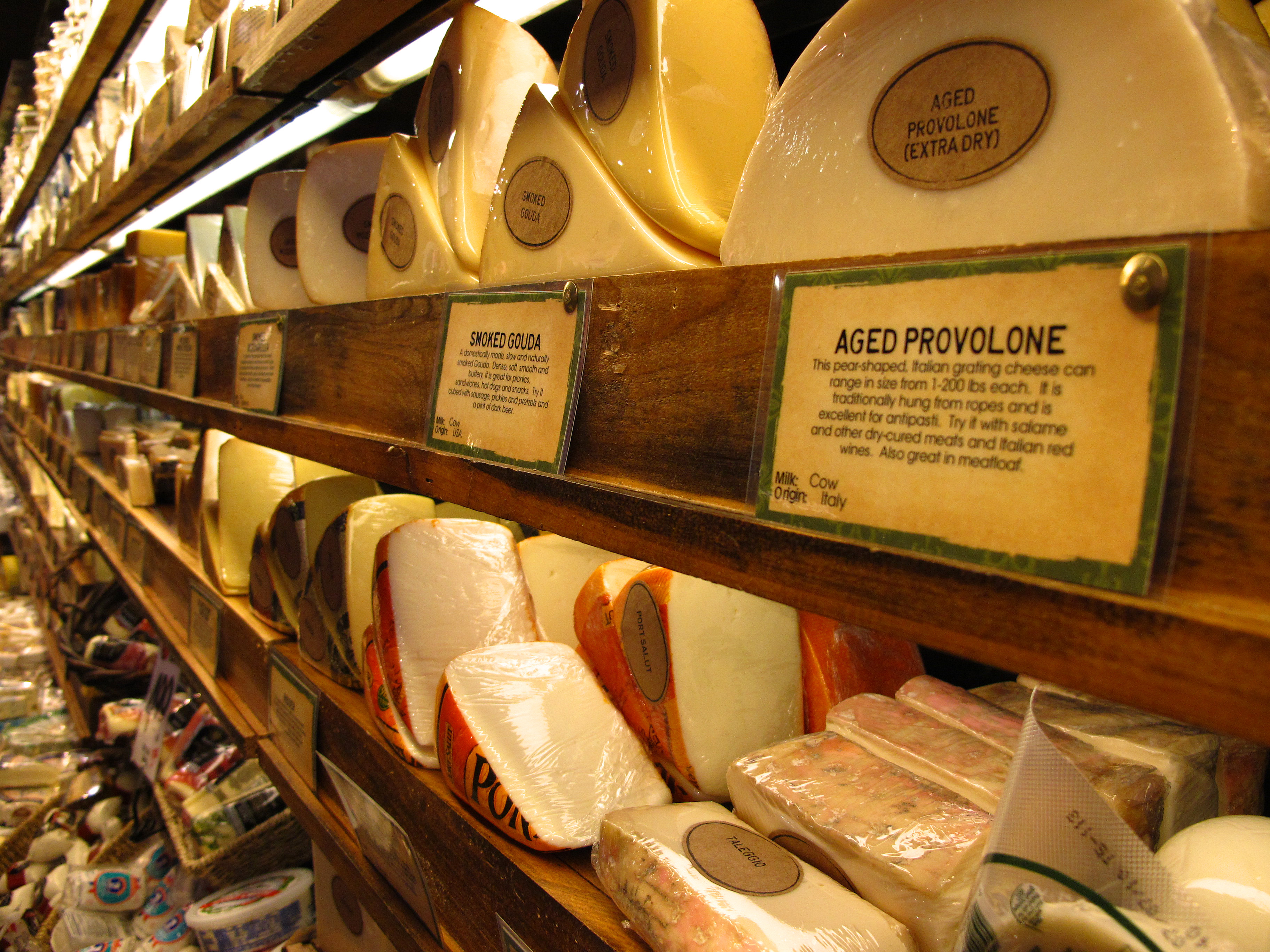
    So you all know that I'm always saying…you have to bring your camera everywhere you go! You never know where beauty will be found and ya need to be ready. Here in Northern California we have this great grocery store chain called Nugget Market. The stores are gorgeous and the food is always fresh and beautiful. When I went there last week to buy the items for the mango salsa…I busted out the camera and took some pictures. I really liked how they came out so I wanted to share them with you. I'm warning you, though, you're going to be hungry after you see these…


    A


    B

    C

    D

    E

    F

    G

    H

    I

    J

    K

    L

    Can't say I didn't warn you! Don't you want to go cook now??

  • Shabby Tea Room Challenge, Week #14 – Summer Fun!

    Summertime, Summertime, Sum, Sum Summertime!!! Woo hoo! Normally I'm not really a hot weather person, but this year, after all the rain, I am ready for it to be nice outside. I do love certain things about Summer: Sandals, warm evenings, fresh fruit and veggies, and being outside.

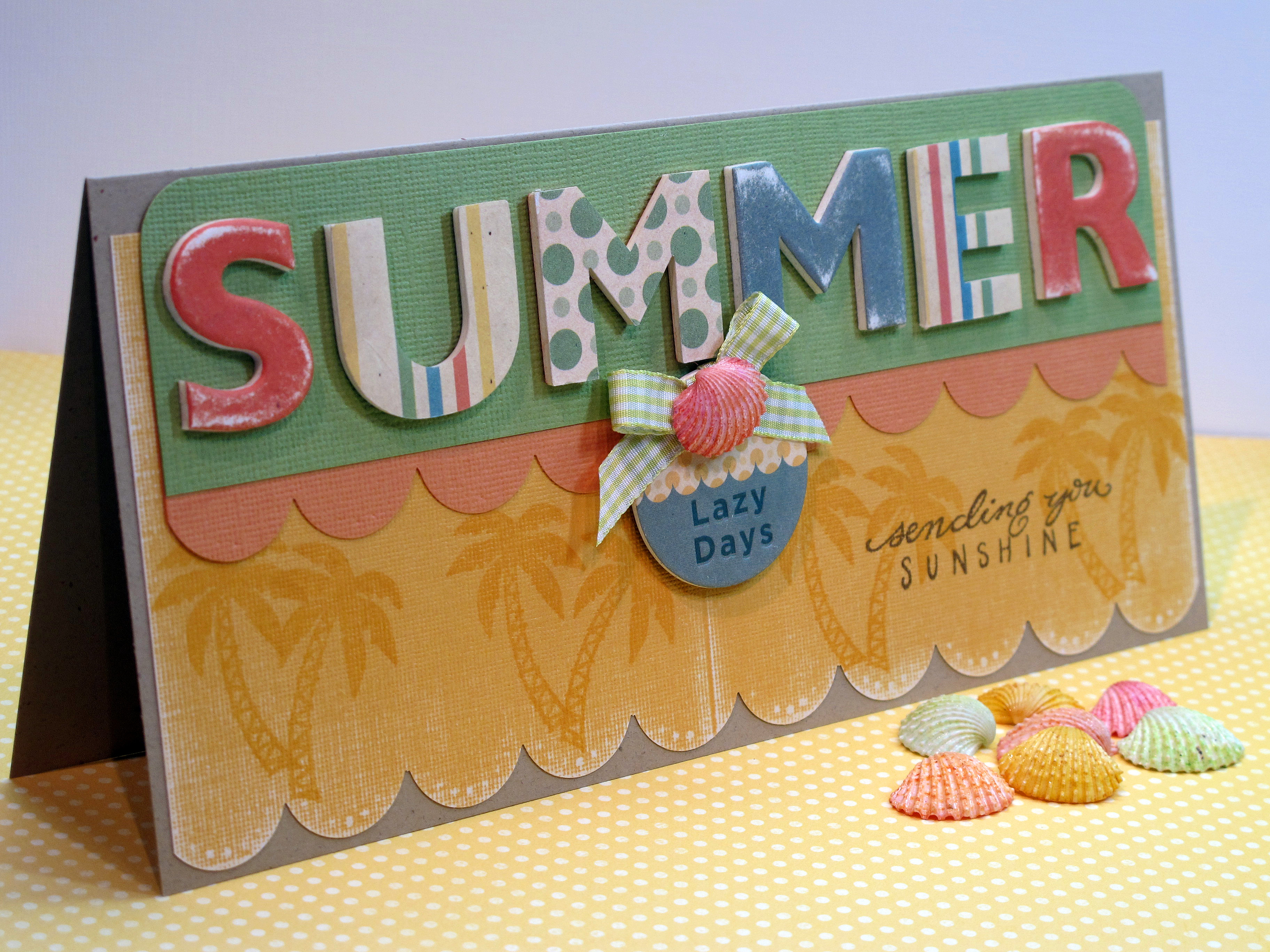
    Today's card is my entry for the Shabby Tea Room Blog Week #14 Challenge – Summer Fun! I love the Shabby Tea Room challenges! I had fun with this one and I really am happy with my card this week. I hope you like it too! It's a long card – finished size is 8" x 4". I needed all that room for the letters…

    IMG_2163


    I had these fun chipboard letters in the cabinet – have had them for a long time. I found some matching paper and some shells and ribbon all in this sort of retro Summer color pallette. Not your typical super bright colors. I sanded the paper to make it look like an old beach towel – all worn in. I stamped the palm trees in the same color ink as the paper. I tried Versamark ink but that wasn't dark enough.

    IMG_2164 (2)


    IMG_2165


    IMG_2167


    Some of the supplies I used. I created my own fun little embellishment with the chipboard, some ribbon and a pretty shell. I've also had those shells forever! Glad to finally use them.

    IMG_2168

  • Tropical Cuties Card…

    Good News! I was chosen as one of the Top Crops over at Taylored Expressions for my card from last week. (Challenge #116). Check out the announcement by clicking here! WOOO HOOO! Thanks Taylor! I love her blog so to be selected (again) is wonderful!

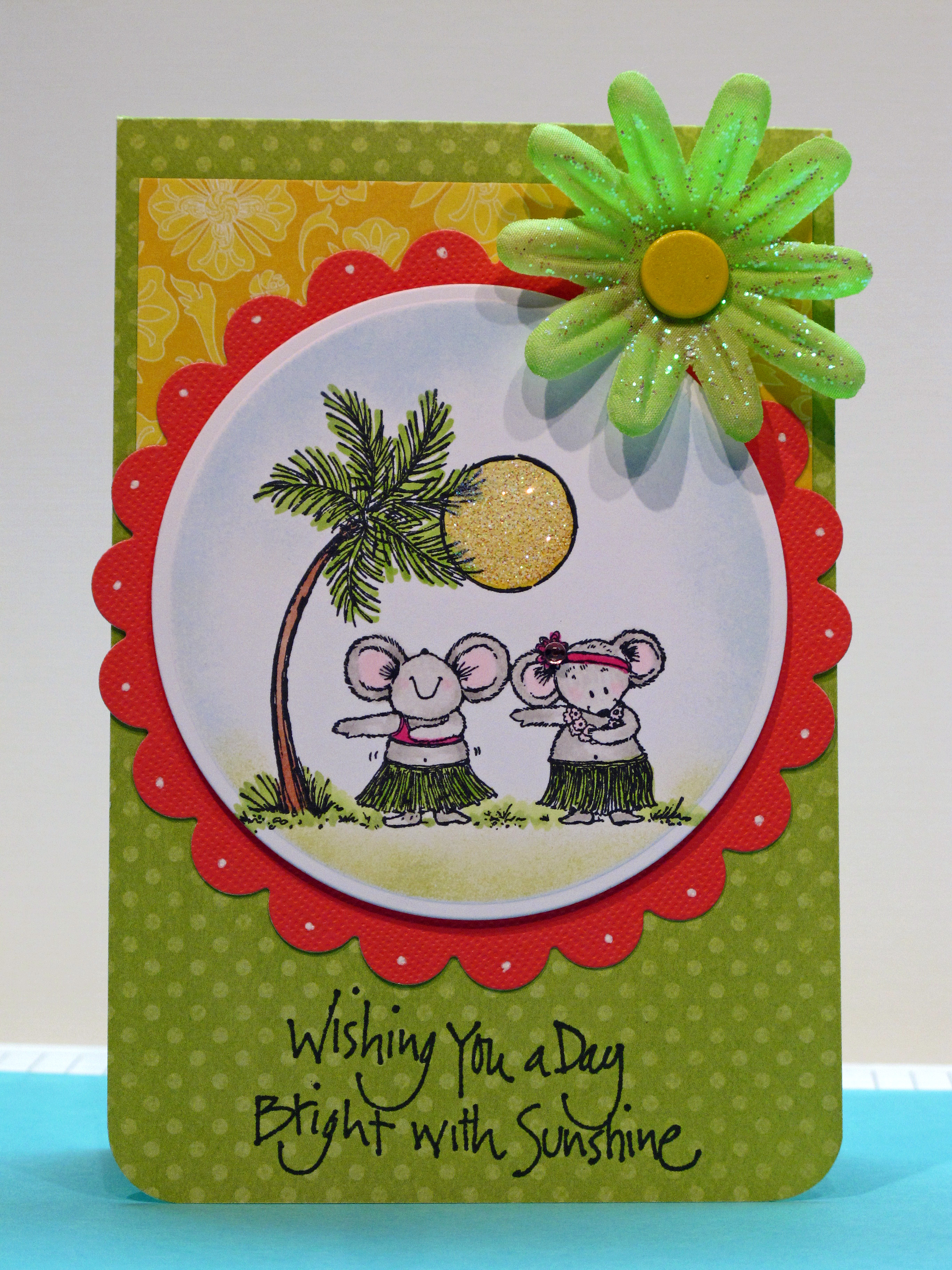
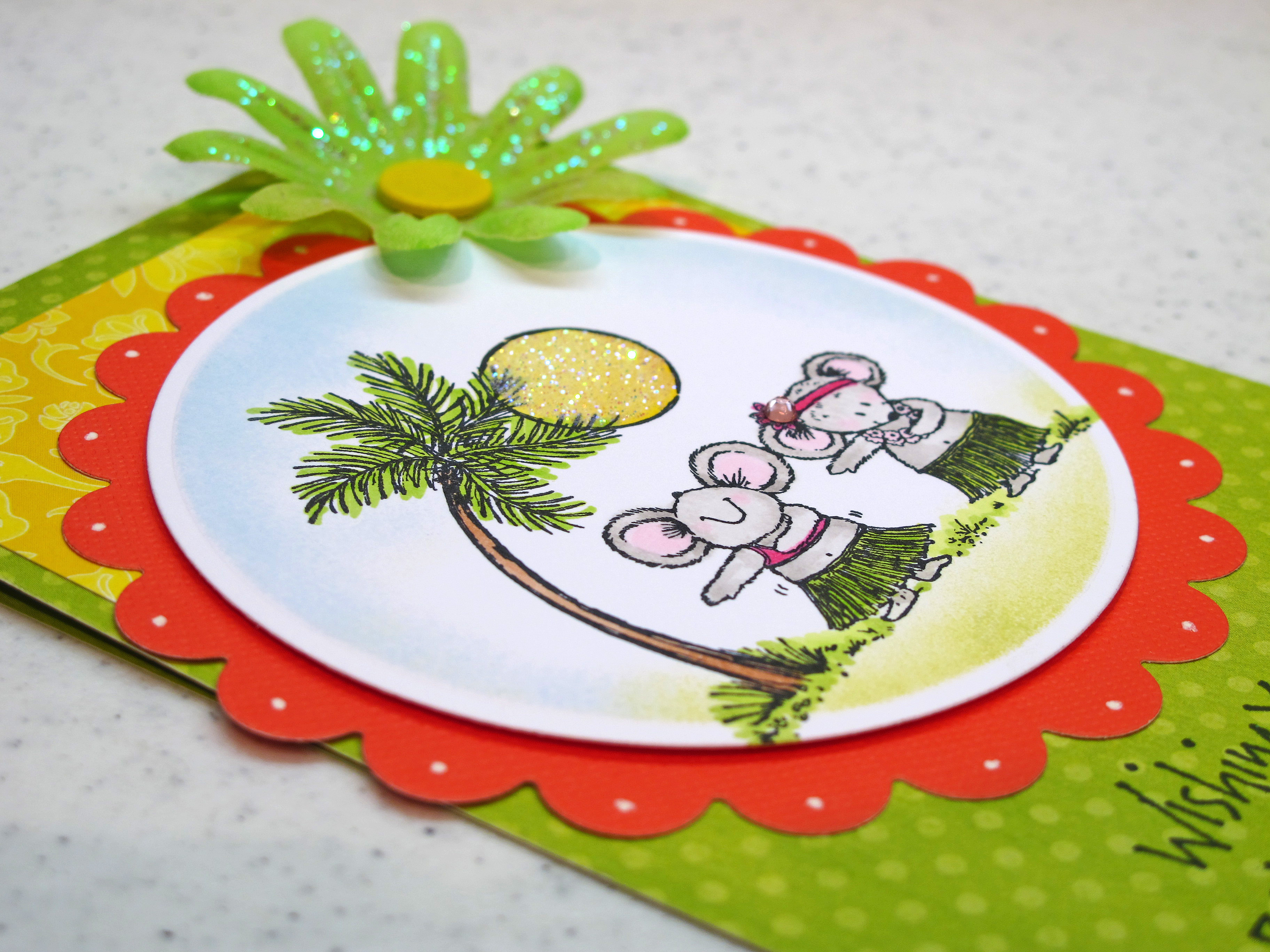
    Today's card was made especially for my sweet friend TeaDub! I just knew she would like these little tropical cuties! I colored the image first and then decided to go all out tropical with the color scheme too. I love these bright sunny colors.


    IMG_2016

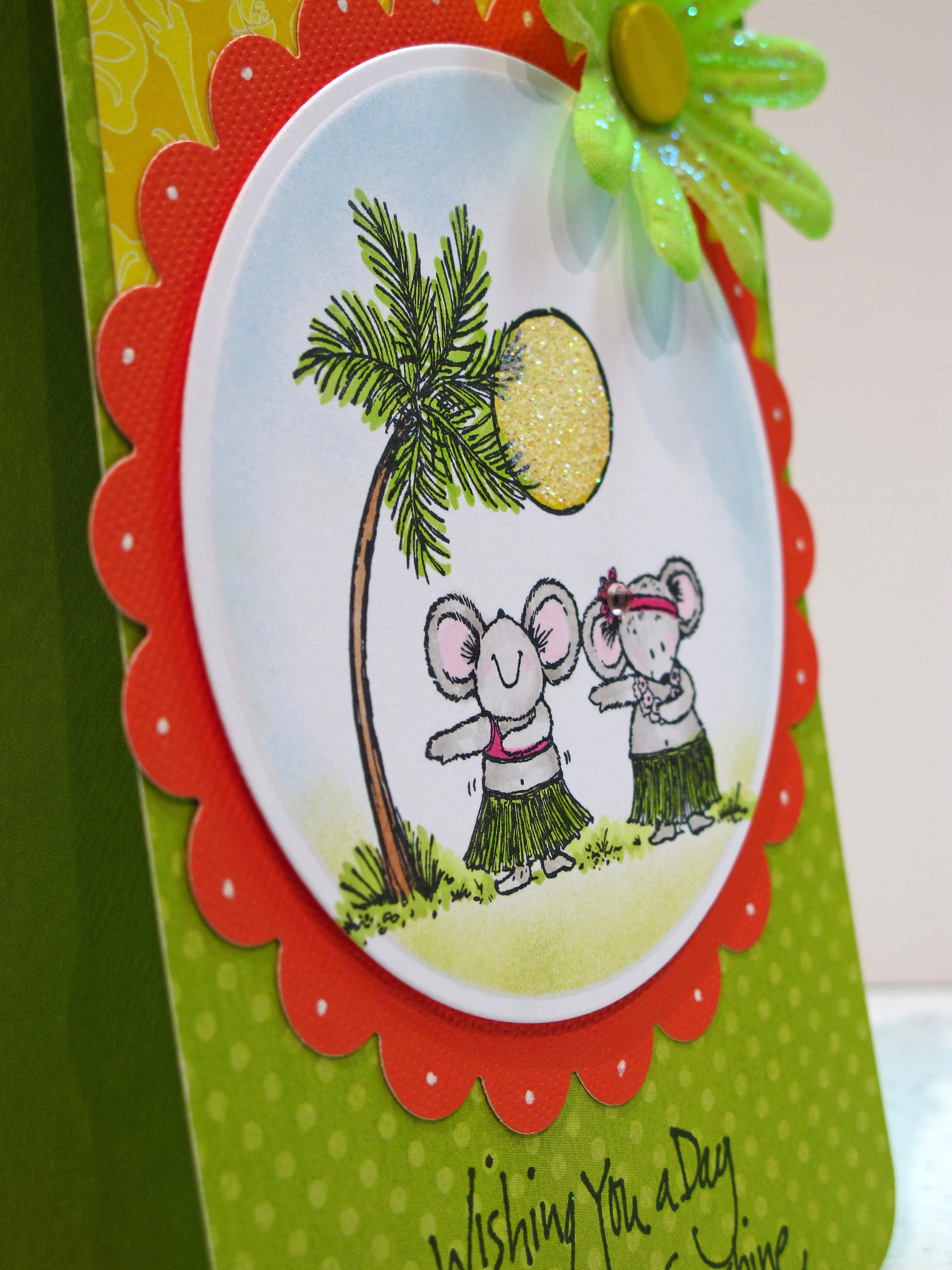
    I colored the mice with my Copic Markers and colored the sun a nice yellow hue. I added some ultrafine prisma glitter to the sun to make it shine. The flower embellishment came with the glitter already on it. I used my nesties for the circle and scallop circle.

    IMG_2020


    IMG_2021

    Aloha!