• Paris Cutie Valentine!

    Bonjour! Ca va? What's going on with you this week? I'm busy at work and trying to get in some stamping time, but that is the story of my life…every week! Got my hair cut on Monday – love to get my hair cut! It always feels so healthy and bouncy. This weekend we're getting our taxes done. Other than that, just plugging along. My card for today features the super cute stamp from The Greeting Farm – Stella. She has this cute bob haircut and just looks like she is holding a special letter straight from Paris. I decided to go with the theme…Je T'aime! I took French in college so I can read it but not speak it that well… Je T'aime means I love you! Mes Amis means my friends! Love you bloggy friends! 🙂

    This card is also my card of the week over on the iCopic Blog! You can buy the Stella stamp there too! Check it out – lots of good stuff over there…and did you know that there are new Copic colors coming out soon? EEEK!


    A


    Here is my design Palette – goodies from Making Memories and Martha…
     

    B


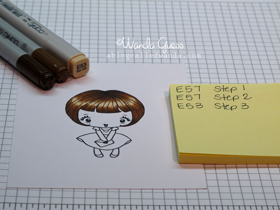
    I thought her hair needed to be a pretty chestnut brown… I started with my E57 Copic Marker and left my white space for the shiny bits. Don't laugh at me…I had the best intentions of taking photos as I went along…but I just got carried away and kept coloring! Sorry about that! You get the idea though.

    C 
     

    Her hair was finished off with E59 and E53. The "white" shiny part is actually a very light beige. You can leave that white too- just preference. Her dress is colored with the rosy shades of RV32 and RV34.  
     

    E


    Here is a close up of the finished coloring. Her face is E00, E000 and RV10 which is my go-to color scheme for skin and faces. She's so adorable! 
     

    F


    G


    I finished the card with chocolate brown around the outer edge and brown ink to pick up the color of her hair and provide some contrast to all that pink. I stamped the swirl onto the patterned paper because I just thought it needed to look more French??!! Does that make sense?
     

    H 

    Au revoir! I'll be back on Thursday with my Chinese New Year cards for 2011 – the Year of the Rabbit! Hope to see you around here soon!
    Birdie signature! 

  • Waltzingmouse Sketch Challenge…Be Mine Lovebirds!

    Today's card is my entry for the latest Waltzingmouse Sketch Challenge! Go on over and check out Claire's blog and enter your own card! The sketch for this week is super clean and simple and leaves a lot of room for creativity. Since I'm on a roll with Valentines…I made another one today! I am still loving that paper collection from We R Memory Keepers!

    Here is my card:

    IMG_5497


    This is the sketch challenge image:
     

    WMSC32

    I used lots of little pearls to accent the card – I just thought it needed some bling! The Be Mine stamp is from Paper Source. Stamped in Watermelon Adirondack Ink.

    IMG_5498


    This is a new technique Jilli Bling taught me Friday night with the ribbon…kinda cool! Put down a layer of adhesive and then just bunch the ribbon up as you go along. Makes a nice texture and visual interest. 
     
    IMG_5499 
     Have a great week everyone!
     
    Birdie signature! 
     

  • Vintage Valentine Boy

    Hey! How was your week? Mine went by in a flash and it was a good one. Hope yours was too. I have been working on an audit in a part of town where a lot of my friends work, so I have been able to catch up with peeps and have lunch and it's been great.  I have some stuff to share today…little of this and a little of that…

    One thing I really like to do is to scout around the interwebs and find cool sketch challenges. I knew I wanted to make a Valentine card but I needed some help with a layout. I found a great one over at The Sweet Stop Sketch Challenge Blog! (Say that three times fast!) Go on over and check it out. I think I will save this one as a favorite. Maybe you'll make a card too?


    A


    Here is the sketch image:
     

    B


    First step was to get out all the supplies I thought I might want to use. I didn't use it all, but a girl has to have options, right? The boy image is from a package of old postcards I got at Paper Source. I liked the two balloons in the picture that were blue, so I thought I would pick up that color somewhere in the card. 

    C
     

    I started with my layout, but the top looked two plain…I got out one of my ALL TIME FAVORITE Stampin' Up backgrounds and put some light distress ink to make my own background pattern. I thought the birdies would show, but in the end they got all covered up!

    D 
      

    Some little ticket stickers, ribbon and a pretty key brad…

    F


    IMG_5486


    The other thing I thought I would share is my organization project from Monday…RIBBON! My ribbon drawer was not working for me and it's been bugging me for a long time. I knew there was cute stuff in there but it was buried and all tangled up…so I always ended up using only the ribbon on the top of the pile. Against my better judgement, I dumped the entire thing out on my desk… Then I thought to myself…self, why did you do that?

    X


    It took me about two hours to sort it all by color…Then I thought to myself…self, whatcha gonna do with it now? Hahaha. I ended up putting each color in it's own big ziploc bag and then put all the bags back in the same drawer. Voila! Definitely a workable solution. Don't you love it when crafty girls have those pretty glass jars in their stamp rooms all lined up for their ribbons and buttons? I love that! Maybe some day…
     

    Y


    You know I had to include a picture of my trusty sidekick and ribbon sorter-helper! Okay, that's all for now. I hope you have a great weekend!  

    Z 
     
     Birdie signature! 

  • Umbrella revisited…

    Hi everyone! Today I'm revisiting a card I posted about a year ago here on the bloggy blog. Now that I am on the Design Team for iCopic, we are talking Copics all the time! I thought it would be good to share this card again. It is a classic example of coloring something shiny and using a light source for your shading. I hope you enjoy this tutorial today! This was such a fun card to color.


    A


    Here is a close up of the finished coloring of the umbrellas…You can see that my light source is coming from the right and hitting all the umbrellas on the top right side of each image. This is a great way to make your coloring eye appealing and realistic – by using your light source uniformly. Also, this extreme use of shading makes the items appear shiny and and like they are reflecting the light.

    E
     

    I used three colors for each umbrella, keeping in the same color family. Here you can see that I've left the white space on the yellow one and am getting ready to fill it in with a very light yellow.

    B


    C


    I used ALLL those colors!
     

    D


    Here's a peek at the back of my image. You can see how much color there is on the paper…it's soaked. That is why the image is so dense and yummy. Keep coloring…don't be afraid to do too much. 
     
    F


    G


    If you look at this super close up, you can almost see exactly where I laid down each of my three colors for each umbrella. I started with my middle color, then put on the darkest color and then finished with the lightest color to blend it all together.
     
    H
     
    Birdie signature! 
     

  • iCopic Color Challenge #14 and a Happy Monday to you!

    Hellllooooo there! I have been a bit absent for a few days just trying to regroup and feel better and generally take a rest. I was sick with a chest cold for almost two straight weeks and it wore me down. Unfortunately…now the DH has it. Ugh. I am feeling much better and hope to be back in the stamping groove. Saturday I got out and about and did some crafty shopping and had dinner with a friend. Good to be back! Today's card was made using the iCopic blog Color Challenge #14. Love these manly shades of moss and blue and teal…so I decided to make a more masculine card.

    Some of the ways that I like to make a card more masculine are: Use squares and rectangles instead of circles and ovals, Incorporate brown or kraft into the layout, No bows! (this one is hard), Use buttons and twine to add texture, and use greens and blues for your color scheme. I hardly ever make a guy card so it's good every once in a whle to just do it!  

    A


    Maybe this image will inspire you to hop over to the iCopic blog and enter your own card? There are prizes each week…and it's fun! Our color scheme this week is Teal, Blue and Moss…yum.
     

    B 


    This is a cute little digital Image from the Pure Innocence Line of stamps over at My Favorite Things! I colored him and his doggie with my Copics and cut them out. The background square was stamped with a Stampin' Up large background stamp and brown ink – to give some texture. The saying is from Hero Arts - one of the clear sets.  

    C


     This is generally my color scheme for faces:

    IMG_5455


    Here is a "formula" for making denim with Copics…Use B21, B23 and B24 to color in the clothing piece. Then take your colorless blender pen and use it to "fade" out the knees! You can also use light, fast strokes over the entire piece to give a "washed" effect. Just try it until you get it the way you want it. If you get it too light, just go back and put some more color on and try again…

    IMG_5456 


    IMG_5457


    IMG_5458


    IMG_5463


    IMG_5464
    Everything IS better when shared with a friend…I would agree with that! Just like this blog…totally better because it's shared with friends like you! Have a great week!

    Birdie signature! 
      

  • Get Sketchy Card Challenge #70!

    Hi! I'm finally bustin' out some Valentine cards this week! Guess I better get busy and get with the program…since Cupid's holiday will be here before we know it! I scouted around to find a cool sketch image for today and found a great one over at GET SKETCHY!  I have had the uber ultra totally cute paper collection from We R Memory Keepers out on my desk just waiting to be used! LOVE it!

    Here is my funny valentine:

    A


    Here's the sketch image:

     B 


    The ribbon is from Martha Stewart and the felt flower is from Pebbles…although don't you think it would be fun to make some of those? I need to remember that! Could be very creative! The Be My Valentine stamp is from Penny Black. The paper and the owl are from We R Memory Keepers 2011 collection for Valentine's Day.

    IMG_5453


    IMG_5454 

     Owl always love you….

    Birdie signature! 
     

  • It’s Blog Hop Day! The theme is L-O-V-E!

    Today I’m participating in my first Blog Hop! It is sponsored by Taylored Expressions ! I had so much fun creating a card to throw in the mix today. You had to use a stamp set from one of the past releases of Taylored Expressions stamps. I chose the set called In The Park. It has a pretty tree and then all kinds of add-ons to go with it. I liked the park bench for my love card. Please take some time to check out all the other awesome entries. There is a link at the bottom of my post so you can click around! Have a wonderful day everybody! Thanks for stopping by.


    A


    I stamped and colored the tree twice and then cut out the leaves and layered them on top of the other leaves with some foam tape. I stamped tiny hearts in the tree! Added some soft blue clouds…
     
    Aa


    B


    C


    D


    IMG_5403


    IMG_5404


    IMG_5410 
    Here’s the link to check out everyone elses’ gorgeous blog hop creations!


  • It’s my turn for Tuesday Tips and Tricks!

    Tuesdaytips 
    Hi! Today it's my turn for Tuesday Tips and Tricks over at the iCopic Blog! Make sure you click on over there and check out the past tips so you don't miss any! Today I'm sharing my favorite trick – Copics and ribbon. have you ever searched high and low for that PERFECT color of ribbon? Search no more…make your own! Did you know that you can have 350 different colors of ribbon?? Yes – by coloring white ribbon with Copic Markers!

    I started today with my three favorite colors for Spring…Pink, Blue and Chartreuse…and some plain white grosgrain and some black and white gingham ribbons…

    IMG_5411


    Color directly onto your ribbon and voila! It's magic!  

    IMG_5412


    With the plain white ribbon you can get a little wild and crazy…stripes, dots, blending colors together. The only thing stopping ya is your imagination!  Have fun and play with it! Make that gorgeous dark teal blue ribbon for your card…or blend all the colors of the rainbow in a tie dye effect! Couldn't be more fun! 
     
    IMG_5416
     
    Birdie signature! 

  • Blue Butterfly Shabby Chic…

    Hi everyone! Sitting here watching the Golden Globe Awards show and stamping and hanging out with Mr. Buddy. Nice Sunday night at our house. Thank you very much everyone for the kind get well wishes and comments on my last blog post. I'm still sick and keep hoping each day I'll wake up and that will be the day I am better! Ugh… Today we got out of the house and went for a nice drive up the hill to see my friend's new house and then for a nice lunch with butternut squash soup (mmmmm). All in all a good weekend. Hope yours was good too.

    Tonight I went a little shabby chic on ya! I got out some pretty vintage-y papers and some new K & Company doo dads. Also, threw in a paper flower I made some time ago (click here for the post on making the flowers). I am loving the whole shabby chic thing lately! Hope you enjoy my card.


    A


    B


    D


    C


    E


    I have a picture to share today too! On Friday the DH went to Yosemite with his friend on a photo trip. He took this picture below and I fell in love with it! Thought you guys might like it too. Brrrrr.

    Icy leaves copy
     

    Birdie signature! 
      

  • Some Eat Cake Graphics Cuties!

    Dang…I am g-l-a-d it's Friday! I caught a cold bug on Monday and it's stuck around all week. Combine that with the fact that I started a new, big project for work this week and I'm pooped. It feels good to be home in my jammies relaxin'. I hope you had a good week and are ready for a nice weekend! Today I'm sharing two cards I made for Eat Cake Graphics. Holly's images are so innocent and sweet and I just love them! I'm really enjoying being a part of her design team. I hope you will hop on over and check out her store…CLICK HERE!

    The first card is a bearthday card! Isn't he so adorable? Love his little striped tee! The background white circle is stamped with a Hero Arts background stamp in a matching shade of blue. You really can't go wrong with red, white and blue. I distressed the blue paper a bit around the edges to make it look like denim.

    IMG_5206


    After I colored him in with a light tan Copic, I went over his "fur" with my Colorless blender pen to make it look rough and more furry. Does that make any sense? Don't answer that! I gave him some little pink cheeks and ears too. I cut him out and mounted him on some foam tape so he would stand out.
     

    IMG_5208


    IMG_5209


    The second card is a sweet girl with her kitty and some flutterbies…so cheery and happy! I can't believe that Holly draws all these images. I wish I could draw like this…don't you? She is also a children's book illustrator and I can totally see that. The butterfly border in yellow is a giant Martha Stewart punch.

    IMG_5210


    Lots and lots of markers for this one…

    Z


    IMG_5213


    Thank you so much for stopping on by to see me! I hope to get some crafty time in this weekend and be back with some new stuff to share. Next week on Tuesday I'll be doing Tips n Tricks on the iCopic blog and on Wednesday I'll be taking part in the Taylored Expressions Blog Hop.  Have a great weekend!  
     
    Birdie signature!